Rachel’s 汉堡餐厅, 上海 / 如恩设计
2019-08-08 14:37
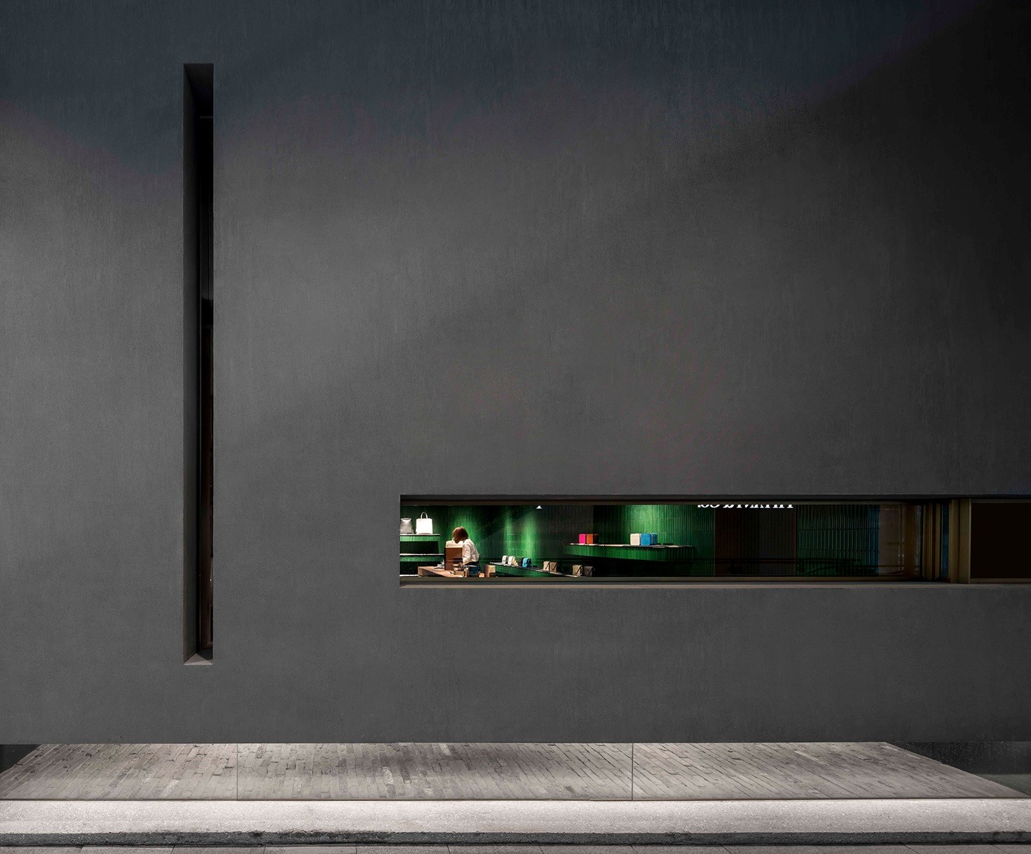
受到二十世纪五十年代美国街边连锁汉堡店的启发,Rachel’s 汉堡餐厅采用了通透的设计理念,模糊了餐厅室内外之间的界限。

Drawing inspiration from the American drive up burger joints of the 1950’s, the restaurant was envisioned as a porous space where the boundaries between inside and outside are blurred.


完全开放式的外墙进一步延伸了餐厅的边界。

The exterior walls can be fully opened to further extend the perceived and actual boundaries of the restaurant.


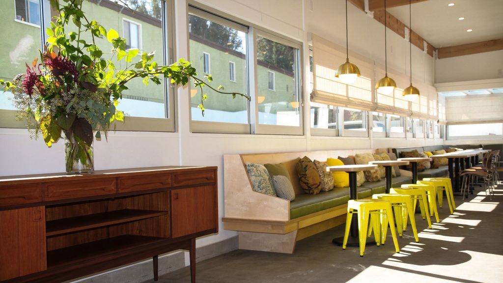
全部闭合后,光面玻璃、纹理玻璃与镜子的搭配使用不仅能够在视觉上留有更多空间,也为室内带来了更加充足的自然光和全景式的室外视野。

When fully closed, however, a clever combination of clear and textured glass along with mirror are used to great effect to visually extend the boundaries of the space while bringing light, views and streetscape deep into the interior.


餐厅没有使用实体墙,轻盈的结构通过狭长的平面得到进一步加强。

The dematerialization of the walls is further emphasized by the dominance of the horizontal planes.


从视觉的角度,屋顶结构似乎悬浮在餐厅之上,地面和就餐吧台采用统一的几何图案,有如地面动态地上下起伏。长桌和旋转吧台椅可以灵活满足不同就餐人数的需求。

The roof structure seemingly floats above the space while the floor rises and falls to support the custom eating and seating surfaces, integrating communal tables with pivoting benches accommodating for individual or group dining flexibility.


 Neri&Hu project_Rachel's Burger_photographed by Dirk Weiblen 13

Project Name: Rachel’s Burger
Site Address: No.202, Wukang Road
Website: www.rachels-burger.com
Project Type: Interior Design
Interior Architect & Interior Designer: Neri&Hu Design and Research Office
Gross area for renovation: 93 sqm

 PintereAI


