Loja Alimentar Ateliê de Arquitetura Líquida
2019-01-04 10:00
架构师提供的文本描述。位于Juiz de Fora市中心的Alimentar商店旨在向消费者提供两种营养产品:一种是针对医院分支机构的肠内营养,另一种是针对普通公众的天然食品。
Text description provided by the architects. Located in the city center of Juiz de Fora, Alimentar Store aims to offer to consumers two strands of nutriment products: an enteral nutrition aimed at the hospital branch and natural food products, to the general public.
Text description provided by the architects. Located in the city center of Juiz de Fora, Alimentar Store aims to offer to consumers two strands of nutriment products: an enteral nutrition aimed at the hospital branch and natural food products, to the general public.
© Bruno Meneghitti
(c)BrunoMeneghitti


建筑项目是从对这两个不同的市场的感知开始的,整合在同一个物理空间中。在商店的最初部分,指定给医院的产品,这个提议是一个真正的“浸”在白色,那里的参展商和轻材料被选择重新创造的医疗氛围。通过穿越这个空间,用户沉浸在一个非正交的木箱中,这让他感受到我们的根的温暖和回归,这是自然而持久的精髓。使用海军胶合板创造这个“盒子”,我们试图以材料的价值方式,事实上,反映用户的体验。
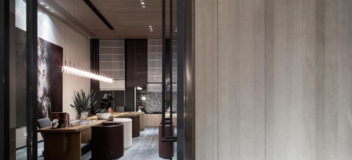
The architectural project started from the perception of these two distinct markets integrated in the same physical space. In the initial part of the store, designated to the hospital products, the proposal is a real "dip" in white, where exhibitors and light materials were chosen to recreate the medical atmosphere. By crossing this space, the user immerses himself in a non-orthogonal wooden box, which invites him to the warmth and return of our roots, which is natural and lasting essence. Using the naval plywood to create this "box", we tried to value the materials in the way they are, in fact, reflecting on the user experience.
The architectural project started from the perception of these two distinct markets integrated in the same physical space. In the initial part of the store, designated to the hospital products, the proposal is a real "dip" in white, where exhibitors and light materials were chosen to recreate the medical atmosphere. By crossing this space, the user immerses himself in a non-orthogonal wooden box, which invites him to the warmth and return of our roots, which is natural and lasting essence. Using the naval plywood to create this "box", we tried to value the materials in the way they are, in fact, reflecting on the user experience.
© Bruno Meneghitti
(c)BrunoMeneghitti


© Bruno Meneghitti
(c)BrunoMeneghitti


它被认为是一套单位,照顾每一面墙,每一个细节,以创造一个独特的特点的空间。所有的家具都是由建筑师设计的,由木制品和金属制成,包括完成以木材为主的区域的瓷砖面板,由于材料之间的对比而对其赞不绝口。这个设计是专为这个项目而设计的,每一块白色瓷砖上都有贴纸并固定在上面,雕刻了一个独特的个人马赛克图案,形成了一个带有公司色彩的艺术面板。
It was thought of the store as a set of units, taking care of every wall, every detail, in order to create a unique characteristic for the spaces. All the furniture was designed by the architects and made of woodwork and metal, including the tile panel that completes the area dominated by the wood, praising it due to the contrast between the materials. This design was created exclusively for the project, with stickers produced and fixed on each of the white tiles, sculpting a unique and personal mosaic, forming an artistic panel with the company's colors.
It was thought of the store as a set of units, taking care of every wall, every detail, in order to create a unique characteristic for the spaces. All the furniture was designed by the architects and made of woodwork and metal, including the tile panel that completes the area dominated by the wood, praising it due to the contrast between the materials. This design was created exclusively for the project, with stickers produced and fixed on each of the white tiles, sculpting a unique and personal mosaic, forming an artistic panel with the company's colors.
© Bruno Meneghitti
(c)BrunoMeneghitti


Atelier的灵感来自于在非传统材料面前重新思考/创造和创新,为一种独特的、艺术的和独特的建筑。除了使用胶合板作为墙壁和天花板的涂层,前面的显示器和灯具在环境中增加了强度。使用刚性u-剖面,允许搁置和使用LED条在其内部,这些元素获得了一个分支的设计,并突出在商店的整体背景。
The Atelier was inspired to rethink/create/innovate in front of unconventional materials, for a distinct, artistic and unique architecture. In addition to the use of plywood as a wall and ceiling coating, the front display and luminaire gain strength in the environment. Using rigid u-profiles that allow shelving and the use of LED strips in its inside, these elements gain a branched design and stand out in the store's overall context.
The Atelier was inspired to rethink/create/innovate in front of unconventional materials, for a distinct, artistic and unique architecture. In addition to the use of plywood as a wall and ceiling coating, the front display and luminaire gain strength in the environment. Using rigid u-profiles that allow shelving and the use of LED strips in its inside, these elements gain a branched design and stand out in the store's overall context.
© Bruno Meneghitti
(c)BrunoMeneghitti


这些重叠集中在私人区域-储藏室、会议室、办公室、厕所和储藏室-在这些地方使用的是一楼的相同色调和材料,无论是颜色、木材还是金属。应客户的要求,这一空间应该能够塑造成不同的功能和需求,从而创造两个由滑动门分隔的环境,使它们能够被这些计划连接或分离,从而产生用户空间占用的动态。
The overlap concentrates the private areas - pantry, meeting room, office, toilet and storage - in which the same tones and materials found on the first floor were used, whether by colors, wood or metal. At the request of the customer, this space should be able to be molded to different functions and needs, thus creating two environments separated by sliding doors, which allows them to be joined or separated by these plans, generating users' space appropriation dynamics.
The overlap concentrates the private areas - pantry, meeting room, office, toilet and storage - in which the same tones and materials found on the first floor were used, whether by colors, wood or metal. At the request of the customer, this space should be able to be molded to different functions and needs, thus creating two environments separated by sliding doors, which allows them to be joined or separated by these plans, generating users' space appropriation dynamics.


下载


