季意设计:天然呆 · NATURALV 首
2021-04-17 09:37
天然呆 · NATURALV


各类消费数据报告和实际的消费行为习惯观察,都充分显示了,“奶茶店”成为占据快销餐饮行业半壁江山的后起之秀。一杯奶茶,引来了流量与资本的双重偏好,也使得行业竞争日趋白热化。一个城市的中心或热门商圈内,往往会有不低于30%(据不专业统计)的含茶量,日前一家发迹于本土的慢饮品牌与我们接洽,意在成都(宇)最(宙)洋(中)气(心)的太古里商圈打造一家具有商业价值的奶茶店。
All kinds of consumption data reports and observation of consumption behavior habits fully show that milk tea shop has become a rising star in the fast-selling catering industry. Milk tea attracts the flow and capital, and also makes the industry competition increasingly fierce. In the center or popular business district of a city, there are no less than 30% tea shops (according to unprofessional statistics). A local slow drink brand approached us recently to build a milk tea shop with commercial value in business districts around Taikoo Li (known as the Universe Center because of its popularity), which is the most popular business district in Chengdu.
Comprehensive Factor Analysis


▲ 图片提供:miniko 探店
通过对市场的分析,我们发现,在越来越多的人将“茶”与年轻人或者说资本市场匹配的浪潮中,“品牌理念、产品口感、空间设计”三位一体组成了一个好的、被年轻市场所喜欢的“茶铺”。
Through the analysis of the market, we find that in the trend of tea linking with young people, three factors play important roles in the capital market. They are brand concept, product taste and space design, which make up a tea shop favored by the young market.


品牌本身有明星加持,那么我们如何利用好区位优势与对空间的把控力,创造出具有品牌溢价可能性的消费体验空间呢?
The brand itself has the background of star cooperation, so how can we make good use of the location advantage and space control to create the consumption experience space with more added value of the brand?


▲ 开业当天品牌代言人关晓彤莅临时现场盛况 图片提供:天然呆品牌方


▲ 图片提供:天然呆品牌方
如何让天然呆旗舰店在太古里商圈的“茶海”里脱颖而出?
How to make the NATURALV flagship store stand out in the tea sea of Taikoo Li business district?
如何利用空间本身的特点促进最大化的商业利益转化?
How to use the characteristics of space itself to promote the maximization of business benefits?
如何使品牌对资本市场看起来就极具说服力?
How to make the brand persuasive to the capital market?
另辟蹊径,许是制胜之道。
A new way may be the way to win.


▲ 图片提供:巴适成都


How to Make a Good Commercial Show with Design


这是是一个80㎡,层高8米的长方形空间。基于奶茶店的“社交空间属性”与“流媒体属性”,我们试图在有限的空间里埋藏无限的艺术想像与社交可能性。以一杯茶与一个空间的独特魅力去引领新一波y2k们的茶饮浪潮。
This is a rectangular space with an area of 80 square meters and a floor height of 8 meters. Based on the social space attribute and streaming media attribute of milk tea shop, we try to bury infinite artistic imagination and social possibility in the limited space. With the unique charm of tea and space to lead a tea drinks wave of Y2K people.


白色、银色、绿色的混合交织是这个空间的色调线索,如同鲜奶与茶叶以不同的比列融合出独特的口味,再点缀以元气十足的橙色,展现出“简洁、鲜明、通透、夺目”的第一印象,也是对“新鲜、独特、活力”等品牌诉求的直观诠释。在这些色彩包裹下的点、线及面,形成了有节奏感的几何纹样与块面,组合出明快、高识别度的空间。
The mixture of white, silver and green is the color clue of the space, just as fresh milk and tea mix in different proportions to produce unique taste, and then embellished with vitality orange, showing the first impression of concise, distinct, transparent and eye-catching, which is also an interpretation of brand demand of fresh, unique and energetic. The points, lines and surfaces with colors form rhythmic geometric patterns and blocks, which combine to create a bright and highly recognizable space.


利用“空”的优势,我们对空间做了几何切分,将之变化为“两个”纵深空间。然后将平面布局规划延伸到了垂直空间的设计。一个三角区做了三层具有不同功能属性的搭建,一个贯穿上下、极具未来科技感的滴滤装置则在平衡空间的同时,也形成了具有品牌文化代表性的视觉焦点。
Using the advantage of emptiness, we make geometric segmentation of space and change it into two deep spaces. Then the plane layout planning is extended to the design of vertical space. A triangle area is built with three layers of different functions, and a trickling filter device with a sense of future science and technology runs through the top and bottom, which forms a visual focus with brand culture representation while balancing the space.


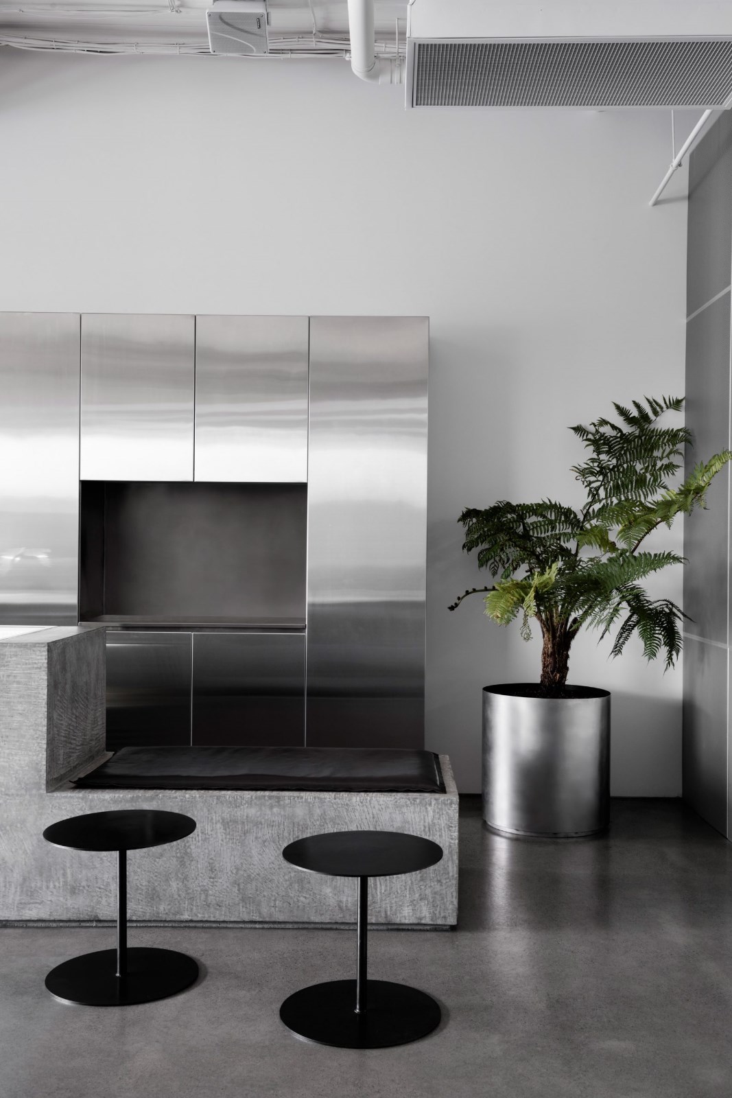
内侧墙面以大面积白色、银色覆盖,镜面不锈钢与通透的玻璃交相映射光线,不仅能够营造出开阔的室内空间效果,还能因为人流的窜动、室内外光线、天气的变化形成动静虚实相生的光影。
The inner wall is covered with a large area of white and silver while the mirror stainless steel and transparent glass reflect the light, which can not only create an open indoor space effect, but also form the light and shadow of dynamic and static virtual reality due to the movement of people, indoor and outdoor light, and weather changes.


我们期望的是:在限定范围内创造出戏剧化的空间延伸感,让进入到室内的人们或坐或走间,都能获取层次丰富的视觉感触与饱有兴味的空间动线体验。
What we expect is to create a dramatic sense of space extension within a limited scope, so that people who enter the room, whether sitting or walking, can obtain rich visual feelings and interesting space moving experience.


与周围的店铺不同,我们采用了整面超大无切割玻璃作为外立面(整个太古里仅有苹果商店采用同款设计手法),将屏幕退后进室内空间,包裹住无法消除的立柱与横梁等房屋结构体。在人流量极大的城市中心地带,让它能与过往的人们最大限度的“交流”。
Different from the surrounding stores, we use the whole large uncut glass as the external facade (only Apple store in Taikoo Li adopts the same design method), and back the screen into the indoor space, wrapping the indelible columns, beams and other housing structures. In the city center with a huge flow of people, it can communicate with people to the maximum extent.


如果你从它面前经过,也许会被XXXXL号的“滴滤”装置所吸引,从而产生一探究竟的冲动;当你踏入其中,又会被略带俏皮感的动线规划所牵引,上到2楼、3楼。
If you pass in front of it, you may be attracted by the trickling filter device in XXXXL size, thus generating your impulse to find out. When you step into it, you will be led by the playful moving line planning to the second and third floors.


▲ 图片提供:巴适成都


玩味成都 我们在这里做了三层的空间分隔,扩展了原本的容纳量,也展开了一家奶茶店的社交功能性。1楼主要是候餐区与备餐区。顺着墙体现场制作了带有公共属性的长椅,为等候时的消费者提供了休憩区。对面能一眼望穿的操作空间也能给食客带来极大的安全感。
We have made a three-layer space partition here, expanded the original capacity, and also launched the social function of a milk tea shop. The first floor is mainly for people waiting and drinks preparation. Along the wall, benches with public properties are made on site to provide a rest area for consumers waiting. The operation space that can be seen from the opposite can also bring great security to diners.


往上走,分别是两层带有不同属性的休憩区。2楼附带一个吧台,搭配与之相对的银色装饰墙面、变幻着霓虹色彩的装置灯管……这里随时可以变身极具网感的迷你酒吧。
Going up, there are two open spaces with different attributes. There is a bar on the second floor, with silver decorative walls and neon colored lights... It can be transformed into a mini-bar at any time.


3楼除了拍照打卡点的设置还做了一块可以展示周边产品的区域,为以后的变现可能性做了延展考虑。而当从三楼再往下俯瞰时,又能拥有神奇又层次丰富的视觉体验。我们摒弃了传统桌椅的设置方式,让人们在高低落的落座方式中获得随意的对话机会,无形中也提升了空间的社交属性。
In addition to setting up spots for taking photos on the third floor, an area was also built to show the brand related products, which considered the commercial possibility in the future. When you look down from the third floor, you can have a magical visual experience. We abandon the traditional way of setting tables and chairs, so that people can have a casual conversation in the way of sitting high and low, which virtually improves the social attribute of the space.


关于这个空间的设计策略,我们遵循“前人”已开拓出的茶饮店进化到社交空间的概念,利用社交网络在零售快销行业中的重要性与消费人群在真实社会中的社交需求,来打造一个能满足精神、视觉、味觉等多维度感官美好体验的空间。
As for the design strategy of this space, we follow the concept of tea shop evolved into social space, which has been developed by predecessors, and make use of the importance of social network in the retail industry and the social needs of consumers in the real society to create a space that can meet the spiritual, visual, taste and other multi-dimensional sensory experience.


我们试图以赋予空间大胆前卫的姿态、能触发感官和结构新想象的方式,将抽象的艺术与品牌文化表达转化为可被感知到的空间语言。当这些被人们察觉到,那么他们也与品牌产生了连接,商业效益增加的目的也在无形中达成了。
We try to transform abstract art and brand culture expression into perceptible space language by giving space bold and avant-garde posture and triggering new imagination of senses and structure. When these are perceived by people, they are also connected with the brand, and the purpose of increasing business benefits is also achieved. - 项目平面图 -


 PintereAI


