Modern Urban Apartment in Tel Aviv created by Studio Perri Interior Design from a previously untouched 1970s apartment 位于特拉维夫的现代城市公寓,由工作室Perri室内设计,从以前从未接触过的70年代公寓
2019-08-29 14:03
In the north end of the city of Tel Aviv, Israel, designer at Studio Perri Interior Design recently completed a renovation on an apartment from the 1970s. Now, the newly updated Modern Urban Apartment is home to a young couple who needed something a little quieter than their previous apartment right in the centre of the city.
以色列特拉维夫市的北端,StudioPerri室内设计公司的设计师最近完成了20世纪70年代的一套公寓改造。现在,最新更新的现代城市公寓是一个年轻的夫妇的家,他们需要的东西比他们以前的公寓在城市中心。
The renovated apartment, which occupies 135 square metres, boasts a living room, kitchen, dining room, and balcony in the public paces, as well as four bedrooms, two bathrooms, a storage space, and even an entire room for the family cats in the private wing. Originally divided into two units- a larger apartment and a delineated smaller wing- in the 70s, the space has been joined for better flow and use of space.
改造后的公寓占地135平方米,公共空间内设有起居室、厨房、餐厅和阳台,还有四间卧室、两间浴室、一间储藏室,甚至还有一整间私人屋内的家庭猫房。最初被划分为两个单元-一个更大的公寓和一个较小的机翼-在70年代,为了更好地流动和利用空间,这个空间被连接起来。
Previously to this brand new project, the apartment had never been renovated before after it was built in the 70s. The new owners, though in love with the building’s history and location, desired something a little more spacious with better light flow. In terms of atmosphere and aesthetic, clients and designers like chose a modern but minimalist scheme that effectively blends both beauty and functionality.
在这个崭新的项目之前,这个公寓在70年代建成后,从来没有翻新过。新的主人,尽管爱上了建筑的历史和位置,但希望能有更多的空间,并有更好的光线流动。在气氛和审美方面,客户和设计师喜欢选择一个现代但简约的方案,它能有效地融合美容和功能。
Inside, the renovation destroyed and rebuilt almost every single wall, keeping only the original support pillars and two wall’s in the couple’s young song’s room. In the space that use to be a separate, smaller unit, designers left walls out to blend it into the main apartment and built the kitchen and storage unit here, maximizing on that space for useful and essential home functions.
在里面,翻修几乎摧毁和重建了几乎每一堵墙,只保留了原来的支撑柱和两堵墙在这对夫妇的年轻歌曲的房间。在过去是一个独立的、较小的单元的空间里,设计师们把墙壁放在主公寓里,在这里建造了厨房和储藏室,最大限度地利用了这个空间来发挥有用的、必不可少的家庭功能。
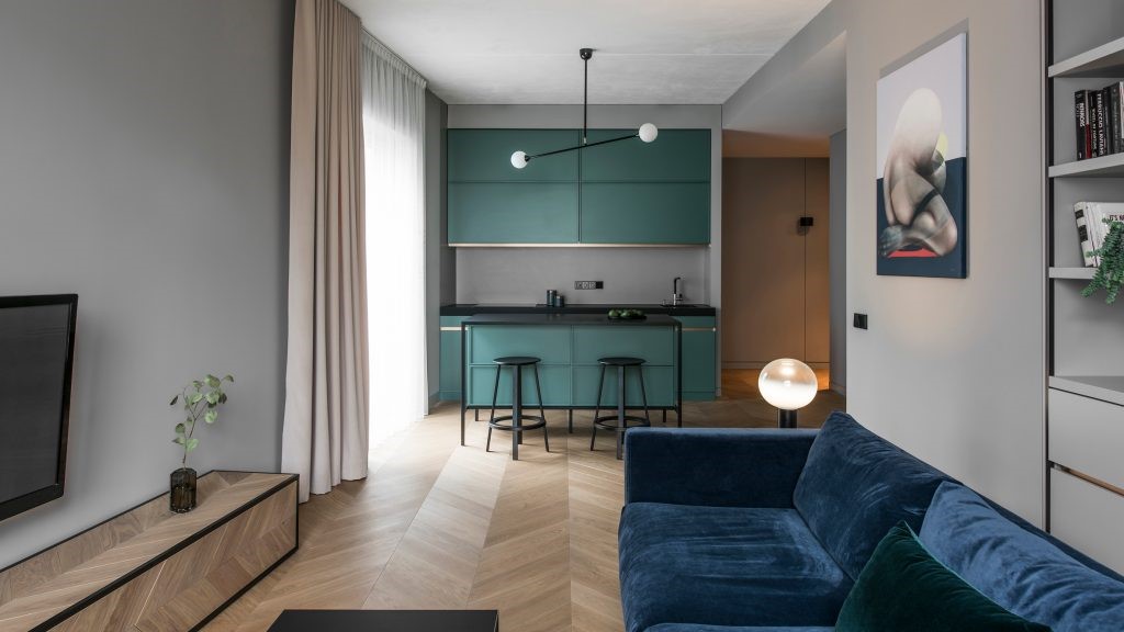
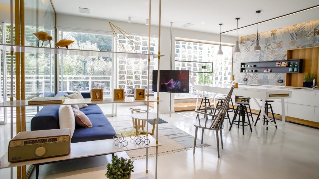
Now, the kitchen is blended right into a bright open living space that sits on the edge of what was originally the main apartment volume while things were still split. Further towards the back of the home, a kids’ play room now sits where the old kitchen used to be. This space is very open as well, with all of the original walls removed and only visual delineations set in place to denote its borders.
现在,厨房被混合成一个明亮的开放式生活空间,它坐落在最初的公寓体积的边缘,而东西还在裂开。回到家的后面,一个孩子“游戏室”现在坐落在旧厨房过去的地方。这个空间也非常开放,所有的原始墙壁都被移除,并且只有视觉描绘被设置在适当的地方来表示它的边界。
Along the same vein of creating new space in efficient ways, designers actually used existing features of the building’s facade to make their client a new balcony space that wasn’t there before. By taking advantage of a strategically place bulge in the building’s exterior facade and building a small extended, open air space outward from the apartment’s outermost wall onto where it juts the furthest.
按照同样的思路,以有效的方式创造新的空间,设计师们实际上利用建筑正面的现有特征,让他们的客户成为一个以前没有的新的阳台空间。利用这座建筑外墙上的凸起的战略优势,从公寓最外面的墙壁向外建造一个狭小的露天空间,一直延伸到最远处的地方。
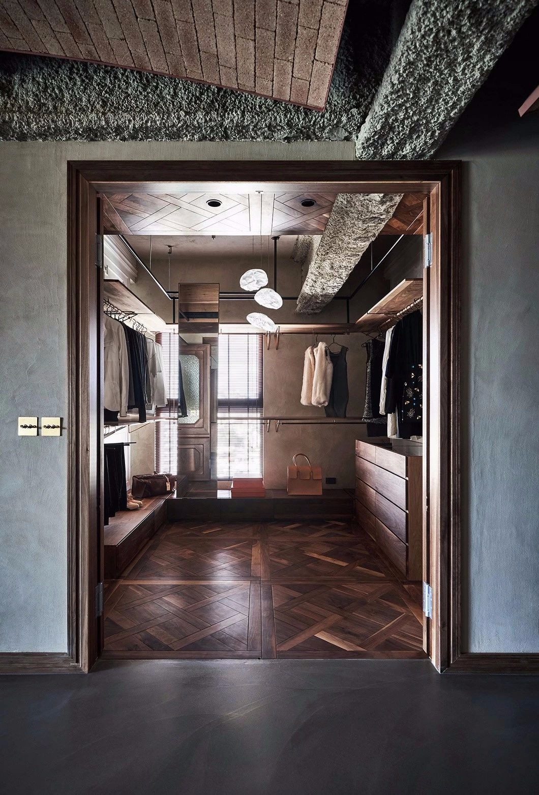
Large renovations took place towards the master bedroom as well. Leading up to the beautiful escape, the original corridor, which was quite narrow in nature, was enlarged and made wider so that more light can easily flow throughout the private spaces. The bedroom itself was also redesigned. Now it features two massive built-in wardrobes that sit parallel to each other and adjacent to the master bathroom, which received an updating treatment from its original state as well.
对主卧室也进行了大翻修。在通往美丽的逃生之路之前,原本狭小的走廊被放大,变得更宽,这样更多的光就可以很容易地流过私人空间。卧室本身也进行了重新设计。现在,它有两个巨大的内置衣柜,坐在平行的,毗邻主浴室,这是一个更新的待遇,从其原来的状态,以及。
Moving back out towards the main living space, visitors encounter the way that furniture, which was all custom designed for the room, does more than just provide seating and comfort. It also acts as a visual delineation between the main family room and the entryway and front door itself. Here, multi-function furniture provides custom storage for things like shoes and coats.
回到主要的生活空间,游客会遇到家具,这都是为房间设计的,不仅仅是提供座位和舒适。它也是家庭主室与出入口和前门之间的视觉勾勒。在这里,多功能家具为鞋子和外套等物品提供定制的存储。
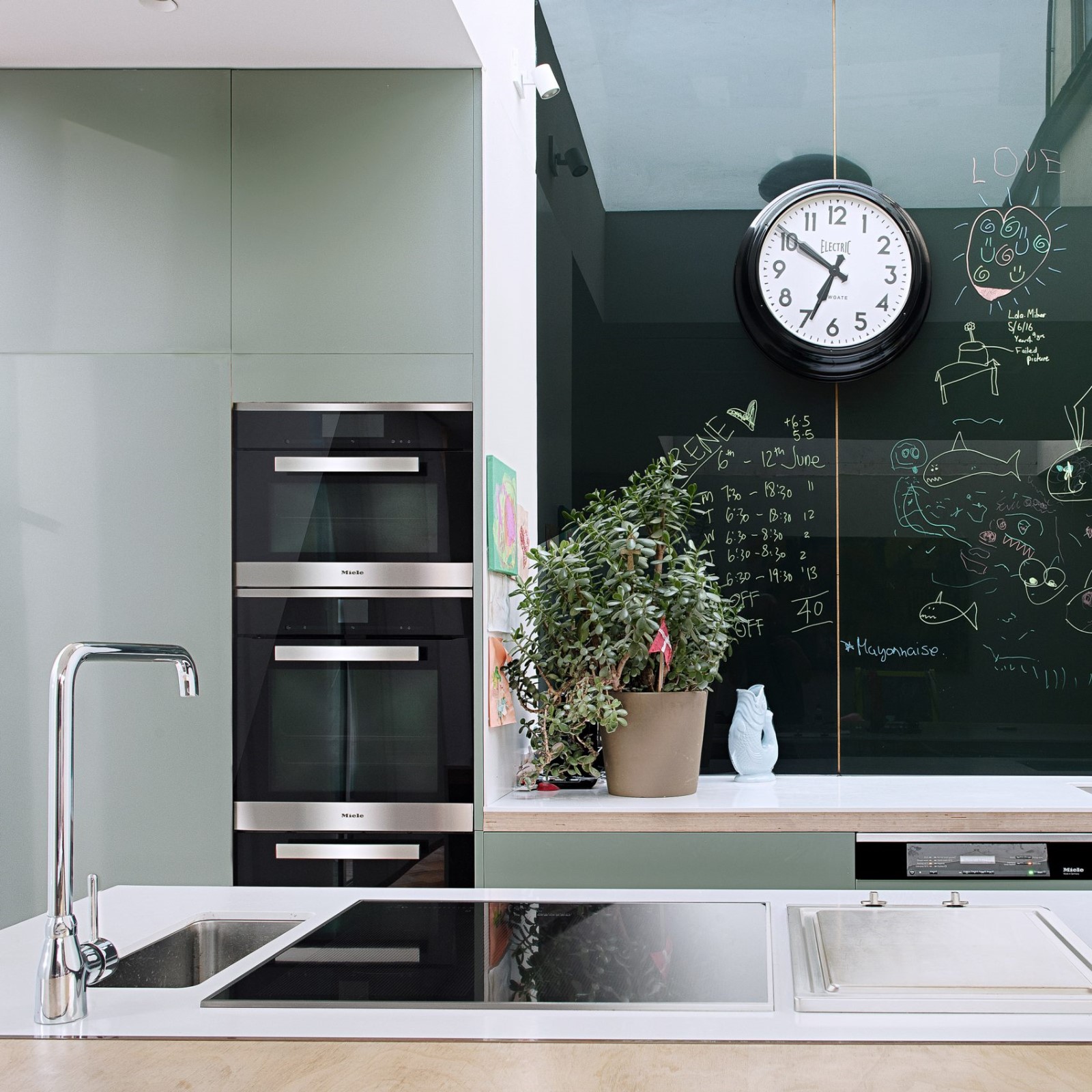
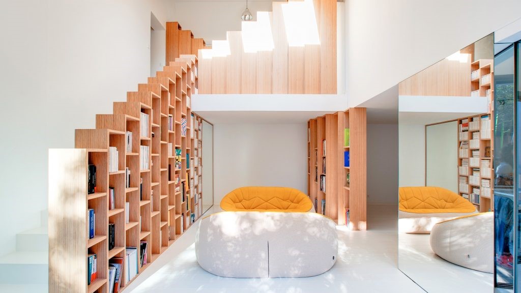
Throughout each space in the house, a careful palette of materials and colours is established and maintained with continuity. There is an emphasis on careful carpentry and colours that suit the wood finishes chosen. Maple wood shines throughout the spaces, accented and complemented by shades of grey, white, and black. To add depth, details in a deep blue, gold, and rich red are also featured like colour pops all throughout the home.
整个房子的每一个空间,一个仔细的材料和颜色的调色板是建立和保持连续性。有一个重点是仔细的木工和颜色,以适合木材完成选择。枫木照亮整个空间,强调和补充灰色,白色和黑色的阴影。为了增加深度,深蓝色,金色和丰富的红色细节也是特色的颜色弹出整个家庭。
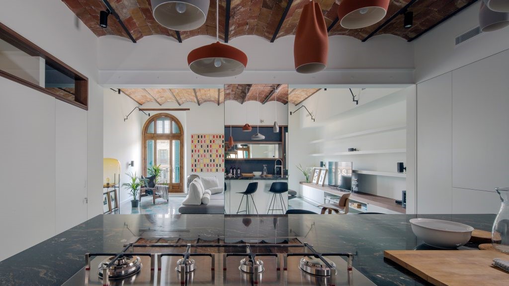
The brand new kitchen we’ve spoken of so fondly wasn’t moved solely for the sake of larger spaces. It was also positioned to more positively influence the flow of the house and how rooms are accessed. Now, rather than being cut off from the main living space, a person working in the kitchen has a clear site to the living room and play room. This allows for daily functions and family time to become a shared experience.
我们说过的那个新厨房并不是为了更大的空间而移动的。它的位置也更积极地影响了房屋的流动以及如何进入房间。现在,一个在厨房工作的人没有被切断主要的生活空间,而是有一个通往客厅和游戏室的清晰场地。这允许日常功能和家庭时间成为共享体验。
 举报
举报
别默默的看了,快登录帮我评论一下吧!:)
注册
登录
更多评论
相关文章
-

描边风设计中,最容易犯的8种问题分析
2018年走过了四分之一,LOGO设计趋势也清晰了LOGO设计
-

描边风设计中,最容易犯的8种问题分析
2018年走过了四分之一,LOGO设计趋势也清晰了LOGO设计
-

描边风设计中,最容易犯的8种问题分析
2018年走过了四分之一,LOGO设计趋势也清晰了LOGO设计


 PintereAI


