Orange Business Services Office T+T Architects
2017-01-15 03:00
架构师提供的文本描述。新成立的莫斯科电信公司Orange Business Services办公室位于莫斯科商业中心“水星”大厦两层。内地总面积为5,300平方米。m.
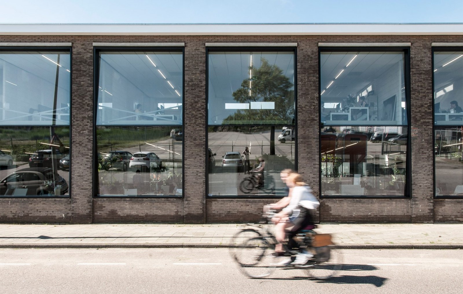
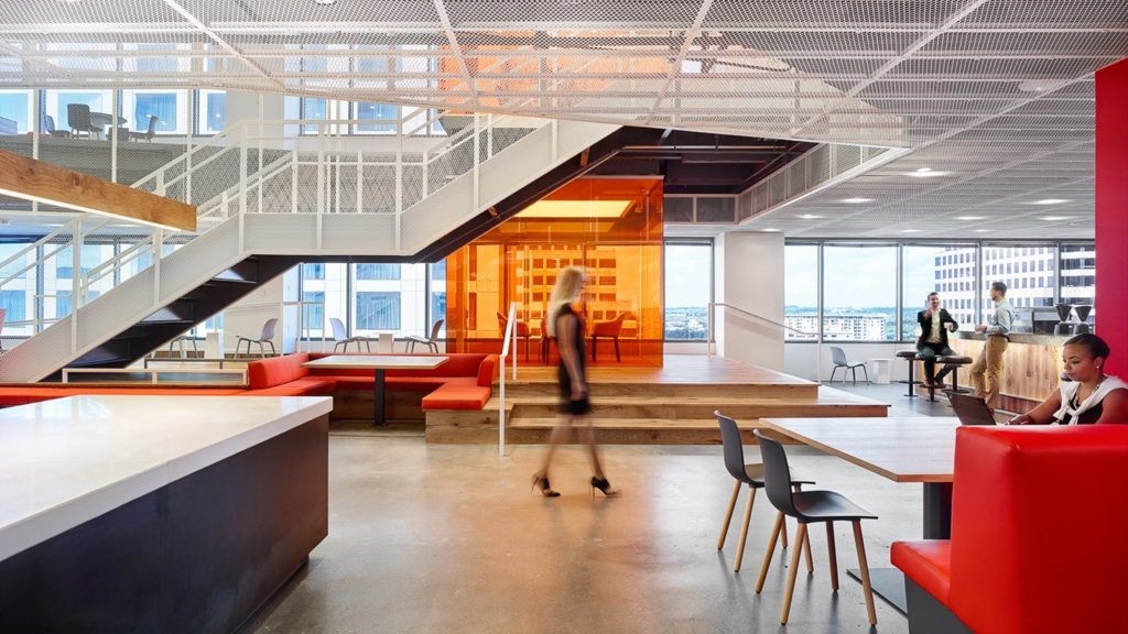
Text description provided by the architects. The new Moscow office of telecommunications company Orange Business Services is located on two floors of “Mercury” tower of business center "Moscow city". The total area of the interior is 5,300 sq. m.
该内部项目由Priex集团公司实施,该公司将总设计师和总承包商的职能结合起来,执行建筑和工程设计,以及工程工程的复杂性。室内设计是由TT建筑师局开发的。
The interior project was implemented by Pridex Group Company, which combined the functions of General designer and General contractor performing the architectural and engineering design, as well as the complex of engineering works. The interior design was developed by T+T Architects bureau.
两个参照点:顾客的标志、橙色的方形和圆形的重音元素成为建筑概念的基础。
Two reference points: customer's logo, the orange square, and accent elements in the form of circles became the basis for the architectural concept.
开放工作空间的原则在全世界都很流行。然而,在这里,客户已经建立了一个独特的功能过程,在这个过程中,任务通过一种部门和专家的“装配线”。这些部门的最后职位是按照这个计划安排的。
The principle of an open workspace is popular all over the world. However, here the customer has built a distinct functional process in which the tasks go through a kind of "assembly line" of departments and specialists. The final placement of the departments follows this scheme.
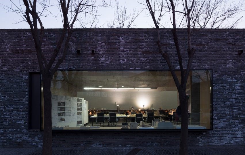
办公空间分为工作区域和非正式交流点,平均分布在整个楼层空间。在这些点上,建筑师在特定的实施例中根据圆圈的形式来设置口音。工作空间是相反的-在正交形式和单色材料。部分非正式沟通点被整合在一些部门的中心,显示出不可分割的工作流程和讨论过程。
The office space is divided into working areas and points of informal communication evenly spread over the entire space of the floors. At these points architects set the accents based on the form of circle in a particular embodiment. Workspaces are made contrastly – in the orthogonal forms and monochrome materials. Part of the informal communication points were integrated in the center of some departments showing the inextricable workflow and the process of discussion.
在500名员工的生产工作中,使用了高舒适性的材料。会议室内有移动分区的解决方案使谈判空间变得灵活和可伸缩。
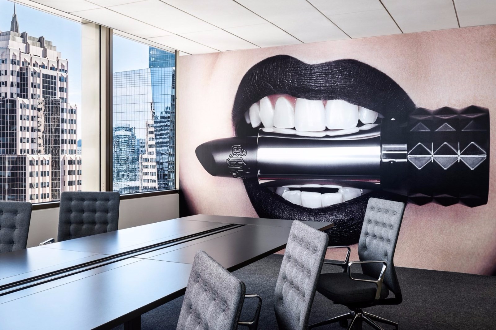
Materials with high acoustic comfort were used for the productive work of 500 employees. Solutions with mobile partitions in meeting rooms made the space for negotiations flexible and scalable.
Pridex集团公司(Pridex Group Company)执行合伙人谢尔盖·库德里亚夫采夫(Sergey Kudryavtsev)表示:“Orange公司的新办公室对我们来说已成为一个严峻的挑战。复杂的建筑结构和一系列客户条件要求团队高度专业。由于选定的解决方案和协调的工作,我们设法在尽可能短的时间内实施了这样一个雄心勃勃的项目。”
"The new office for Orange Company has become for us a serious challenge. Complicated architecture of the building and a number of customer conditions demanded high professionalism of the team. Due to the selected solutions and coordinated work, we managed to implement such an ambitious project in the shortest possible time", - says Sergey Kudryavtsev, managing partner of Pridex Group Company.
“对企业标准给予了极大关注。”Orange“为我们提供了详细的品牌手册,提供了许多限制和建议。在实施过程中,我们设法创造了一个独特的解决方案,同时又没有破坏基本的企业战略,”该项目的主要设计师、T T建筑师事务所(TT Archittors Bureau)的主要设计师波琳娜·沃沃迪纳(Polina Voevodina)表示
"Great attention was paid to the corporate standards. “Orange” provided us with the detailed brand book with a lot of restrictions and recommendations. During the implementation we managed to create a unique solution without breaking the basic corporate strategy", - says Polina Voevodina, the main architect of the project, the T+T Architects Bureau.
“我们感谢Pridex公司迅速和高质量地实施了这一复杂的项目。一切都是按照橘子品牌风格的要求来做的。新办公室推出舒适和实用,最重要的是-有助于提高我们的员工互动的生产力。这肯定会对改善对我们客户的服务质量产生影响。“-Orange Business Services的商业房地产和设施管理总监Olga Nekrasova评论道。
"We thank the Pridex Company for the fast and high quality implementation of this complex project. Everything is done in accordance with the requirements of the Orange brand style. New office came out comfortable and functional, and most importantly - helped to raise the productivity of our employees interaction. It will definitely impact on improving the quality of service to our clients", - commented Olga Nekrasova, Director of commercial real estate and facilities management at Orange Business Services.
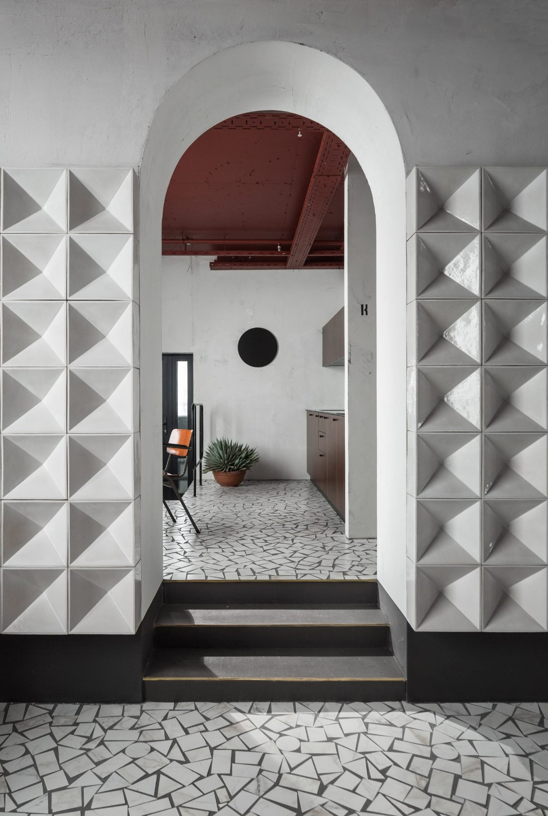
产品描述:概念的要点是简洁整洁的内部,其中的主要材料之一是白色本身。然而,我们高度重视公共空间:圆形钢筋混凝土楼梯,靠近它的休息区,咖啡点和厨房,非正式会议区,接待处。
Product Description: As far as the main point of the concept was minimalistic and neat interior, one of the principal materials was the white color itself. However, we paid high attention to the public spaces: circular reinforced concrete staircase, lounge area near it, coffee points and kitchen, informal meeting areas, reception.
相反的白色和真正简单的开放空间,有重音墙与微水泥装饰涂层(巴尔迪尼)或明亮的橙色天花板细节(蒂库里亚绘画)。也有一些舒适的悬挂灯(“胡德”,阿泰耶Lyktan)与红色毛毡阴影,这决定了独特的地区。使用不同颜色的德索航空主地毯集合,使我们可以区分不同的功能区,通过确定地板的颜色。
Oppositely to the white and really simple open space areas, there are accent walls with micro-cement decorative coating (Baldini) or bright orange-color ceiling detail (Tikkurilla paintings). There are also some cozy suspended lamps (“Hood”, Atelje Lyktan) with red felt shades, which determine unique areas. Using different colors from Desso Airmaster carpet collection allowed us to distinguish different functional zones by determing the floor color.
Architects T+T Architects
Location 1st Красногвардейский проезд 15, Mercury City Tower, Moscow, Russia
Category Offices Interiors
Architect in Charge Sergey Truhanov, Voevodina Polina, Parfenova Yuliya, Denisova Galina, Trusova Olga.
Photographs Dmitriy Yagovkin
 举报
举报
别默默的看了,快登录帮我评论一下吧!:)
注册
登录
更多评论
相关文章
-

描边风设计中,最容易犯的8种问题分析
2018年走过了四分之一,LOGO设计趋势也清晰了LOGO设计
-

描边风设计中,最容易犯的8种问题分析
2018年走过了四分之一,LOGO设计趋势也清晰了LOGO设计
-

描边风设计中,最容易犯的8种问题分析
2018年走过了四分之一,LOGO设计趋势也清晰了LOGO设计


 PintereAI


.jpg)


