矩陣 新作|朗生展示空間:開啟HIDE-SEEK「劇場」體驗 首
2024-10-28 22:03


△空間軸測圖


商業空間設計以促進轉化爲核心,通過創新的沉浸式佈局和設計,將傳統靜態展示轉變爲動態、互動性強的體驗空間,以激發顧客的興趣、增強品牌認知並促進銷售。場景模擬包括零售賣場、商業概念店、家居空間、藝術陳列、材料實驗室和設計師工作坊等,爲顧客與品牌產品之間的深層次溝通提供了多元化的平臺。旨在以朗生板爲敘述主線,滿足C端客戶和商業空間客戶的需求,通過材料的廣泛應用和多樣的呈現形式,展現品牌與產品的豐富可能性。
Commercial space design focuses on facilitating conversion, transforming traditional static displays into dynamic, interactive experience spaces through innovative immersive layouts and designs. This approach stimulates customer interest, enhances brand recognition, and promotes sales. Scenario simulations include retail stores, concept shops, home spaces, art displays, material labs, and designer workshops, providing a diverse platform for in-depth communication between customers and brand products. The aim is to use Langsheng boards as the narrative主线, meeting the needs of C-end customers and commercial space clients, showcasing the rich possibilities of the brand and products through extensive material applications and diverse presentation forms.


矩陣此次為朗生集團設計的展示空間,結合朗生集團行業引領者地位以及品牌定位升級的訴求,基於空間美學、品牌賦能、商業價值三大維度,構建全新品牌展示陳列場域。
The showroom space designed by MatrixDesign for Lansen Group combines Lansen Groups position as an industry leader and the demand for upgrading its brand positioning, and constructs a new brand display space based on the three dimensions of business value, brand empowerment and spatial aesthetics.


矩陣抓取到朗生集團「科技化、定制化、創新性」的關鍵詞,區別於傳統的展陳空間所見即所得的形式,以創新的激發靈感與想像力的「情緒劇場」概念,將「多維感官、交互體驗、場景化、情緒感知、科技創新」理念融合釋放出更多元的可能性,讓身處其中的體驗者獲得更立體的品牌識別與轉化場景。
The MatrixDesign captures Lansen Groups keywords of ‘technology, customisation and innovation’, and distinguishes itself from the traditional WYSIWYG format of exhibition space by using the innovative concept of ‘Emotional Theatre’ that inspires the senses and imagination, and unleashes more diversified possibilities of ‘multidimensional senses, interactive experience, scenario, emotional perception, and technological innovation’, so as to provide a more three-dimensional scene of brand recognition and transformation to those who are in the midst of the experience.


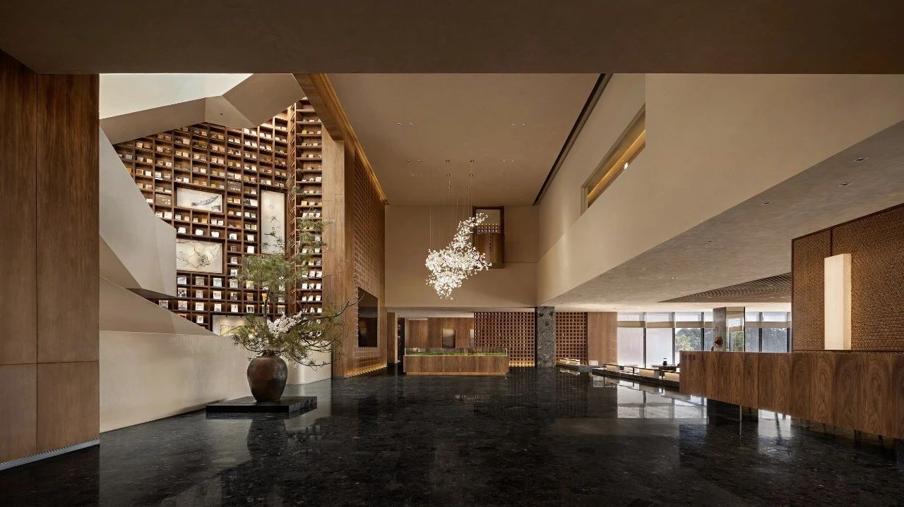
從入口開始以張揚卻又讓人沉浸的燈光裝置,引領觀者進入「劇場」主題,每一個空間的連接處都恰如其分地隱藏,就像我們遠看森林,是一整片自然,當我們走進又會發現每棵大樹都有不同的形態和美感,每個空間都像是一個禮物等待用戶的打開與體驗。
Starting from the entrance, we lead the viewers into the theme of ‘theatre’ with the dramatic yet immersive lighting installations. Each space is appropriately hidden at the connection point, just like when we look at the forest from afar, its a whole piece of nature, and when we walk in, we will find that each tree has a different shape and beauty, and each space is like a gift waiting to be opened and experienced by the users.


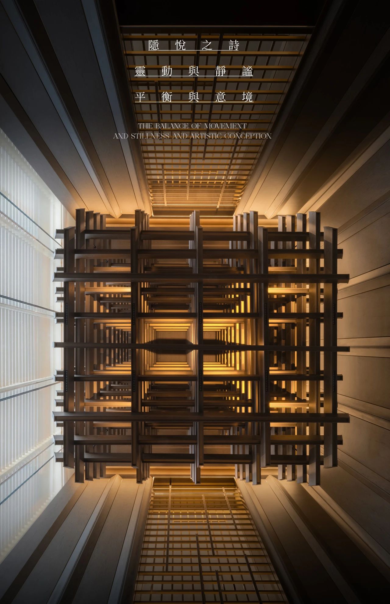
不同光線的層次交疊,讓空間擁有更多變的風格形式,入口處的立柱在原有的建築結構基礎上運用LED屏製造視覺的魔法,從平面和立面兩個維度運用光影述說故事,品牌的科技與藝術調性呼之欲出。
The layering of different light levels gives the space a more varied style. At the entrance, the pillars, built upon the existing architectural structure, employ LED screens to create visual magic. They tell stories through light and shadow in both the planar and façade dimensions, bringing the brands tech and artistic nuances to the forefront.


金屬的漫反射以及幾何切割的俐落質感,是材質的具象化空間呈現,每一個轉角都能探索不一樣美學體驗。流感擬態的金屬陳列傢俱在光影的映襯下更富有張力。
The metals diffuse reflection and the sharp texture of geometric cuts provide a tangible spatial representation of the material, where every corner invites exploration of a distinct aesthetic experience. The flu-like, streamlined metal display furniture gains even more tension under the interplay of light and shadow.


在另一層次光線下空間語言揭開新的序幕,對於想像的延展、陣列的美感、尺度的把控上以朗生板為主線,釋放獨特的表達。階梯和光影的搭配讓整體空間更具層次感,這種互動關係如同點睛之筆喚醒場域生命力。
Under a different layer of lighting, the spatial language unveils a new prologue. The extension of imagination, the beauty of arrays, and the control of scale are all centered around Langsheng boards, releasing a unique expression. The combination of steps and light and shadow gives the overall space a greater sense of hierarchy, and this interactive relationship, like the finishing touch, awakens the vitality of the space.


動線轉角處設置是以朗生板材為主要材質的零售概念空間,利用挑高延伸切割的仿製岩石立面效果,地面反射和白光燈膜增加了整體的科技感。這也是朗生集團快裝技術系統的展示空間,切合當前縮短工期提升裝配效果的趨勢,以整體場景直觀呈現。
At the corners of the circulation route, a retail concept space primarily constructed with Langsheng boards is set up. The space utilizes an extended, height-increasing cut to mimic the facade of rock, and the floor reflection along with white light film add a sense of technology to the overall atmosphere. This space also serves as a showcase for Langsheng Groups quick assembly technology system, aligning with the current trend of shortening construction periods and enhancing assembly effects. The entire scene is presented intuitively to demonstrate these capabilities.


整個展館的打造由朗生整裝科技研發的QIT超級結構系統取代了傳統的裝飾結構工藝,現場不需要任何的底板基層輔助,全部由超級結構系統的標準規格管材進行鋪設,其高效/快速/精準/靈活/極度標準化施工等特點也是傳統的裝飾結構工藝不可比擬的,QIT超級結構將會是未來商業、辦公、酒店等行業裝飾的趨勢。
The entire exhibition hall is constructed using the QIT Super Structure System developed by Langsheng Integrated Technology Research and Development, which has replaced traditional decorative structure processes. There is no need for any auxiliary base layers; everything is laid out using standard specification pipes of the super structure system. Its characteristics of efficiency, speed, precision, flexibility, and extreme standardization in construction are unparalleled to traditional decorative structure crafts. The QIT Super Structure is set to be a trend in decoration for future commercial, office, and hotel industries.


在走道的另一側則以滾動的LED屏幕指引動線進入另一個擬態商業空間,在極簡的空間關係中無序動線讓觀者更加沉浸其中。
On the opposite side of the aisle, a rolling LED screen directs the flow into another simulated commercial space. Within the minimalist spatial arrangement, the deliberately designed disorderly pathways enhance viewer immersion in the experience.


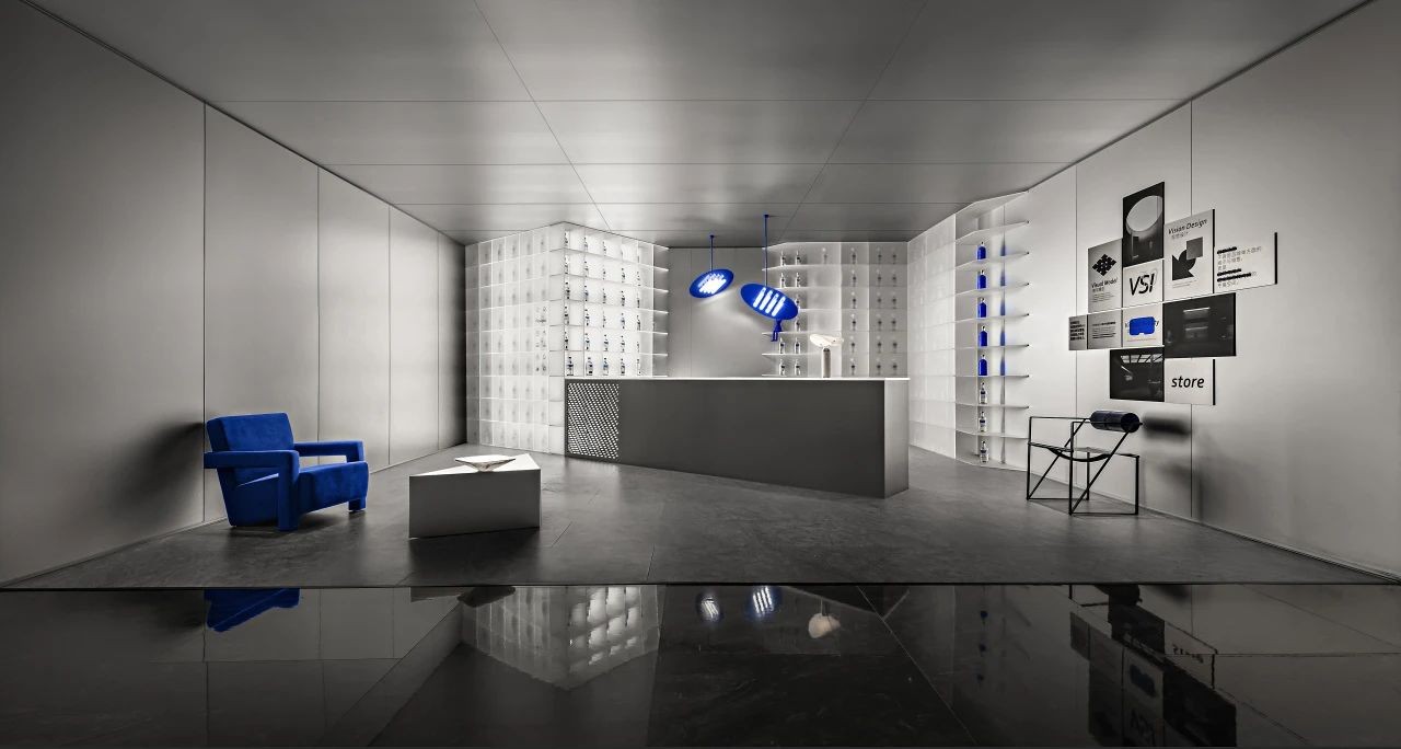
打造概念買手店空間,以藝術承載商業形態讓不同效果的板材直觀呈現具體落地效果,在可感、可觀、可觸的「樣板間」中加速商業轉化。
Create a concept boutique space, using art to carry commercial forms, allowing different effect panels to intuitively present concrete landing effects. In the sample room that is perceptible, viewable, and tangible, accelerate commercial transformation.


我們希望製造空間的對立性和思考性,運用色彩和材質的變化和語言,釋放更多元的感官體驗和可能性的探索。
We aim to create a sense of opposition and thought-provoking elements in the space, using the language of color and material changes to release a more diverse sensory experience and exploration of possibilities.


為空間質感特別訂製的創意展示櫃及藝術燈具成為亮點,長島台是板材工藝與創意形式的多樣化表達,成為可供觀者駐足的休憩空間,寶藍色傢俱設計回應了燈光形態,讓整體視覺更加和諧呼應。
Custom-designed creative display cabinets and artistic lighting fixtures tailored for the spatial texture emerge as highlights. The long island counter serves as a diverse expression of panel craftsmanship and creative forms, providing a resting space for visitors to pause. The sapphire blue furniture design complements the lighting arrangement, creating a more harmonious overall visual.


對於不同的客群的實際需求,設計團隊針對客群的使用場景和偏好規劃了符合設計師和材料需求方的空間功能。矩陣想將材料室變成選購空間,大面積的頂部燈膜塑造了明亮且具有延伸感的氛圍,大屏幕LED可展現材質的檔案資料,便於檢索。
To address the actual needs of different customer groups, the design team developed spatial functions tailored to the usage scenarios and preferences of designers and material suppliers. Matrix aims to transform the material room into a selection space, where a spacious overhead light film creates a bright and expansive atmosphere. Large-screen LED displays showcase material documentation, making retrieval more convenient.


天花、鏡面、櫃體的縱橫交錯,通過漫反射和鏡面折射增強空間的延伸感,貼合材質展示和檢索的功能需求,在保持美觀的同時儘可能多的展示材料種類與形態。
The interplay of ceiling, mirrors, and cabinetry creates a sense of depth through diffuse reflection and mirror refraction, enhancing the feeling of space extension. This design accommodates the functional needs for material display and retrieval, showcasing a variety of material types and forms while maintaining aesthetics.


櫃體的收納和展示充分考慮了材料種類的多樣性和瀏覽視覺的焦點層次,用小規格樣品展示面,以抽拉式儲存櫃等多樣化結構,將原來的陳列數量拓展10倍。
The cabinets storage and display thoughtfully accommodate the diversity of material types and the hierarchy of visual focal points for browsing. Featuring small-scale sample display surfaces and incorporating varied elements like pull-out storage cabinets, the original display capacity is increased tenfold.


此外多維度考慮不同行業的使用需求,劃分適用於不同業態的常用材質和新款樣式,讓顧客在參觀的同時進行快速的導覽轉化。
Additionally, considering the usage needs of different industries from a multi-dimensional perspective, the space is divided to accommodate commonly used materials and new styles suitable for various business types, allowing customers to quickly navigate and transform their visit into a guided experience.


項目名稱|朗生企業總部展廳
業主單位|深圳朗生整裝科技有限公司
項目地址|深圳市龍崗區愛南路368號
空間設計|IDMatrix(IDM工作室)
項目攝影|釋象萬合
硬裝造價|4000元/平米
軟裝造價|3000 元/平米
設計面積|900㎡
主要材料|朗生板
設計時間|2022
竣工時間|2024


矩陣纵横設計股份有限公司
MATRIX DESIGN CO.,LTD.
深圳 福田區 蓮花街道金田路4036號榮超大廈17-19F
17-19F,No.4036,Rongchao Tower, Jintian Road, Futian District,Shenzhen
北京市 朝陽區 廣渠路壹中心126幢6-17-08
6-17-08, Building 126, One Center,Guangqu Road, Chaoyang District, Beijing
上海 黃浦區 瑞金二路38號2、3層
2-3 floor, No.38, Ruijin 2nd Road, Huangpu District, Shanghai
成都 雙流區 高新創智廣場C座
Block C, Innovation and Intelligence Square, Shuangliu District, Chengdu
西安 高新區 錦業路綠地中心A座41F
41F, Block A, Greenland Centre, Jinye Road, High-tech Zone, Xian
武漢 硚口區 K11 ATELIER14層1409單元
Unit 1409, 14/F, K11 ATELIER, Qiaokou District, Wuhan
商務Marketing Dept.
電話Tel: 86 755 82876950
郵件Mail: zyd@matrixdesign.com
人資Human Resources Dept.
郵件Mail:hr@matrixdesign.com
品牌BrandDevelopment Dept.
郵件Mail: zyd@matrixdesign.com
官網Site: www.matrixdesign.com
微博Weibo: https://weibo.com/matrixdesign
微信公眾號Wechat: MatrixDesign矩陣縱橫
Creative design | Global opportunities | Award-winning projects

下载


