老厂房改造 | 市井里的有鲤酒馆
2023-03-23 20:05
- - - - - - - - - - - - - - - - - -
PROJECT 介绍

Project Name:有鲤三五壹壹
Location:陕西 西安
Indoor area:180㎡
Project type:商业空间
Completion Date:2020
Materials:水泥
Design Director:郭莘
Designed by:
郭莘空间设计 | 郭莘 | 朱宇航 | 李洋
Photographer:杨磊
- - - - - - - - - - - - - - - - - -
CULTURE 老厂房
项目原址曾是西北最大的军需毛巾厂,而这些包豪斯风格的老厂房,承载着时间的记忆。城市发展飞快,老旧厂房被再改造与再利用。一个能够融合菜市场、花鸟市场、文化创意、文化、美食、展览等多重元素的新商业空间,给周边的市民提供了更多元化的文化氛围。

The original site of the project was once the largest munitions towel factory in the northwest, and these old Bauhaus-style factory buildings carry the memories of time. The city is developing at a rapid pace and old factory buildings are being remodelled and reused. A new commercial space that can integrate multiple elements such as vegetable market, flower and bird market, cultural creativity, culture, food and exhibition, providing a more diversified cultural atmosphere to the surrounding citizens.
- - - - - - - - - - - - - - - - - -
NOTES 方案

项目地址位于古都西安一个有几十年时间的老厂房改造的商业空间里,周边被老校区、新小区、高新区所包围,集中了老、中、青三代的人群,生活气息浓郁,在这里有菜市场、花卉市场、融合性商业区,而其中我们的酒馆就坐落在商业最不佳的位置。

The project is located in a decades-old factory converted commercial space in the ancient capital of Xi'an, surrounded by old school buildings, new neighborhoods and high-tech areas, with a concentration of people from the old, middle and young generations and a strong sense of life, where there are vegetable markets, flower markets and integrated commercial areas, and where our pub is located in the least commercially desirable location.
如何融入到这样的氛围里,又如何吸引年轻人呢,那就做一个“通道”吧。这就是我们的设计思路。

How do fit into this atmosphere and how do attract young people? That's what we've come up with.
因为是精酿酒吧,所以我们重中之重就是要处理需要冷藏的酒库,常规的酒库都是设置到酒头的后面,为了减少酒桶到酒头之间的距离,温度产生变化影响酒品。

Because it is a craft brewery bar, our top priority is to deal with the wine storage that needs to be refrigerated. Conventional wine storage is set up to the back of the pub in order to shorten the keg-to-tap distance, where the temperature changes and affects the quality of the wine.
我们这次大胆的将酒冷库,利用层高优势放置到了吧台的头顶。这样,最大的空间留给了通道和就坐区,最大程度的提高了空间的利用率
We have taken the bold design of placing the wine cooler, taking advantage of the height of the floor, at the head of the bar. This leaves the maximum space for access and seating areas, maximizing the utilization of space.
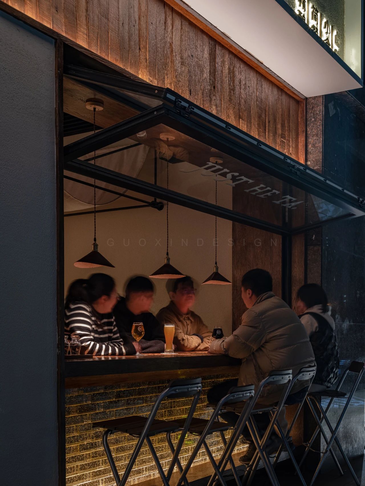
虽然我们的店铺位置不佳,但我们是唯一一家,一半室内,一半室外的商铺。这样在冬天室内入口处也能外摆。固定的水泥台,在不营业的时候,也可以给来往的人留有一个可以坐着晒太阳的地方。我想,提供方便予人,也是关系上的“融合”吧。

Although our pub is in a poor location, we are the only one that is half indoor and half outdoor. This allows for outside placement of seats even at indoor entrances in winter. The fixed concrete bench provides a place for passers-by to enjoy the sun when the pub is closed..I guess it's also a "integration" of relationships to provide convenience to people.
- - - - - - - - - - - - - - - - - -
MATERIALS 水泥
材质上我们决定铲去原有的腻子墙面,裸露出原有的建筑基础,用最接近原来建筑的材质进行融合,我们采用最质朴的新型水泥材料,进行不断地打磨,失败,再打磨,最终产生使用多年的光润感,希望从质感上和时间有所交集。

For the materials, we decided to remove the original putty walls to expose the original building foundations and blend them with materials closest to the original building. We used the most rustic new cement material and carried out continuous sanding, failing and sanding again, eventually producing a glossy feeling from years of use, hoping to intersect with time in terms of texture.
这可能是我们图纸最没有确定性的一次。工人问我:“这个墙面用什么材料?”我说:“铲了看看再说吧。”很多时候都是在观察。看建筑有什么,而不是一开始就去加什么。怎么做到新设计和老建筑的和谐。设计的初衷是“简单”的。融合!一个是和建筑的融合,一个是和人的融合。

This is probably the most uncertain design in our drawings. The worker asked me, "What material is used for this wall?" I said, "Shovel it and see."A lot of time was consumed for observation. Looking at what the building has to offer rather than adding something at the beginning. How to achieve harmony between the new design and the old building. The original design is "simple" and takes integration. The integration with the building and the integration with the people.
- - - - - - - - - - - - - - - - - -
LIGHT 穿越

希望你坐在有鲤,感受到以前,未来,并享受当下。看着穿越的人,其实,我们也是生活的一部分。

I hope you sit here, feel the past and the future, enjoying the moment. Looking at the people who have crossed over, we are, in fact, part of life.
原创作品
 举报
举报
别默默的看了,快登录帮我评论一下吧!:)
注册
登录
更多评论
相关文章
-

描边风设计中,最容易犯的8种问题分析
2018年走过了四分之一,LOGO设计趋势也清晰了LOGO设计
-

描边风设计中,最容易犯的8种问题分析
2018年走过了四分之一,LOGO设计趋势也清晰了LOGO设计
-

描边风设计中,最容易犯的8种问题分析
2018年走过了四分之一,LOGO设计趋势也清晰了LOGO设计


 PintereAI


