W+网络综合办公室|大可设计 首
2020-12-13 17:19
蓝色长线的跳动/穿越/爆炸

你有没有被他所波动?
在互联网时代,我们看到的是碎片化的世界,
然而这不是真实的世界。

事实上,所有信息碎片的下面,
都有着千丝万缕的联系,
编织成一张浩瀚的互联网。

In the Internet Age, we see a Fragmented World, but this is not the real world. In fact, all the pieces of information underneath, are inextricably linked, woven into a vast internet.


构建一个空间需要考虑多种因素:断点与连接是每个空间都要考虑的问题,业主给到的空间要求是要有办公 直播 会议 老总办公 直播间 仓库 打卡点,那如何将这些这些看似互不相关却又紧密相连的功能融合为一体?

There are a number of factors to consider when building a space: breakpoints and connections are issues to consider in every space, and the space given by the owner requires office, live broadcast, meetings, executive office, live studio, warehouse, and punch card, so how do you merge these seemingly disparate but tightly connected functions into one?


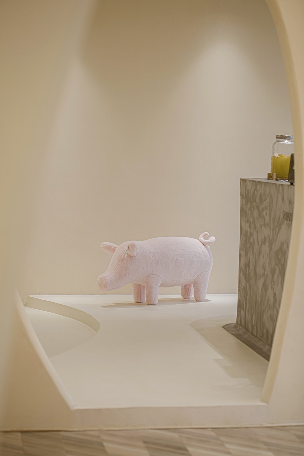
或者我们可以用几个超大的快递盒把空间打包然后贯穿一起,拒绝固化形式的解读,提交创新性答案。打破传统的固定直线型逻辑,释放空间活力,让人可以更加随性的穿梭探索。去探索一个又一个“快递盒”,体验一下拆快递的心情!

Or we could pack up the space in a couple of giant express boxes and run it through, refusing to interpret the solidified form and submitting innovative answers. Break the traditional fixed linear logic, release the vitality of space, so that people can more casual shuttle exploration. To explore one after another express box , experience the feelings of the Open Express


以不同形式撕裂,串联起来,满足各种不同的功能,比如办公、直播、展示、接待。

Its torn apart in different ways, connected in series, for all sorts of different functions, like office, live, display, reception


不同的开口,呈现出有趣的对比关系与节奏:私密与开放、幽暗与明亮,并传达出不同的空间情绪。

Different openings present interesting contrasts and rhythms: intimate and open, dark and light, and convey different spatial emotions.


1993年,互联网之父为下划线文字选择了蓝色的字体颜色,后来蓝色就成为了互联网行业的主题色。而被白色隔断和 分隔开的办公室,在中性的调色板的映衬下,设计师创造了一条蓝色的不规则的光,去穿越整个空间。

In 1993, the father of the Internet chose a blue font color for underlined text, which has since become the Internets dominant color. While the offices, separated by white and, separated by a neutral Palette, the designer created a blue irregular light to cross the space.


大量黑白的基调,兼收并蓄,一切都纯粹且契合。

A lot of black and white tone, ECLECTIC, everything is pure and fit.


整个设计过程中,都在尝试让办公室不再是沉闷的场所,而是一个与行业息息相关甚至带点趣味性的艺术空间,从而创造一个崭新愉悦的工作体验。

Throughout the design process, the office is no longer trying to make the dull place, but a closely related to the industry and even a bit interesting art space, thus creating a new enjoyable work experience.


Project Name|项目名称
W+网络综合办公室
Location |项目地址
江苏省徐州市
Area|项目面积
约450㎡
Chief Designer|首席设计师
大可
Master Designer|主案设计师
孙冰
Participating designers|参与设计师
小波  宋晨
Lighting designer|灯光设计师
大可
Material Science|主要材料
金属/微水泥
Photography|摄影
A+PLUS STUDIO

 PintereAI


