晨升SPATIAL DESIGN-黑白无色-----------引“木” 首
2020-01-13 08:25
随动-围绕-取点/Follow-up-around-take-point
项目位于北京市亦庄富兴国际大厦。天力创科技有限公司致力于研发高端产品,由于人员体质和公司定位升级,所以对整体空间要求和视觉感官要求都比较细致。而且对企业的发展方向和专业领域,都有着独特的思想和权威的主导地位。因此从设计开始到结束一直在敏锐的观察和破解新的设计语言。
The project is located in Fuxing International Building, Yizhuang, Beijing. Tianlichuang Glass Technology Co. Ltd. is committed to the development of special glass, due to the relatively high physical fitness and company positioning, so the overall space requirements and visual sensory requirements are more detailed. And to the development direction and professional field of the enterprise, has the unique thought and the authoritative dominant position. Therefore, from the beginning to the end of the design, the new design language has been keenly observed and cracked.
有时候必然发现有趣的东西,然后创造有意思的事,最后把有意思的事情变得有价值的信息进行传达。
Sometimes it is necessary to find something interesting, then create something interesting, and finally turn something interesting into something valuable.
随动/Follow-up
分区明确,互动便利,这是办公环境的基础概念。从前厅开始主动线起到引导作用。整个空间运用块,面,线的组合。明确的部门分区随动而进,形成一种结构性的线,面对话。根据特定因素考虑,也作为空间引导性的元素考虑。材质和色彩上也以块,面的体量搭配和不同形态为主。
The division is clear and interactive, which is the basic concept of the office environment. From the front hall, the active line plays a guiding role. The whole space is a combination of blocks, faces, and lines. Clear sectoral divisions move in and form a structured line dialogue. According to specific factors, it is also considered as an element of spatial guidance. The material and color are also based on blocks, body size and different forms.
围绕/Around
设计初期的风格和现在不太一样,布局动线没有什么改变。
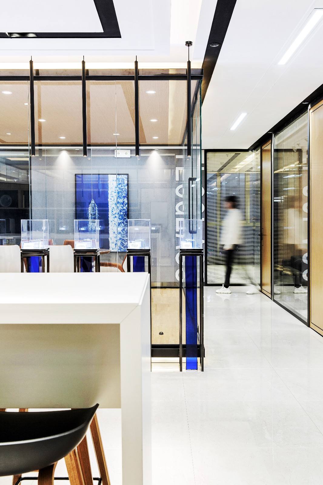
空间中最大的公共区域是水吧区和透明会议室。考虑到部门之间的穿插互动,运用正方体使会议室形成独立的空间,使其视觉感官上更有层次感。小会议室像透明的盒子,透过灯光的折射和幻想,立体感更强。所有的分支动线都会围绕此空间而行。
The initial style of the design was not the same as it is now. There was no change in the layout line.
The largest public areas in space are the water bar area and transparent conference rooms. Taking into account the interspersed interaction between departments, the use of cubes to form a separate space in the conference room, making its visual sense more hierarchical. The small meeting room is like a transparent box. Through the refraction and illusion of the light, the three-dimensional sense is stronger. All branch lines will line around this space.
取点/Pick up point
在三种光源的烘托下,材质运用上木色和灰色占有很大一部分面积。反而处处可见的黑色成了每个空间的亮点。色彩法则上黑色和白色作为“无色”的主导,都是经典的代表。此空间部分留黑恰当好处的勾勒着每个框架结构,可能没有留白的意义“幽静”。但在形式上和留白如出一辙。
Under the baking of three light sources, the material uses a large part of the wood color and gray station area. Instead, black everywhere becomes the highlight of each space. Black and white on the color law as the "colorless" dominant, are classic representatives. The appropriate benefits of keeping this space part black outline each frame structure, and may not have the meaning of leaving white "static." But in form its the same as leaving a blank.
Project Name项目名称:北京天力创科技有限公司
Design area/设计面积:400平米
Material Quality/材质:木皮,壁纸,不锈钢,黑镜,方钢
Design company/设计公司:北京晨升佳艺装饰设计有限公司
Original design/主创设计:姚远
Execute the design/执行设计:林剑
Engineering team/工程团队:北京晨升佳艺装饰设计有限公司
Photographer/摄影师:侯松茂
原创作品
 举报
举报
别默默的看了,快登录帮我评论一下吧!:)
注册
登录
更多评论
相关文章
-

描边风设计中,最容易犯的8种问题分析
2018年走过了四分之一,LOGO设计趋势也清晰了LOGO设计
-

描边风设计中,最容易犯的8种问题分析
2018年走过了四分之一,LOGO设计趋势也清晰了LOGO设计
-

描边风设计中,最容易犯的8种问题分析
2018年走过了四分之一,LOGO设计趋势也清晰了LOGO设计


 PintereAI


