左通右达 | 在腾挪转移中,缓缓降临
2019-07-04 09:00
这是围绕一位艺术家的工作需求和生活状态而设计的建筑改造项目,55这个数字对于业主而言代表特殊的意义,所以我们将这个项目命名为Apartment 55(A55)。

This is an architectural renovation project designed for working requirements and living conditions of an artist. We named the project Apartment 55 (A55) because the number 55 has a special meaning to the owner.
场地位于一栋五层公寓的顶楼,业主希望保留现有露天庭院,同时兼顾工作,会客,展览,起居等功能。希望营造创作空间的绝对隐私感,对于作画的位置,光线的角度和视线所及的景象,都需斟酌考量。

The apartment is located on the top floor of a five-story building. The owner wants to keep the existing courtyard and ensure the functions of work, reception, exhibition and daily life at the same time. His studios require an absolute sense of privacy, thus it takes a great amount of consideration about the position of the painting, the angle of the light and the vision of the artist himself.
这个项目的挑战在于,在原有结构的承载力限定下的腾挪转移。空间梳理之后我们重新定义了建筑和庭院,组织安排了动线和垂直交通。在对整体结构进行了全新的计算之后,新增荷载控制在9吨之内。设计的全新钢结构被‘绑’在原混凝土框架结构之上,避免对原结构产生负面影响,并起到一定的围箍作用。

The biggest challenge of this project is how to renovate and make rooms for all functions within the limits of the carrying capacity of the original structure. After reorganizing the spatial arrangement, we redefined the building and courtyard, and rearranged the horizontal and vertical circulation. The added load is controlled within 9 tons after the latest calculation of the whole structure. The brand-new steel structure is “tied” to the original concrete frame so that it can not only avoid negative impact on the original structure but also play a certain role of enclosure.
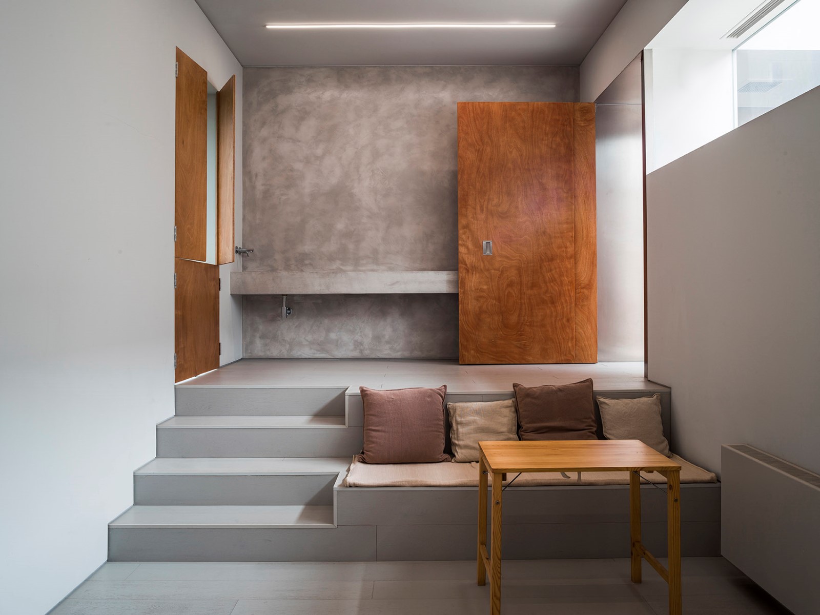
在空间规划和动线上,是由主入口开始向内延伸的公共区(会客,展览),向半公共区和私人区域(起居,画室)过渡。每个空间性质的转化,通过轨道移门的开启和关闭,窗的位置和玻璃透明度,结合楼梯和走廊的过渡空间,来引导访客对于空间的可见和可达性。我们在工作区域为艺术家设计了三个画室,通过新增钢结构来控制层高,开窗和房间的尺寸,同时通过自然光和墙壁的反射对画室光环境的影响,营造了氛围各不相同的创作空间。

As for the circulation and spatial planning, it starts at the main entrance and goes inward to the public areas (reception room, exhibition room), and transitioning towards the semi-public areas and private areas (living room, studio). In order to provide visibility and accessibility for the visitors, they can experience the transformation of spatial properties through the opening and closing of the sliding doors, the position and transparency of the window, and combining the transitional spaces between the stairs and corridors. We designed three studios for the artist in the working area, and it constructs different creative spaces with various atmosphere by controlling the height through the new steel structure, the position of the window and the size of the room, the effect on the light environment through the reflection between the natural light and wall.
为了增加空间的隐私感,内向庭院中新增建筑立面的幕墙起始标高为5.6米,这意味着首层会客区的视线高度上没有任何开窗,让整个庭院成为一个均质的露天展览空间。立面背后由隐藏一层通向二层大画室的楼梯过渡空间,玻璃幕墙结合庭院和天光作为一个自然采光的玻璃盒子,以此来过滤直接进入大画室的自然光,使得画室光线更加柔和。天光渲染了由一层公共/半公共空间,过渡向画室和私人空间的情绪变化和仪式感。

In order to increase the sense of privacy of the space, the new curtain wall starts at 5.6meters at the elevation of inner courtyard, which means that there are no windows at eye level of the reception area on the first floor, making the whole courtyard a homogeneous open-air exhibition space. A staircase leading to the large studio on the second floor is hidden behind the facade as a transitional space. The glass facade combines the courtyard and daylight into a glass box full of natural light, therefore filter the direct sunlight that comes into the large studio, and making the light softer in the meantime. Skylight renders the emotional changes and ritual sense of transition from the public/semi public space on the first floor to studio/private space.
空间气氛和情绪的过渡,通过材料的颜色,材质和光线混合构成第二次转化。首层会客区大面积使用深灰色纳米混凝土地面以及墙面,手工打磨的颗粒感配合颜色木纹的纹路和光泽,整体压低会客区的色调,与庭院的淡灰绿色真石漆形成室内外的对比,强调从室外投射进入的自然光给空间带来的精神体验。

The mixture of color, material and light, constitutes the second transformation of atmosphere and emotion. A large area of nano-concrete is used on the floor and wall of reception area on the first floor; granular sensation of hand polished surface with texture and gloss of the wood, which is darkening the whole hue of reception area and in contrast to the courtyard with glaucous real stone paint. It emphasizes the spiritual experience brought by the natural light projected from outside.
由一层走廊转向楼梯上二层,空间的色调开始转淡,浅灰色墙面和同色木地板,配合天光强化进入私人工作区前的情绪准备。二层整体使用浅灰色纳米混凝土地面和灰白色墙体,落地玻璃幕墙让光线作为空间唯一的表情,为工作区带来静谧和纯粹。三层露台可俯瞰大画室和庭院,夜晚从玻璃幕墙漫射出的光线,作为城市景观,渲染了整个建筑的气氛。

The hue of the space starts to fade once turning from the corridor on the first floor to a stairway leading up to the second. The wall and wooden floor are both light gray, it strengthen emotions with daylight together right before entering the private working zone. Light gray nano-concrete floor and white wall is used for the whole second floor. Daylight comes though the curtain wall and brings serenity and purity to the working area. The large studio and courtyard can be overlooked on the third-floor terrace, with lighting diffusing from the glass facade at night exaggerating the architecture as an urban landscape.
A55从设计到建造完工为期三年,在这个限制条件极其苛刻的项目中,我们尝试最大限度地为建筑空间带来与功能相宜的变化和节奏,感知和形式,轻盈和沉重,光影和颜色,希望这些交织在一起的综合体验,连同业主创造的艺术一起,缓缓降临。

A55 takes up to three years from design to completion. Limited to the extremely harsh constraints of the project, we try to maximize the change and rhythm of the building in accordance with the function, along with perception and form, lightness and heaviness, light and color. Hopefully, these integrated experiences will slowly coming together with the art created by the owner.
王旎(左);张大为(右)

左通右达建筑工作室成立于2013年。创始人王旎和张大为早年期移居澳洲,在海外接受了完整的建筑学教育,并在全球多个国家参与实践了建筑和室内设计。两位创始人致力于国际化背景下对传统文化的传承和创新,试图打破和消解东西方文化二元对立的隔阂,“左通右达”的名字灵感源于《千字文》中“右通广内,左达承明“,旨在探索中国建筑的当代精神以及传统在当代生活方式中的回归。

Atelier About Architecture was established in 2013. The Founders Wang Ni and Zhang Dawei received comprehensive architectural education after moving to Australia in their early years and practiced on architecture and interior design in many different countries. The two founders are dedicated to the inheritance and innovation of traditional culture under the background of internationalization to dispel the gap between Eastern and Western cultures. The Chinese name of the office came from the verse “Right leads to the liberty, left, and scholar’s dormitory” in Thousand-Character Classic, which advocates for the aspiration of exploring the contemporary spirit of China’s architecture and the return of tradition in contemporary lifestyle.

左通右达建筑工作室提供建筑,室内,景观,家具以及装置等全方位的专业设计服务,已完成或正在进行的项目包括私人美术馆、艺术工作室、精品酒店、餐厅、私宅、城市商业建筑等等,项目分布在北京、上海、苏州、广州等地。

Atelier About Architecture provides holistic and professional design services on architecture, interior, landscape, furniture and installation. It has many completed and ongoing projects in Beijing, Shanghai, Suzhou, Guangzhou and many other cities, including private art galleries, art studios, boutique hotels, restaurants, private houses, urban commercial buildings, and among many others.

“建筑的氛围(Atmosphere)”是左通右达建筑工作室一直探索的核心主题,两位创始人认为设计的最终目的是为了抵达一种“效果”(effect)。只有通过前期缜密的调查研究,从大局到细节反复推敲的理性设计,再到事无巨细严格把控的施工执行,才能以极高的完成度最终抵达和营造出想要呈现的“氛围”,这也是左通右达建筑工作室始终坚持的思维模式和工作方法。

The “Atmosphere of Architecture” is a central subject of the office. Wang Ni and Zhang Dawei believe that the ultimate goal of design is to realize an “effect”. And it is only with careful research in early stages, rational design methods throughout the whole process under repeated deliberation and rigorously-controlled construction that one can create a highly-accomplished “effect”.

国际著名建筑史学家和评论家David Leatherbarrow先生与冯仕达先生也曾对工作室作品有如下的解读:“在王旎和张大为设计的作品中, 我们发现了一些特别的效果(effect),关于建筑构件的‘厚和薄‘有两种做法。(sizing of thick things and sizing of the thinsheets)一种是通过厚重构件和薄板构件之间的调整,把’人‘和‘人的行动’作为厚与薄设计的中间厚度。利用不同颜色和材料消减建筑构件的体量感,并且转化成二维平面的阅读可能。

Internationally renowned architecture historian and critic David Leatherbarrow and Mr. Stanislaus Fung used to comment on the office’s practices: In the works of Wang Ni and Zhang Dawei, we have found some special effects, and the two ways of sizing the thickness and thinness of architectural components: one is to adjust the thick and thin components to take man and man’s action as an intermediate thickness when designing between the thick and the thin; the other is to digest the volume of the architectural components or to turn them into comprehensible two-dimensions with different colors and materials.
项目地点 | 北京

Project location | Beijing, China

基本功能 | 住宅/工作室

Functions | Residence/studio

建筑规模 | 300㎡

Area | 300 ㎡

建成年份 | 2019年

Completion time | 2019

室内设计 | 左通右达建筑工作室(www.aboutarch.com)

Interior Design | Atelier About Architecture(www.aboutarch.com)

主创设计师 | 王旎、张大为

Chief designers | Ni Wang, Dawei Zhang

设计团队 | 杨树军、寿大光 、范意任

Interior design team | Shujun Yang, DaguangShou, Yiren Fan

结构设计 | 刘粟

Structural design | Su Liu

施工团队 | 大有和诚建筑装饰

Construction firm | Da You He ChengConstruction & Decoration Co., Ltd.

主要材料 | 纳米水泥(Soluzioni Microverlay)、家具(CASSINA)

Main materials | Nano-concrete (SoluzioniMicroverlay), Furniture (CASSINA)

摄影师 | 孙海霆

Photography | Haiting Sun
采集分享
 举报
举报
别默默的看了,快登录帮我评论一下吧!:)
注册
登录
更多评论
相关文章
-

描边风设计中,最容易犯的8种问题分析
2018年走过了四分之一,LOGO设计趋势也清晰了LOGO设计
-

描边风设计中,最容易犯的8种问题分析
2018年走过了四分之一,LOGO设计趋势也清晰了LOGO设计
-

描边风设计中,最容易犯的8种问题分析
2018年走过了四分之一,LOGO设计趋势也清晰了LOGO设计


 PintereAI


