Big And Tiny Zooco Estudio
2019-01-16 17:00
架构师提供的文本描述。2018年7月推出的“大而小”是圣莫尼卡独特的丰富空间,它促进了父母和孩子的生产力、创造力和社区。这是第一个结合父母创业的学习、娱乐和工作空间。我们为儿童保育带来了传统的合作空间的灵活性。该公司的使命是支持和增强我们充满活力的家长社区,帮助他们整合个人和职业生活。基于这个前提,“大”和“小”都是为成年人和儿童设计的。
Text description provided by the architects. Launched in July 2018, Big and Tiny is a unique enrichment space in Santa Monica that fosters productivity, creativity, and community for both parents and kids. It is the first integrated learn, play and work space with entrepreneurial parents in mind. We bring the flexibility of traditional co-working spaces to child care. The mission of the company is to support and empower our vibrant community of parents by helping them integrate their personal and professional lives. Based on this premise, Big and Tiny was designed with both adults and children in mind.
Text description provided by the architects. Launched in July 2018, Big and Tiny is a unique enrichment space in Santa Monica that fosters productivity, creativity, and community for both parents and kids. It is the first integrated learn, play and work space with entrepreneurial parents in mind. We bring the flexibility of traditional co-working spaces to child care. The mission of the company is to support and empower our vibrant community of parents by helping them integrate their personal and professional lives. Based on this premise, Big and Tiny was designed with both adults and children in mind.
我们从一个空的2,100平方米开始。主主人公是高木弓架天花板,横向限制空间的脚部空间。这些构架最终将空间分成三个独立的区域,其中一个区域是主要的空间。
We began with an empty 2,100 sq. foot space where the main protagonist is the high wood bow truss ceiling that limits the space transversely. These trusses would eventually divide the space into three separate areas with the middle one being the predominant space.
We began with an empty 2,100 sq. foot space where the main protagonist is the high wood bow truss ceiling that limits the space transversely. These trusses would eventually divide the space into three separate areas with the middle one being the predominant space.
© Aaron & Jon Photographers
前面的空间以咖啡和零售区域为特色,而中间区域(也是项目的核心)是孩子们的游乐场。最隐秘的第三个区域是成年人共同工作的空间。以原来的桁架天花板作为一个通用几何语言的例子,我们创造了一个重复的模块化和建设性的系统,这让我们想起了一个谜题。这一适应性系统在这三个领域都创造了吸引人的高地。
The front space features a coffee and retail area, while the middle area (and core of the project), is a playground for kids. The most secluded third area serves as a co-working space for adults. Using the original truss ceiling as an example of a universal geometric language, we created a repetitive modular and constructive system, that remind us of a puzzle. This adaptable system creates appealing elevations in all the three areas.
The front space features a coffee and retail area, while the middle area (and core of the project), is a playground for kids. The most secluded third area serves as a co-working space for adults. Using the original truss ceiling as an example of a universal geometric language, we created a repetitive modular and constructive system, that remind us of a puzzle. This adaptable system creates appealing elevations in all the three areas.
© Aaron & Jon Photographers
© Aaron & Jon Photographers
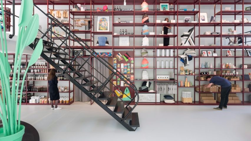
前台接待/零售区是一个多用途的空间,墙壁上有定制的铁家具,后面有一个柜台。
The front reception/retail area is a multipurpose space with bespoke iron furniture on the walls and a counter in the back.
The front reception/retail area is a multipurpose space with bespoke iron furniture on the walls and a counter in the back.
模块和移动立方体是由10x10瓷砖,粉红色和蓝色,这是品牌的调色板。这提供了根据不同需求配置空间的灵活性。
The modular and movable cubes are made out of 10x10 ceramic tiles in pink and blue which is the brands’ color palette. This offers the flexibility to configure the space according to different needs.
The modular and movable cubes are made out of 10x10 ceramic tiles in pink and blue which is the brands’ color palette. This offers the flexibility to configure the space according to different needs.
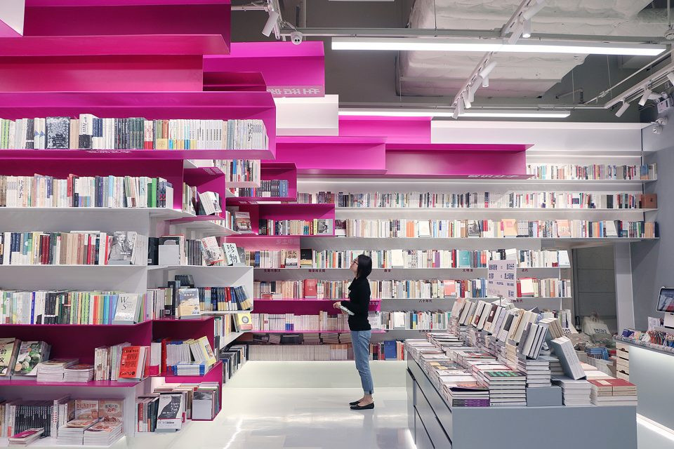
The retail area includes iron shelves and racks using same geometric language.
The retail area includes iron shelves and racks using same geometric language.
© Aaron & Jon Photographers
主中心空间出现在一个大型木结构内。这一地区分为两部分:操场,或称“丁尼乐园”,包括木结构,如球坑和滑梯;以及艺术工作室,儿童在那里从事艺术项目,并参加其他丰富的课程。
The main central space is presented inside a large wooden structure. This area is divided in two parts: The playground, or “Tinyland”, includes wooden play structures such as the ball pit and slide; and the art studio, where children work on their art projects and take other enrichment classes.
The main central space is presented inside a large wooden structure. This area is divided in two parts: The playground, or “Tinyland”, includes wooden play structures such as the ball pit and slide; and the art studio, where children work on their art projects and take other enrichment classes.
© Aaron & Jon Photographers
第三个也是最后一个区域,位于大木结构和室外露台之间,是为我们的合作成员预留的。这一空间配备了诺曼·科芬哈根的办公家具和一部隔音电话。
The third and final area, located between the big wooden structure and the outdoor patio, is reserved for our co-working members. This space features office furniture from Normann Cophenhagen and a soundproof phone both by ROOM.
The third and final area, located between the big wooden structure and the outdoor patio, is reserved for our co-working members. This space features office furniture from Normann Cophenhagen and a soundproof phone both by ROOM.
© Aaron & Jon Photographers
 举报
举报
别默默的看了,快登录帮我评论一下吧!:)
注册
登录
更多评论
相关文章
-

描边风设计中,最容易犯的8种问题分析
2018年走过了四分之一,LOGO设计趋势也清晰了LOGO设计
-

描边风设计中,最容易犯的8种问题分析
2018年走过了四分之一,LOGO设计趋势也清晰了LOGO设计
-

描边风设计中,最容易犯的8种问题分析
2018年走过了四分之一,LOGO设计趋势也清晰了LOGO设计


 PintereAI


