矩陣 新作|1 7 Bread 重塑麵包店的溫暖想象 首
2024-09-27 22:16
在現代商業中如何打造一家「充滿溫度和呼吸感」的連鎖麵包店,品牌初心理念、食材的用料和工藝以及門店的運營模式缺一不可。然而如何把對於品牌和商業的思考融入空間,通過潛移默化的設計高效吸引目標客群,完成高效運營動線,輔助商業轉化,是空間設計中至關重要的部分。
A bakery chain needs a brand concept, ingredients, craftsmanship and shop mode of operation. But the most important part of the design is to incorporate the brand and business thinking into the space, attract customers, complete the operation line and assist business transformation.
矩陣設計團隊歷時壹年打磨,從商業落地運營的角度,為連鎖型商業空間提供設計解題思路——「商業場景化設計」。從前期的市場調研分析、品牌洞察及競品分析、不同業態的消費人群動線考察等角度切入,融合到空間設計的整體思考之中。
After a year, the Matrix design team offers design solutions for commercial spaces from a commercial perspective. The design is integrated into the overall thinking of space design from the perspective of market research, brand insights, competitor analysis and consumer groups.
When the aroma of bread fills the air
its a unique code for happiness
打造一家溫暖的麵包店空間,不僅在於形更在於魂。矩陣設計團隊提取1-7Bread王牌產品豆乳吐司的切片造型,結合光膜效果優化天花造型,在潛意識裡對用戶植入品牌心智。延伸的視覺效果使店鋪氛圍外溢,從而達到吸引客流進店的空間效果。
The creation of a welcoming bakery space is not merely a matter of shape; it is also a matter of soul. The Matrix design team extracted the sliced shape of 1-7Breads most popular product, soya milk toast, and combined it with the light film effect to optimise the ceiling shape. This approach subconsciously implants the brands identity into the users mind, creating a visual effect that extends throughout the space and evokes a welcoming atmosphere. This spatial effect attracts customers into the shop.
裝置牆與鏡面玻璃材質起到裝飾立柱以及拓展空間視覺效果的作用,牆面陳列的麵包手作工具,在顧客進店前的第一時間直觀體現出品牌匠心精神,降低信息傳達的成本。
The installation wall and mirrored glass material play a role in decorating the columns and expanding the visual effect of the space, and the bakery tools displayed on the wall reflect the brands artisanal spirit in the first visualisation before customers enter the shop, reducing the cost of information dissemination.
天花具有延伸感的燈膜引導顧客進店,在功能區塊上緊湊劃分各個模塊的占比和位置,這是前期設計思考的重要方向,無論顧客從哪個端口進入都能高效完成消費行為。
The light film of the ceiling with a sense of extension guides customers into the shop, and the proportion and position of each module in the functional blocks are tightly delineated, which is an important direction of the pre-design thinking, so that customers can efficiently complete their consumption behaviours no matter from which port they enter the shop.
在色彩的運用上,延續品牌一貫溫暖柔軟的品牌調性,採用大面積面光源漫反射的燈光膜布材質,光線更加柔和親切。木色調的材質給人質樸溫馨的氛圍感,形似珠寶盒的玻璃展示櫃,讓麵包的精緻感更加通透直觀。
In the use of colours, the brand continues to be warm and soft, using a large area of surface light source diffuse reflection of the light film cloth material, the light is more soft and friendly. The wood tone material gives a simple and warm atmosphere, and the glass display case, which resembles a jewellery box, makes the bread more transparent and intuitive.
環繞式島台休閒區點綴綠植,為整體空間帶來更加親切放鬆的氛圍。純白色靈動桌椅,可適應單人品嚐、朋友分享、拍照打卡、家庭採購等多種消費場景。
The wrap-around island lounge area is decorated with greenery, bringing a more intimate and relaxing atmosphere to the whole space. Pure white tables and chairs can be used for single person tasting, sharing with friends, photo-taking, family shopping and other consumption scenarios.
Life is always in a hurry
its time to stop and pay attentionto your own soft daily life
店鋪位處商業體一層的出入口旁,是客流的主要交通節點,如何將快速通行的客流引入店鋪併產生消費行爲,成爲本次設計的思考點。
Shop is located in the commercial body of the ground floor of the entrance and exit, is the main traffic node, how to introduce the fast-passing passenger flow into the shop and produce consumer behaviour, as the design of the thinking point.
門店內儘可能打開空間尺度,將圍合區與中軸方位變成麵包飄香的最佳展示區,考慮整體效果的同時融入動線設計,顧客可以從各個展示面進入完成產品展示及高效購買。
Inside the shop, we try to open up the space scale as much as possible, turning the enclosed area and the centre axis into the best display area for the aroma of bread, considering the overall effect and integrating the design of the movement line, so that customers can enter from all display surfaces to complete the display of products and efficiently purchase.
如何吸引人流駐足是本次空間設計的商業化重點,矩陣設計團隊融入戶外構築以及藝術裝置化的設計策略,在天花的造型上下功夫,同時將燈光置入模塊化設計中,進一步提升店鋪在客流中的視覺敏感度,達到一眼吸睛的效果。
Attracting people to stop by is the commercial focus of this space design. The Matrix design team incorporated outdoor structures and art installation design strategies, working on the shape of the ceiling, and at the same time placing lighting into the modular design, to further enhance the visual sensitivity of the shop in the flow of customers, and to achieve the effect of eye-catching at a glance.
提取1-7Bread品牌拳頭產品輪廓以及IP形象進行圖形的幾何化,將平面元素轉化為空間模塊化體量,把元素模塊陣列結合實際功能形成通透且具有辨識度的商業灰空間。
Extracting the contours of 1-7Breads fist products and IP images for graphic geometrization, the flat elements were transformed into spatial modular volumes, and the elemental modular arrays were combined with the actual functions to form a transparent and recognizable commercial grey space.
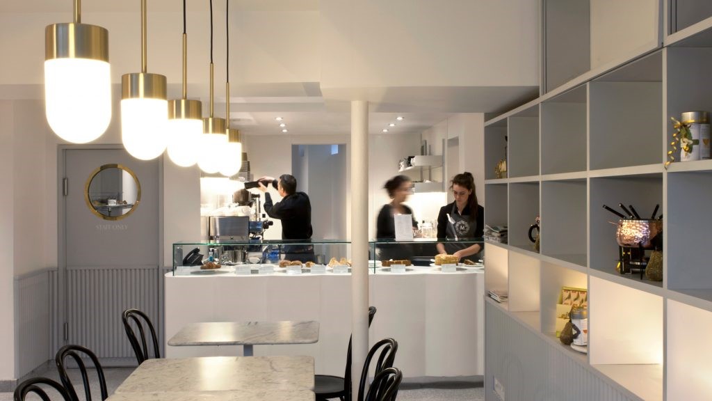
低於一般高度850mm的櫃檯尺寸,在細節處花心思讓穿梭的人流能一眼看到產品全貌,從而讓顧客更長時間地停留駐足。
The lower-than-usual counter size of 850mm has been designed to provide a full view of the products at a glance, thus allowing customers to linger longer.
同時為了帶來空間的輕盈感以及可持續性,區別於傳統室內設計的體系,採用便於拆卸安裝的組裝架構框架,用木製層架和編織隔斷完成空間的整體架構。木製結構與編織紋理形成疏與密的呼應對比,在柔暖的燈光映襯下散發愉悅的氣息。
Meanwhile, in order to bring a sense of lightness and sustainability to the space, unlike the traditional interior design system, the overall structure of the space is completed with wooden shelves and woven partitions, using an assembly frame that is easy to dismantle and install. The wooden structure and the woven texture form a contrast between sparseness and density, and the soft and warm lighting gives off a pleasant atmosphere.
Fill quiet afternoons with a little bit of time
marvel at the beauty of life with a little bit of happiness
and let happiness slowly ferment
項目位於商業體與城市交通樞紐的必經動線上,左右兩側已包含目前市場最新的商業業態及品牌;整體呈現爲扇形的展示面;單日人流量幾乎爲全區最高,且流速較快,如何在商業街中脫穎而出,同時將客戶導入店內並高效完成消費行爲,是本次店鋪設計重點思考的方向。
The project is located in the commercial body and the citys transport hub must be on the line of action, the left and right sides have included the current market of the latest commercial sectors and brands; the overall presentation of the fan-shaped display surface; the single-day flow of people is almost the highest in the region, and the flow rate is relatively fast, how to stand out in the commercial street, and at the same time, will be guided to the shop and efficiently complete the consumption of behaviour, the design of the shop is the direction of the focus of the thinking.
在門口的視覺呈現上,有別於傳統分割的界面設計,設計團隊採用內退的門頭體量形成視覺焦點高效引導顧客進店,模糊的室內外邊界減少內心屏障,增加了1-7Bread的品牌親和感。
In terms of the visual presentation of the entrance, unlike the traditional segmented interface design, the design team adopted a receding doorway volume to form a visual focus to efficiently guide customers into the shop, and the blurred indoor/outdoor boundary reduces the inner barrier, increasing the brand affinity of 1-7Bread.
環形展示區前置,以高效的購買及操作動線爲前提,整合空間材質、燈光及綠植進一步提升品牌識別度及激發顧客的好奇和進店購買動機。
The front of the circular display area is based on the premise of efficient purchasing and operation lines, integrating spatial materials, lighting and greenery to further enhance brand recognition and stimulate customers curiosity and motivation to purchase in-store.
天花鏡面材質點綴增加空間向上延伸感,面光源提升明亮度,搭配點光源襯托麵包柔軟香甜的的氣息。
The ceiling mirror material embellishment increases the sense of upward extension of the space, and the surface light source enhances the brightness, with the point light source to bring out the soft and sweet aroma of bread.
牆面木質紋理的裝飾,富有層次感又和諧統一,明亮的環境塑造了具有呼吸感的幸福空間,在場景中選購不由得放慢腳步,享受此刻的鬆弛自然。
Wooden texture decoration on the wall, rich sense of hierarchy and harmony and unity, bright environment shaped with a sense of breathing happiness space, in the scene of the purchase can not help but slow down, enjoy the moment of relaxation and nature.
裝置化的“室內建築”打造視覺焦點,天花建構具有和諧的流暢感,定制木質桌椅點綴綠植牆面,發揮原有場地優勢建立動線裝置體塊感增加打卡屬性。
Installation of ‘interior architecture’ to create a visual focus, ceiling construction with a harmonious sense of flow, custom wood tables and chairs embellished with greenery on the wall, give full play to the advantages of the original site to establish a dynamic installation block sense of increased card attributes.
空間即品牌,好的商業不僅僅停留在追求視覺效果的衝擊力,更在於對生活方式的理解以及塑造。將品牌核心理念「Soften Your Life」踐行到視覺空間中,用設計提升品牌價值。
Space is brand, good business not only stays in the pursuit of visual impact, but also in the understanding of lifestyle and shaping. The core concept of the brand ‘Soften Your Life’ is implemented into the visual space, and the brand value is enhanced by the design.
商業空間設計需要的不是曇花一現的美感,而是背後對於業態和人群的洞察分析,並且用合適的材質與動線模塊輔助運營與轉化。持久性與長遠的發展目標是空間設計中至關重要的考量因素。
Commercial space design is not about transient aesthetics, but about analysing the business and people behind the scenes, and using the right materials and movement modules to assist in operation and transformation. Durability and long-term development goals are crucial considerations in space design.
深圳 福田區 蓮花街道金田路4036號榮超大廈17-19F
17-19F,No.4036,Rongchao Tower, Jintian Road, Futian District,Shenzhen
北京市 朝陽區 廣渠路壹中心126幢6-17-08
6-17-08, Building 126, One Center,Guangqu Road, Chaoyang District, Beijing
2-3 floor, No.38, Ruijin 2nd Road, Huangpu District, Shanghai
Block C, Innovation and Intelligence Square, Shuangliu District, Chengdu
41F, Block A, Greenland Centre, Jinye Road, High-tech Zone, Xian
武漢 硚口區 K11 ATELIER14層1409單元
Unit 1409, 14/F, K11 ATELIER, Qiaokou District, Wuhan
郵件Mail: zyd@matrixdesign.com
郵件Mail:hr@matrixdesign.com
郵件Mail: zyd@matrixdesign.com
官網Site: www.matrixdesign.com
微博Weibo: https://weibo.com/matrixdesign
微信公眾號Wechat: MatrixDesign矩陣縱橫
采集分享
 举报
举报
别默默的看了,快登录帮我评论一下吧!:)
注册
登录
更多评论
相关文章
-

描边风设计中,最容易犯的8种问题分析
2018年走过了四分之一,LOGO设计趋势也清晰了LOGO设计
-

描边风设计中,最容易犯的8种问题分析
2018年走过了四分之一,LOGO设计趋势也清晰了LOGO设计
-

描边风设计中,最容易犯的8种问题分析
2018年走过了四分之一,LOGO设计趋势也清晰了LOGO设计


 PintereAI


