新零售超市设计 · 提升购物欲丨再設計空间事務所
2023-06-02 15:46
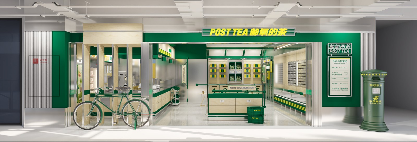
该项目主打新零售概念,室内重色采用让人感觉健康生态的绿色来呈现,再次从视觉效果凸显出零售的健康性。

This project focuses on a new retail concept, with indoor heavy colors presented in a green that makes people feel healthy and ecological, once again highlighting the health of snacks through visual effects.


空间视觉 | Spatial vision

生鲜、餐饮、零售“三合一”
Fresh, Catering, and Retail Three in One

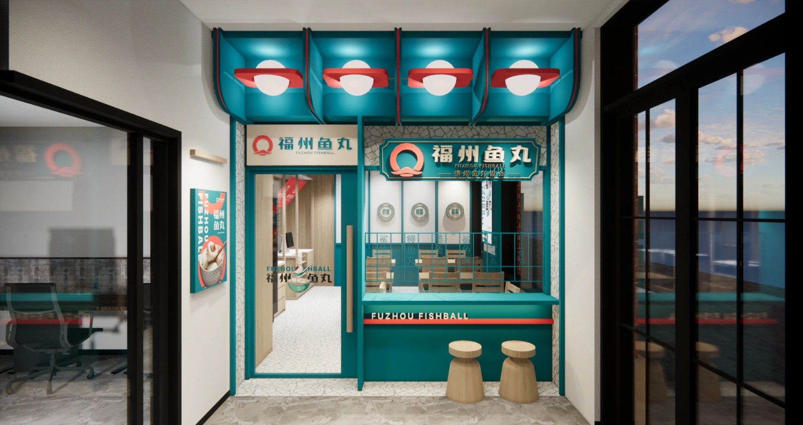
空间上利用不同的地面和天花板划分空间,路线布局尽量让顾客不重复走,商品陈列醒目清晰且有层次感,予消费者的视觉冲击,也能体现出生活化和人性化。

该项目作为新零售超市,超市档口以生鲜、餐饮、零售的模式相结合,满足顾客的体验感,打造办公场景+家庭场景+社区场景的消费模式,简称“三合一”。

In terms of space, different floors and ceilings are used to divide the space, and the route layout is designed to ensure that customers do not walk repeatedly. The product display is eye-catching, clear, and layered, giving consumers a visual impact and also reflecting the lifestyle and humanization.

As a new retail supermarket, this project combines fresh food, catering, and retail models at the supermarket entrance to meet customers sense of experience, creating a consumption model of office, family, and community scenes, abbreviated as three in one.


汲取健康生活理念,将绿色融入购物环境,通过品牌色打造店铺记忆点。与其他店铺形成对比做出属于自己的风格。在满足消费者便利购物的同时,营造舒适的购物氛围,大众喜好的高性价比的新零售超市。

Drawing on the concept of healthy living, green is integrated into the shopping environment, creating a shop memory through the brand colours. Contrast with other shops to make a style of its own.A new retail supermarket that meets the convenience of shopping while creating a comfortable shopping atmosphere and a high cost performance ratio that the public prefers.

----------------------------------------------------------------------------------------------------------------------------------------

项目名称丨加拿大新零售超市

项目类型丨餐饮空间

设计单位丨再設計空间事務所

 PintereAI


