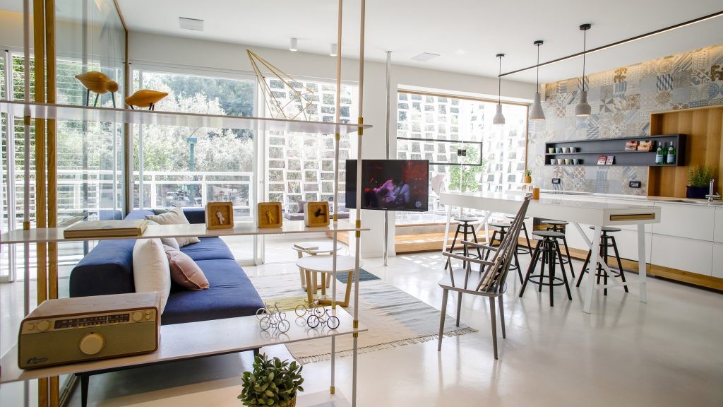
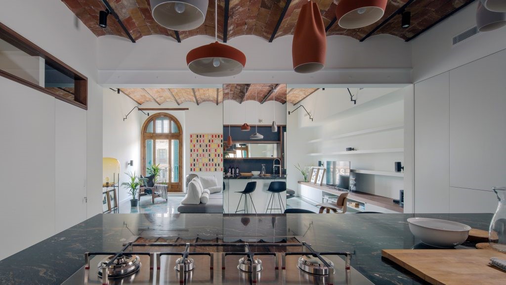
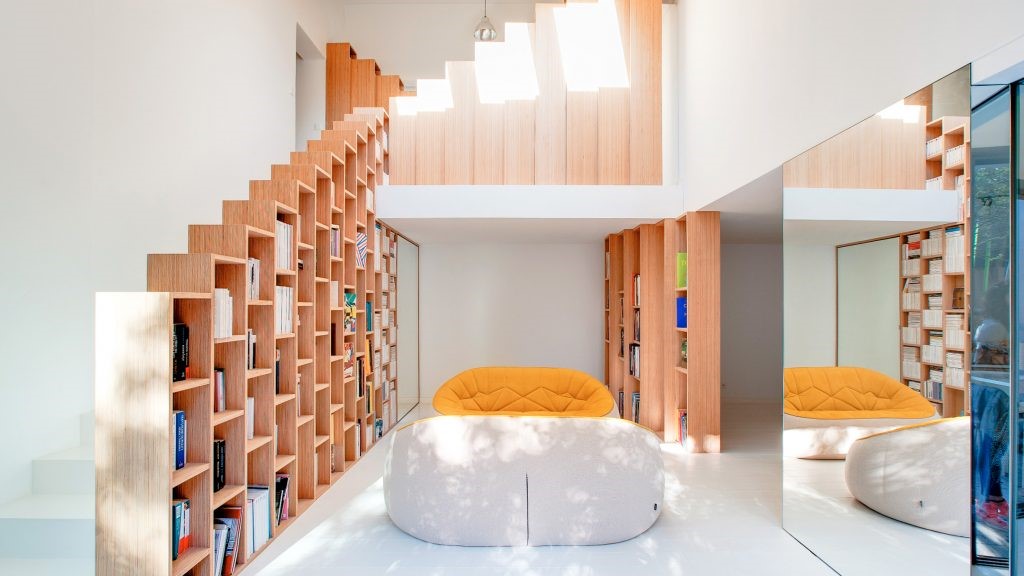
Wooden 19th Street Residence created by Sidell Pakravan Architects to provide stunning Californian views 由SidellPakravanArchitects创建的第19号木质住宅,以提供惊人的加州景观。
2019-08-13 15:29
On the hillside streets of San Francisco, California, creative design teams at Sidell Pakravan Architects have recently completed a full building renovation, giving particular style attention to the top floor penthouse. This fantastic new space was dubbed the 19th Street Residence upon completion.
在加利福尼亚州旧金山的山坡街道上,西德尔·帕克拉文建筑师事务所的创意设计团队最近完成了一项全面的建筑改造,对顶层的顶层公寓给予了特别的风格关注。这个奇妙的新空间在完工后被称为第19街的住宅。
Although the entire building underwent some type of renovation, the penthouse apartment at the very top received a particularly heavy overhaul. The resident of this apartment is actually the owner of the entire building, both living and working from the same space. They wanted, therefore, to afford themselves a little bit extra living and working space that blends better than before.
虽然整个建筑经历了某种改造,但顶层的顶层公寓得到了一个特别重的检修。这个公寓的居民实际上是整个建筑的主人,都是在同一空间里生活和工作的。因此,他们想让自己的生活和工作空间比以前好一些。
This was achieved by adding a lovely addition to the apartment, turning it into two blended volumes with free flowing space between them, rather than just a singular feeling residence where everyday life and workplace function step on each other’s toes. At the same time, designers wanted to maintain the stunning view provided by the apartment’s prime place at the top of a building that sits atop a hill.
这是通过在公寓中添加一个可爱的附加物来实现的,把它变成了两个混合的空间,它们之间有着自由流动的空间,而不仅仅是一个独特的感觉住宅,在这里,日常生活和工作场所的功能在彼此的脚尖上相互与此同时,设计师们想要保持公寓的最佳位置所提供的令人叹为观止的景观,这是坐落在山顶上的一座建筑。
The aforementioned view lets owners and guests fully appreciate the stunning urban context in which the building sits. Beyond that, the water sparkles in the sunlight and provides a breathtaking visual contrast between natural beauty and city character. The relationship between these two mirrors the relationship inside the apartment between complementary home and work spaces.
上述景观让业主和客人充分了解该建筑所处的令人惊叹的城市环境。除此之外,水在阳光下闪闪发光,在自然美景和城市特色之间提供了惊人的视觉对比。这两者之间的关系反映了公寓内互补的家庭和工作空间之间的关系。
Originally built with low ceilings, this old building presented designers with particular challenges in making the spot feel spacious and open in a way that will really benefit the open concept but simultaneously blended layout they were planning for. This is why an extension was built that not only expanded the place width-wise but that also broke through vertically to give the apartment more height.
这座老建筑最初是用低天花板建造的,它给设计师们带来了特殊的挑战,在让现场感觉宽敞和开阔的同时,也会使他们规划的开放式概念变得更加开放,但同时也会融合他们的布局。这就是为什么扩建的原因,不仅扩大了地方的宽度,但也突破了垂直,使公寓更高。
The difference in heigh in the two volumes or sides of the apartment creates a space on the roof of the lower side. Designers opted to take advantage of this spot by creating an additional interior room at the top. The walls of this room can be pulled entirely back to blend indoor and outdoor spaces all along a perimeter wall where a stunning built-in bookcase balances a wooden island in the centre of the room. The view from this spot feels unprecedented as you stare out over the city.
不同的高度在两个体积或两侧公寓创造了一个空间屋顶的下部。设计师们选择利用这一优势,在顶部创造了一个额外的室内空间。这间房间的墙壁可以完全向后拉,使室内和室外空间融合在一堵围墙上,在那里,一个令人叹为观止的内置书柜平衡着房间中心的一个木岛。当你凝视着这座城市的时候,从这个地方看到的感觉是前所未有的。
Part of the magic of the view is created in the fact that the visual edges of the rooftop terrace sit almost precisely evenly with the San Francisco skyline if you look directly from the door. A view of the buildings below leading up to the water’s edge can be gleaned instead by crossing the terrace to the balcony’s edge.
景观的部分神奇之处在于屋顶露台的视觉边缘与旧金山的天际线几乎完全一样,如果你直接从门上看的话。通过越过露台到阳台的边缘,可以收集到下面通向水的边缘的建筑物的景致。
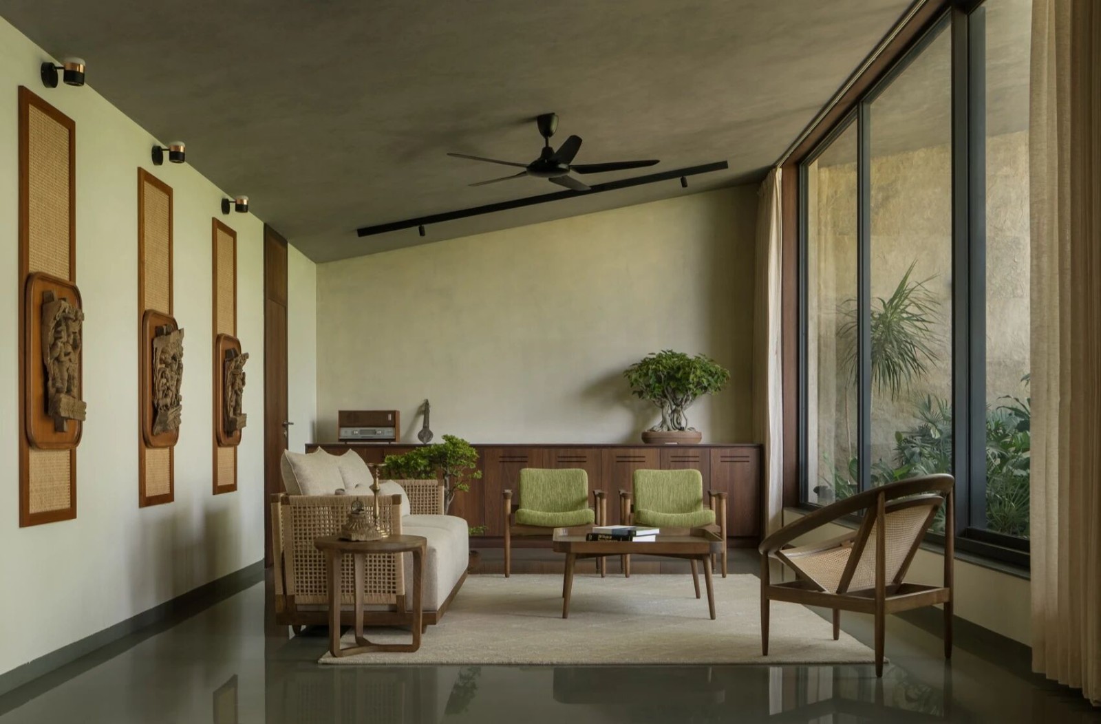
Inside the apartment, the entire colour palette has a stunning sense of neutrality about it. While the ceilings, walls, and many surfaces have a calming cream shade to them, contrasting furnishings and built-in features were done in the same naturally stained wood as the previously mentioned bookcase that sits near the sliding glass doors.
在公寓里,整个调色板都有一种令人惊叹的中立感。虽然天花板,墙壁和许多表面有一个平静的奶油阴影,对比家具和内置的功能是在相同的自然染色木材,就像前面提到的书架坐落在滑动玻璃门附近。
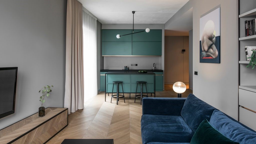
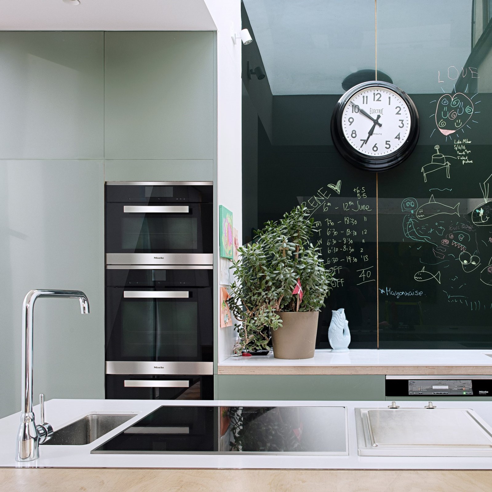
The effect if one of calming sensical atmospheres that makes sense from space to space. The palette also allows for any presence of decorative colour to pop against otherwise subtly cohesive backgrounds, as is the case with the lovely teal painted walls in the children’s play room.
如果一种让人感觉平静的气氛从一个空间到另一个空间是有意义的。调色板还允许任何装饰色彩的出现,以配合本来微妙的内聚力背景,就像儿童游戏室里可爱的茶壶画的墙壁一样。
Perhaps our favourite feature of the apartment is the lower balcony edge that boasts a safety partition made entirely of smoothly glazed glass. Putting this in place instead of an opaque wall provides an almost uninterrupted view of the city right from the apartment door.
也许我们最喜欢的公寓特色是阳台的下部边缘,它拥有一个完全由光滑的玻璃制成的安全隔板。用它代替一堵不透明的墙,几乎可以不间断地从公寓楼的门上看到这座城市。
Photo by Laurian Ghinitoiu
 举报
举报
别默默的看了,快登录帮我评论一下吧!:)
注册
登录
更多评论
相关文章
-

描边风设计中,最容易犯的8种问题分析
2018年走过了四分之一,LOGO设计趋势也清晰了LOGO设计
-

描边风设计中,最容易犯的8种问题分析
2018年走过了四分之一,LOGO设计趋势也清晰了LOGO设计
-

描边风设计中,最容易犯的8种问题分析
2018年走过了四分之一,LOGO设计趋势也清晰了LOGO设计


 PintereAI


