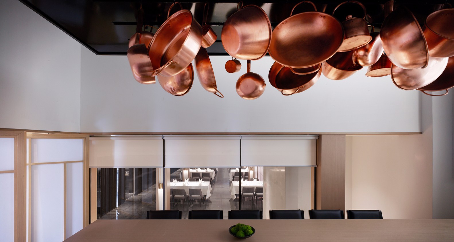
Olivo Restaurant / Architect Pierluigi Piu
2017-02-08 21:04
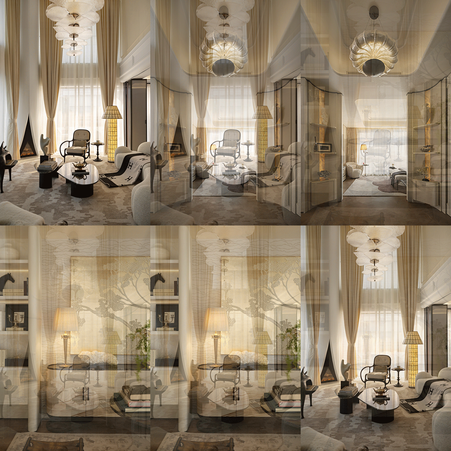
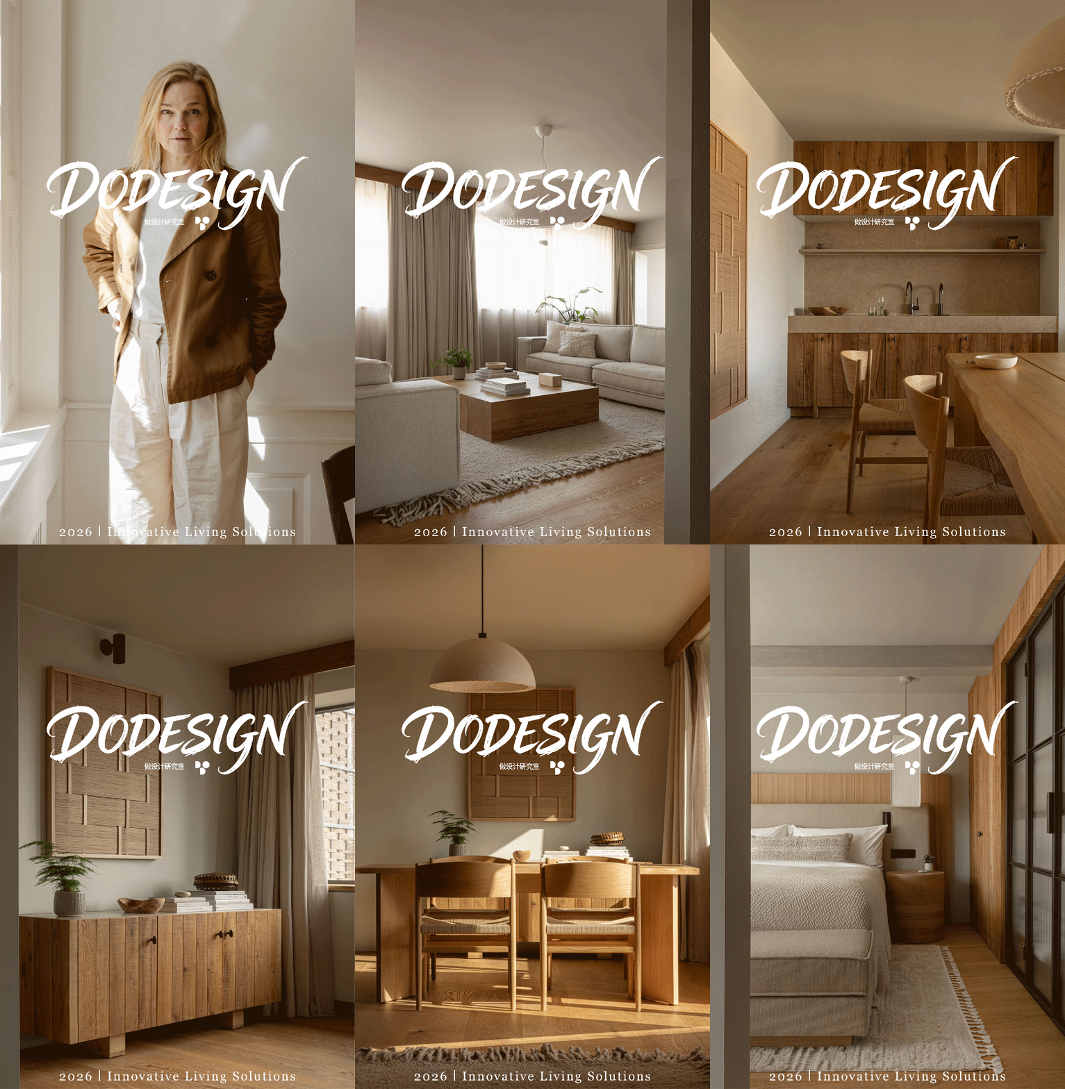
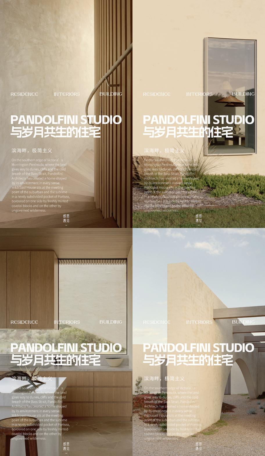
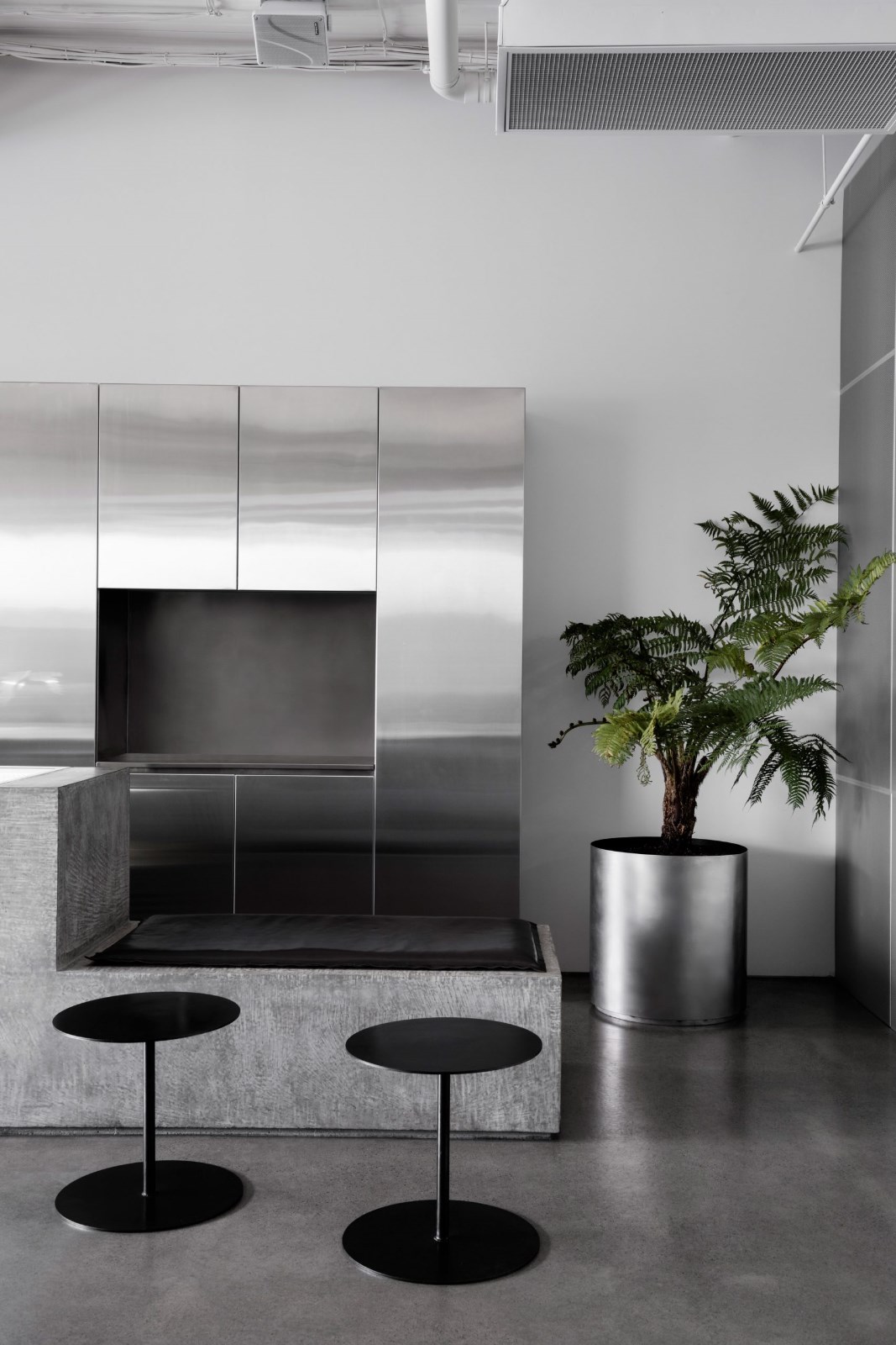
Architect Pierluigi Piu has designed the Olivo Restaurant in London, UK, in 2016. In this new restaurant, refurbished 25 years after he first designed it, the same architect continues telling customers about Sardinia (a narration of the proprietor’s home island that he previously began with the same company’s other venues), here evoked through wide natural stone bas-reliefs referring to the unmistakable ancient weaving technique named a pibiònes (grained texture), peculiar to that island.
2016年,建筑师Piu设计了位于英国伦敦的Olivo餐厅。这家新餐厅是在他第一次设计25年后重新装修的。在这里,这位建筑师继续向顾客讲述撒丁岛(讲述东主的家乡岛,他以前是从同一家公司的其他场所开始的),这里通过宽阔的天然石板浮雕唤起人们的回忆,这些浮雕指的是那座岛特有的一种明显古老的编织技术-一种名为皮比诺(纹理)的古老编织技术。
The access to the restaurant and the whole building is through a shop front very much respecting the London Victorian tradition in design (though made “fresher” by the use of a quite unusual colour). The solid wall which previously divided the entrance lobby from the dining room facing the street has now been removed and replaced by a full height fire resistant glazed divider, so as to give a more visual opening and greater breadth to an otherwise overly compressed space.
进入餐厅和整个建筑是通过一个商店的正面非常尊重伦敦维多利亚传统的设计(虽然“新鲜度”使用相当不寻常的颜色)。原先将入口大堂与面向街道的餐厅隔开的实心墙,现在已被全高度耐火玻璃隔板所取代,从而使一个原本过于压缩的空间更具视觉开放性和更大的宽度。
At the end of the small entrance lobby the restaurant door and the one giving access to the staircase leading to private upper floors, combined in their respective open and closed position, form an unitary full height panel veneered with dark brown stained oak unmistakably directing visitors towards the main dining room, the primary feature of which is a first wide wall “tapestry” made out of natural stone (finely chiselled by LITHEA’stone art masters according to the architect’s design), inspired by typical Sardinian fabrics where decorative patterns (among which the lapwing bird, here reproduced – see photo gallery here below – considered as a symbol of fertility and prosperity, is one of the most recurring ones) are enhanced by a sort of grain in relief (pibiònes) generated by sequences of small loops executed with the weft thread. On the right side as one enters is the bar/reception unit, consisting of a multifunctional counter completely made out of “coffee-bean” brown Corian®, behind which, in between the dining rooms at the front and at the rear, is the access to the staircase leading to the kitchen located in the basement.
在小入口大厅的尽头,餐厅的门和通往私人上层的楼梯的门,以各自开放和封闭的位置结合在一起,形成了一个整体的全高度面板,上面镶嵌着深褐色的橡木,明确地将游客引向主餐厅,其主要特征是由天然石头制成的第一个宽墙“挂毯”(根据建筑师的设计,由LITHEA的石材艺术大师精心雕琢),灵感来自典型的撒丁岛织物,其中装饰图案(这里是翻翼鸟,在这里复制)-见下面的照片画廊-被认为是富饶和繁荣的象征,是最经常出现的循环之一)是通过一种用纬线执行的小循环序列生成的一种浮雕谷物(pibiónes)来增强的。右边是酒吧/接待室,由一个完全由“咖啡豆”棕色科里安组成的多功能柜台组成,后面是前面和后面的餐厅之间的楼梯,通往位于地下室的厨房。
Opposite to the access to the inner dining room is a second stone “tapestry” covering the whole far wall and featuring a new pattern once again based on the iconography of the lapwing bird. On the right side a full height door veneered with dark brown stained oak opens on a tiny lobby giving access to the toilets, where the mirrored door panels of the wardrobe cabinet provide the illusion of a deeper space.
通往内部餐厅的对面是第二块石头“挂毯”,覆盖了整个远墙,并根据飞鸟的图标,再次采用新的图案。右侧是一个全高的门,上面镶有深褐色的橡木,在一个小小的大厅里打开,可以进入卫生间,衣柜橱柜的镜像门板提供了一个更深的空间。
All the premises walls are covered with a matt wax finished blend of resin and cement finely grained, coloured in the warm and dark shades of dove grey and burnt coffee which, while producing an effect of diffuse semi-darkness, give prominence to the sepia colour bas-reliefs lit by a vivid grazing light and enhance the unusual “duck egg” colour of the genuine linen tablecloths, also featured in the colour of the shop front and harmonizing with the wood floor finished with a special hardwearing coating paint.
所有房屋的墙壁都覆盖着一层由树脂和水泥细粒度混合而成的无光蜡,涂上了鸽子灰色和煮熟咖啡的暖色和暗色,在产生弥漫半黑暗的效果的同时,突出了用鲜亮的放牧光照亮的深褐色浮雕,增强了真正的亚麻桌布不同寻常的“鸭蛋”颜色,在商店前的颜色中也有特色,并与用一种特殊的硬涂层漆完成的木地板相协调。
Thank you for reading this article!
 举报
举报
别默默的看了,快登录帮我评论一下吧!:)
注册
登录
更多评论
相关文章
-

描边风设计中,最容易犯的8种问题分析
2018年走过了四分之一,LOGO设计趋势也清晰了LOGO设计
-

描边风设计中,最容易犯的8种问题分析
2018年走过了四分之一,LOGO设计趋势也清晰了LOGO设计
-

描边风设计中,最容易犯的8种问题分析
2018年走过了四分之一,LOGO设计趋势也清晰了LOGO设计


 PintereAI


