Light Corridor House is an Extension to a Typical Victorian Workers’ Cottage
2017-08-15 13:48
Architects: Figr Architecture - Design Project: Light Corridor House Styling: Ruth Welsby Location: Cremorne, Melbourne, Australia Photography: Tom Blachford
This semi-detached worker’s cottage in Cremorne, Melbourne, was at the ‘point of no return’. Home to architect Michael Artemenko, co-director of FIGR, his wife Emma and their baby Ruby, the place was leaking and lacked amenity rather than additional space. “It was at that point where the choice was to renovate or move to a new house,” says Artemenko, who worked closely with FIGR’s co-director, architect Adi Atic.
这间位于墨尔本克里莫恩的半独立工人小屋,正处于“死路一条”的时刻。建筑师迈克尔·阿尔特米科(MichaelArtemenko)是FIGR、他的妻子艾玛(Emma)和他们的宝贝红宝石(Ruby)的联席董事。“就在那个时候,选择是翻新还是搬到新房子,”Artemenko说,他与FIGR的联合主管,建筑师Adi Atic密切合作。
From the start of the renovation, FIGR’s ‘mantra’ was ‘getting more with less’. The early 20th century cottage is located on a relatively modest site in a heritage-listed street. This renovation was intended to show that families don’t have to settle on the quarter acre block with endless bedrooms. “The house was relatively large enough. It just lacked natural light and the type of spaces we enjoy being in,” says Artemenko.
从翻修开始,FIGR的“咒语”就是“用更少的钱获得更多”。这座20世纪初的平房坐落在一个相对较小的遗址上,坐落在一条历史悠久的街道上。这一翻修的目的是要表明,家庭不必定居在四分之一英亩的街区,有着无穷无尽的卧室。“这房子相当大。它只是缺乏自然光和我们喜欢的空间类型,“Artemenko说。
Most architects working with similar cottages would retain the original bedrooms, remove the lean-tos at the rear and add on a glazed contemporary box. While this renovation may have appeared to follow the same path, the approach is significantly different. The front three rooms, two used as bedrooms and the third as a study, were retained. However, unbeknown to the eye, each of these rooms was marginally reduced in size by as little as 600 X 600 millimetres. This allowed for a 1.8-metre-long laundry accessed from the main passage. There was also sufficient room to slightly expand the bathroom.
大多数使用类似住宅的建筑师都会保留原来的卧室,移除后部的瘦身,并添加一个带玻璃的现代箱子。虽然这种改造似乎遵循了相同的道路,但这种方法却有很大的不同。前面的三个房间,两个房间用作卧室,第三个房间用作研究室。然而,这些房间中的每一个都在眼睛中不知道,只是稍微缩小了600X600毫米。这允许从主通道进入1.8米长的衣物。还有足够的空间稍微扩大浴室。
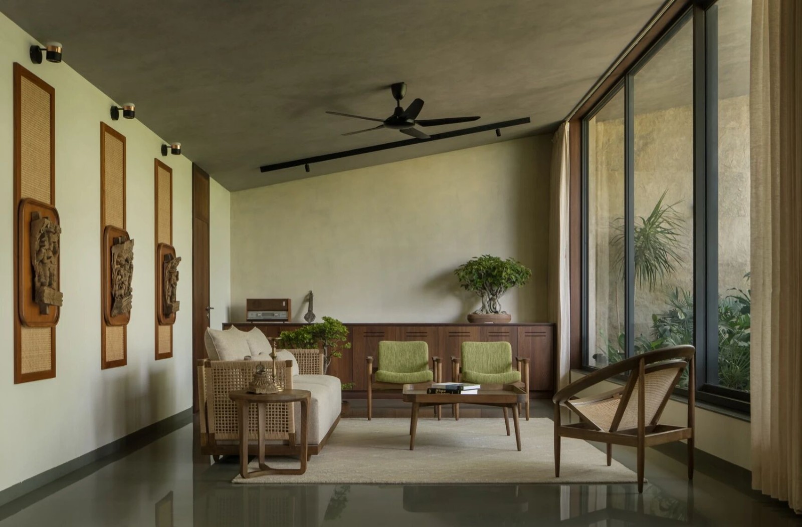
While these subtle changes can’t be detected, there is a dramatic change with the transition to the new wing, comprising the separate lounge, dining area and enclosed verandah. Japanese inspired, FIGR has masterfully created a tranquil and understated living area that is bathed in light. The architect used a series of timber-battened screens and glazing to allow for both filtered light and privacy.
虽然这些微妙的变化是无法察觉的,但随着向新侧翼的过渡,包括独立的休息室、就餐区和封闭的阳台,出现了戏剧性的变化。在日本的启发下,FIGR巧妙地创造了一个平静而低调的生活区域,沐浴在阳光中。这位建筑师使用了一系列的木板屏风和玻璃,以允许过滤光和隐私。
From the outset, FIGR was keen to create different experiences in each space. The living area, for example, features Victorian ash above the ‘picture rails’, evocative of many period homes. However, fibro cement sheets, rather than plaster, feature on the walls. And to ensure northern light filters into the living room, once the darkest spot in the house, highlight windows together with pitched timber-lined ceilings act as beacons for the light. Rather than simply a doorway into the open plan kitchen and dining area, FIGR inserted a ‘threshold’ of black stained timber to walk across.
从一开始,FIGR就热衷于在每个空间创造不同的体验。例如,居住区域的特点是维多利亚时代的火山灰在“图画栏杆”上方,让人联想到许多有时代气息的住宅。然而,纤维水泥片,而不是石膏,特点是在墙上。为了确保北方的光线过滤到起居室,曾经是房子里最黑暗的地方,把窗户与倾斜的木质天花板一起突出,作为照明的信标。FIGR不只是进入开放式厨房和就餐区的一个门口,而是插入了一个黑色染色木材的“门槛”,让人们走过去。
The kitchen and dining area also has a strong Japanese sensibility, with the southern verandah covered by translucent acrylic and timber slats. The exterior wall, stained black, allows for herbs and artifacts to be displayed.
厨房和餐厅也有很强的日本人的敏感性,南边的阳台上覆盖着半透明的丙烯酸和木材板条。外墙被染成黑色,允许展示草药和文物。
The other skill brought to this renovation is the sense of touch. Raw materials, such as fibro-cement used to line walls, are beautifully contrasted with richer and more luxe materials, such as the bronze mirror used for the kitchen’s splashbacks.
这次翻新带来的另一个技巧是触觉。原材料,如用于排列墙壁的纤维水泥,与更丰富和更豪华的材料,如用于厨房喷溅的铜镜,形成了美丽的对比。
Flexibility was also embedded in the brief for this project. With the idea of staying in this home for years to come, creating experiences was pivotal. The sliding glass and timber-battened screens, for example, fully retract to allow a seamless connection to the garden. The window seats/lounges, designed for both inside and out, allow the family to spread out inside while feeling as through they’re relaxing in the back garden.
该项目的简要说明中也包含了灵活性。考虑到在这个家呆上几年的想法,创造经验是至关重要的。例如,滑动的玻璃和木结构的屏风完全收缩,以便与花园保持无缝连接。窗户的座位/休息室,为里面和外面设计,允许家庭分散在里面,同时通过他们的感觉,他们在后面的花园放松。
While this design appears relatively simple, it is considerably more complex. One can appreciate the number of schemes that took the design to this point. “It was important not just to create spaces, but spaces that felt exciting to be in,” says Artemenko, who feels that we’re spoilt for space in Australia. “You need to see how the Japanese or even the Europeans live, to see it’s the quality, rather than the amount, of space that you really need.”
虽然这个设计看起来相对简单,但它要复杂得多。我们可以欣赏到将设计带到这一点的各种方案的数量。“重要的是不仅要创造空间,更重要的是要有令人兴奋的空间,”Artemenko说,他觉得我们在澳大利亚的空间被宠坏了。“你需要看看日本人,甚至欧洲人是如何生活的,你真正需要的是空间的质量,而不是数量。”
 举报
举报
别默默的看了,快登录帮我评论一下吧!:)
注册
登录
更多评论
相关文章
-

描边风设计中,最容易犯的8种问题分析
2018年走过了四分之一,LOGO设计趋势也清晰了LOGO设计
-

描边风设计中,最容易犯的8种问题分析
2018年走过了四分之一,LOGO设计趋势也清晰了LOGO设计
-

描边风设计中,最容易犯的8种问题分析
2018年走过了四分之一,LOGO设计趋势也清晰了LOGO设计


 PintereAI


