Gracefully Nostalgic A Contemporary Apartment in Minsk Reminisce About its Past
2019-08-05 18:20
Located in a historic building in the heart of Minsk, Belarus, this one bedroom apartment has been thoughtfully renovated by Third Wave Architects, a team of three young Belarusian architects, who drew from its history as revealed in old photographs to create a modern home that nevertheless recalls the timeless elegance of its past. Underpinned by a modernist ethos of less is more, the team focused on the functionality of the layout, purity of form, and quality of detailing, and the result is a home of architectural poise and graceful nostalgia.
位于白俄罗斯明斯克市中心的一座历史建筑中,这套一居室的公寓由三名年轻的白俄罗斯建筑师组成的第三波建筑师小组(Third Wave Architect)进行了深思熟虑的翻修。这三名年轻的白俄罗斯建筑师从其历史中汲取了旧照片所揭示的历史,创造了一座现代住宅,但这所住宅却让人想起了它过去永恒的优雅在“少即多”的现代主义精神的支持下,团队专注于布局的功能性、形式的纯洁性和细节的质量,其结果是一个建筑风格优雅的怀旧之家。
Photo by Alexandra Kononchenko.
Photo by Alexandra Kononchenko.
Photo by Alexandra Kononchenko.
Photo by Alexandra Kononchenko.
Photo by Alexandra Kononchenko.
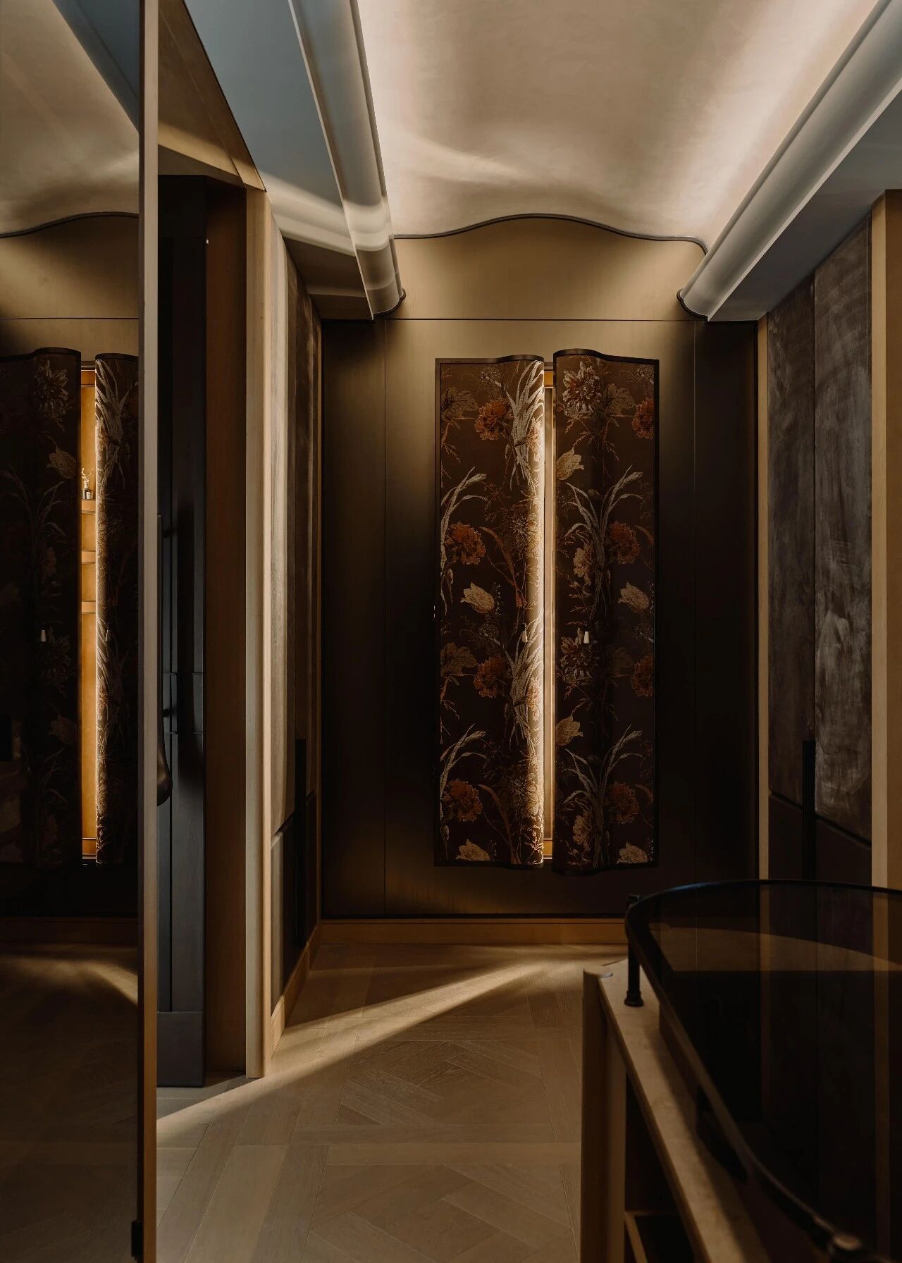
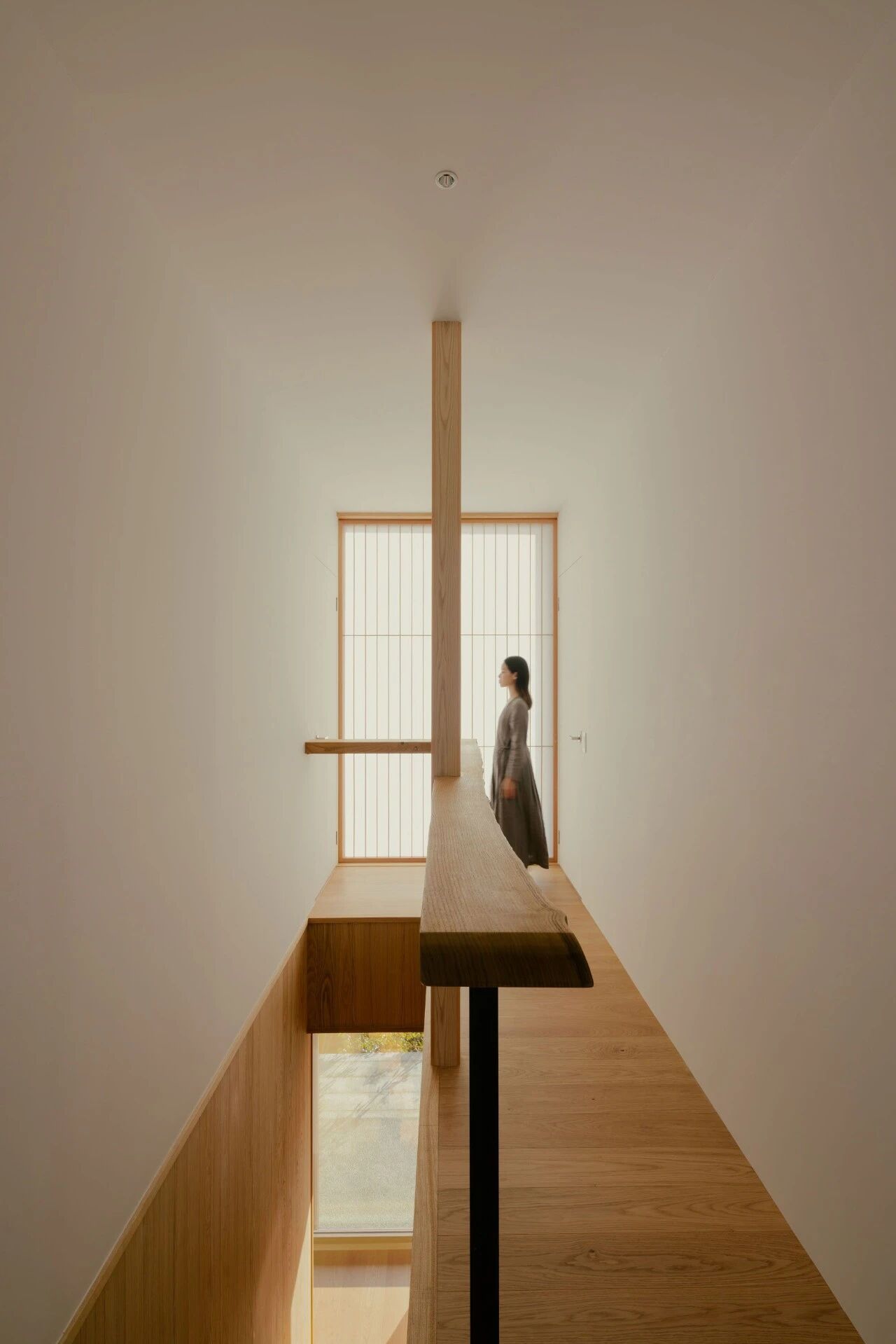
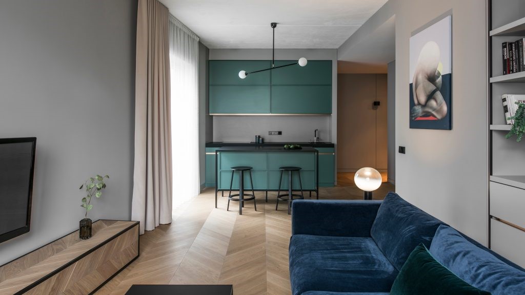
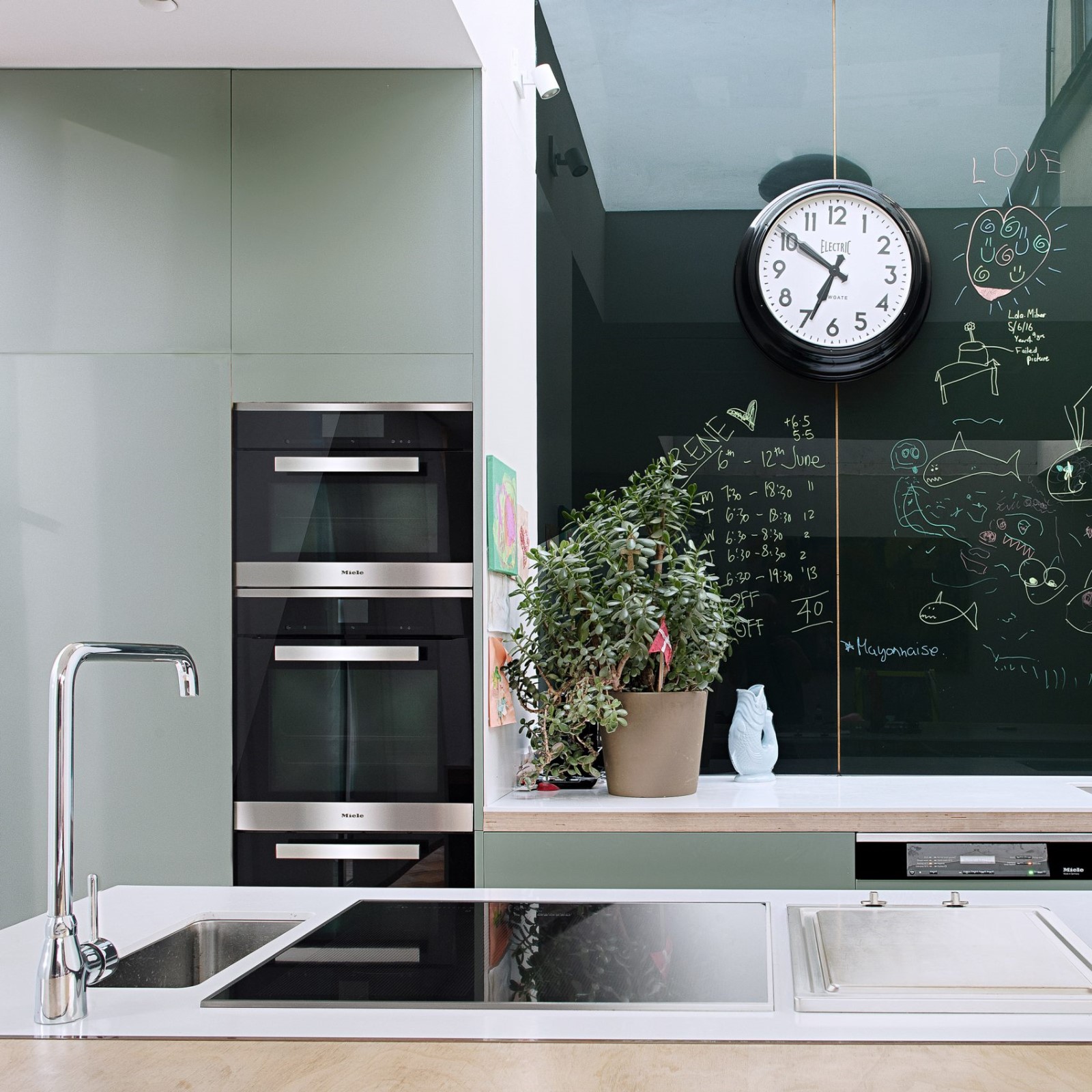
In what amounted to a comprehensive renovation, the first order of business was to redesign the existing layout which dividing the modestly sized apartment in separate rooms connected by a corridor. The space is divided instead in two zones, an open plan living space where the new owner will spend most of his time and a separate zone comprising the bedroom and bathroom. A built-in wardrobe separates the entrance from the rest of the living space without cutting it off while also accommodating kitchen cabinets on the reverse side. Blessed with two tall French windows that open up onto a balcony, the living space is flooded with natural light. A neutral colour palette of light grey walls and matching curtains, as well as natural wood flooring, further increases the impact of the light coming in while also enhancing the sense of spaciousness. The subdued colour scheme is only interrupted by the selective use of red veneer for doors, cabinets and wardrobes, as well as the headboard in the bedroom, which imbues the apartment with a heightened sense of elegance and establishes a cohesive aesthetic.
在一次全面的改造中,首要任务是重新设计现有的布局,将中等大小的公寓划分为由走廊连接的单独房间。取而代之的是两个区域,一个是开放式的居住空间,新主人大部分时间都是在这里度过的,另一个是由卧室和浴室组成的单独的区域。一个内置的衣柜将入口与生活空间的其他部分隔开,而不切断入口,同时也能容纳反面的厨房橱柜。幸运的是,两扇高高的法国窗户打开在阳台上,生活空间充满了自然光。中性色调色板的浅灰墙壁和匹配的窗帘,以及天然木地板,进一步增加了光线的影响,同时也增强了空间感。柔和的配色方案只会被选择性地使用红色贴面作为门、橱柜和衣柜,以及卧室的床头板所打断,从而赋予公寓更高的优雅感,并建立起一种具有凝聚力的美学。
Photo by Alexandra Kononchenko.
Photo by Alexandra Kononchenko.
Photo by Alexandra Kononchenko.
Photo by Alexandra Kononchenko.
Photo by Alexandra Kononchenko.
Photo by Alexandra Kononchenko.
Although minimalist in principle, the interior design subtly conveys the mid-century sensibility of the apartment’s past through several features inspired by old photographs and effortlessly integrated into the new décor. The most prominent of these are the wide ceiling cornice that appears throughout the apartment, and a selection of vintage lamps and furniture pieces. The inclusion of slender contemporary pieces such as the metallic coffee tables and night stands, which have been designed by the architects, ensure that the aesthetic, far from becoming retro, is assuredly modern. Perhaps what best exemplifies the designers’ marriage of past and present are the two artworks that have been strategically hung: namely a monochromatic grey canvas of Abstract Expressionist sensibility, and a fragment of “Virgin and Child with Angels”, an early 17th century Baroque painting by Italian artist Bartolomeo Cavarozzi. Whereas the former hangs in the living room, exactly where you’d expect to find the TV, the latter hangs across the bed and is thus the last thing you see before you go to sleep and the first thing you see when you wake up.
尽管从原理上讲,内饰设计巧妙地传达了世纪中期公寓过去的敏感性,通过一些受旧照片启发的特点,并轻松地融入新的德科。其中最突出的是整个公寓中出现的宽天花板檐口,以及各种复古灯具和家具。由建筑师设计的细长的现代作品,如金属咖啡桌和夜位,确保了美学,远离复古,是可靠的现代。也许最好的体现了过去和现在的设计师婚姻的是这两幅具有战略意义的艺术品:即抽象表现主义情感的单色灰色画布,以及17世纪早期意大利艺术家BartolomeoCavarozzi的一幅17世纪巴洛克绘画《维珍与儿童》的片段。而前者挂在客厅里,正好在那里你希望找到电视,后者挂在床上,因此是你睡觉前看到的最后一件事,而当你醒来时,你看到的第一件事。
Photo by Alexandra Kononchenko.
Photo by Alexandra Kononchenko.
Photo by Alexandra Kononchenko.
Photo by Alexandra Kononchenko.
Photo by Alexandra Kononchenko.
keywords:Design Interior Design
 举报
举报
别默默的看了,快登录帮我评论一下吧!:)
注册
登录
更多评论
相关文章
-

描边风设计中,最容易犯的8种问题分析
2018年走过了四分之一,LOGO设计趋势也清晰了LOGO设计
-

描边风设计中,最容易犯的8种问题分析
2018年走过了四分之一,LOGO设计趋势也清晰了LOGO设计
-

描边风设计中,最容易犯的8种问题分析
2018年走过了四分之一,LOGO设计趋势也清晰了LOGO设计


 PintereAI


