Ste.Marie Whimsically Reinvents the Humble Tapas Bar for Vancouvers Culinary Scene
2019-08-05 18:20
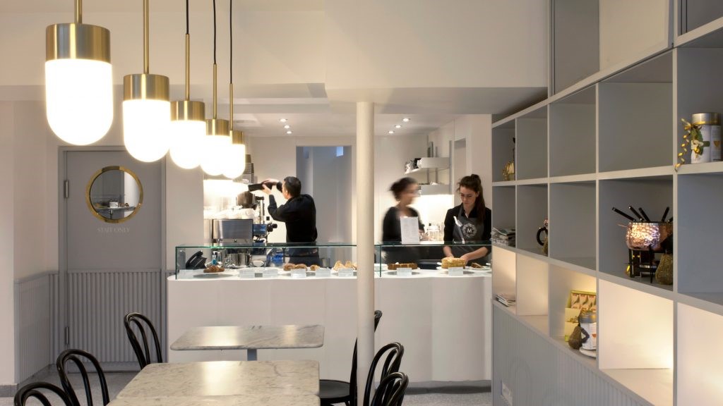
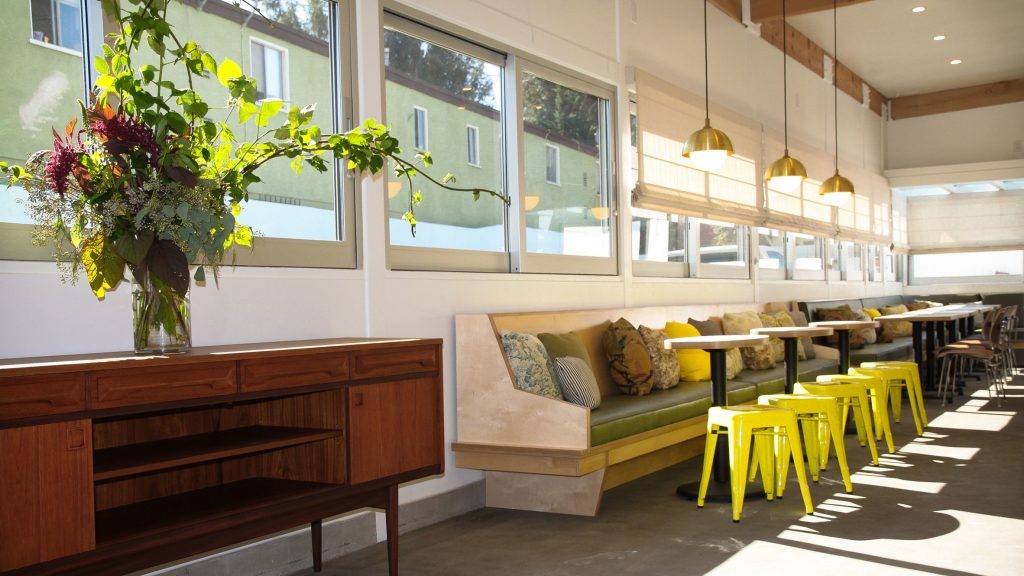
Canadian design studio Ste.Marie has a talent for transforming the traditional into the unexpected. After revamping a traditional alimentary, an Italian family-owned grocery shop and deli, into the whimsical Caffè La Tana, the studio has taken on the world famous Spanish tapas bars for their latest project in Vancouver, Como Taperia. Taking as their starting point the historic tapas bars in Barcelona’s Poble Sec and Madrid’s La Latina quarters, Ste.Marie re-imagined the classic, centuries-old, standing room-only venue as a relaxed, contemporary eatery where an artistic-minded, playfully-graphic aesthetic meets the quaint charm and un-fussy conviviality of age-old tapas bars.
加拿大设计工作室Ste.Marie有将传统转变为意外的天赋。这家工作室将一家意大利家庭经营的食品店和熟食店改造成异想天开的咖啡馆拉塔纳(CaffèLa Tana),之后又在温哥华的最新项目-科莫·塔必里亚(Como Taperia)-与世界著名的西班牙塔帕里酒吧展开了较量。以巴塞罗那波布尔证券交易委员会(Poble SEC)和马德里拉拉蒂纳区(La Latina)历史悠久的塔帕斯酒吧为起点,斯特-玛丽(Ste.Marie)重新设想了这座经典的、百年历史悠久的、只有站立空间的餐厅,它是一家轻松、现代的餐厅,在那里,一种有艺术性的、有趣的图形美学,符合古老的塔帕斯酒吧的古朴魅力和不挑剔的欢乐气氛。
Photo by Conrad Brown. Styling by Kate Richard.
图片来源:Conrad Brown。凯特·理查德的造型。
Photo by Conrad Brown. Styling by Kate Richard.
图片来源:Conrad Brown。凯特·理查德的造型。
Photo by Conrad Brown. Styling by Kate Richard.
图片来源:Conrad Brown。凯特·理查德的造型。
Photo by Conrad Brown. Styling by Kate Richard.
图片来源:Conrad Brown。凯特·理查德的造型。
Photo by Conrad Brown. Styling by Kate Richard.
图片来源:Conrad Brown。凯特·理查德的造型。
There’s no definitive account about the origins of tapas bars but the more fun version is certainly the one that purports that bartenders took advantage of the saucers placed on top of glasses of beer or sherry to keep the flies out. At some point the story goes that they must have realised that it would be a great idea to use the saucer as a plate to serve a little snack, perhaps in order to attract clients back, or maybe to keep them sober enough to stay for another drink. The bartenders’ unplanned, resourceful thinking intrigued the design team and convinced them to keep things simple and fun. As lead designer, Rachel Martinuk explains, “we employed this haphazard, relaxed approach throughout the design process, which liberated us to solve challenges with the same utilitarian, unfussy approach that we imagined the bar keepers of Barcelona, Madrid - Seville did”.
关于塔帕斯酒吧的起源,目前还没有明确的说法,但更有趣的版本肯定是调酒师利用放在啤酒或雪利酒杯上的茶碟来防止苍蝇飞出。在某种程度上,他们肯定意识到用碟子做小点心是个好主意,也许是为了吸引顾客回来,或者是为了让他们保持清醒,可以留下来再喝一杯。调酒师的计划外,足智多谋的想法吸引了设计团队,并说服他们保持简单和有趣的事情。作为首席设计师,瑞秋·马蒂努克解释说:“我们在整个设计过程中都采用了这种随意、轻松的方法,这使得我们能够用我们想象中的马德里巴塞罗那酒吧老板那样的功利主义、随心所欲的方法来解决挑战。
Photo by Conrad Brown. Styling by Kate Richard.
图片来源:Conrad Brown。凯特·理查德的造型。
Photo by Conrad Brown. Styling by Kate Richard.
图片来源:Conrad Brown。凯特·理查德的造型。
Photo by Conrad Brown. Styling by Kate Richard.
图片来源:Conrad Brown。凯特·理查德的造型。
Photo by Conrad Brown. Styling by Kate Richard.
图片来源:Conrad Brown。凯特·理查德的造型。
Photo by Conrad Brown. Styling by Kate Richard.
图片来源:Conrad Brown。凯特·理查德的造型。
Photo by Conrad Brown. Styling by Kate Richard.
图片来源:Conrad Brown。凯特·理查德的造型。
Como Taperia’s playful décor is dominated by large terracotta tiles playfully assembled on the walls to resemble brickwork, inspired by the three iconic brick chimneys in Jardins de les 3 Xemeneies in Barcelona’s Poble-sec (xemeneia means chimney in Catalan), which are all that remains from an early 20th century power station locally known as ‘La Canadiense’ as it was operated by a Canadian utility. You have to hand it to Ste.Marie: a Canadian tapas bar channelling a Spanish landmark built by Canadians, above all else it’s a witty concept that perfectly encapsulates the studio’s narrative-based approach. The team was also inspired by another Catalan icon, artist Joan Miró, whose paintings are populated by biomorphic forms and vivid colours, both of which pop up in Como Taperia’s interior, most notably in the use of Miró’s characteristic blue that punctuates the space in bold, linear strokes. But more than colours or forms, the designers have taken a page from Miró’s artistic practice of combining spontaneity with meticulous planning in order to create a uniquely original venue that nevertheless conveys the camaraderie of traditional Spanish tapas bars.
Como Taperia有趣的装饰品主要由大型陶瓷砖组成,这些瓷砖在墙上很好玩地组装成砖块,灵感来自巴塞罗那Poble-sec的Jardins de les 3 Xemeneies(xemeneia的意思是加泰罗尼亚的烟囱)的三座标志性砖烟囱,这是20世纪初一座当地名为“La Canadiense”的发电站所遗留下来的,当时它是由一家加拿大公用事业公司运营的。你必须把它交给Ste.Marie:一个加拿大的塔帕斯酒吧,引导一个由加拿大人建造的西班牙地标,最重要的是,它是一个诙谐的概念,完美地封装了工作室基于叙事的方法。这支队伍还受到另一位加泰罗尼亚人-艺术家琼·米罗的启发,他的绘画中充斥着生物形态和生动的色彩,这两种颜色都出现在Como Taperia的内部,最引人注目的是使用了米罗特有的蓝色,这种蓝色以粗体、直线的笔画点缀着这个空间。但除了色彩和形式之外,设计师们还从米罗的艺术实践中学到了一页,那就是把自发性和精心策划结合起来,以创造一个独特的原创场所,传达西班牙传统塔帕斯酒吧的情谊。
Photo by Conrad Brown. Styling by Kate Richard.
图片来源:Conrad Brown。凯特·理查德的造型。
Photo by Conrad Brown. Styling by Kate Richard.
图片来源:Conrad Brown。凯特·理查德的造型。
Photo by Conrad Brown. Styling by Kate Richard.
图片来源:Conrad Brown。凯特·理查德的造型。
Photo by Conrad Brown. Styling by Kate Richard.
图片来源:Conrad Brown。凯特·理查德的造型。
Photo by Conrad Brown. Styling by Kate Richard.
图片来源:Conrad Brown。凯特·理查德的造型。
keywords:Restaurants Design Interior Design
 举报
举报
别默默的看了,快登录帮我评论一下吧!:)
注册
登录
更多评论
相关文章
-

描边风设计中,最容易犯的8种问题分析
2018年走过了四分之一,LOGO设计趋势也清晰了LOGO设计
-

描边风设计中,最容易犯的8种问题分析
2018年走过了四分之一,LOGO设计趋势也清晰了LOGO设计
-

描边风设计中,最容易犯的8种问题分析
2018年走过了四分之一,LOGO设计趋势也清晰了LOGO设计


 PintereAI


