Yamakawa Rattan Showroom Sidharta Architect
2012-02-18 00:00
架构师提供的文本描述。由Sidharta建筑师设计的Yamakawa Rattan展厅的主要概念是让人们以一种不同的方式体验产品。街上的人们会看到这栋建筑的外墙是一个两层高的质量,一楼有一个悬挂的立方体,第二层是无框透明玻璃后面展示的其他产品。更多的图片和建筑师的描述后,休息。
Text description provided by the architects. The main concept of the design of the YAMAKAWA Rattan showroom by Sidharta Architect is to let people experience the product in a different way. People from the street will see the façade of the building as a two storey mass with a hanging cubical on the first floor, and other products displayed behind frameless clear glass on the second floor. More images and architects' description after the break.
当你走进一楼的时候,建筑师想让它看起来像一个画廊。当我们进入这个层次的时候,这些产品就成了我们在墙两边的丙烯酸平台上的一件艺术品。我们还会发现旋转的丙烯酸箱-白色油漆钢框架-悬挂的传送带系统.这个盒子将在一个固定的时间内旋转,显示任何允许访问者从几个角度看它的产品。所以,当我们看到山川从外面的街道,我们会看到产品展示不断变化,在这个旋转的盒子。
Interior Concept As you come into the first floor, the architect wanted to make it look like a gallery. The products become an artwork on an acrylic platform at the wall on both sides while we come into this level. We will also find the rotating acrylic box - white painted steel framed - hung by a conveyor system. This box will rotate in a set time, displaying any product which allows the visitor to look at it from several angles. So back when we see Yamakawa from the street outside, we’ll see the product display constanly changing on this rotated box.
在接待处后面是展示楼梯,它通向二楼,二层分为两层,你可以从阁楼的后台办公区和洗手间经过。在二楼,您将体验到更像客厅或餐厅的氛围和布局。在这里,人们可以坐在那里,试着在墙边用木质的触觉感受到温暖的气氛。其理念是使所有的产品成为主要的关注点,使内部变得更加简单,用未完成的/自然的外观来突出产品的材质。
Behind the reception is the display stairs and it goes to the 2nd floor which is divided in two and you’ll pass the back office area and restroom in the mezzanine. At the second floor, you’ll experience the ambiance and layout to be more like a living room or dining room. In here, people can sit and try the product with a warm atmosphere in wooden touch at the wall side. The idea is to make all the products become the main attention and the interior to become more simple with an unfinished / natural-look on the material to highlight the products.
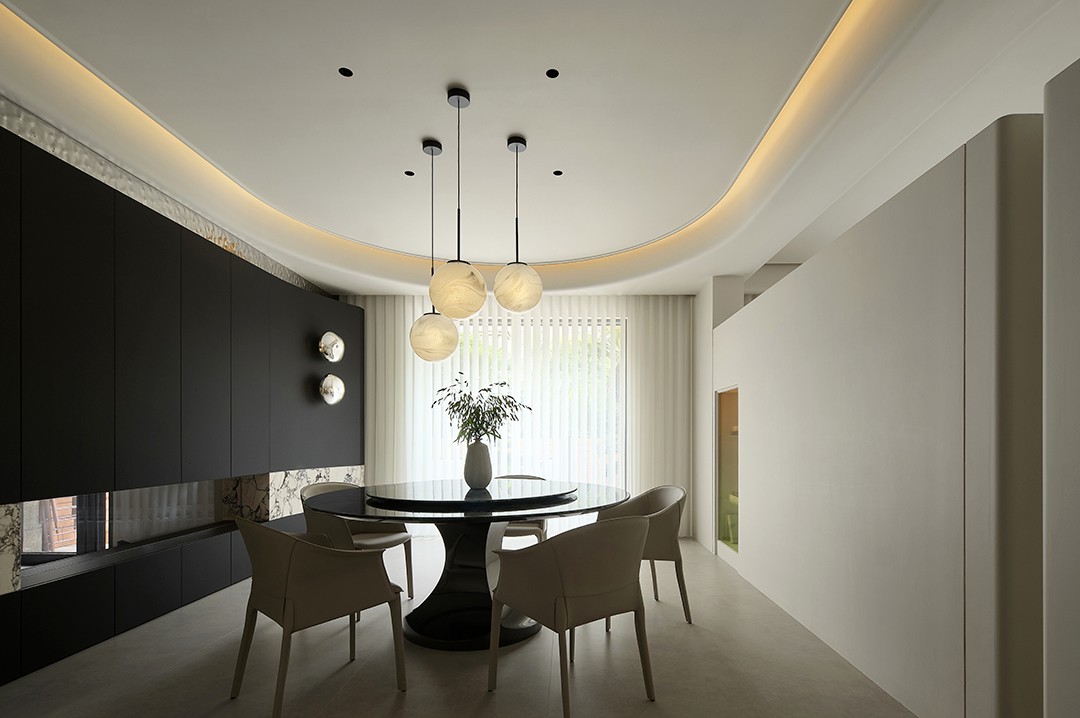
这座大楼的三楼是一个餐饮区,展示餐椅和餐桌。除了地板的设计外,建筑师还使用水泥地板、裸露砖、预制混凝土和木材等材料来营造一种纯净的氛围,使产品成为这个展厅的主要关注点。
The third floor of this building is a food and beverage area displaying dining chairs and dining tables. In addition to the design of the floors, the architect used materials such as the cement floor, exposed brick, precast concrete and wood to deliver a pure atmosphere where the product becomes the main attention of this showroom.
 举报
举报
别默默的看了,快登录帮我评论一下吧!:)
注册
登录
更多评论
相关文章
-

描边风设计中,最容易犯的8种问题分析
2018年走过了四分之一,LOGO设计趋势也清晰了LOGO设计
-

描边风设计中,最容易犯的8种问题分析
2018年走过了四分之一,LOGO设计趋势也清晰了LOGO设计
-

描边风设计中,最容易犯的8种问题分析
2018年走过了四分之一,LOGO设计趋势也清晰了LOGO设计


 PintereAI


