Sapeurs Pompiers de la Baule
2012-06-04 00:00
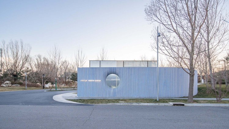
架构师提供的文本描述。干预中心沿着道路以一种独特的形状延伸,以一个稍微明亮的棱镜的形式出现,它是用有邮票和染色的粗混凝土制成的,在那里挖出了水泥石。其特点是其甲基丙烯酸酯表皮在白昼呈白色,夜间明亮。这是一种非常有效的光衍射材料。
Text description provided by the architects. The intervention centre stretches along the road in a unique shape and appears in the form of a slightly bright prism made in stamped and stained crude concrete where empochements were dug. The particular feature is their methacrylat epidermis which appears white in day light and bright in the night. This is a very efficient material for light diffraction.
在较低的外观,有一个溢出的玻璃盒与图18,这体现了控制站的位置。同样的建筑创作过程在整个项目中被再现。其原理非常简单,几乎是极简主义的,由暗块和釉面区域组成,排列在垂直条上,周围是光亮的抛光铝,或者是大的浅色区域。
Lower in the façade, there is an overflowing glass box with the figure 18 which materializes the position of the control station. The same architectural writing process is reproduced on the whole project. The principle is very simple, almost minimalist and made of dark masses and glazed areas arranged in vertical strips surrounded by shiny polished aluminum or in large tint areas.
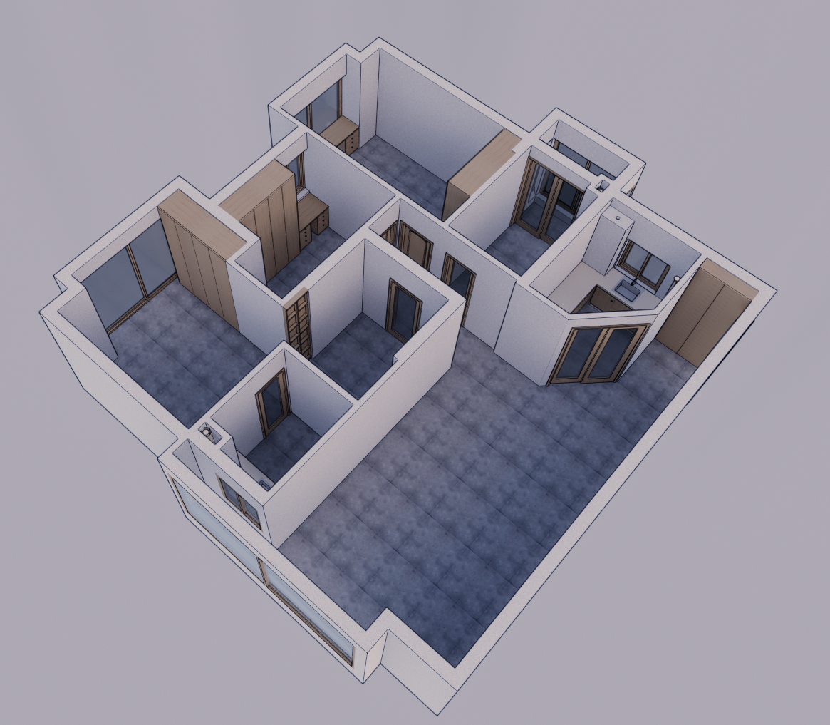
在这个项目的关键是,有一个宽敞的庭院,内衬白色油漆的正面,这很好地分布在建筑中的光线。其中的花园提供了一个避风港,是消防员休息或等待的理想场所。
In the crux of the project there is a generous patio lined with white painted facades which distribute well the light in the construction. The garden therein offers a piece of haven, ideal for firefighters’ breaks or waiting periods.
 举报
举报
别默默的看了,快登录帮我评论一下吧!:)
注册
登录
更多评论
相关文章
-

描边风设计中,最容易犯的8种问题分析
2018年走过了四分之一,LOGO设计趋势也清晰了LOGO设计
-

描边风设计中,最容易犯的8种问题分析
2018年走过了四分之一,LOGO设计趋势也清晰了LOGO设计
-

描边风设计中,最容易犯的8种问题分析
2018年走过了四分之一,LOGO设计趋势也清晰了LOGO设计


 PintereAI


