Grupo Sud Offices 57STUDIO
2016-01-18 13:00
© Caco Oportot
Caco Oportot


架构师提供的文本描述。Grupo Soud是将一家旧香水工厂改造成一个开放的工作场所,供4家公司控股,这些公司完全融入了营销、生产、设计和通信领域。该建筑位于圣地亚哥市,位于“意大利”社区,包括设计、艺术和装饰奢侈品商店。
Text description provided by the architects. Grupo Sud is the conversion of an old perfume factory into an open work space for a holding of 4 companies that are fully integrated in the marketing, production, design and communication areas. The building is located in the city of Santiago, in the "Italia" neighborhood that encompasses design, art and decoration luxury stores.
Perspective


该遗址宽20米,深75米,由一系列在不同时间点建造的仓库组成,这些仓库在同一时间被扩展和细分。该项目需要恢复空间的顺序并对其进行重组,以满足公司的需要,主要是办公室,大约有100人的劳动力。
The site, 20 meters wide by 75 meters deep, comprised a series of warehouses constructed at different points in time that had been expanded and subdivided throughout that same time. The project entailed the restoration of the sequence of spaces and their reorganization so as to serve the needs of the companies, mainly offices for a work force of about a hundred people.
© Caco Oportot
Caco Oportot


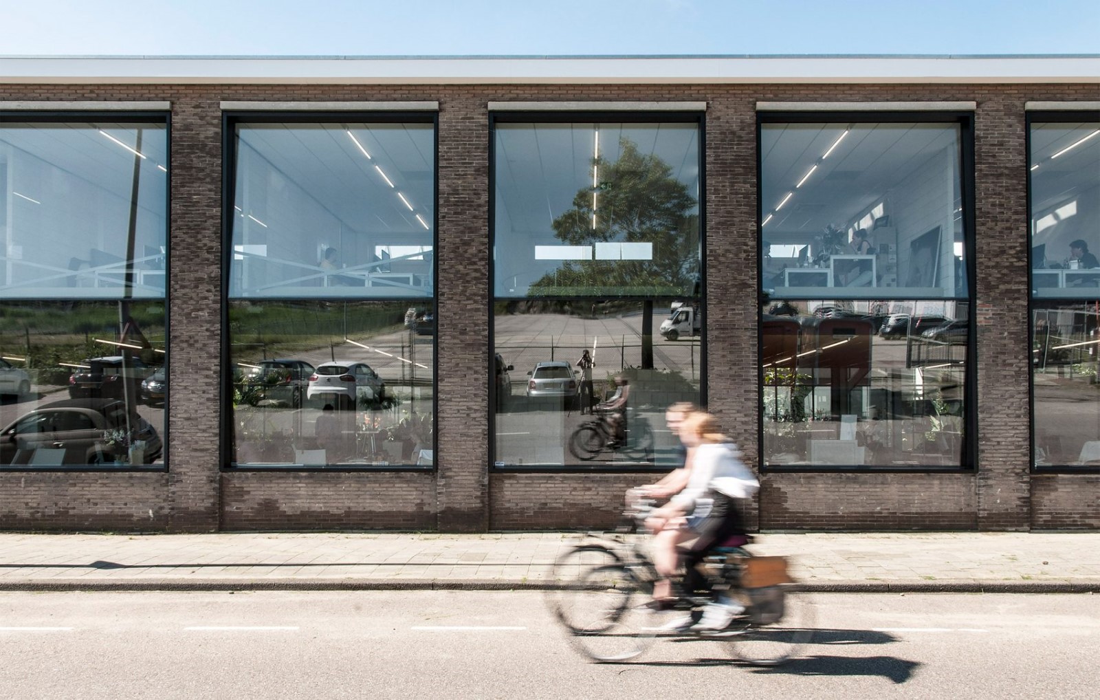
该项目的执行预算非常有限,而且只排了五个月的时间。决策必须谨慎和具有战略性。为了实现这一目标,提出了两项主要行动:删除无用的和重用现有的。移除和重用细分元素,恢复了不同仓库之间的通信,并带来了更多的流动性和更明亮的空间:集成和团队合作方法的理想环境。
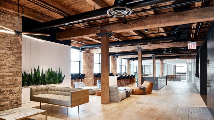
There was a very limited budget and a tight schedule of only five months for the project’s execution. Decisions had to be careful and strategic. In order to achieve this, two main actions were proposed: to remove what was useless and to reuse what existed. Removing and reusing the elements of subdivision restored the communication between the different warehouses and resulted in more fluid and brighter spaces: the ideal environment for an integrated and team work approach.
© Caco Oportot
Caco Oportot


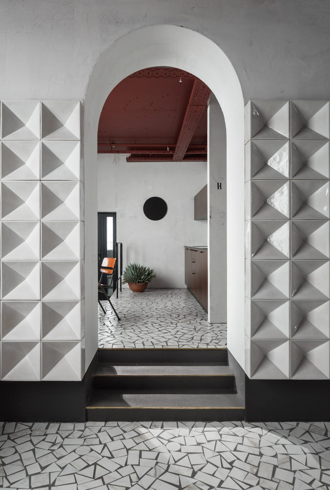
干预旨在揭示和对比新旧。长期厚厚的墙壁,纹理和高天花板是反对新的更轻和透明的元素,最小规模,以满足用户的需要。调色板是中性的,以保持安静和突出充裕的空间。白色,具有不同程度的光泽,被用来作为一个基础,统一和重新评价空间通过光。地板保持灰色,而一些口音是通过使用颜色或暴露砖层在墙上的。
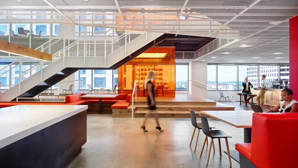
The intervention aimed to reveal and contrast the old and the new. Longstanding thick walls, textures and high ceilings are opposed to the new lighter and transparent elements, minimally scaled to satisfy the user’s needs. The color palette is neutral to maintain the quietness and to highlight the ample spaces. The white, with different levels of shine, was used as a foundation to unify and revalue the spaces through light. The floors were kept gray while some accents were incorporated on walls through the use of color or by revealing the brick layer.


Floor Plan


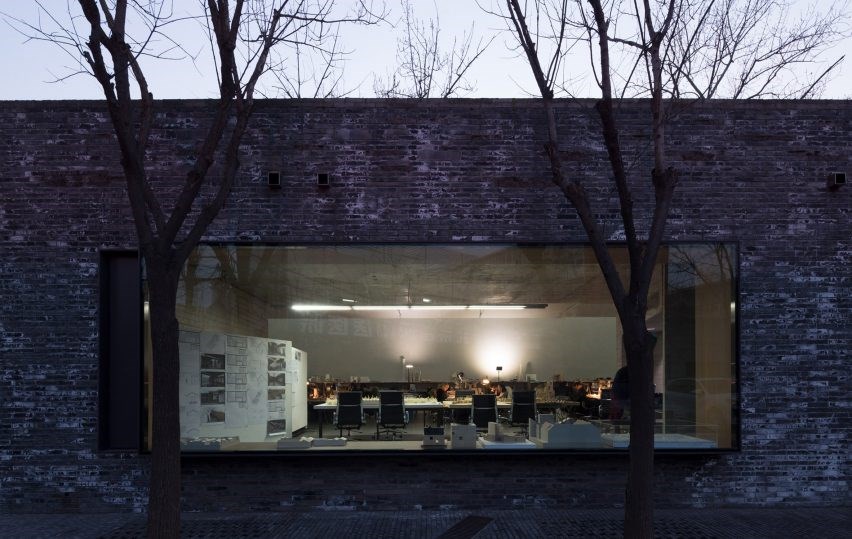
新的分割是由玻璃组成的,试图稀释边界,并将这些新元素的直线和定义的边缘与旧的不精确进行对比。新的气候和电力控制面板强调了镀锌金属,通过中立的白色背景有序地移动。这些家具和灯具都是由57STUDIO设计的,其背景是与回收空间相同的同一性和反差。
The new divisions were made of glass, seeking to dilute boundaries and to contrast these new elements of straight and defined edges to the imprecisions of the old. The new climate and electricity control panels were highlighted in galvanized metal, moving in an orderly fashion through the neutrality of the white background. Both the furniture and the lamps were designed by 57STUDIO following the same premise of identity and contrast over a recycled space as a backdrop.
© Caco Oportot
Caco Oportot


Architects 57STUDIO
Location Italia, Providencia, Providencia, Región Metropolitana, Chile
Category Offices Interiors
Area 1500.0 m2
Project Year 2015
Photographs Caco Oportot

 PintereAI


_james_jones.jpg)

