The Stealth Building WORKac
2016-11-09 12:00
采购产品客户/建筑经理奈特斯布里奇物业室内设计师/景观工程建筑公司机械/电气工程+集团咨询工程结构工程师罗伯特西尔曼协会照明设计师Tillotson设计协会恢复建筑师CTS集团艺术家,专栏资本迈克尔汉斯迈耶代码顾问CCBS咨询制造商装货.多规格少规格
Client/Construction Manager Knightsbridge Properties Interior Designer/Landscape WORK Architecture Company Mechanical/Electrical Engineer Plus Group Consulting Engineering Structural Engineer Robert Silman Associates Lighting Designer Tillotson Design Associates Restoration Architect CTS Group Artist, Column Capitals Michael Hansmeyer Code Consultant CCBS Consulting Manufacturers Loading... More Specs Less Specs
© Bruce Damonte
布鲁斯·达蒙特


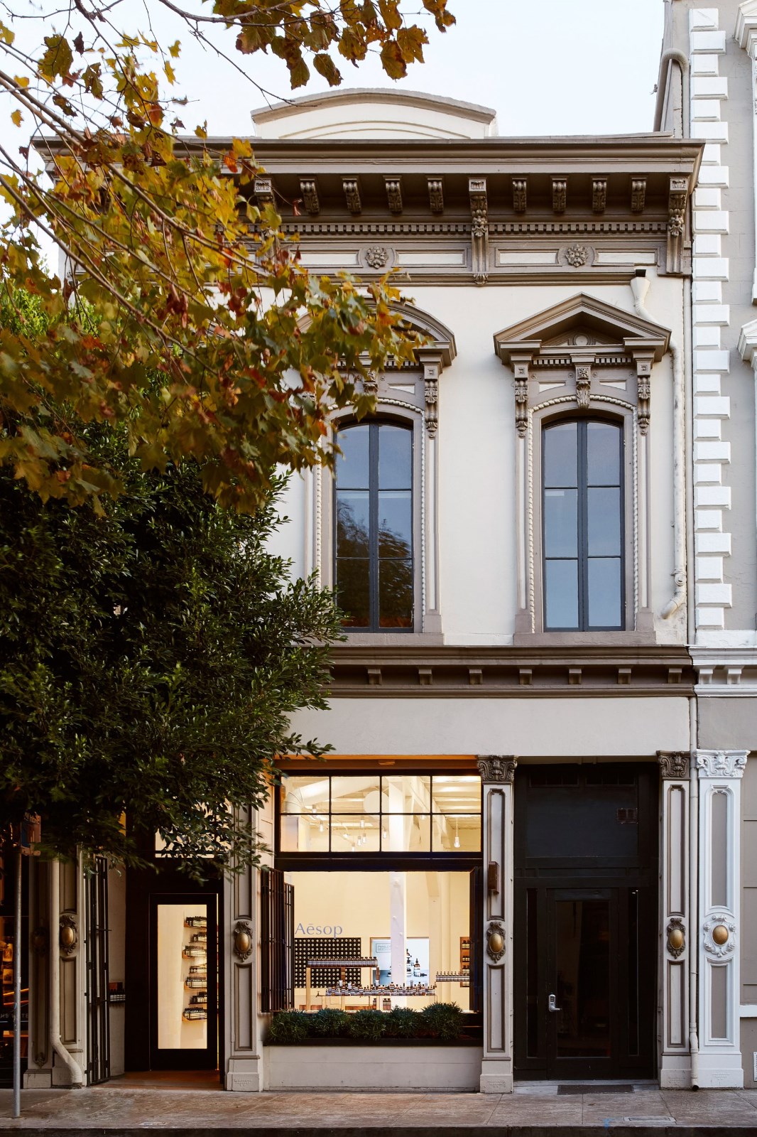
架构师提供的文本描述。这一住宅开发包括一个完整的肠道改造和新的建筑背后的纽约最美丽和最古老的铸铁外观。它需要一个认真的方法,以融合当代建筑与历史保护。纽约市地标委员会要求所有屋顶加设不可见。然而,这座建筑位于一个高度清晰可见的拐角处,街对面有一栋低的两层楼。这意味着,这座建筑的屋顶几乎在三个街区外就可以看到。
Text description provided by the architects. This residential development consists of a complete gut renovation and new construction behind one of New York’s most beautiful and oldest cast-iron facades. It required a careful approach to the blending of contemporary architecture with historic preservation. New York City’s Landmarks Commission required any rooftop addition to be invisible. The building, however, is located on a highly-visible corner with a low, two-story building across the street. This meant that the building’s roof was visible from almost three blocks away.
© Bruce Damonte
布鲁斯·达蒙特


Roof Evolution Diagram
顶板演化图


© Bruce Damonte
布鲁斯·达蒙特


从建筑物可见的最远点追踪视力的圆锥体,工作交流利用了3个屋顶投影来掩盖额外的大部分:隔壁的历史上的凯瑞建筑的三角形,以及建筑本身顶部的圆形和废弃的电梯舱壁。由这三个投影创建的“阴影”为新增屋顶创建了一个相当大的区域,并为新屋顶提供了独特的角度表。结果是雕塑的形式,同时也是在下面的街道上完全看不到的。
Tracing the cone of vision from the furthest point from which the building was visible, WORKac utilized three rooftop projections to mask the bulk of an addition: the triangular pediment of the historic Carey Building next door, and the circular pediment and an abandoned elevator bulkhead at the top of the building itself. The “shadow” created by these three projections created a sizeable zone for the addition and the opportunity for a distinctive angled form for the new roof. The result is a sculptural form that is – at the same time – completely invisible from the street below.
Floor Plans
平面图


© Bruce Damonte
布鲁斯·达蒙特


对于公寓内部和公共区域,WORKAC创造了将自然启发的元素和系统与城市生活的新观念相结合的空间。从大厅的光滑绿色墙到二楼、六楼和七层宽敞的种植园和阳台,都强调了与户外的联系。在每套公寓内,卧室和起居室之间的“第三个空间”被创建在包含存储和浴室的空间的顶部。不到四英尺高,这“盆景公寓”配备了一个蒲团,座位区,和一个草药花园上方的厨房。它的主要特点是一个蕨类植物花园连接主淋浴下面。淋浴产生的蒸汽聚集在花园的玻璃墙上,给植物浇水。
For the apartment interiors and public area, WORKac created spaces that combine nature-inspired elements and systems with new ideas about urban living. From the tessellated green wall at the lobby to generous planters and balconies at the second, sixth and seventh floors, connections to the outdoors are emphasized. Within each apartment, a “third space” between bedrooms and living spaces is created at the top of the volume containing storage and bathrooms. Less than four-feet high, this “bonsai apartment” is outfitted with a futon, seating areas, and an herb garden above the kitchen. Its main feature is a fern garden connected to the master shower below. Steam from the shower collects on the glass walls of the garden and waters the plants.
© Bruce Damonte
布鲁斯·达蒙特


© Bruce Damonte
布鲁斯·达蒙特


这套顶层公寓将宿舍楼内的卧室和家庭房间与六楼新屋檐下的新娱乐和餐饮空间结合起来。一个与世隔绝的露台沉落在山墙后面,可以看到伍尔沃思大厦;旧的电梯舱壁被重新设计成一个热水浴缸。视觉锥所形成的角度所提供的高度允许后面的阁楼俯瞰市中心和自由塔。
The penthouse combines sleeping spaces and a family room within the old fifth floor of the building with new entertaining and dining spaces under the new roof at the sixth floor. A secluded terrace is sunken behind the pediment with views to the Woolworth Building; the old elevator bulkhead is repurposed with a hot tub. The height afforded by angle formed by the cone-of-vision allows for a rear mezzanine with views toward downtown and the Freedom Tower.
© Bruce Damonte
布鲁斯·达蒙特


1857年的外墙被完全修复。WORKAC选择的新的木炭颜色提到了这座建筑与其较轻的邻居进行深色对比的历史。由于这座建筑所有的科林西安专栏资本主义都被历史所遗忘,WORKAC与艺术家MichaelHansmeyer合作创作了新的版本。汉斯迈耶发明了一种电脑脚本,让科林斯命令中的经典花卉元素得以“断断续续”地“生长”,从而形成了一种新的设计,它遵循了旧的比例,但却由明显的新形式和特性组成。与屋顶加注一样,这些大写首字母乍看上去相当普通;只有经过仔细观察,才能清楚地看出现代设计战略注入的隐秘策略。
The 1857 façade is completely restored. The new charcoal color chosen by WORKac references the building’s history of being painted in dark contrast with its lighter neighbors. As all of the building’s Corinthean column capitols had been lost to history, WORKac collaborated with the artist Michael Hansmeyer to create new versions. Hansmeyer created a computer script that allowed the classical floral elements of the Corinthean order to “grow” fractally, resulting in a new design that adheres to the old proportions but is composed of clearly new forms and idiosyncrasies. Like the rooftop addition, these capitals at first glance appear quite ordinary; it is only on closer inspection that the stealthy strategy of strategic injection of contemporary design becomes clear.
© Bruce Damonte
布鲁斯·达蒙特


Architects WORKac
Location New York, NY, United States
Category Apartments
Team Dan Wood, FAIA, Amale Andraos (principals); Sam Dufaux (associate principal); Karl Landsteiner (construction administration project architect); Chris Oliver (design project architect); Maggie Tsang, Timo Otto, Patrick Daurio
Area 14000.0 ft2
Photographs Bruce Damonte
Manufacturers Loading...


.jpg)
