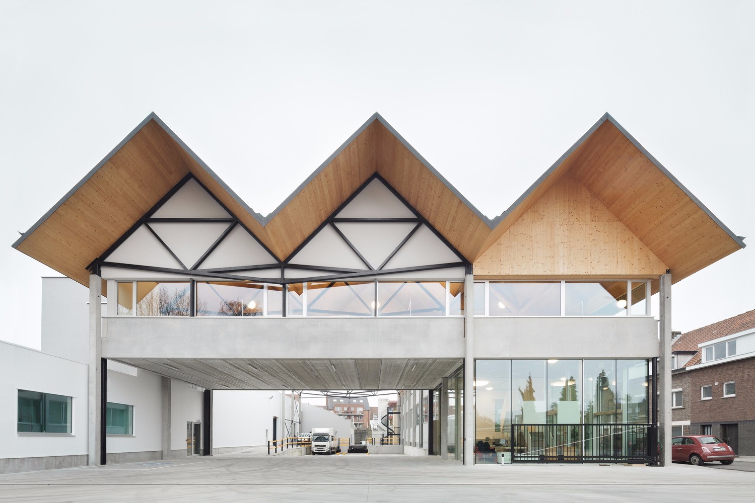
Wiadomości Wrzesinskie Editorial Office Ultra Architects
2016-12-20 05:00
© Jeremi Buczkowski
c.Jeremi Buczkowski


架构师提供的文本描述。Wiadomości Wrzesińskie(Wrzesińskie News)编辑部的三层楼的形式是由其功能规划和低预算决定的。露台式剪影是对出版社各种活动的不同需求的回应。同时,减少曲面,优化功能程序,降低投资成本。
Text description provided by the architects. The form of a three-storeyed building for Wiadomości Wrzesińskie (Wrzesińskie News) editorial office was determined by its functional program as well as a low budget. Terrace-shaped silhouette is an answer to different needs of publishing house's various activities. At the same time reduction of surface and optimization of functional program let to reduce costs of investment.
© Dawid Majewski
c.Dawid Majewski


地下设有客服、设施会议室、自助餐厅和设有自行车停车场的小型停车场。由于该楼层功能最复杂,其面积大于下一层。由于它的公共功能,底层也是办公大楼最开放的部分-它的正面是玻璃和封闭的小屋顶,创造了一个欢迎的入口区域。
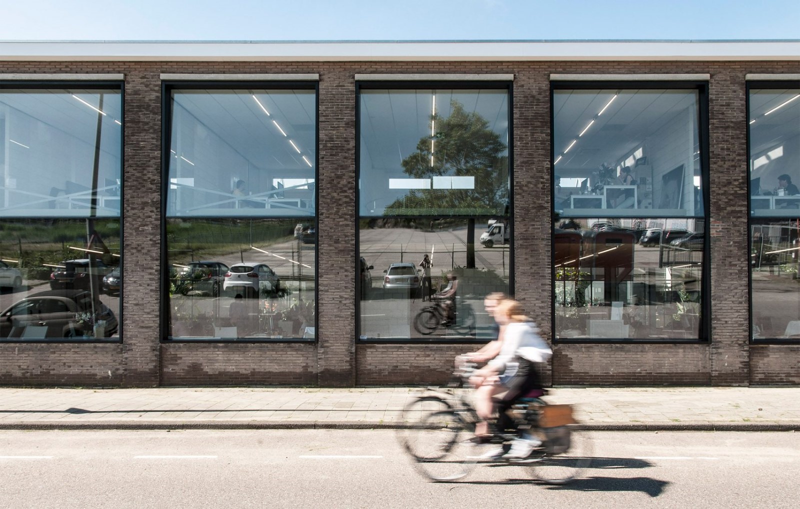
On the ground floor there are customer service, conference room with facilities, cafeteria and a small car park with parking place for bicycles as well. Because of the most complex functional program of this storey its area is bigger than next floors. Due to its public function, the ground floor is also the most open part of the office building – its facade is glazed and enclosed with a small roof that creates a welcoming entrance area.
Ground Floor Plan


一楼,面积略小于一楼,可容纳编辑室。设计大楼的这一部分是最大的挑战,因为我们必须结合两个不同的假设:第一个是新闻业的公开性和透明度,第二个是与这项工作的具体性质有关的假设。记者们大部分的工作时间都花在电脑显示器前,为了给他们提供一个舒适的环境,我们不得不限制进入室内的阳光量。
First floor, with a slightly smaller area than the ground floor, accommodates editorial rooms. Designing this part of the building was the biggest challenge, because we had to combine two different assumptions: the first is openness and transparency of journalism, the second one is related to the specific nature of this job. Journalists spend most of their work time in front of computer monitors, and to provide them with a comfortable environment we had to limit the amount of sunlight entering the interior.
© Przemysław Turlej
(ław Turlej)


© Jeremi Buczkowski
c.Jeremi Buczkowski


这层楼的北面有编辑办公室、小饭区和会议室。所有这些房间都可以进入室外露台。有记者办公桌的空地位于楼层的南部。为了保护内部免受阳光的影响,我们决定在我们的项目基础上,用带有孔的铝制复合板覆盖前立面。穿孔的图案受到报纸专栏的启发。这样,立面就可以成为建筑物的视觉标识。
On the northern side of this floor are located editors' offices, small dining area and a conference room. All these rooms have access to outside terrace. Open space with journalists' desks is located on the southern part of the storey. To protect interiors against the sunshine we decided to cover front elevation with perforated screens made of aluminium composite panels with holes cut on the basis of our project. The pattern of a perforation was inspired by newspaper's columns. In this way an elevation can be a visual identity of a building.
1st Floor Plan
一楼图则


2nd Floor Plan
二楼图则


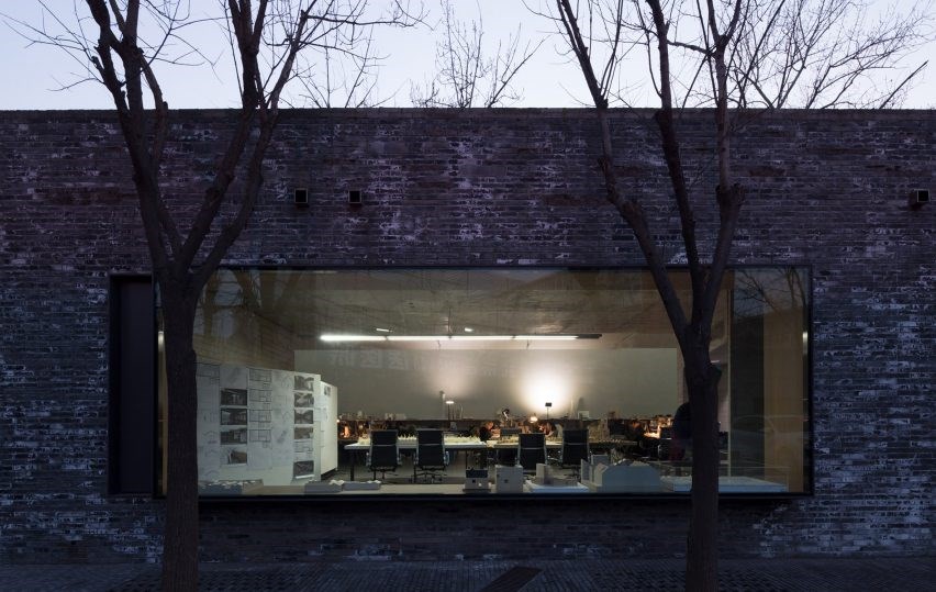
有穿孔的外墙,在一天之内,在天黑后几乎是看不见的,提供了防光的保护。只要工作持续下去,灯光照亮的建筑物就会一直活到深夜。我们选择这种包层也是因为未来的扩展计划。网格面板可以无缝连接旧的和新的部分的建筑物,同时仍然保持其当代外观。
The perforated façade, that during a day provides protection against light, after dark is almost invisible. Illuminated building is alive late into the night, so long as the work lasts. We chose this kind of cladding also because of extensions plans for the future. Mesh panels enable seamlessly junction of older and new part of a building while still maintaining its contemporary look.
© Dawid Majewski
c.Dawid Majewski


大楼二楼设有互联网电视演播室、小型客房和技术基础设施。从观景台上可以欣赏到城市的天际线。
The second floor of a building accommodates Internet television studio, small guest room and technical infrastructure. From the observation deck one can admire the city skyline.
© Jeremi Buczkowski
c.Jeremi Buczkowski


© Jeremi Buczkowski
c.Jeremi Buczkowski


由于楼盘的梯级形状,我们得到了覆盖着绿色植物的外部空间。他们在为工人创造娱乐场所的同时,也使建筑更加环保。绿色植物是一种天然的空气过滤器,它吸收雨水,减少排入城市下水道的水量。
Thanks to terraced shape of building's block we received exterior spaces that is covered with greenery. They create recreational areas for workers while at the same time they cause that the building is more environmentally friendly. Greenery is a natural air filter and it absorbs rainwater reducing the amount of water discharge to municipal sewers.
© Skyflash
© Skyflash


产品描述:建筑的南立面覆盖着穿孔的屏幕,以保护内部免受阳光的照射。这些筛子是在我们的项目基础上用有孔的铝制复合板制成的。穿孔的图案受到报纸专栏的启发。这样,主立面作为建筑物的视觉标识。穿孔的正面,它在一天内提供光的保护,在黑暗之后几乎是看不见的,你可以看到里面发生了什么。灯火通明的建筑一直延续到深夜,看上去就像一盏大灯笼。
Product Description. Southern facade of the building is covered with perforated screens to protect interiors against the sunshine. These screens are made of aluminium composite panels with holes cut on the basis of our project. The pattern of a perforation was inspired by newspaper's columns. In this way main facade acts as a visual identity of a building. The perforated facade, that during a day provides protection against light, after dark is almost invisible and one can see what is happening inside. Illuminated building is alive late into the night and looks like a big lantern.
© Przemysław Turlej
(ław Turlej)


Architects Ultra Architects
Location Września, Dworcowa 1, 62-302 Września, Poland
Category Office Buildings
Architects in Charge Marcin Kościuch, Tomasz Osięgłowski
Area 406.0 m2
Project Year 2016
Photographs Przemysław Turlej, Jeremi Buczkowski, Dawid Majewski, Skyflash
Manufacturers Loading...

 PintereAI


