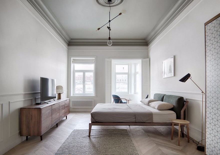
Lounge at Strigino International Airport Nefa Architects
2018-03-24 12:00
地区机场是俄罗斯领先的机场控股公司。今天的机场包括Ekaterinburg机场(Koltsovo)、Samara机场(Kurumoch)、Rostov on-Don机场和Nizhny Novgorod机场(Strigino)。
«Airports of Regions» is a leading airport holding company in Russia. Today the holding includes airports of Ekaterinburg (Koltsovo), Samara (Kurumoch), Rostov-on-Don and Nizhny Novgorod (Strigino).
2016年,在Strigino国际机场建造了一个新的客运大楼,NEFA建筑师设计了一个商务休息室。这个项目是业主与建筑局之间富有成果的合作的延续。目前的挑战是为乘坐国内航空公司的商务舱乘客创造一个舒适的现代空间。
Construction of a new passenger terminal at Strigino International Airport was completed in 2016, and Nefa Architects designed a business lounge. This project was a continuation of the fruitful cooperation between the holding and the architectural bureau. The challenge was to create a modern comfortable space for business-class passengers using domestic airlines.
空间组织:商务休息室位于大楼内部,位于航站楼的“洁净区”。的总面积超过300平方米,可容纳77个座位。
Organization of space: The business lounge is located inside the building, in the "clean zone" of the terminal. The total area of the lounge exceeds 300 square meters; its passenger capacity is up to 77 s
该空间可容纳接待区、餐厅和两个软区。空间分区为所有乘客提供最大的舒适。如果一个代表团要飞,你可以呆在一张普通的桌子上,也可以呆在一个大沙发上。对于那些想要隐私和沉默的人来说,在壁龛里有一些地方。左翼包括一个时尚的媒体区,餐厅位于商务休息室的右侧。
The space accommodates a reception area, a restaurant and two soft zones. Space zoning provides maximum comfort for all passengers. If a whole delegation is going to fly, you can stay at a common table or on a large sofa. For those who want privacy and silence, there are places in niches. The left wing includes a stylish media zone, and the restaurant is on the right side of the business lounge.
设计理念:的主要思想设计理念是创造一个具有自己的规模和色彩的大型工业城市的形象。艺术形象是基于鲜明的红色和几乎黑色的蓝色金属表面的对比组合。建筑师们从克里姆林宫墙上的旧砖块的深红色、勃艮第色、棕色调色板开始,这为诺夫哥罗德的色彩奠定了基调。城市形象的第二个明显主题是它强大的工业、机器和机械的生产场所,所以这个项目的主要材料是钢铁。
Design Concept: The main idea of the design-concept is to create the image of a large industrial city, which has its own scale and color. The artistic image is based on the contrasting combination of a bright red-ocher color of the patina and an almost black surface of the blued metal. Architects started from the dark red, burgundy, brown palette of the old bricks of the Kremlin wall, which sets the tone for the coloring of Nizhny Novgorod. The second obvious theme of the city`s image is its powerful industry, factory grounds where machines and mechanisms are produced, so the main material of the project is steel.
该项目的作者试图传达工业城市的形象,它的众多工厂和工厂,使用残酷的形式和材料在内地。这些是装饰在天花板上的管道和带有生锈的金属、混凝土桌子和面对氧化钢的单独家具。
The authors of the project tried to convey the image of the industrial city with its numerous factories and plants, using brutal forms and materials in the interior. These are trimming of pipes in the ceiling and individual furniture with the texture of rusty metal, concrete tables and facing with the oxidized steel.
照明解决方案:建筑物内缺乏窗户和日光,这使建筑人员努力寻找原来的照明解决方案-定制灯具是专门为该项目设计的。声学解决方案:
Lighting solutions: The lack of windows and daylight inside the building concentrated the architects` efforts on finding original lighting solutions - custom lamps were specially created for the project. Acoustic solutions:
为了增加乘客在软区的舒适度,使用了声学面板。该项目采用非标准材料和技术-钢氧化;个别工作室设计的灯具,定制项目。所有个别内饰、家具、灯具均由国内厂家生产。
For additional comfort of passengers in the soft zone acoustic panels were used. The project used non-standard materials and technologies – steel oxidation; individual studio-designed light fixtures, custom-made items. All individual interior items, furniture, lamps were produced by domestic manufacturers.
 举报
举报
别默默的看了,快登录帮我评论一下吧!:)
注册
登录
更多评论
相关文章
-

描边风设计中,最容易犯的8种问题分析
2018年走过了四分之一,LOGO设计趋势也清晰了LOGO设计
-

描边风设计中,最容易犯的8种问题分析
2018年走过了四分之一,LOGO设计趋势也清晰了LOGO设计
-

描边风设计中,最容易犯的8种问题分析
2018年走过了四分之一,LOGO设计趋势也清晰了LOGO设计



 PintereAI


