Chelsea Apartment BoND
2018-12-20 12:00
架构师提供的文本描述。曼哈顿西切尔西一片漆黑、四分五裂的室内,由建筑师丹尼尔劳奇沃格和诺姆德维尔(邦德)将其改造成一个明亮、阁楼般的空间。这套公寓位于1910年一座小型公寓楼的三楼,两人于2017年春天购得这套公寓。
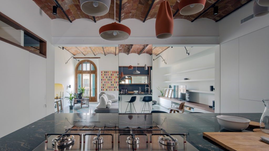
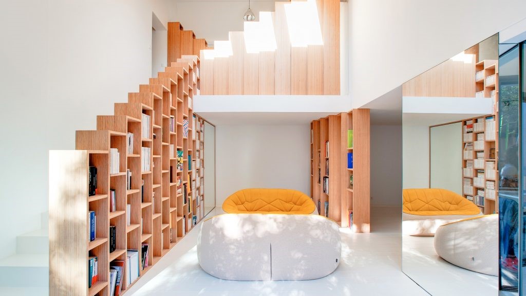
Text description provided by the architects. A dark and divided interior in West Chelsea, Manhattan, was transformed into a bright, loft-like space by architects Daniel Rauchwerger and Noam Dvir (BoND). The apartment, which the architecture duo acquired in spring 2017 occupies the third floor of a small 1910 apartment building.
Text description provided by the architects. A dark and divided interior in West Chelsea, Manhattan, was transformed into a bright, loft-like space by architects Daniel Rauchwerger and Noam Dvir (BoND). The apartment, which the architecture duo acquired in spring 2017 occupies the third floor of a small 1910 apartment building.
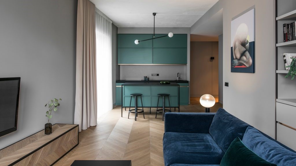
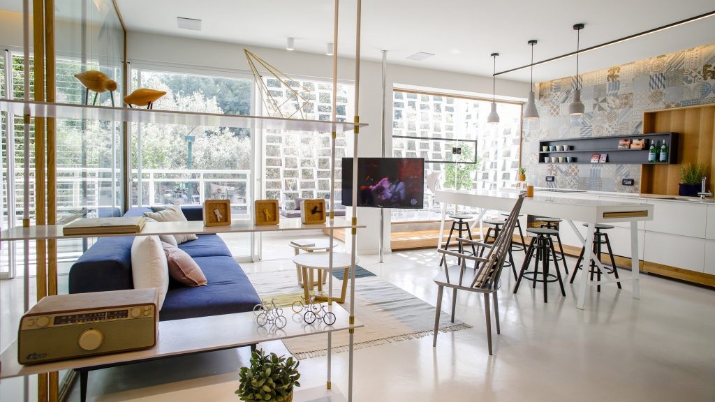
这套公寓的总高度为11.5英尺乘50英尺(520 SF),这套公寓的布局在纽约的许多战前公寓中是典型的。类似于“铁路公寓楼”,它的形状是一个狭长的长方形,从建筑的前后两侧吸收光线。在邦德介入之前,在最初的布局中,这套公寓被划分为三个不同的部分:客厅、卧室和一条连接厨房和浴室的封闭走廊。建筑师们拆除了这些隔间,创造了一个连续的空间,庆祝公寓的拉长比例,并最大限度地提高了深度的错觉。通过一系列从厨房线性延伸到卧室的内置照明装置,以及突出空间长度而不是宽度的木地板图案,进一步增强了强制透视图。这一翻修在西面墙壁(公寓的公用设施、服务和硬件位于其中)和东墙(为艺术展示留出空白)之间形成了明显的区别。
Measuring 11.5 by 50 feet total (520 sf), the apartment’s layout is typical to many prewar apartments in New York. Similar to the “Railroad Apartment,” it takes the shape of a long and narrow rectangle that draws light from the building’s front and rear sides. In its original layout, prior to BoND’s intervention, the apartment was divided into three distinct sections: a living room, a bedroom, and a closed-off corridor connecting the two - which housed the kitchen and the bathroom. The architects removed these partitions to create one continuous space, celebrating the apartment’s elongated proportions and maximizing the illusion of depth. The forced perspective is further enhance by a series of inset lighting fixtures that extend linearly from the kitchen into the bedroom, and a wood floor pattern which highlights the length rather the width of the space. The renovation created a clear distinction between the western wall - along which the apartment's utilities, services and hardware are located - and the eastern wall, which was left blank to provide room for art display.
Measuring 11.5 by 50 feet total (520 sf), the apartment’s layout is typical to many prewar apartments in New York. Similar to the “Railroad Apartment,” it takes the shape of a long and narrow rectangle that draws light from the building’s front and rear sides. In its original layout, prior to BoND’s intervention, the apartment was divided into three distinct sections: a living room, a bedroom, and a closed-off corridor connecting the two - which housed the kitchen and the bathroom. The architects removed these partitions to create one continuous space, celebrating the apartment’s elongated proportions and maximizing the illusion of depth. The forced perspective is further enhance by a series of inset lighting fixtures that extend linearly from the kitchen into the bedroom, and a wood floor pattern which highlights the length rather the width of the space. The renovation created a clear distinction between the western wall - along which the apartment's utilities, services and hardware are located - and the eastern wall, which was left blank to provide room for art display.
翻新利用定制设计细节与现成产品结合使用。例如,壁炉是公寓的原始(和功能)固定装置。它的砖芯由由不锈钢制成的切割和折叠的薄片包裹,该薄片在唐人街的本地车间被委托,给房间提供了当代的边缘。使用由黄铜制成的照明器材来回应金属效果,该照明器材悬挂在餐桌上方。厨房的特色是将宜家机柜与集成电器和定制大理石板组合在一起。
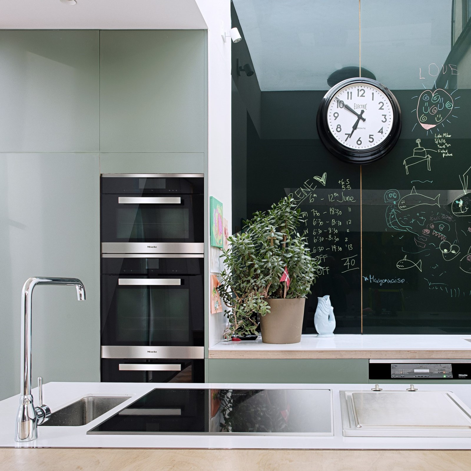
The renovation makes use of custom design details combined with off-the-shelf products. The fireplace, for example, is an original (and functioning) fixture of the apartment. Its brick core is wrapped by a cut-and-folded sheet made of stainless steel, which BoND commissioned at a local workshop in Chinatown, giving the room a contemporary edge. The metallic effect is echoed by use of a lighting fixture made of brass, which hangs above the dining table. The kitchen features “hacked” IKEA cabinets combined with integrated appliances and a custom marble slab.
The renovation makes use of custom design details combined with off-the-shelf products. The fireplace, for example, is an original (and functioning) fixture of the apartment. Its brick core is wrapped by a cut-and-folded sheet made of stainless steel, which BoND commissioned at a local workshop in Chinatown, giving the room a contemporary edge. The metallic effect is echoed by use of a lighting fixture made of brass, which hangs above the dining table. The kitchen features “hacked” IKEA cabinets combined with integrated appliances and a custom marble slab.
邦德的其他项目-建筑和媒体办公室-包括一个关于国家图书馆建筑和历史的开创性展览,以及在纽约的住宅和零售项目。
Other projects by BoND - an office for architecture and media - include a seminal exhibition about the architecture and history of national libraries, and residential and retail projects in New York.
Other projects by BoND - an office for architecture and media - include a seminal exhibition about the architecture and history of national libraries, and residential and retail projects in New York.
 举报
举报
别默默的看了,快登录帮我评论一下吧!:)
注册
登录
更多评论
相关文章
-

描边风设计中,最容易犯的8种问题分析
2018年走过了四分之一,LOGO设计趋势也清晰了LOGO设计
-

描边风设计中,最容易犯的8种问题分析
2018年走过了四分之一,LOGO设计趋势也清晰了LOGO设计
-

描边风设计中,最容易犯的8种问题分析
2018年走过了四分之一,LOGO设计趋势也清晰了LOGO设计


 PintereAI


