PintereAI


空予设计 X 半见 中国古色谱解构北欧极简 首
2025-07-21 09:33


许慎《说文解字 · 见部》有言:
覛,衺视也。
从目,从見。
莫狄切。
半见也。
清末沈寿《雪宦绣谱》亦有言,
“半见”为传统色彩名。
黄而微青,若隐若现
恰似日光出现
恰如植物新芽
淡雅含蓄
隐约朦胧
空予设计以“中间色”为基底
为过渡,为载体
游走于画纸之上
推开每一扇未知的门
用空间的组成物去象征居者生命的生长变化


半见之中,观察自然,观察自我,观察生命,感受点滴变化的不同体验。这是设计师为居者铺开的立体画纸,传统色彩由此焕新;以门为卷,居者以未知为生活增色添物,再构筑丰满与个性。
鹅黄、紫芋,磨砂玻璃与实木隔断,生起朦胧意境,虚实相生。黑白与绒面交织,转折堆叠的手法,各有归位,各有可能。仿佛春回大地,
万物复苏,生长无限,想象亦无限。

窗与窗对望

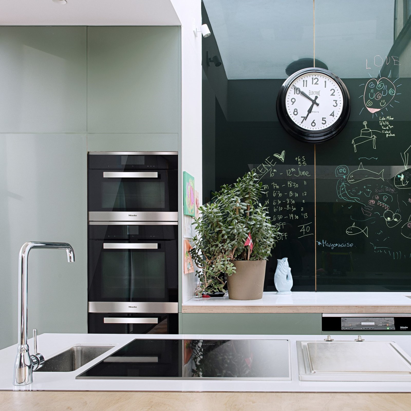
设计保留原始结构并拆除飘窗,餐厨区与客厅在同一个平面上相望,大窗与小窗对照,让光自在流动,通透洁净,简单柔和。入户往右即为餐厨区,它承载了居者更多的时间以及更具象化的幸福。设计师对此做了较多收纳设计——悬空式壁橱,防止藏污纳垢;折角型灶台,可沥水;堆叠拼接橱柜,记录岁月的点滴——线条是趣味的引导者,翻阅时光,是居者生命参与的见证。
The design retains the original structure and removes the floating window, the dining area and living room look at each other on the same plane, and the contrast between the large window and the small window allows the light to flow freely, which is transparent, clean, simple and soft. To the right of the entrance is the dining and kitchen area, which carries more time and more figurative happiness of the residents. Designers have made more storage designs - hanging closets to prevent dirt from hiding; folded corner cooktop to drain water; stacked and spliced cabinets to record the years - lines are the guides of fun, and flipping through time is the witness of the residents life participation.


小而灵动的用餐区,放置于鸽子画作之下。鸽子寓意友谊、和平、自由平等,也暗示情感专一;淡紫色的背景孕育着智慧、浪漫、空灵,静谧与热烈,凭借直觉力量而对撞。它呼应着生命中发生的一切,如那把曲折而上的椅子,弯绕的矛盾也将融化于深邃时光里。
The small but dynamic dining area is placed under the dove painting. The dove symbolizes friendship, peace, freedom and equality, and also suggests emotional exclusivity; the mauve background nurtures wisdom, romance, ethereality, and the clash of quiet and passion with the power of intuition. It echoes everything that happens in life, like the chair that twists and turns upward, and the curved conflicts will melt in the deep time.


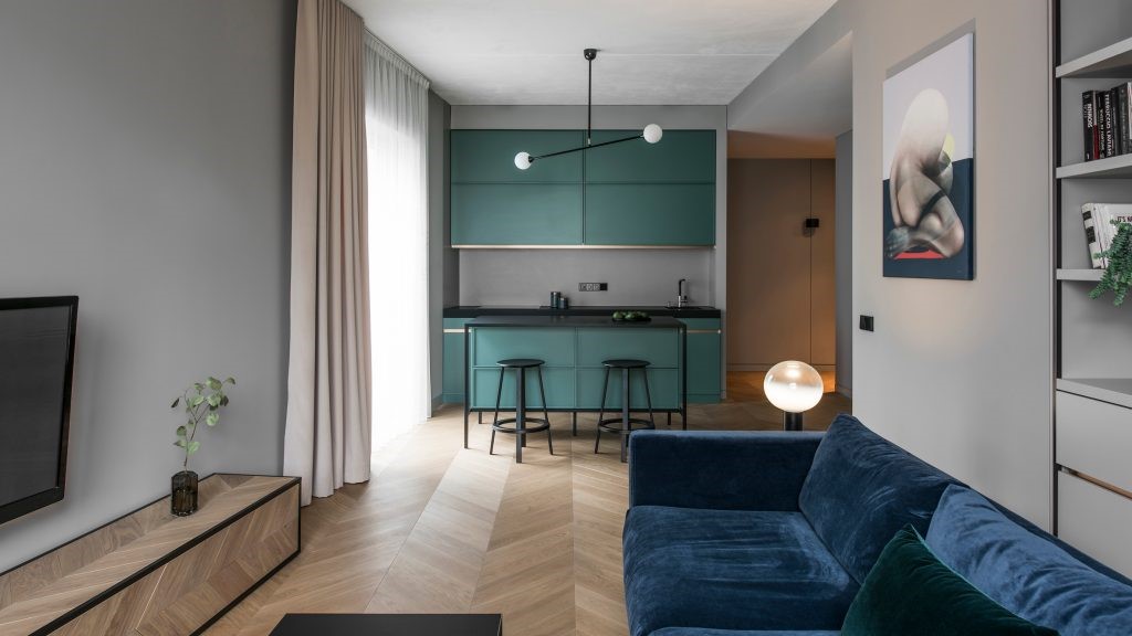
空间减少隔断,随着光影转向客厅区域,大面积落地窗以及延伸出的小露台,让整个空间于“若隐若现”中渐渐浮出画卷。皮质沙发,玻璃茶几,羊绒地毯,组成客厅一角;是孩子成长的天地,是亲子互动的乐园,也是“躺平”的基地。
The space reduces the partition, and as the light and shadow turn to the living room area, the large floor-to-ceiling windows and the extended small terrace make the whole space gradually emerge from the picture in the “hidden”. Leather sofa, glass coffee table and cashmere carpet form a corner of the living room; it is a world for children to grow up, a paradise for parent-child interaction, and a base for “lying flat”.


设计将原本的电视墙做了隔断又拆分重组,与实木拼接,附上绒黄色的烤漆,内嵌磨砂玻璃,朦胧婉约的意境,继续呼应着壁画、紫砖等空间里的物体......同时,定制可移动的电视架,更实用便利。
The design of the original TV wall to do the partition and split reorganization, and solid wood splicing, attached to the velvet yellow baking paint, embedded frosted glass, hazy euphemistic mood, continue to echo the mural, purple brick and other objects in the space ...... At the same time, customized removable TV stand, more practical and convenient.


“门”的世界
过道,像一条诱人的洞穴,所有声响皆从内心而来;进入其中,找到它,然后坠入斑斓的梦境。电视墙隔断之后的客房,也是居者放空思考的角落;当阳光穿过罗马帘,模糊界限,去感受跃然纸上的丰富画像,去感受“隐退消失般”的无人之境。
The corridor is like an inviting cave, where all sounds come from inside; enter it, find it, and fall into a colorful dream world. The guest room behind the TV wall is also a corner for the residents to relax and think; when the sunlight passes through the Roman curtains, blurring the boundaries, to feel the richness of the picture on the paper, to feel the no-mans-land of “retreating and disappearing”.


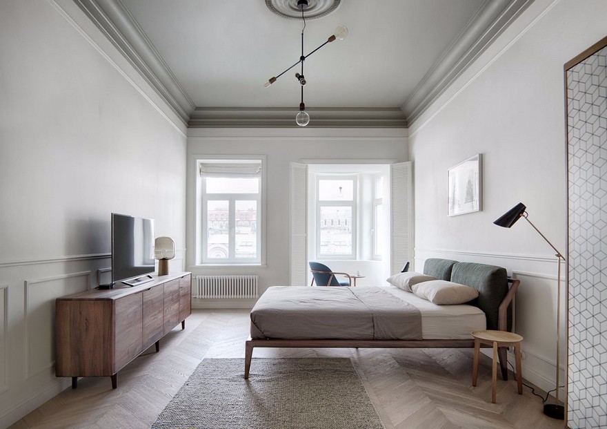
简单,是主卧的核心。两把木质椅代替传统床头柜,用喜欢的方式储存日常;亲肤白色与绒面布艺、木质肌理相搭,宁静感悄然弥漫。而居者将在此氛围里,为生活续写其他色彩。
Simplicity is at the heart of the master bedroom. Two wooden chairs replace the traditional nightstand, storing everyday in a favorite way; skin-friendly white matches with suede fabric and wood texture, and a sense of serenity quietly pervades. And in this atmosphere, the residents will continue to write other colors of life.


滑动查看

平面图

项目资料
项目名称 Name | 半见
项目地址 Location | 重庆渝北
项目类型 Program | 住宅
设计公司 Design firm | 空予设计
主案设计 Chief Designer | 项涛mils 羽西
项目面积 Area | 110㎡
完工时间 Completion time | 2024.1
摄影团队 Photograph | 飞飞


项涛mils
空予设计工作室 主理人
空予设计
Kong Yu Design Studio,于2017年成立。秉承“设计服务于人与生活的态度”,是集室内空间设计、软装设计、平面设计及生活美学设计服务为一体的综合性工作室。
团队以真正的个性为基石,以实现设计平衡为信,希望通过自身的设计素养,品味运用,生活态度分享更多美好的初心,去满足和解决客户不同的设计需求。
部分获奖荣誉
2020 红棉奖 室内设计奖
2020 中国私宅设计年度评选重庆top10设计师/机构
2021 私宅设计大奖城市榜top10
2021 营造家奖年度设计top500
2021 IHIDA国际人居空间设计奖 年度十佳住宅空间
2021 40under40中国(重庆)设计杰出青年
2022 私宅设计大奖 全国top100作品奖
2023 金案奖全国优胜奖
2024 红棉设计奖 优秀雅居空间设计奖
2024 ICs色彩空间设计奖 年度优秀色彩空间设计


推荐作品

相关文章
-
2018年走过了四分之一,LOGO设计趋势也清晰了LOGO设计
-
2018年走过了四分之一,LOGO设计趋势也清晰了LOGO设计
-
2018年走过了四分之一,LOGO设计趋势也清晰了LOGO设计