新作|苏捷 胡同儿“艳遇” 首
2024-11-14 17:14
This is a spatial design description of a paint shop that exudes the charm of Beijing. With frankness and humor, it gives the paint shop a warm and down-to-earth atmosphere.
The Story Society of Color
我们索性把地面、墙面用多变的艺术涂料表现成暖色的木质气息,瞅着那么“柔和”。
每一个独立的空间装饰,都是我们精心布置的艺术涂料的超级大色卡,它们不仅承载着色彩的魅力,更把材质的韵味展现得淋漓尽致。
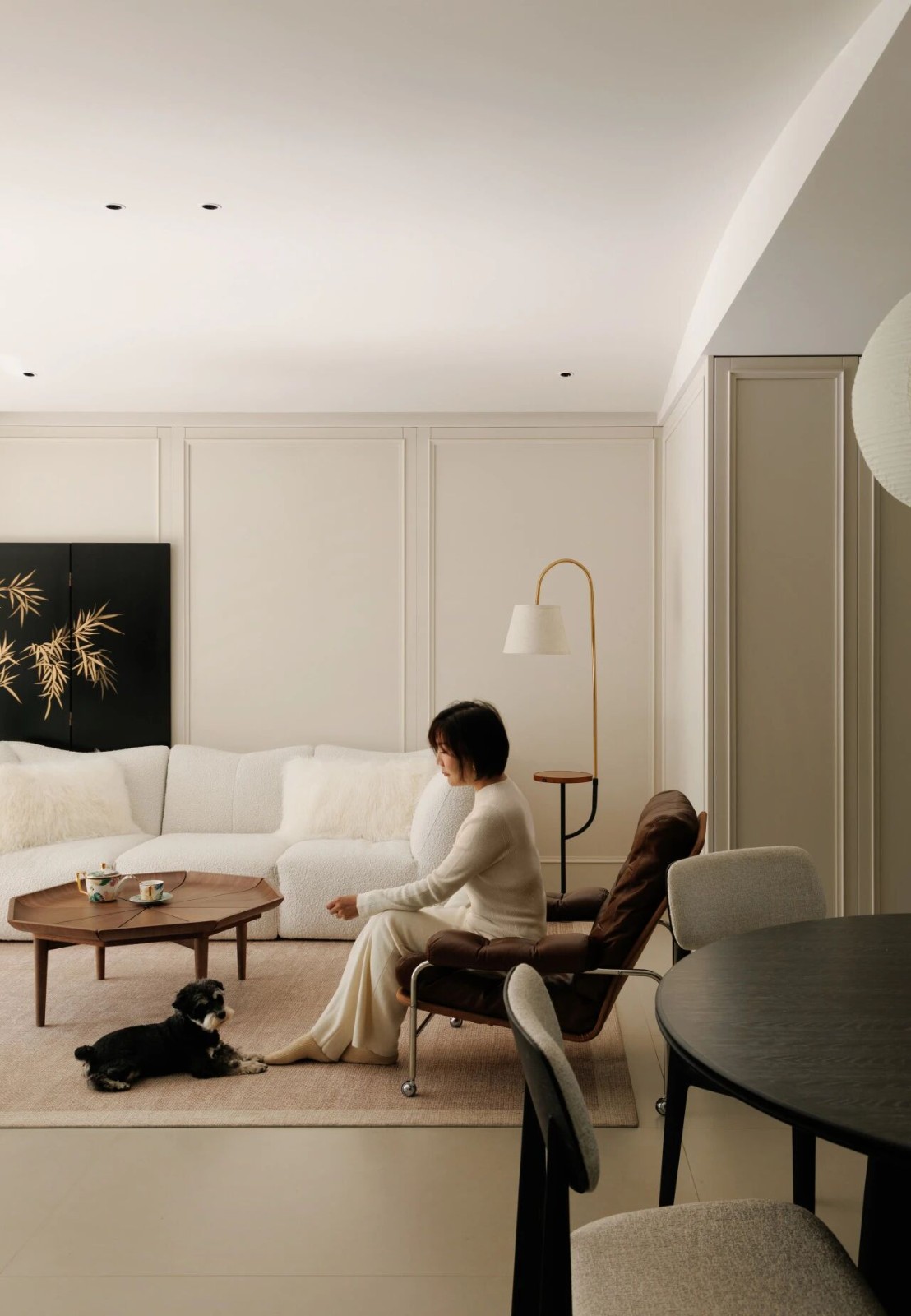
As a paint shop, the main color tone in our store should not be too cold, but rather warm. So we directly apply various artistic coatings to the floor and walls to create a warm wooden atmosphere, which looks soft at first glance. The wooden texture, combined with the metal texture carefully brushed with artistic paint, creates a warm and cool atmosphere that complements each other. Each independent space decoration is a carefully arranged display color card of artistic paint, which not only carries the charm of colors, but also fully showcases the charm of materials. Make customers feel that, um, this is really a place that values lifestyle.
其实这店呢,不就是卖点“色”吗?但咱也不能干巴巴地卖,还得卖出点儿韵味儿。咱不能一进门就给顾客甩一沓色卡,那多乏味啊。咱得讲究个“浪漫邂逅”,让顾客一进来就感觉这不是逛店,而是在享受一场与色彩的艳遇!谁都不知道自己会走到哪儿、会碰上啥色儿,但在店里溜达一圈儿,保管能遇上点“自己喜欢的”。
Isnt this store just selling its color? But we cant just sell it dry, we still need to sell some charm. You cant just throw a bunch of color cards at customers as soon as they enter, its so boring. We need to pay attention to a romantic encounter, so that customers feel like they are not just shopping, but enjoying an encounter with colors as soon as they come in! No one knows where they will go or what color they will encounter, but strolling around the store and taking care of them can lead to encountering something they like.
The newly entered Color Corridor has a color palette that looks like the walls of an old house in our alley, but it is beautiful and exquisite, with a dazzling array of colors that make customers feel like they are on a trip when they enter. They dont do anything and just stand and look, making them dazzled. Strolling further inside, there was a door with a hint of meaning: You, please come inside, and the half wall that was faintly visible piqued my appetite. If you dont go in and take a look, your mind will itch. Curiosity will pique, and then this matter will be resolved!
墙上挂着各色配方,既是给顾客看的,也是暗示你“这儿有大把选择”。落座了慢慢
Going further inside, the entire space suddenly quieted down, and this is the Bay of Inspiration. A circle of comfortable sofas are leisurely arranged, implying that you dont need to rush and sit down first. There are various formulas hanging on the walls around, both for customers to see and implying that there are plenty of choices here. Sitting down and chatting slowly, what color do you want to choose? Dont be impatient or impatient, lets just daydream together and find that flash of inspiration that belongs only to you.
店里最讲究的是调色工作坊。调色区光线得好,不能跟理发店小巷子似的黯淡无光,也
不能一片大白光照过来,晃得顾客眼睛疼。把自然光和暖光配着用,就像在自己家一样。展示区的射灯得精打细打,不瞎照。每一块板儿的光都得像明星登台那样,明亮、有重点,别的地方光线悠着点,整体氛围才更加柔和、舒适。
The most important thing in the store is the color matching workshop. The color matching area should have good lighting, not as dull and dull as a small alley in a barber shop, nor should it be illuminated by a bright white light that shakes the customers eyes. Combine natural light with warm light, just like in your own home. The spotlights in the display area should be carefully crafted and not blindly illuminated. The light on each board should be as bright and focused as a celebrity on stage, while the light in other areas should be more relaxed, creating a softer and more comfortable overall atmosphere.
到了展示区,不是直白的堆色板,咱这儿讲究的是个“自然意境”。每一块色板都透露着森林、大海、晚霞的自然诗意。顾客站在这里,一会儿觉得自己徜徉在秋天的林子里,一会儿又像是在晨曦初露的海边。
When we arrive at the exhibition area, its not a straightforward color palette, what we emphasize here is a natural artistic conception. Each color palette reveals the natural poetry of forest, sea, and sunset. The customer stands here, feeling like they are wandering in the autumn woods at one moment, and at another like they are on the beach at dawn.
顾客爱看现场调色,这就让人有种“在现场搞创作”的参与感,亲眼看着颜色出来。
卖的不仅是色彩,更卖的是那份儿对生活、对自然的热爱与向往。
When we arrive at the exhibition area, its not a straightforward color palette, what we emphasize here is a natural artistic conception. Each color palette reveals the natural poetry of forest, sea, and sunset. The customer stands here, feeling like they are wandering in the autumn woods at one moment, and at another like they are on the beach at dawn. Although we are selling colors, we also need to make customers feel like they are savoring a painting, selling not only colors, but also their love and longing for life and nature.
咱这儿啊,卖的不仅仅是涂料,更是一种对生活的热爱,一种对美好家居环境的追求,
让每一位顾客,都能在这儿找到属于自己的那份温馨与舒适。
As a paint shop, the main color tone in our store should not be too cold, but rather warm. So we often use warm colored wood for the ground and walls, which looks soft at first glance. The combination of wooden materials and delicate metal decorations creates a warm and cool atmosphere that complements each other, exuding a sense of daily life. Make customers feel that, um, this is really a place that values lifestyle.Here, we not only sell paint, but also a love for life and a pursuit of a beautiful home environment, allowing every customer to find their own warmth and comfort here.
意大利Icolori della terra 艾寇艺术漆
采集分享
 举报
举报
别默默的看了,快登录帮我评论一下吧!:)
注册
登录
更多评论
相关文章
-

描边风设计中,最容易犯的8种问题分析
2018年走过了四分之一,LOGO设计趋势也清晰了LOGO设计
-

描边风设计中,最容易犯的8种问题分析
2018年走过了四分之一,LOGO设计趋势也清晰了LOGO设计
-

描边风设计中,最容易犯的8种问题分析
2018年走过了四分之一,LOGO设计趋势也清晰了LOGO设计


 PintereAI


