新作|观至设计 融合、克制、纯粹 首
2024-10-15 22:06
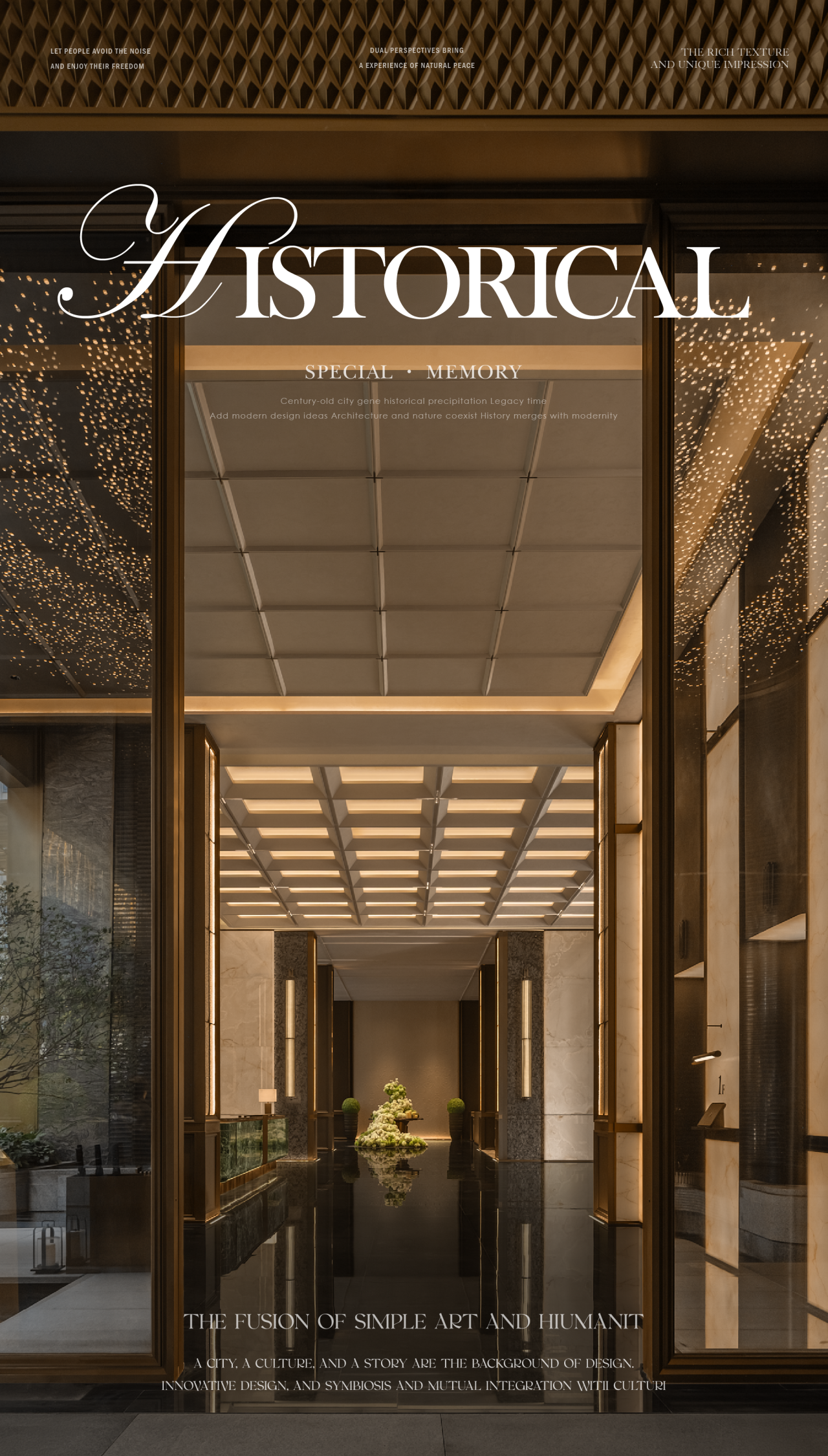
柔和而中性的材质、色调,应用于内部和外部,强化空间的场域让产品融入空间。
With restrained design techniques, the space presents a clean aesthetic feeling.
Soft and neutral materials, tones, applied to the interior and exterior, strengthen the field of the space and let the product blend into the space.
让产品融入空间,也让空间中有突出的产品展示,即照顾到空间的属性,也适度的让空间形成一个有商业属性的整体,岩、水、光、声音形成了一个完整的自然世界,让人在空间中能感受到产品带来的视觉冲击,也能感受到自然的声息场。
Let the product into the space. Also let the space have a prominent product display that takes care of the attributes of the space and moderately let the space form a whole with commercial attributes. Rock, water, light and sound form a complete natural world. Let people in the space can feel the visual impact of the product can also feel the natural sound field.
重新组织空间关系.通过室外的水面长廊,寻声进入空间。简洁的体块关系切割出空间的功能属性,空间错落塑造出立体的空间关系。好的商业空间与人是没有距离感的. 所以不张扬 不尖锐 保持克制与适度 才能每一个游走在空间中的人感到愉悦。
Reorganize spatial relationships. Through the outdoor water corridor, the sound enters the space. The simple volume relations cut out the functional properties of the space, and the spatial displacements shape the three-dimensional spatial relations. A good commercial space has no sense of distance from people. Therefore, no publicity, no sharpness, restraint and moderation can make every person walking in the space feel happy.
由于岩板的品类和颜色款式繁多,我们希望用2-3种颜色和品类去打造一个统一纯粹的空间。让之形成一个场域,把其他的颜色和品类通过展架的形式去做藏纳。让空间形成一个底色板,让其他的颜色和品类在挑选的时候是特别和突出的存在,加强产品的差异属性。
There are many types and colors of rock slabs. We hope to use 2-3 colors and categories to create a unified and pure space. Let it form a field. Put the other colors and Categories are stored in the form of exhibition shelves. Let the space form a base palette. Make other colors and categories special and stand out when choosing them. product-enhancing Difference attribute.
岩板的使用是宽域的.弧面.折叠面.斜向折叠.我们通过简洁的设计把这些工艺的展示自然的融入到空间。
自然光线落到地面、墙面,让岩板的肌理得到最好的自然呈现,有明有暗。
The use of rock slabs is wide range. Curved surface. Folded surface. Oblique fold. We integrate the display of these crafts into the space naturally through simple design. Natural light falls to the ground. Wall. Let the texture of the rock board get the best natural presentation. There are light and dark.
人与物、光与影、空间与时间相互交织,各种材料以其独特的感性物质参与了一场流畅婉转的协奏。
People and things, light and shadow, space and time are interwoven, and all kinds of materials participate in a smooth and graceful concert with their unique perceptual substances. The simple and pure space carries the designers spirit and the tenderness of materials.
不同视角带来的不同的感受,触碰着岩板材质的肌理去感受它的故事,空间层次错落去表达不同材质之间的关系,尽头的旋转楼梯是通往2楼的空间,光影从天窗上散落,让整个楼梯有雕塑感一般的状态。
Different perspectives bring different feelings, touch the texture of the rock board to feel its story, and the spatial layers are scattered to express the relationship between different materials. The spiral staircase at the end is the space leading to the second floor, and the light and shadow are scattered from the skylight, making the whole staircase feel sculptural.
水波纹通过阳光的折射活跃的映射在室内空间的顶面上,为空间添加了一些俏皮的动态元素,也能感受到自然带来的惊喜,空间,水波纹,水面,人形成了一个巧妙的关系 。
塑造一个空间也是塑造一种空间气质,用材质控制比例去打造空间,得到的是一个有空间属性的空间,这边作为接待的区域,有主次的墙面关系,也有内外的空间界限,亦有高低的层次关系,塑造精准的空间气质,亦如岩板本身需要精准的尺寸要求
Shaping a space is also shaping a kind of space temperament, using material control proportion to create space, to get a space with spatial attributes, here as a reception area, there are primary and secondary wall relations, there are internal and external space boundaries, there are high and low level relations, shaping accurate space temperament, also like the rock plate itself needs accurate size requirements.
观至设计成立于2017年,致力于时尚、展厅与私宅等领域的空间设计。我们思考着设计的多维度表现,让空间的表达突破限制,以简洁精致的设计语言与空间相融相生。通过逻辑性的思考对空间的光线、尺度、精神属性进行本质的思考,赋予空间的多样性和可能性。
TO Design was established in 2017, specializing in space design for fashion, exhibition halls, and private residences. We consider the multidimensional expression of design, allowing the expression of space to break through limitations, and integrate with the space through elegant and refined design language. Through logical thinking, we fundamentally consider the light, scale, and spiritual attributes of space, giving space diversity and possibilities.
采集分享
 举报
举报
别默默的看了,快登录帮我评论一下吧!:)
注册
登录
更多评论
相关文章
-

描边风设计中,最容易犯的8种问题分析
2018年走过了四分之一,LOGO设计趋势也清晰了LOGO设计
-

描边风设计中,最容易犯的8种问题分析
2018年走过了四分之一,LOGO设计趋势也清晰了LOGO设计
-

描边风设计中,最容易犯的8种问题分析
2018年走过了四分之一,LOGO设计趋势也清晰了LOGO设计


 PintereAI


