祎间设计 时光流动,诗意栖居 首
2024-09-24 15:16
家,不仅仅是一个物理空间,更是承载每位居住者独特生活故事的“容器”。在这里,过往的每一点思绪、每一个喜好、每一段回忆都留下了深深的印记。一个真正有质感的设计,不仅追求布局的合理与空间的优美,更致力于引发与生活和情感的诗意共鸣。
Home is not only a physical space, but also acontainerthat carries the unique life story of each resident. Here, every thought, every preference, every memory of the past leaves a deep imprint. A truly qualitative design not only pursues rational layout and beautiful space, but also devotes itself to triggering poetic resonance with life and emotion.
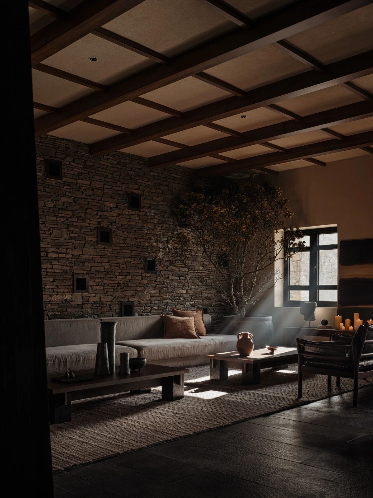
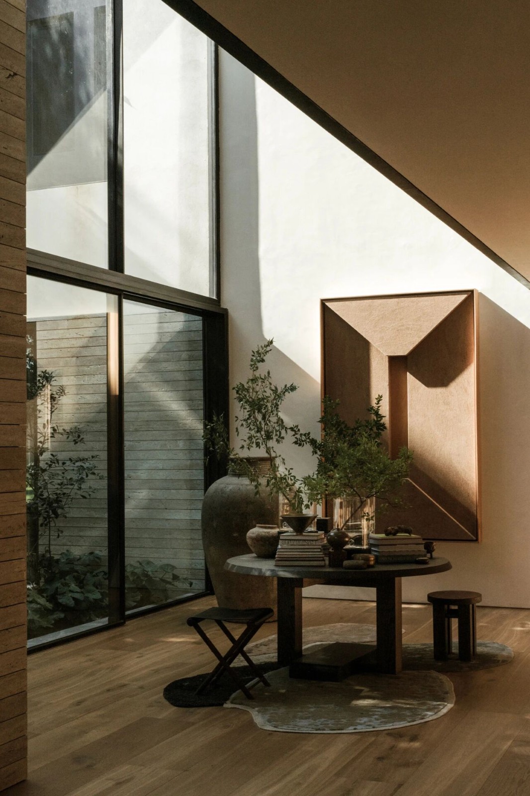
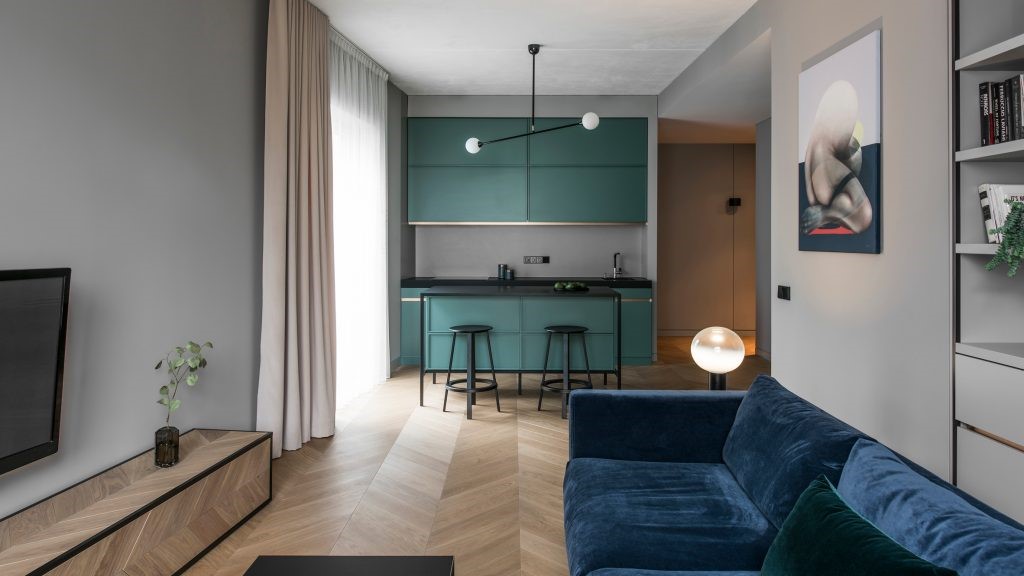
在这套180㎡的户型中,时尚、中古、东方与禅意不断融合;东西方的文化元素彼此交织碰撞;古与今的精致美学自然流转……,在对功能的合理化布局中,屋主的审美、喜好与家的空间完美结合起来。
In this 180 square metres house type, fashion, antiquity, the Orient and Zen are constantly fused; the cultural elements of the East and the West intertwine and collide with each other; and the exquisite aesthetics of the ancient and the modern naturally flow ...... In the rationalisation of the layout of the function, the aesthetics and preferences of the house owner and the space of the home are perfectly combined.
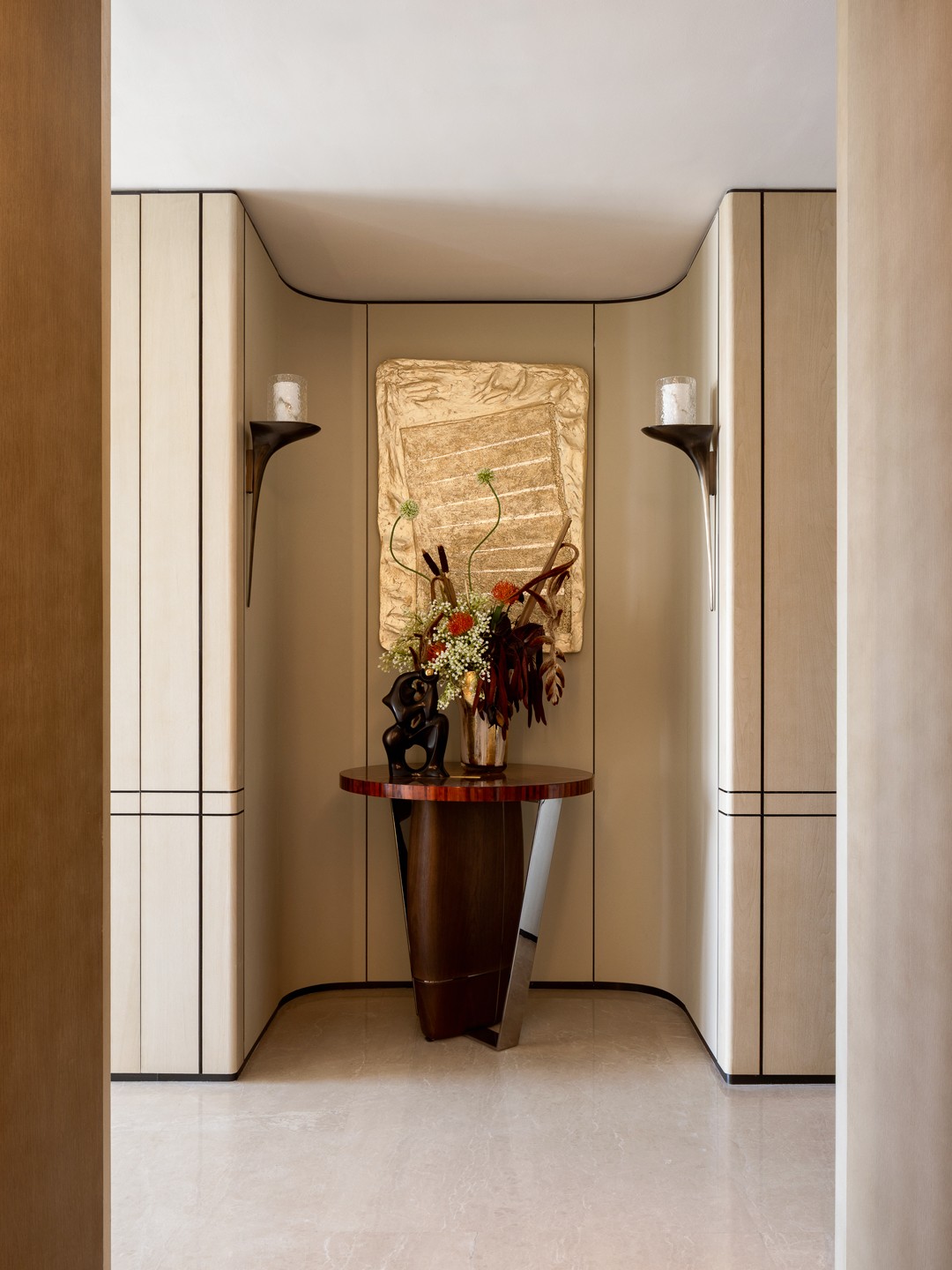
Entering the entrance hall, the eye is first attracted by a large lacquered Bogu shelf. The simple shape and exquisite workmanship, together with the graceful and flowing plants, are creating a relaxing yet refined texture for the entrance space of the home.
玄关一侧的客厅,一件红色的“鸵鸟”边柜也十分博人眼球,连同空间中的金丝楠木坐凳,都由设计师与屋主共同精心淘来。“一进入客厅,看到这样精巧别致的红色边柜,对于空间来说起到一种画龙点睛的作用,在不知不觉间引导视觉、提升空间氛围感。”设计师叶子说。
In the living room on the side of the entrance, a red ostrichsideboard is also very eye-catching, together with the gold nanmu stool in the space, which was carefully sourced by the designer and the homeowner. Once you enter the living room, the red sideboard, which is so delicate and chic, is a kind of finishing touch to the space, guiding your vision and enhancing the atmosphere of the space without you realising it.says designer Ye Zi. Designer Ye Zi said.
在原始户型中,客厅的面积并不大;设计师在此处巧妙地将走廊区域利用起来,拆除原有墙体,并通过调转主沙发和电视墙的朝向,将空间的利用率最大化,无形间让客厅的空间变得更加开敞。
In the original house type, the living room is not large; here the designer cleverly makes use of the corridor area, removing the original wall and maximising the utilisation of the space by reversing the orientation of the main sofa and the TV wall, invariably making the living room more spacious.
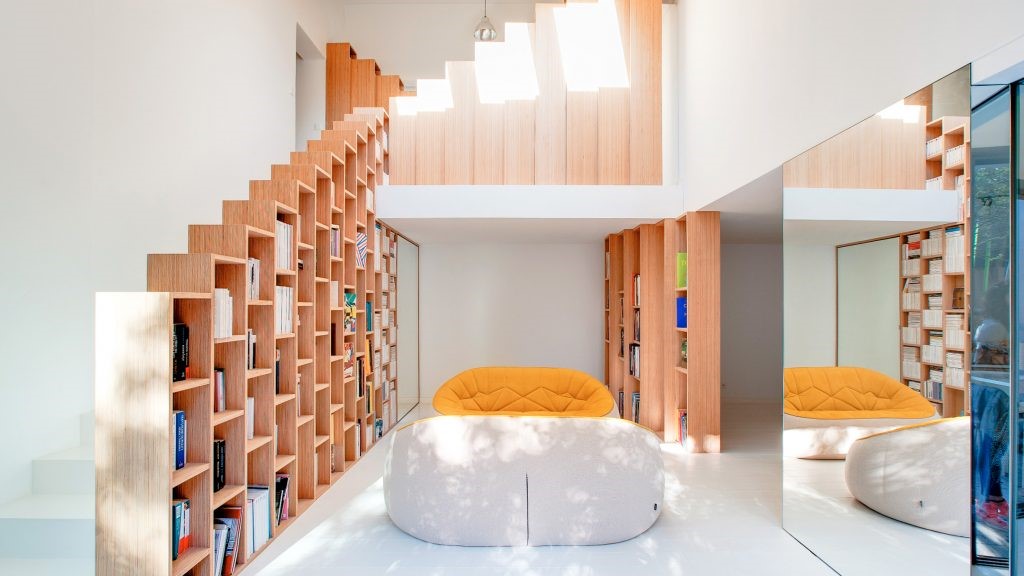
经过重新设计的客厅空间动线也更为合理,男主人喝茶的功能、一家人阅读、收藏的功能,都被整合在沙发后的多功能背景柜中。二楼的空间相对比较局限,没有设置单独的书房,因而我们在一楼客餐厅中巧妙植入了开放式书房的概念,把业主一家人的需求尽可能容纳在空间之中,同时又保证收纳的便捷性、空间的整洁性,希望一家人在一起的大部分时间都是在客餐厅一起度过的。
The redesigned living room is also more reasonable in terms of space and motion. The function of drinking tea for the male owner and reading and collecting for the family are all integrated in the multifunctional background cabinet behind the sofa. The space on the first floor is relatively limited, and there is no separate study, so we cleverly implanted the concept of an open study in the ground floor dining room to accommodate the needs of the owners family in the space as much as possible, while ensuring the convenience of storage and the cleanliness of the space, and we hope that the family spends most of their time together in the dining room.
客厅的风格、色彩、质感也做到多层次的混搭融合。男主人喜爱喝茶,在他的“茶空间”区域,藤编的座椅、胡桃木的茶桌与主沙发的布艺质感相得益彰,既彼此形成对比、又形成一个低调温润的整体;在彰显东方美学禅意氛围的同时,不失现代与年轻感,呈现出更加时尚与多元的美感,一切都遵循着永不过时独特的美学原则。
The style, colour and texture of the living room are also mixed and matched at multiple levels. The man loves tea, in his ‘tea space’ area, rattan seats, walnut tea table and the main sofa fabric texture complement each other, not only to form a contrast, but also to form a low-key warm whole; in the manifestation of oriental aesthetics of the Zen atmosphere at the same time, without losing the sense of modernity and youth, presenting a more fashionable and diversified aesthetics, everything! Everything follows the unique aesthetic principle of never going out of fashion.
玄关另外一侧通向餐厨区,优美的拱形扶手对楼梯与餐厅区域进行了空间上的区隔。这个巧思一方面在有限的空间之内延展出更多层次,丰富空间体验感;另一方面,使得入口就宛如美术馆一般优雅现代,极大提升了家的艺术感。
The other side of the entrance leads to the dining and kitchen area, and the graceful arched handrail makes a spatial separation between the staircase and the dining area. On the one hand, this idea extends more layers within the limited space, enriching the sense of spatial experience; on the other hand, it makes the entrance as elegant and modern as an art gallery, which greatly enhances the sense of art in the home.
餐厅同样是优雅极简的风格,大块面的大理石餐桌既适用于一家人用餐、聚会,同时也兼具了一个办公的功能。餐厅的一侧增加了白色餐边柜,更加便于收纳和储藏。
The dining room is also elegant and minimalist, with a large marble table suitable for family meals and gatherings, as well as an office function. A white sideboard has been added to one side of the dining room, making it easier to store and organise.
为了保持视线的通透,设计师选择将厨房原有的墙体拆除,采用玻璃门替代,使得整体空间更为通透、开敞;同时,三联动的推拉门在开与合之间,厨房也可以随时切换为开放式,非常灵活。
In order to keep the line of sight permeable, the designer chose to remove the original wall of the kitchen and replace it with a glass door, which makes the overall space more transparent and open; at the same time, the triple linkage sliding door can be switched to open at any time between opening and closing, and the kitchen can be switched to open at any time, which is very flexible.
图说:植物穿插在空间中的各处,为自然主义的家装点绿色
大儿子已经比较成熟,在加拿大读大学,房间就选用稳重的黑白灰色调,整体搭配起来也显得比较酷一些,是相对比较硬朗的风格,并附有独立的衣帽间、手办展示柜。
On the first floor are the rooms of the homeowners two sons, each in a different style depending on their personality and age profile.
The eldest son has been more mature, in Canada for university, the room will choose a stable black, white and grey tones, the overall collocation also looks cooler, is relatively hard style, and comes with a separate cloakroom, handiwork display cabinets.
小儿子还在小学,空间的风格偏向于年轻化、可爱一些。采用军绿色为主色调,大面积白色的柜体、书架,满足了小朋友这个年龄段读书、收纳所需的储存空间。
The youngest son is still in primary school, the style of the space tends to be younger and more lovely. The use of military green as the main colour, a large area of white cabinets, bookshelves, to meet the children of this age reading, storage space needed for storage.
三楼则是主人的主卧套房空间,依据两人的性格喜好,选用了一款比较厚重的床头、偏奢华优雅的皮质双人床。颜色上采用低饱和的灰蓝色,并在床尾搭配了一件轻巧别致的法式床尾凳,风格和材质的混搭既符合屋主两人的成熟气质,同时又不显老气,十分的内敛高级。
The youngest son is still in primary school, the style of the space tends to be younger and more lovely. The use of military green as the main colour, a large area of white cabinets, bookshelves, to meet the children of this age reading, storage space needed for storage.
隐形的衣帽间柜门让整个空间更加整体,四进一的衣柜区域,可以放置浴巾、换洗衣物、毛巾等等,同时还内置有一个小型的水吧,非常方便。
All rooms are designed without a main light, thus there is a bedside chandelier in each bedroom. The background of the master bedroom adopts a modelling design that is partial to modern French style, which echoes the bedside bench and at the same time, also echoes the theme of our whole design, which is not defined by the style, but only harmoniously mixes and integrates the collision of different aesthetic elements.
Invisible cloakroom cupboard doors make the whole space more holistic, and the four-into-one wardrobe area is handy for bath towels, a change of clothes, towels and more, as well as having a small built-in water bar.
在设计师眼中,任何软装单品或是家具在空间中的植入都不应该是割裂的、孤立存在的,而应该具有彼此融合和流动的气息。“为家居空间加入带有时间印记的复古单品,就宛如在家中轻触历史的脉搏,古典与现代在同一屋檐下交织,在融合与碰撞之中晕染出独一无二的全新光彩。”
The bathroom of the master bedroom was originally an outdoor space, which was extended to indoor during the remodelling process. The overall design style is atmospheric and simple, with a separate bathtub set up in front of a blue starry background wall, with French antique pieces, and soft furnishings to add more soft and elegant ambience to the bathroom space, each space is unique in its existence.
In the eyes of the designer, any soft furnishing items or furniture implanted in the space should not be cut off, isolated existence, but should have each other fusion and flow of breath. ‘For the home space to join with the time mark of the vintage items, it is like touching the pulse of history at home, classical and modern under the same roof intertwined, in the fusion and collision in the staining of a unique new lustre.’
采集分享
 举报
举报
别默默的看了,快登录帮我评论一下吧!:)
注册
登录
更多评论
相关文章
-

描边风设计中,最容易犯的8种问题分析
2018年走过了四分之一,LOGO设计趋势也清晰了LOGO设计
-

描边风设计中,最容易犯的8种问题分析
2018年走过了四分之一,LOGO设计趋势也清晰了LOGO设计
-

描边风设计中,最容易犯的8种问题分析
2018年走过了四分之一,LOGO设计趋势也清晰了LOGO设计


 PintereAI


