Plate selector,西班牙巴塞罗那
2024-09-14 13:10
There are very special projects and this is one of them. Working with friends is always the best. Start together and grow together. Almost 10 years ago we designed the first Plate and today we present its new HQ.
有一些非常特殊的项目,这是其中之一。与朋友一起工作永远是最好的。一起开始,一起成长。大约 10 年前,我们设计了第一块 Plate 板块,今天我们推出了它的新总部。
Plate selector is a gastronomy-oriented content creation agency that publishes through its website and social networks. Founded by Alba Yanez, Khaled Abbas and Juan Navaza. Its high growth in recent years created the need for new offices. Having collaborated with them 10 years ago, we embarked on a new adventure with them designing these offices.
Plate selector 是一家以美食为导向的内容创作机构,通过其网站和社交网络发布。由 Alba Yanez、Khaled Abbas 和 Juan Navaza 创立。近年来的高增长产生了对新办公室的需求。10 年前与他们合作后,我们与他们一起开始了新的冒险,设计这些办公室。
Create offices reflecting the well-being of the workers and an environment where you feel at home, focusing on the most important area of the project, the kitchen. Through the materials, we also talk about the passage of time and the way in which the company has grown and evolved.
创建反映员工福祉的办公室和让您有宾至如归的感觉的环境,专注于项目最重要的领域,即厨房。通过这些材料,我们还讨论了时间的流逝以及公司的成长和发展方式。
Given the nature of the enterprise, the kitchen stands as the central core of this project, highlighting its fundamental importance. To underline this crucial role, the kitchen has been designed as a true sculpture, with a special focus on its imposing central island. The material chosen for the base of the island, Alicante red marble, creates a striking contrast with the rest of the space, which is dyed in linen tones, thus enhancing this key element.
鉴于企业的性质,厨房是该项目的中心核心,突出了其根本重要性。为了强调这一关键作用,厨房被设计成一个真正的雕塑,特别关注其雄伟的中央岛。岛台底座选择的材料是阿利坎特红大理石,与空间的其他部分形成鲜明对比,空间的其他部分采用亚麻色调染色,从而增强了这一关键元素。
Thanks to this central island, the kitchen not only becomes a highly functional space, allowing fluid circulation, but also transforms into a meeting point that encourages social interaction. This design not only solves practical needs, but also creates a cozy and social atmosphere, which in turn looks like a piece of art. Combining practicality and beauty in one piece. From this core, the project flows organically, integrating subtle references from the kitchen throughout the space, maintaining an aesthetic and thematic cohesion.
得益于这个中央岛台,厨房不仅成为一个功能强大的空间,允许流体流通,而且还变成了一个鼓励社交互动的聚会点。这种设计不仅解决了实际需求,还营造出一种舒适和社交的氛围,反过来又看起来像一件艺术品。将实用性和美观性融为一体。从这个核心开始,该项目有机地流动,将厨房的微妙参考融入整个空间,保持美学和主题的凝聚力。
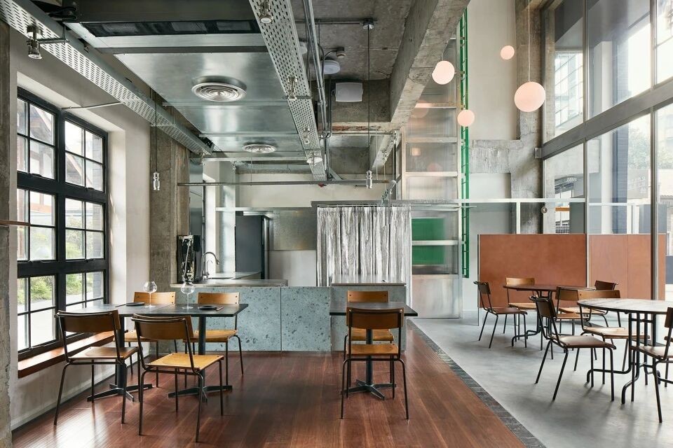
Upon entering the space, we encounter the Open Space, which, thanks to its wide opening and its soft color palette, conveys a feeling of well-being indispensable for the workers. This space is equipped with two large tables that facilitate the performance of daily tasks comfortably and efficiently. At the end of these tables, stands out a cylinder of red Alicante marble integrated into the design, acting as a sculpture and serving as a clear reference to the central space of the kitchen.
进入空间后,我们遇到了开放空间,由于其宽阔的开口和柔和的调色板,它传达了一种工人不可或缺的幸福感。这个空间配备了两张大桌子,方便客人舒适高效地完成日常任务。在这些桌子的尽头,一个红色的阿利坎特大理石圆柱体与设计融为一体,充当雕塑,明确参考了厨房的中央空间。
To further reinforce this cozy and homely atmosphere, shelves have been designed that display decorative objects, adding a personal and warm touch to the work environment.
为了进一步加强这种舒适和温馨的氛围,设计了展示装饰品的架子,为工作环境增添了个人和温暖的气息。
This area has been carefully designed to convey a sense of well-being and encourage social interaction, thanks to the type of furniture chosen and, above all, to its strategic disposition. The Masheb sofa by Architecture G, which can be used as a module, creates a perfect space to rest briefly and have informal conversations. Its design, which plays with geometric solids like triangles and blocks, contrasts with the cylinders of the table, while its light color integrates it perfectly into the space.
这个区域经过精心设计,以传达一种幸福感并鼓励社交互动,这要归功于所选择的家具类型,尤其是其战略布局。Architecture G 的 Masheb 沙发可以用作模块,为短暂休息和非正式交谈创造了一个完美的空间。它的设计玩转了三角形和块状等几何实体,与桌子的圆柱体形成鲜明对比,而浅色则将其完美地融入空间。
In addition, the use of high floors adds an element of freshness and naturalness, turning the area into a revitalizing and pleasant rest area.
此外,高楼层的使用增添了清新和自然的元素,将该地区变成了一个充满活力和宜人的休息区。
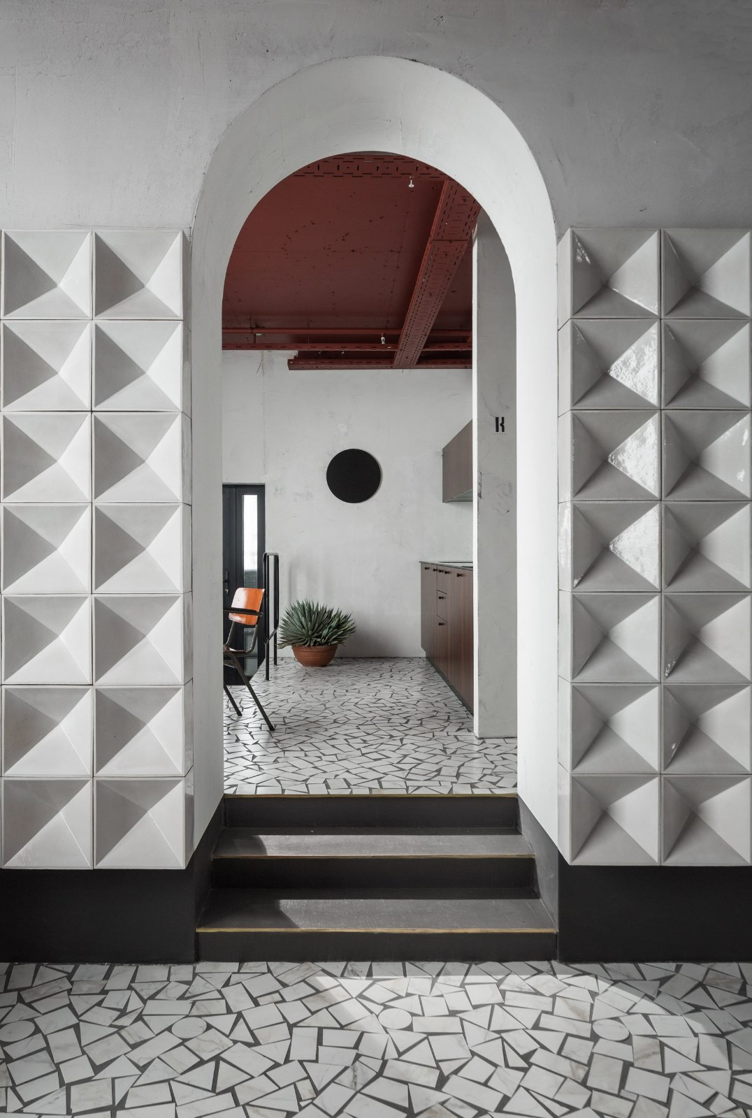
The meeting room is distinguished by the unique shape of its entrance and its colour palette. The two arched doors not only bring a sculptural sense, reminiscent of a work of art, but also provide the necessary privacy for meetings. From the outside, these arches allow a glimpse of the terracotta color of the interior, referring once again to the central element of the kitchen.
会议室以其独特的入口形状和调色板而著称。两扇拱形门不仅带来雕塑感,让人联想到艺术品,而且还为会议提供了必要的隐私。从外面看,这些拱门可以瞥见内部的赤土色,再次参考了厨房的中心元素。
This terracotta color not only visually connects with the core of the design, but also creates an intimate and warm atmosphere, ideal for productive and comfortable meetings.
这种赤土色不仅在视觉上与设计核心相连,还营造出亲密而温暖的氛围,非常适合高效和舒适的会议。
Like the meeting room, the bathroom features an arched entrance, maintaining the aesthetic cohesion of the design. The terracotta color chosen for the bathroom provides a feeling of comfort and privacy, complemented by warm lighting that turns this space into a comfortable and quiet place.
与会议室一样,浴室也设有拱形入口,保持了设计的美学凝聚力。浴室选择的赤土色给人一种舒适和私密的感觉,辅以温暖的灯光,将这个空间变成一个舒适安静的地方。
This project places the kitchen in the center, from where all the spaces are connected. Through this space, we seek to reflect the growth and maturity that the company has achieved in these ten years. In addition, the design has been thought to be functional and for the well-being of the workers. This point of color, innovation, elegance and craftsmanship that the marble block gives us invades the rest of the space becoming different elements. A splash of color and texture in the interior of the meeting room and bathrooms, creating a contrast with the rest of the space A splash of color and texture in the interior of the meeting room and bathrooms, creating a contrast with the rest of the space. And some solid marble columns like legs for the work tables. We could say that these are the pieces that stand out and blend in a space that is neutral, serene and very architectural.
该项目将厨房置于中心,所有空间都从那里连接起来。通过这个空间,我们力求反映公司在这十年中取得的成长和成熟。此外,该设计被认为具有功能性并符合工人的福祉。大理石块带给我们的这一色彩、创新、优雅和工艺侵入了空间的其余部分,成为不同的元素。会议室和浴室内部的一抹色彩和纹理,与空间的其他部分形成鲜明对比 会议室和浴室内部的一抹色彩和纹理,与空间的其他部分形成鲜明对比。还有一些坚固的大理石柱子,比如工作台的腿。我们可以说,这些作品在中性、宁静和极具建筑感的空间中脱颖而出并融为一体。
采集分享
 举报
举报
别默默的看了,快登录帮我评论一下吧!:)
注册
登录
更多评论
相关文章
-

描边风设计中,最容易犯的8种问题分析
2018年走过了四分之一,LOGO设计趋势也清晰了LOGO设计
-

描边风设计中,最容易犯的8种问题分析
2018年走过了四分之一,LOGO设计趋势也清晰了LOGO设计
-

描边风设计中,最容易犯的8种问题分析
2018年走过了四分之一,LOGO设计趋势也清晰了LOGO设计


 PintereAI


