鲁班时代 刻光裁影,圈云窥光 首
2024-09-04 22:06
摄影基地
Photography Base
RESOUL
SPACE
DESIGN
FASHION
TRAVEL
LIFESTYLE
颠覆传统体系的自然生长,释放空间的个性和主张,从而让顾客获得精神和内在的享受。不确定性的思辨,在“设计之外”启迪“设计主体”,为商业主体带来不可估量的价值。品牌的自述是一种隐喻表达的生活理念,呈现一个能与每个人产生共鸣的开放、包容和自由平易近人空间,挑战并重塑过去,在感知的复杂性中萃取一种新时代的纯粹性,让人感受到时尚的变革力量。
Disrupting the traditional system of natural growth, unleashing the individuality and ideas of space, thereby allowing customers to gain spiritual and inner enjoyment. The speculation of uncertainty inspires the design subject beyond design and brings immeasurable value to commercial entities. The self description of a brand is a metaphorical expression of a life philosophy, presenting an open, inclusive, free and approachable space that resonates with everyone, challenging and reshaping the past, extracting a new era of purity from the complexity of perception, and making people feel the transformative power of fashion.
营造一个包容、自然的环境,以空间为主导,产品为辅,共创和谐。LubanEra·Design创意总监Bobo用简洁而不失深意的空间布局,让每一件展品都能在宁静的背景中绽放其独特之美。形体的分区阻隔了内外之间的表面物理关系,视觉通过观测,由外向内传递,室内空间的五感因波动产生相对的反应,当内在变化反作用于外部环境时,边缘不再受限,反应像立体直觉一样,向着所需方向前进。室内外之间所有意识形态,紧密结合,也宣告着温暖与气质之间,可以找到一种完美的平衡,在空间的建构上,形成新的意指。
Create an inclusive and natural environment, with space as the main focus and products as a supplement, to create harmony together. LubanEra Designs creative director Bobo uses a simple yet profound spatial layout to allow each exhibit to bloom its unique beauty in a peaceful background. The partition of the form blocks the surface physical relationship between the inside and outside. Vision is transmitted from the outside to the inside through observation, and the five senses of indoor space produce relative reactions due to fluctuations. When internal changes react to the external environment, the edges are no longer limited, and the reaction moves forward in the desired direction like a three-dimensional intuition. The close integration of all ideologies between indoors and outdoors also declares a perfect balance between warmth and temperament, forming new meanings in the construction of space.


不追求所谓的设计风格,只探寻美学给空间创造的商业价值。这是
LubanEra·Design创始人Bobo的设计创新之道
We do not pursue the so-called design style, but only explore the commercial value created by aesthetics for space. This is LubanEra·Design founder Bobos approach to design innovation.


DESIGNER
陈洪波 Bobo
FASHION
时尚的变革
01
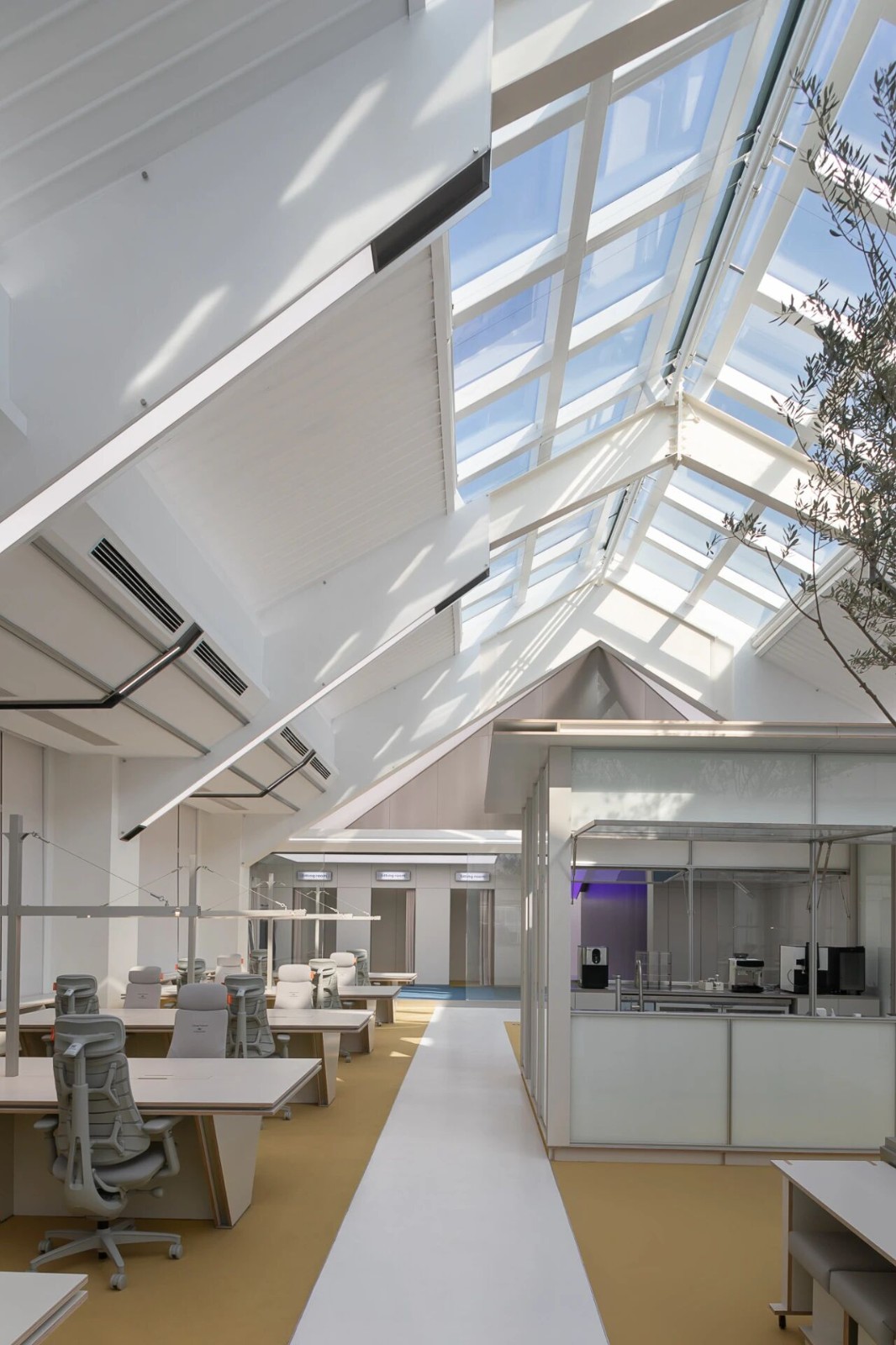
此项目位于甲方工业园楼顶的天台,被作为仓库使用,但也已废弃良久。当我们走上天台,阳光暴烈,只见一片荒芜寂寥。甲方因商业模式的升级,决定改造这荒废的仓库,希望最大程度地利用起楼顶,让这贫瘠之地也能别有生机,也让品牌同这天台一般焕发新的活力。天台视野虽好但光线的直射使楼顶炎热难耐,让人难以长久驻留。于是LubanEra·Design创始人Bobo在保留原始结构的基础上,引入自然,搭梯建廊,围水造园,将景观融于建筑,打造自然场景,带来和煦的感官享受,使天台的每一寸都焕发了新生。用光影交织出柔和的空间,基础之上蕴生层次,无论是办公还是取景都能解锁奇妙体验,给人带来精神上的平静安然,纾解繁碌,自在变革的品牌精神蕴育其中。
This project is located on the rooftop of Party As industrial park and was used as a warehouse, but it has also been abandoned for a long time. When we walked up to the rooftop, the sun was scorching and we saw a desolate and lonely place. Due to the upgrade of the business model, Party A has decided to renovate this abandoned warehouse, hoping to maximize the use of the rooftop, giving this barren land a new vitality and revitalizing the brand like this rooftop. Although the view from the rooftop is good, the direct sunlight makes it unbearably hot, making it difficult for people to stay for a long time. So Bobo, the founder of LubanEra Design, introduced nature while preserving the original structure. He built stairs, corridors, and surrounded the water to create a garden, integrating the landscape into the building, creating a natural scene, bringing warm sensory enjoyment, and revitalizing every inch of the rooftop. By interweaving light and shadow to create a soft space, layers are created on top of it. Whether its office work or framing, it can unlock wonderful experiences, bringing people spiritual peace and tranquility, relieving hardships, and nurturing the brand spirit of free change.


SPACE
空间之韵
02
自由流淌、明暗交错、是光,亦是空间之韵。当光有了形状,有了温度,影便是它的情绪 空间运用形体与自然对话的窗口,引入室外的自然光线洒落在整个空间,将四季的色彩引入内部,更替变化,行走其中感受自然且舒适的空间氛围。顺着光的路径向外部打开展现区别于粗犷自然的人文之美,且又与自然相融,使内部领域与室外环境相互连接,通过一窗之隔,独立内外之别,连接彼此相互交融。它赋予空间的不仅仅是表面的结构轮廓,而是一种精神层面的独立。
Free flowing, interweaving light and shadow, it is both light and the charm of space. When light takes on shape and temperature, shadow becomes its emotional space. It serves as a window for dialogue between form and nature, bringing in natural light from the outside that spreads throughout the space. It introduces the colors of the four seasons into the interior, creating a natural and comfortable atmosphere while walking. Following the path of light, it opens up to the outside to showcase the beauty of humanity that is different from rough nature, while also blending with nature, connecting
the internal realm with the outdoor environment. Through a window, it separates the inside and outside independently, connecting and blending with each other. It endows space not only with surface structural contours, but also with a spiritual level of independence.


SENSORY
感官享受
03
注重流线和空间分割,同时注重美感和舒适度,呈现出自然而然的空间感。围聚其间,疏落有致,借助自然肌理构筑内部空间,同时凝结了时间与空间的深远,引发对时间与空间哲思的细节工艺,也蕴含着无处不在的艺术感,深入感知艺术的细腻,明与暗的空间对比,衬托了时间的意义。无论是横向还是纵向,都被丰富的美学包裹着,让人不得不沉浸于这种享受之中
Emphasis is placed on streamline and spatial segmentation, while also emphasizing aesthetics and comfort, presenting a natural sense of space. Surrounded by natural textures, the interior space is constructed in a sparse and orderly manner, while also condensing the depth of time and space. The detailed craftsmanship that triggers philosophical thinking about time and space also contains an ubiquitous sense of art, deeply perceiving the delicacy of art. The contrast between light and dark space highlights the meaning of time. Whether horizontally or vertically, it is enveloped by rich aesthetics, making people unable to immerse themselves in this enjoyment.


CONTEMPORARY
自然与当代
04
时光雕琢,岁月铸就。石纹交错不仅只局限于在形态中,更体现在岁月点缀的肌理,承载着时间的痕迹,将其附着在物体中点出虚与实、厚重与轻盈、自然与当代的主题要旨,同时经由室外转入室内,情绪逐渐趋于舒缓、平静。通过建筑主体不同深浅与冷暖交替的变化,呈现几何切割的正反关系,独立出内外之别,又将彼此连接起来。
Time carves, time forges. The interweaving of stone patterns is not only limited to form, but also reflected in the texture embellished by time, carrying the traces of time, attaching them to objects to highlight the themes of emptiness and reality, heaviness and lightness, nature and modernity. At the same time, as they transition from the outdoors to the indoors, emotions gradually become relaxed and calm. By varying the depth of the buildings main structure and alternating between warm and cold, a geometric cutting relationship is presented, which separates the interior and exterior and connects them together.


PRODUCT
产品艺术
05
去除传统商业展厅遍布品牌标志的意识模式,转而投入可被身体感知的产品艺术,将缥缈的思考落于实际的作答,通过谆谆引导将品牌形象润入人心,以细小入微的角度切入,链接起人与空间人与品牌的交互。
Remove the traditional awareness model of brand logos scattered throughout commercial exhibition halls, and instead invest in product art that can be perceived by the body, putting vague thinking into practical answers. Through earnest guidance, the brand image is infused into peoples hearts, and from a subtle perspective, it connects people with space, people with the interaction of the brand.


FREE
自在流线
06
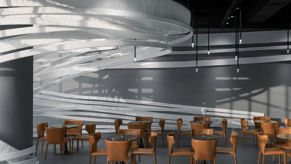
灵动自由的曲线牵引动线,轻盈徘徊的灯光萦绕了空间,引导视线穿插错落其间,视野不断拓展,充分感受空间的律动。纯粹克制的材质运用,勾勒出干净细腻的线条,缔造素雅沉静的展品空间,赋予来访者自在悠然的参观体验。
The dynamic and free curves pull the line of motion, and the light wanders around the space, guiding the line of sight to interweave and scatter, constantly expanding the field of view, and fully experiencing the rhythm of the space. The use of purely restrained materials outlines clean and delicate lines, creating an elegant and serene exhibition space, giving visitors a comfortable and leisurely visiting experience.


INTEGRATION
交融共生
07
不同材质间的相互碰撞,在不同观点与想法中创造出无限可能。树脂与天然石材的巧妙结合,粗犷的石材与细腻的树脂交融共生,在光线的挥洒下营造出温馨自然的购物体验空间。
The collision between different materials creates infinite possibilities in different perspectives and ideas. The clever combination of resin and natural stone, the rough stone and delicate resin blend and coexist, creating a warm and natural shopping experience space under the influence of light.


艺术场域
08
空间在展现精神性艺术表达的同时,需要以具体的温度来回应来访者的感受及体验。因此设计在划分空间配比之初,将艺术性场域体验与功能性场景体验进行拆解,通过动线与空间的串联,将品牌产品巧妙融入叙事中,通过精巧的移步易景,赋予多种场景的丰富变化。
While showcasing spiritual artistic expression, space needs to respond to visitors feelings and experiences with concrete warmth. Therefore, at the beginning of dividing the spatial ratio, the design breaks down the artistic field experience and the functional scene experience. Through the connection of the flow and space, the brand products are cleverly integrated into the narrative, and through exquisite steps and easy scenery, various scenes are endowed with rich changes.


左右滑动查看更多
Designed by LubanEra·Design
CONCISE
简洁有力
09
建构,向来始于对具体功能的探究,进而生发出场地的精神,二者交织形成立体的、可体验的空间。简洁而富有力量感的形态,规则的和不规则的几何形状彼此之间“环环相扣”,建筑一体式的结构高低错落、起伏变化,突出形状和线条,使得整体形态更加紧凑、有力。
Construction has always begun with the exploration of specific functions, leading to the emergence of the spirit of the site, and the interweaving of the two forms a three-dimensional and experiential space. The concise and powerful form, with both regular and irregular geometric shapes interlocking with each other, creates an integrated structure with varying heights and undulations, highlighting shapes and lines, making the overall form more compact and powerful.


TIME
时间之韵
10
水之“远”,在于其空灵深幽,暗藏时间无尽之韵。光之“华”,在于其朦胧透明,于空间转换中灵动穿行。水庭由水体镜像创造并放大建筑尺度感和空间领域感,同时模糊了空间界限。顶部设计打破空间限制将云的变化,光的尺度倒影其中,从物象到意象、空间到精神,看到的并不只是天空和云,更是时光的流逝和岁月的变迁。创意的变化虽然令人沉迷,而合适的美则更加深入人心,在空间与功能的彼此让渡中,为品牌形象构建真实可达的体验。
The distance of water lies in its ethereal and profound nature, concealing the endless charm of time. The brilliance of light lies in its hazy transparency, which moves through space transitions with agility. The Water Garden is created by the reflection of water bodies, amplifying the sense of architectural scale and spatial domain, while blurring the boundaries of space. The top design breaks the spatial limitations and reflects the changes of clouds and the scale of light. From objects to images, space to spirit, what we see is not only the sky and clouds, but also the passage of time and the changes of time. The changes in creativity may be addictive, but the appropriate beauty is more deeply ingrained in peoples hearts, creating a truly accessible experience for brand image through the mutual transfer of space and function.


FULLNESS
留白与丰盈
11
阳光和煦,无需艳丽的色彩和强烈的造型,空间构建起留白的从容,绿植独具丰盛的生命力,与周围环境完美地融为一体。
The sunshine is warm, without the need for bright colors and strong shapes. The space is constructed with a calm and white space, and the green plants have a unique and abundant vitality, perfectly integrating with the surrounding environment.


材质的选用,追求质感与触感的平衡,以细腻的肌理呼应植物的生动。恰到好处的阳光洒落在植物和空间留白之处,营造出层次分明的光影效果。每一个元素的组合,都是对空间美学的极致追求,在这种宁静与温馨的空间中寻得心灵的慰藉与归属。
The selection of materials pursues a balance between texture and touch, echoing the vividness of plants with delicate textures. The just right amount of sunlight falls on the plants and the blank spaces, creating a layered light and shadow effect. The combination of each element is the ultimate pursuit of spatial aesthetics, finding solace and belonging in this peaceful and warm space.


BOUNDARY
空间边界
12
在界定院落空间边界时为创造出一种新的建筑形式,在柱与廊之间找到了结合点,由圆柱阵列构成的廊,通过天然石坎加以过渡,形成对院落空间边界的界定,同时构成了多元化的场所体验。当边界有了进入空间的尺度,艺术和生活才会变得更加丰富多彩。
In order to create a new architectural form when defining the boundaries of courtyard space, a combination point was found between columns and corridors. The corridors composed of cylindrical arrays were transitioned through natural stone ridges to define the boundaries of courtyard space and create a diversified place experience. When boundaries have the scale to enter space, art and life become more diverse and colorful.


DESIGN
设计之手
13
空间设计是一种从无到有的创造,它通过对人与生活的洞察,以设计之手,创造全新的空间体验。
Space design is a creation from scratch, which creates new spatial experiences through insights into people and life, using the hands of design.


在此过程中,设计巧妙地运用色彩、光线、材质与形态,使建筑框架赋予温暖与灵魂。空间的留白从容彰显生命的蓬勃张力;光影的巧妙运用,让光明与阴影交织出层次丰富的视觉诗篇;每一处轮廓的勾勒、材料的选用,都承载着对美好生活的向往和追求;流动与静止的巧妙平衡,使空间既充满动态的活力,又有宁静的沉淀。设计之手,塑造独具匠心的空间体验,令局促的天地展现出非凡意境。
During this process, the design cleverly utilizes color, light, material, and form to imbue the architectural framework with warmth and soul. The blank space calmly showcases the vigorous tension of life; The clever use of light and shadow interweaves light and shadow to create a visually rich and layered poem; Every outline and material selection carries the yearning and pursuit for a better life; The clever balance between flow and stillness fills the space with both dynamic vitality and peaceful sedimentation. The hand of design shapes a unique spatial experience, allowing the cramped world to showcase extraordinary artistic conception.


NATURE
映入自然
14
落地玻璃宛如一幅自然的画框,映衬出绿意盎然的景致,让视线得到延伸,室外的自然光线如甘露般洒落在整个空间之中,四季的色彩不断交替,交融于室内。办公空间与自然场景彼此和谐共生,漫步其中,便能感受到恬逸宁静的空间氛围。不同的材质通以变化的形态切割雕刻着时间与空间,或直白,或迂回,使得各个区域既相互独立,又紧密相连。每一处景致,无不彰显出自然共生的品牌精神。
The floor to ceiling glass is like a natural frame, reflecting the lush green scenery and extending the line of sight. The natural light outside falls like dew on the entire space, and the colors of the four seasons constantly alternate and blend into the interior. The office space and natural scenery coexist harmoniously, and walking in it, one can feel the peaceful and tranquil atmosphere of the space. Different materials cut and carve time and space in varying forms, either directly or indirectly, making each area both independent and closely connected. Every scenery showcases the brand spirit of natural coexistence.


EMOTIONAL
情感共通
15
自然与光感的巧妙结合设计,借用植物与空间之间产生合理交汇,光影绰约,在光影的场景化表达中,内外的界限得到模糊,随之无缝相融的是静谧与平和,虽在外壳包裹下的空间内,依然有与自然的情感共通。
The clever combination of nature and light perception design creates a reasonable intersection between plants and space, with graceful light and shadow. In the scene based expression of light and shadow, the boundaries between inside and outside are blurred, seamlessly blending into tranquility and peace. Although enclosed in the outer shell of the space, there is still a shared emotional connection with nature.


EMOTIONAL
情绪氛围
16
旋转门沉稳却灵巧,切割了空间,而视线倾斜,一片绿意透过通明的窗侵入,让本应紧张的办公空间变得松弛,情绪得到释缓。张弛之间,设计的温度浸润铺陈,超乎功能之外,带来情感上的归属感。
The revolving door is steady yet agile, cutting through the space, while the gaze tilts, and a green field invades through the bright window, making the already tense office space relaxed and relieving emotions. Between relaxation and tension, the temperature of the design permeates and spreads beyond its functionality, bringing an emotional sense of belonging.


CONVERSATION
茶话闲谈
17
沉浸在安宁静谧的禅意里,辗转的脚步探寻茶室每一处,每一面都在持续延伸茶香所带来自然心境,在光和影的衬托下令人感官享受更为丰富与具象化。
Set up a tea room as a resting place for the mind and spirit, making it a secluded paradise away from the hustle and bustle.
Immersed in the peaceful and tranquil Zen atmosphere, the wandering footsteps explore every corner of the tea room, each side continuously extending the natural state of mind brought by the fragrance of tea. Under the backdrop of light and shadow, the sensory enjoyment becomes more rich and concrete.


LIGHT
静夜与光
18
夜幕四合,月色朦胧,自然光影被深邃的黑夜吞没,孤寂安宁。建筑与空间却吸附着氛围光所带来的“黎明”,于夜半月生,万籁俱寂之时,赋予其朗阔开阖的尺度,营造引人入胜的动线。氛围灯在夜空中与建构不谋而合,在白色纯粹基础下,以自然的形态造就井然秩序的商业空间。
The night falls, the moon is hazy, and natural light and shadow are engulfed by the deep darkness, creating a lonely and peaceful atmosphere. Architecture and space, on the other hand, absorb the dawn brought by ambient light. When the night is half moon and everything is quiet, they give it a broad and open scale, creating a captivating flow. Atmosphere lighting coincides with construction in the night sky, creating a natural and orderly commercial space based on pure white.


AM
项目团队
The Team for the Work
创意总监 Creative Director :
陈洪波 Bobo
RESOUL
本文为原创策划内容 图片归原作者或来源机构所有
Original Planning Content
THE TEAM
内容策划


陆婕仪 编辑

 PintereAI


