Curve Appeal at Hillhurst House,加拿大卡尔加里 首
2024-08-12 14:15
This 1970’s Calgary bungalow is home to a young family that had high hopes of turning this modest house into a more modern approachable space.
When our clients came to us in 2021, we already knew it would be a great match as we had worked closely with the husband on his local coffee shops in the city. It was clear that the main focus of this family’s renovation was to open up the home to offer more family driven living. Reading nooks, storage and a playful aesthetic were paramount to our client’s family needs.
当我们的客户在 2021 年找到我们时,我们已经知道这将是一次完美的匹配,因为我们与丈夫在该市当地的咖啡店密切合作。很明显,这个家庭装修的主要重点是开放住宅,提供更多以家庭为主导的生活。阅读角、储物空间和俏皮的美感对于我们客户的家庭需求至关重要。
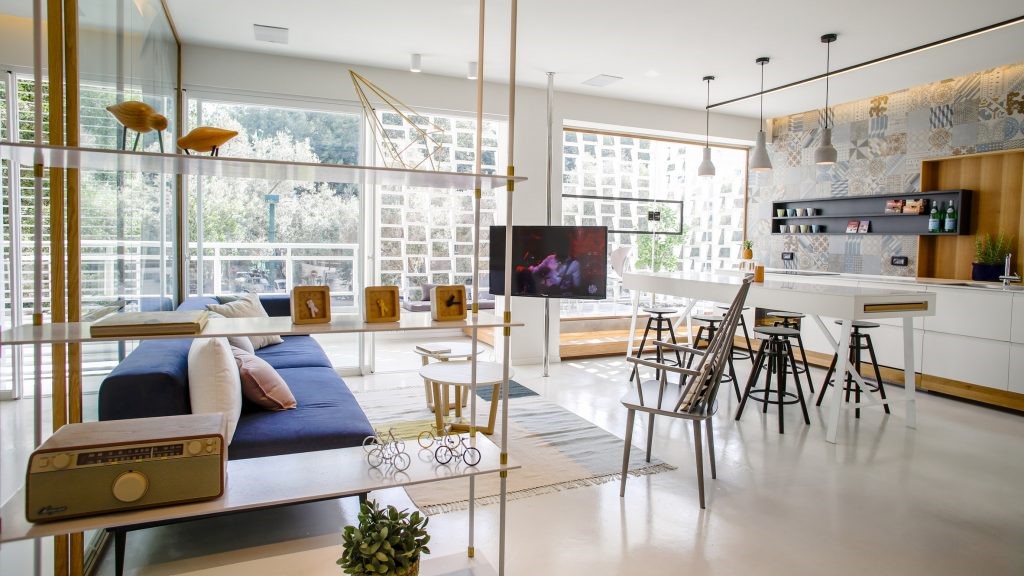
With 1700 square feet to work with our design team set out to incorporate curves and then more curves. A non-fussy and liveable mindset allowed us to go outside of the normal floor plan layout. Starting at the entry we softened the typical squareness of the bungalow’s main floor by adding in a slightly curved seating bench. The open slats feel was intentional in creating a separated entry yet maintaining an airy feel with warm wood tones and tile selected.
与我们的设计团队合作,占地 1700 平方英尺,开始融入曲线,然后是更多曲线。不挑剔和宜居的心态使我们能够走出正常的平面图布局。从入口处开始,我们通过添加略微弯曲的座椅长凳来软化平房主层典型的方形。开放式板条的感觉是有意创造一个独立的入口,同时保持通风的感觉与温暖的木质色调和瓷砖的选择。
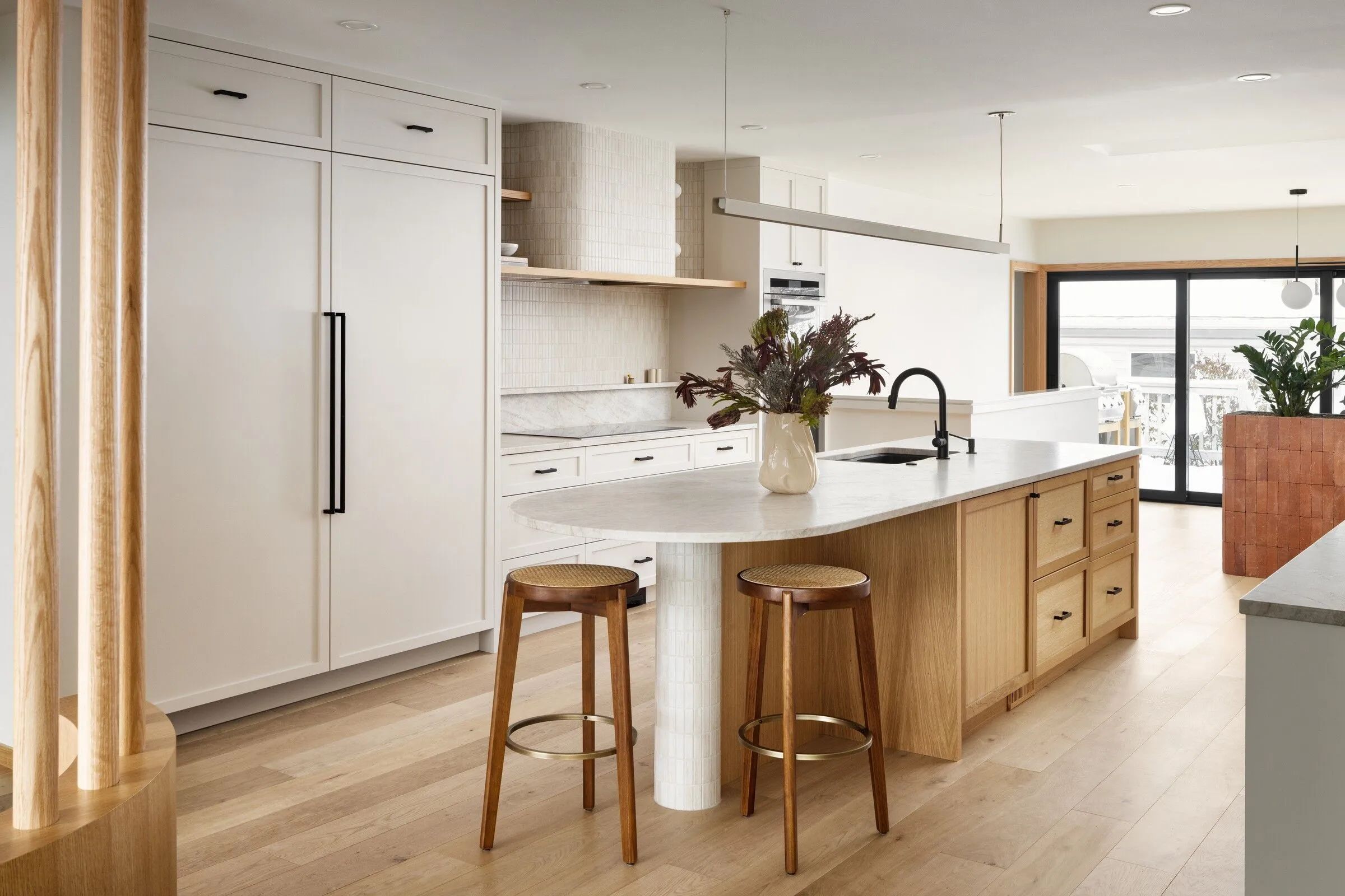
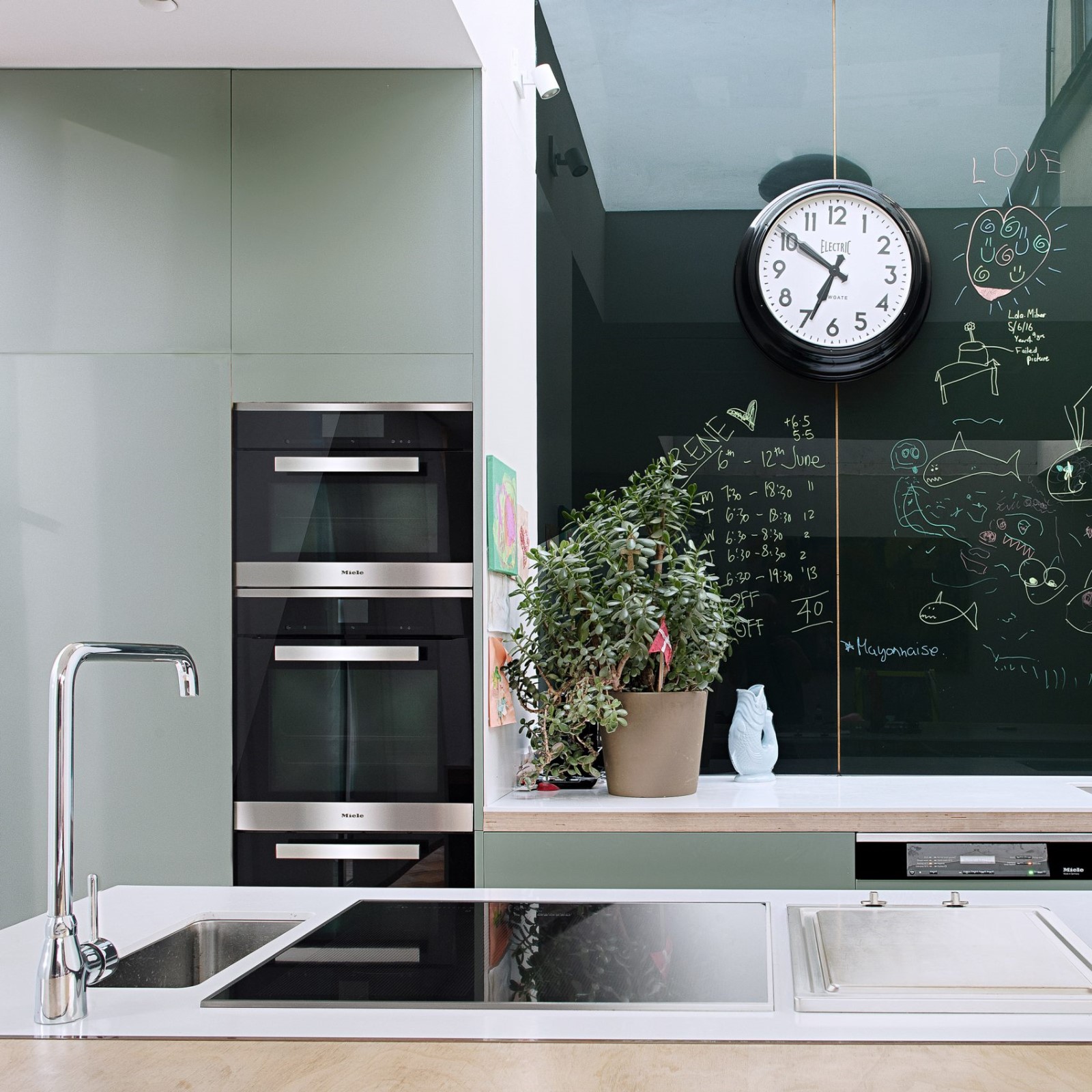
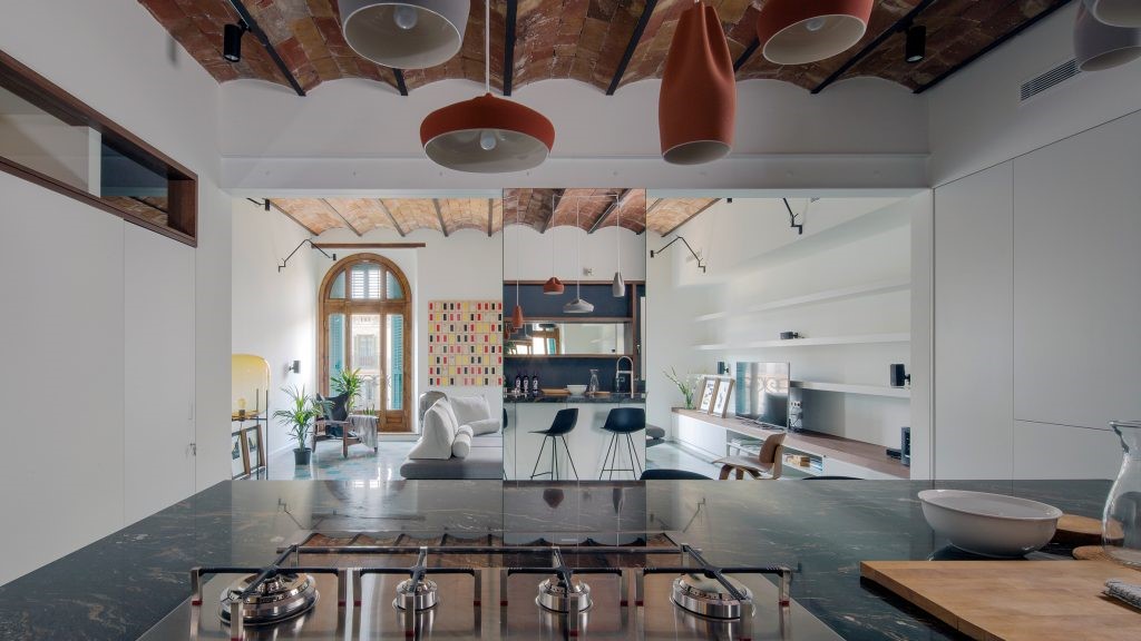
The heart of this home is the kitchen and creating a large kitchen in a small space was a challenge that we happily accepted. Neutral cabinetry and countertops opened up a once closed off kitchen, typical of the 60’s. Blending the island wood tones with the hardwood floor allows the eye to carry straight through to the large windows along the back of the home. The hood fan is definitely a focal point of this space and we had fun curving out the normal boxiness of this kitchen appliance.
这个家的核心是厨房,在小空间里打造一个大厨房是一个挑战,我们很高兴地接受了。中性的橱柜和台面打开了曾经封闭的厨房,这是 60 年代的典型风格。将岛木色调与硬木地板融为一体,让视线可以直接看到房屋后面的大窗户。抽油烟机风扇绝对是这个空间的焦点,我们很有趣地弯曲了这个厨房用具的正常方形形状。
The main floor powder room has no shortage of curves and whimsy. Having a large window to work with created an obstacle that soon proved to be an inspiration. Offsetting the vanity mirror created a Zen-like approach to this room and fun surprise upon entry.
主楼化妆间不乏曲线和奇思妙想。有一个大的工作窗口造成了一个障碍,但很快就被证明是一个灵感。抵消梳妆镜为这个房间营造出一种禅宗般的氛围,并在进入时带来有趣的惊喜。
Similar vibes carried through into the Primary Ensuite with curves in unexpected areas and minimal details. Natural woods and calming cream tones infuse a peacefulness into an important room of the house. Being efficient with the small footprint was crucial, therefore marrying a full size soaker tub shower alludes to a much larger Primary bathroom. Not to mention a spa-like environment for the parents of young children.
类似的氛围也延续到了主套间,意想不到的区域有曲线,细节极少。天然木材和平静的奶油色调为房子的一个重要房间注入了宁静。在小占地面积的情况下保持高效至关重要,因此将全尺寸浸泡浴缸 淋浴结合起来意味着主浴室要大得多。更不用说为幼儿的父母提供类似水疗中心的环境了。
Team: 项目团队:
Architect: Mera Studio Architects
建筑师:梅拉工作室建筑师事务所
Photographer: Eymeric Widling
摄影师:埃默里克·威德林
采集分享
 举报
举报
别默默的看了,快登录帮我评论一下吧!:)
注册
登录
更多评论
相关文章
-

描边风设计中,最容易犯的8种问题分析
2018年走过了四分之一,LOGO设计趋势也清晰了LOGO设计
-

描边风设计中,最容易犯的8种问题分析
2018年走过了四分之一,LOGO设计趋势也清晰了LOGO设计
-

描边风设计中,最容易犯的8种问题分析
2018年走过了四分之一,LOGO设计趋势也清晰了LOGO设计


 PintereAI


