Neil Architecture 自然艺术与品味的平衡 首
2024-08-05 23:41


Neil Architecture
是一家位于澳洲的建筑事务所,由经验丰富的建筑师
Cameron Neil
David Neil
Huyen Bui
Neil Architecture is an Australian based architectural practice co-chaired by experienced architects Cameron Neil, David Neil and Huyen Bui. Each of their projects is unique, functional and challenging, designed to meet the needs of the client while enhancing the quality of life and the built environment.


Butterfly
Neil Architecture
Butterfly Villa is located on one side of the street, surrounded by residential density, how to create privacy in this environment and maximize the introduction of natural light and improve ventilation became the biggest challenge of the design. In response, Neil Architecture conceived a freestanding single-storey pavilion with a series of distinctive, butterfly-shaped columns and slender glass walkways connecting the historic home - a form that creates a new landscaped courtyard between the two buildings.


David Neil
通过对建筑朝向和景观资源的综合考虑,天花采用了面状的结构表达,使其看起来“几乎就像一张折叠的纸”。随着天花抬升,视野转向后院,下缘处凸起的通道最大限度地提高了两个内部庭院的空间感,仿佛将内部的家庭厨房、起居室和餐厅“悬浮”于自然光和郁郁葱葱的自然景观之中。
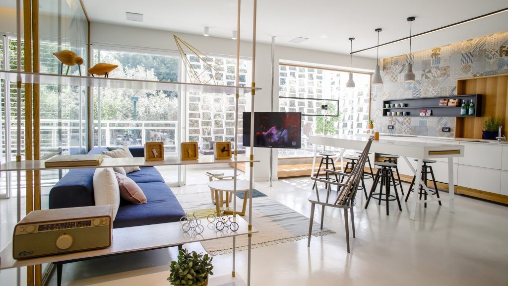
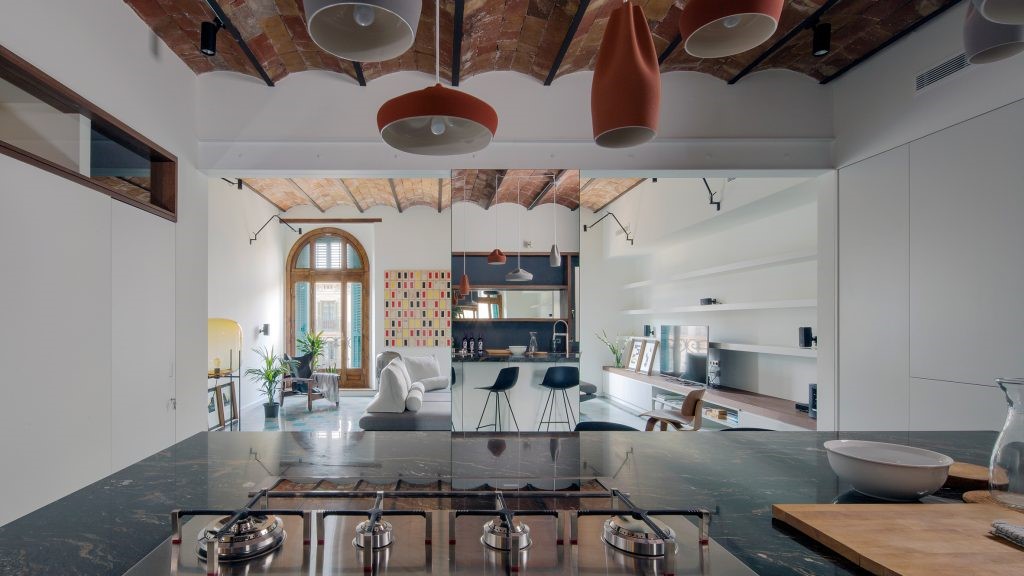
By taking into account the buildings orientation and landscape resources, David Neil used a planar structural expression for the ceiling, making it look almost like a folded piece of paper. As the ceiling rises, views turn to the backyard, where a raised passageway at the lower edge maximizes the sense of space in the two internal courtyards, as if floating the family kitchen, living room and dining room within the natural light and lush landscape.


浅色橡木的使用增强了空间连贯性,辅以仿洞石瓷砖和有着金色纹理的黑色花岗岩,它们使内部视野向外延伸至花园,使室内外的体量之间产生有机地联系。建筑师
Daniel Riddell
说:“材料规格和应用的一致性形了空间的和谐度、温暖感和实用性——这是材料之间一种平衡的结果。”
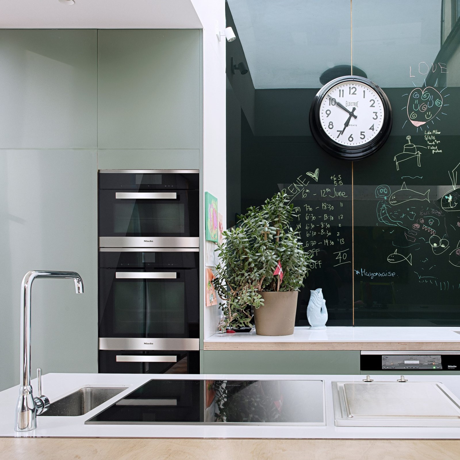
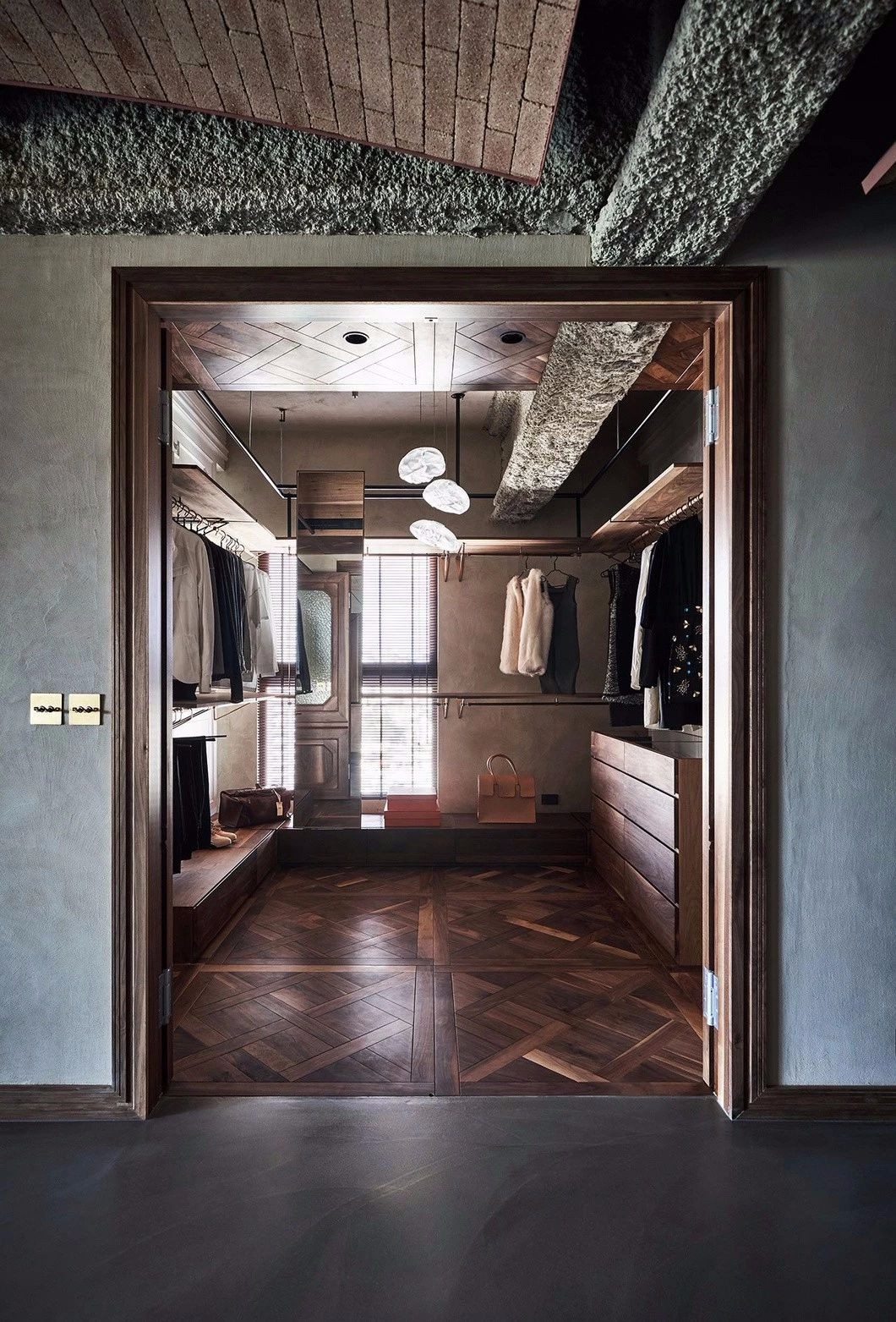
The use of light oak enhances the spatial coherence, complemented by imitation cave stone tiles and black granite with a gold texture, which extend the interior view outwards to the garden, creating an organic connection between the interior and exterior volumes. The consistency of material specifications and applications shapes the harmony, warmth and utility of the space - a balance between the materials, said architect Daniel Riddell.


于原始住宅中,
Neil Architecture
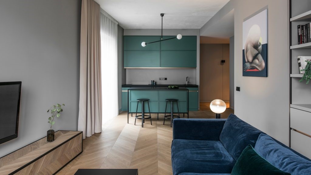
利用“更具装饰性的方法,丰富的色彩和纹理”来实现情绪的对比。柔和的灰绿色衬托出华丽的飞檐、边框,增强住宅令人亲近而传统的特征,而调整后的灯光、木作和家具则体现了彼此的协调与平衡。东侧增建的部分包括一个宽敞的主卧、楼上儿童区则有三间新的卧室,以及一个共享的学习区,互为独立,又保障隐私。
In the original home, Neil Architecture used a more decorative approach, rich colours and textures to achieve contrast in mood. A soft, grayish green accent enhances the intimate and traditional character of the house with ornate cornices and borders, while adjusted lighting, wood work and furniture harmonize and balance each other. The east addition includes a spacious master bedroom, three new bedrooms in the upstairs childrens area, and a shared study area that provides independence and privacy.


图片版权 Copyright :Neil Architecture

 PintereAI


