杨雪婉新作 |LANWUU IMAGINE 澜雾 首
2024-04-15 16:44
LANWUU IMAGINE是一家集婚纱摄影、婚礼跟拍、写真等系列的摄影机构,主理人的创立初心是心动、悦己、定格高光时刻的拍摄理念,拍摄有温度的照片,记录平凡生活中的美好瞬间。在和业主沟通后,我们希望空间也可以呈现出同样的品牌精神。

「AURORA DESIGN」在兼容品牌主旨和这一区域特点的前提下,拉取了平凡生活中的美好瞬间,将瞬间凝固在未完成的时间里,将美好定格在平凡当中。


LANWUU IMAGINE is a photography studio offering a range of services including wedding dress photography, wedding ceremony coverage, and portrait sessions. The founder's original aspiration is to capture moments of excitement, self-satisfaction, and highlight special moments through photography. They aim to take warm, heartfelt photos that record the beauty of everyday life. After discussions with the owner, we both hope to reflect this same brand spirit in the design of the space.

While aligning the brand mission with the distinctive features of the area, AURORA DESIGN seeks to capture the beauty of everyday moments. These moments are frozen within the fluidity of time, preserving the allure of ordinary life.
留存场地原始的结构形式,围绕空间中心的核心区域,依次展开功能刻写。在延续场地记忆的同时,构建新生的空间叙事形式,形成时空的张力,创造“未完成”的现代诗。


The original structures of the site are preserved, unfolding around the central core area of the space to delineate functional zones sequentially. While maintaining the memory of the site, a new narrative form of space is crafted, generating tension between time and space, and creating a sense of "unfinished" modern poetry.
在整个设计过程当中,设计师采用不同的载体来表现“未完成”的概念整体。从时间的瞬息描述平凡的美好,在未完成的未来扣问远方。

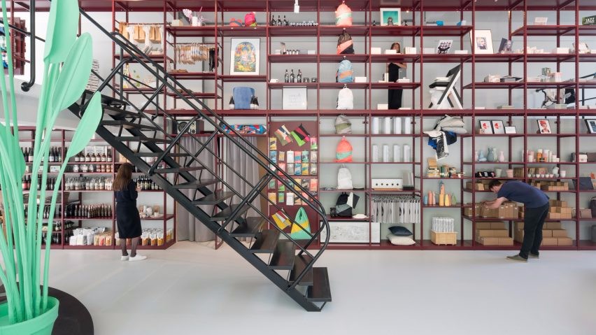
拨开日光,清冷的金属光泽打开眼前的一扇门,跳跃闪现的粉色让你眼前一亮,脚手架的出现恍惚间将你带入一个还在“行进中”的工地,他的完整形态还需要时间的烹调,但初现时已经有了可爱的模样,设计师将这样“未完成”的形态展现,引来了人们的好奇和探索。


Throughout the entire design process, the designer utilizes various mediums to express the overall concept of "unfinished". She captures the beauty of the mundane from fleeting moments in time, while also contemplating the unknown in the unfinished future.

Breaking through the sunlight, a cool metallic sheen reveals a doorway before you. The vibrant flashes of pink décor captivate your gaze. As scaffolding appears, it transports you to a construction site that remains "in progress". Its eventual form is still subject to the passage of time, yet in its initial stages, it already exudes a charming allure. The designer showcases this "unfinished" state, inviting curiosity and exploration from onlookers.
内部空间的构造也倾向于保留场地原有的故事格局,简洁造型的天花,有序排列的灯光,将场地原有的初始形态保留,使整个空间处于一种“待续”的暧昧状态,在初始状态和行进状态的摇摆不定中创造一种无限延展的空间形态。


The interior structure tends to preserve the original narrative of the site, with ceilings featuring simple designs and lighting arranged in an orderly manner. This approach maintains the initial essence of the space, imbuing it with a sense of ambiguity and continuity. The interplay between its initial and ongoing states creates an infinitely expansive spatial form.
运用基础的元素 —— 体块来串联空间关系。

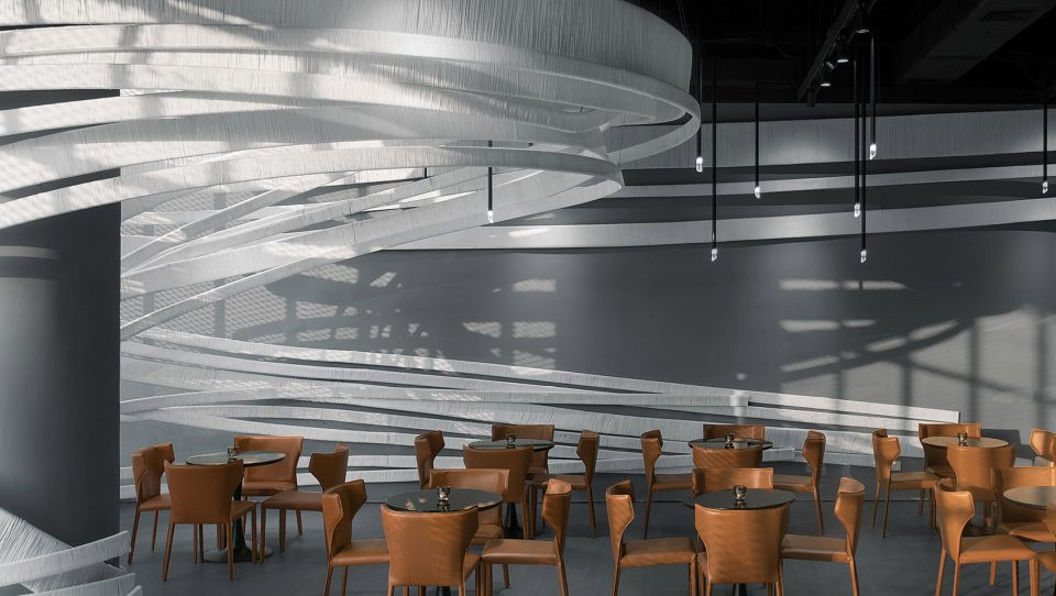
旋转中的柱状围合空间,凝固在某一个瞬间,它不拘一格的形态刻画出某种自由、连续的氛围,贴合了会客空间的功能属性;在展示空间中,设计师运用了半封闭的圆柱围合空间,稍显温和的舒缓形态,伴随观者的心情流动,也围拢了观者的目光。

场景的转换和空间的变化都依托住最基础的元素,在客人和场所间建立一种新的流动。


The basic element - mass is utilized to connect spatial relationships. Rotating cylindrical structures enclose spaces, capturing a moment where their unconstrained forms depict a sense of freedom and continuity, aligning with the functional attributes of the reception area. Within the exhibition space, the designer employs semi-enclosed cylindrical structures to define the space, creating a gently soothing form that accompanies the flow of viewers' emotions and directs their gaze. The transitions of scenes and changes in space rely on the most fundamental elements, establishing a new flow between guests and the environment.
在色彩的运用中,我们使用了大量的金属,不锈钢,混凝土灰,木色和大理石的表皮表达,将具有表现力的色彩运用到空间中,塑造出硬朗,高调,自由的空间观感。

特别是不锈钢和金属色的延伸扩展,赋予了未来色彩的艺术感与科技感。


In terms of color application, we incorporate abundant elements of metal, stainless steel, concrete gray, wood tones, and marble coverings. These expressive colors infuse the space, creating a bold, sophisticated, and liberated ambiance. Especially notable is the extension of stainless steel and metal, imparting a futuristic sense of artistry and technological texture to the space.
设计师运用基础几何元素和色彩为整个空间的属性添写注脚,将自由、高调,硬朗的精神表达和“未完成”的状态植入到空间中,也是品牌内涵的多维书写。
The designer employs basic geometric elements and colors to define the characteristics of the entire space, infusing it with a sense of freedom, sophistication, and boldness, along with an essence of unfinished, reflecting the multidimensional aspects of the brand’s meaning.
设计以生活的浪漫视角出发,用跳跃的建筑语言重塑室内场景,最终形成空间丰富的场景叙事感。

由正门进入内部空间,圆形的构筑物将视觉中心收拢,半围合的设计创造出自由而多元的空间张力,设计师将展示间安排在这里,以顾客的观察视角形成情感的体验中心。


Starting with a romantic perspective on life, the design employs dynamic architectural language to reshape the indoor scenery, ultimately cultivating a rich narrative within the space. Upon entering from the main entrance, a circular structure draws one's focal point, while the semi-enclosed design fosters a sense of free and diverse spatial tension. The designer situates the showroom here, creating an emotional experiential center from the customer's viewpoint.
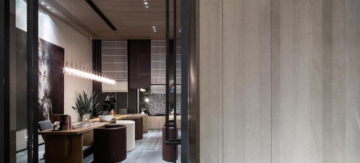
将视角转入另一头,洽谈区以咖啡吧的形式出现,整体的布局设计也加入了咖啡的复合型商业概念,将生活中浓郁的温暖香气融入,浸润空间的味觉体验。

整个洽谈区域呈现出跳跃而有序的格局。

矩形地毯搭配随意摆放的座椅、而整齐排列的会客座椅却由不规则围合,端景处的一抹绿色成为空间的逗号,仿佛在街区中心的公园和路沿的座椅,碰见了三两好友,一起坐下聊聊那些正在发生的美好。


Shifting the perspective to another corner, the chat zone takes the form of a café bar. The overall layout design incorporates a blended commercial concept of coffee, infusing the space with the rich and warm aroma of coffee, enhancing the sensory experience. The chat zone presents a lively yet organized layout. The rectangular carpet complements the casually arranged seats, while the neatly arranged seating is enclosed within an irregular structure. At the far end of the space, a touch of green serves as a punctuation mark, reminiscent of a park in the neighborhood center or roadside seating, where one might encounter a few friends and sit down to chat about the pleasant events happening around them.
设计师将窗景设计为圆的造型,模拟成相机的镜头,与白色的外墙形成LANWUU IMAGINE特有的品牌视角,用包容的白色容纳内部发生的一切,将这些美好的时刻定格,保留时光的间隙,捕捉瞬间的永恒。


The designer shapes the window scenery into a circular form, mimicking as a camera lens. By integrating this round window view with the white exterior walls, LANWUU IMAGINE's distinctive brand perspective is established. The inclusive white color embraces everything happening inside, capturing and preserving those beautiful moments, while also retaining the passage of time and capturing the eternal essence of the fleeting moments.
金属材质的楼梯分割了休闲区域和工作区域,顾客体会到完全不同的场景转换,主要由木质隔墙打造的化妆间和更衣室,采取了日式和室的布局形式,围合成一个个隔间,在完成了私密性的硬性要求下,也将简约、舒适的美学追求传递到空间中。


The metal staircase divides the space into leisure and working areas, providing customers with a distinct transition between scenes. The makeup room and dressing room, primarily constructed with wooden partition walls, adopt a layout reminiscent of Japanese-style rooms, enclosing each area into individual compartments. While meeting the essential requirement for privacy, the space also embodies a pursuit of simplicity and comfort in its aesthetic.
金属质感的推拉门,把我们带回到喧嚣的城市中,沿着道路行走,我们看见街口的涂鸦,自由挥舞的笔触,描摹出走廊空间洒脱的行走路线,反光的金属面和清水混凝土的材质配比,雕刻出整个空间的质感和结构美,于简约中构建力量,在反射中呈现本我。

设计师运用材质的对比诠释了品牌内涵中对自我美好品质的表达。


The metal-textured sliding door transports us back to the bustling city. As we stroll along the streets, we encounter graffiti at the intersection, where free-flowing brushstrokes depict the carefree pathways within the corridor space. The contrast of reflective metal surfaces and architectural concrete materials carves out the texture and structural beauty of the entire space. Through simplicity, strength is built, and through reflection, the essence of self is revealed. The designer's use of material contrasts interprets the brand's essence, expressing qualities of self-improvement.
设计师利用不同的场景变化,在空间中展现对美好瞬间的不同理解,将设计师的视角与体验者的情感记忆点融合互换,形象化的呈现出品牌的内涵和空间精神。
The designer employs various scene changes to present different understandings of beautiful moments within the space. By blending and exchanging the designers perspective with the emotions and memories of the experiencers, the essence of the brand and the spirit of the space are vividly depicted.
「AURORA DESIGN」通过对品牌轮廓的剖析和解构,以生活的平凡姿态为切入点,用“未完成”的时空构想来延续瞬间的美好,用张扬的色彩表达品牌所追求的“自我”时刻。
期待在更多的对场景变化的感悟中,搜寻未来未见的点滴美好和温暖。
AURORA DESIGN analyzes and deconstructs the brand profile, taking the ordinary aspect of life as its starting point. Through the concept of unfinished time and space, it extends the beauty of fleeting moments and expresses the brands pursuit of self through bold colors. We look forward to discovering more unseen beauty and warmth in the future through deeper reflections on changes in scenery.
Project  Information

项目名称|LANWUU IMAGINE澜雾

项目地点|云南省昆明市

项目面积|400平米

设计团队|AURORA DESIGN 艾洛设计

主案设计|杨雪婉

设计团队|AURORA DESIGN 艾洛设计  王达 张斯劼

灯光设计 | Uniimport 元入科技

设计时间 | 2023.8月

完工时间 | 2023.12月

施工落地|重塑空间

项目摄影师|言隅 纳信
NCA 新商业空间大奖-2023 年度新商业空间设计师 TOP100 等
艾洛设计 / AURORA DESIGN 是一家针对空间设计的高级室内设计机构,致力于打造共情消费者的态度美学空间,并诠释当下消费体验趋势所在。
本着「创造幻想的美」的设计理念,历经多年品牌服务与项目落地 ,对固有品牌业态的重新诠释,为婚纱摄影空间定制、商业零售、独立 /连锁餐饮迭代 、展厅空间、高端住宅、艺术装置等领域的精英客户提供全面极致的设计顾问服务。
原创作品
 举报
举报
别默默的看了,快登录帮我评论一下吧!:)
注册
登录
更多评论
相关文章
-

描边风设计中,最容易犯的8种问题分析
2018年走过了四分之一,LOGO设计趋势也清晰了LOGO设计
-

描边风设计中,最容易犯的8种问题分析
2018年走过了四分之一,LOGO设计趋势也清晰了LOGO设计
-

描边风设计中,最容易犯的8种问题分析
2018年走过了四分之一,LOGO设计趋势也清晰了LOGO设计


 PintereAI


