Mountain Soil丨空间中的体积感,义乌桃花源住宅 首
2024-01-20 14:48


Mountain Soil
山地土壤室内设计创立于2019年,以“无限接近自然,回归自然”作为基本设计准则,寻求人与空间,建筑与自然之间的平衡关系。
Mountain soil interior design was founded in 2019, with infinitely close to nature, return to nature as the basic design criteria, seeking a balanced relationship between people and space, architecture and nature.


项目位于浙江义乌市绿城桃花源,远离城市中心喧嚣,僻静的环境属性和四层的建筑空间,使得设计的核心落于给居住者营造一个舒适且自由的生活空间。
The project is located in a four-story villa that is away from the hustle and bustle of the city, enabling the design to embrace the core idea of creating a comfortable residential space for the inhabitants, fulfilled with free spirit.


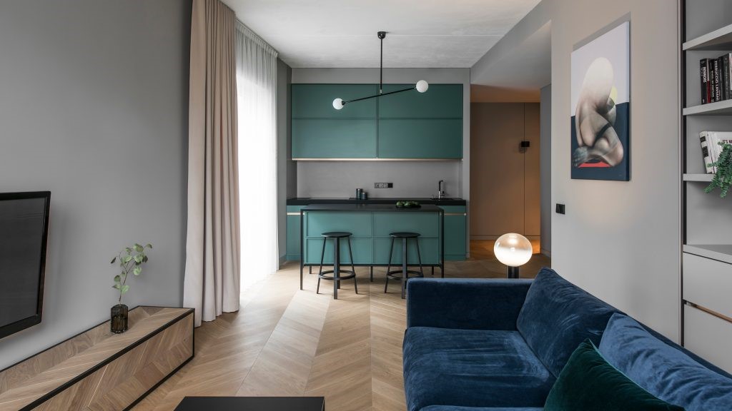
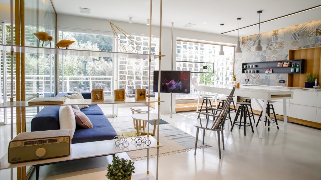
室内面积约为510平方米,我们在设计上结合了对不同空间体积及尺度的思考,辅以现代极简风格和对细节的珍视、处理,让居住空间得以在悠久的时间里,合乎功能和日常使用的各种实际需求,同时也映衬出居住者的个性、生活方式和生活品味。
The interior encompasses 510 square meters, and considerations for divergent spatial volumes and scales were incorporated into the design, complemented by a modern minimalist style and attention to details. This allows overall space to meet various practical needs for functionality and daily usage over a long period of time, while also reflecting personality, lifestyle, and taste of the homeowner.


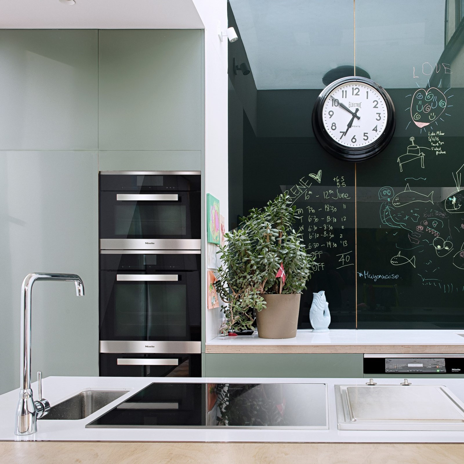
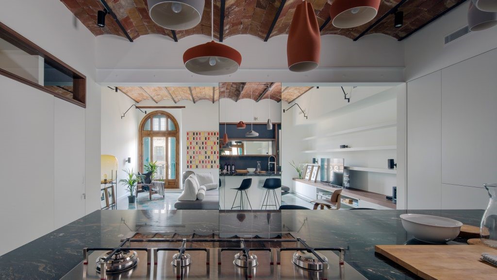
一层区域在平面规划中由三个主要的生活支点展开,分别为厨房、客厅以及餐厅。
Starting from three main living pivots, the first floor is organized into kitchen, living room and dining room.


在厨房和餐厅连接的区块内,有一根建筑原有的支撑柱体,贯穿着天花和地面。在细节设计上,我们用三角改变原始的柱体骨骼形态,表皮则包裹上天然石材肌理。靠近餐厅的墙体结构内部为原始建筑排水管道,我们将管道的外围赋予秩序几何,再镜像复制,平衡视觉。
In the block connecting the kitchen and dining room, an original supporting column that runs through the ceiling and ground, was wrapped in natural stone textures and exemplified in triangles to alter the original cylindrical bone shape. The wall structure alongside the dining room involves existing drainage pipelines. We have assigned new geometry surface was employed to cover the periphery of the pipeline, and the balance of visual experience has been achieved by mirrored and replicated touch.


在空间的间离和链接上,我们在客厅和父母卧室的空间中增加了一条分割线,主单元与次单元以一种模糊的关系融合在一起。在分割的边线的细节处理上,设计师于此置入了一个立体装置,给予体积尺度感上的厚度支撑,同时与实用功能相结合,让此处空间成为一个独立的体系。介入的全新装置不仅仅局限于体积造型感的表面,而是真正地满足日常生活的功能。项目中所有建筑自有的横梁和柱体,都有着不同体积尺度的处理,达到整体空间统一表达的极简之感美学。
A dividing unit is added up between the living room and the parents room, which blurs the boundaries between the main area and the secondary, marking a sublime interpretation of spatial separation and connection. To process details of the segmented edges, the designer has placed a three-dimensional installation, providing supporting thickness in terms of volume scale, juxtaposed with practical functions to erect an independent system. Different functional needs of daily life have been taken into consideration with this new involvement that also speaks to the concept of spatial volume and shape applied in a sensitive design language. The existing architectural beams and columns are treated with different volume scales, achieving a minimalist aesthetic of unified expression throughout the space.


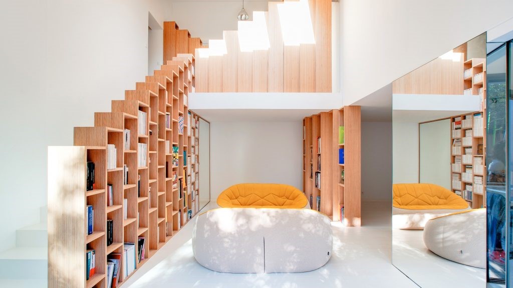
二楼起居室与卧室休息区的顶部由一根抛物线连接首尾。 在纵向轴线中插入边界墙体,左右两侧的移门消隐在墙体内侧。这样尽管主体相连,但却又保持各自的独立性。在负二层的顶面置入一个方形几何体,几何体的内部如同一个巨大的容器承载着储物功能。在其外侧,我们通过人为干预把几何体的网格边线向右侧移动,给居住者形成一个有意识的空间形变。在几何体外侧的挑空处,我们预留了五个透明的盒子,光引入室,通过光的阴影与折射给空间增添自然厚度。
A square geometry was employed on the top of the first basement, of which function like a huge container with the storage capability.Grid edges of the geometry is shifted to the right from its outer side through purposeful intervention, casting a conscious spatial deformation for the inhabitants. Five transparent boxes are reserved in the upper void space at outer part of the geometry, bringing light into the space where natural elements are punctuated by the shadow and refraction of lights.


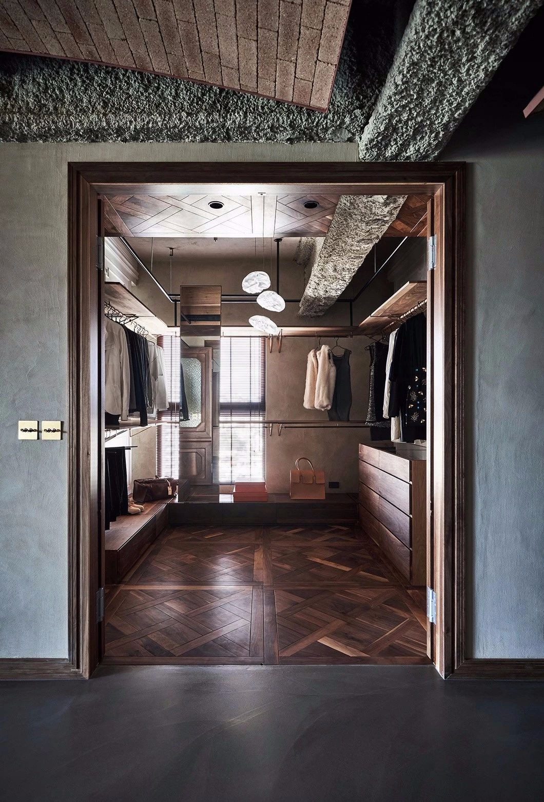
所有的家具和功能区域都经过精心的布局,确保动线的合理流畅外,最大程度地优化到日常生活中的使用层面。在空间的材质和颜色选取上,设计师以呼应和对比的处理,呈现色彩和不同肌理的表现。休闲茶吧的储物柜体与墙体饰面,由两个不同颜色的木饰面拼接,在空间呈现的主要表面上形成对比。深色的柜体表面与折叠造型门相呼应,让材质与材质之间发生对话。
Every piece of the furniture and section of the functional area were carefully planned to ensure a reasonable and smooth circulation, completed by optimization for daily use. In terms of material and color selection, texture of the palette was completed by contrasting and continuous cohesion. The storage cabinet and wall ornaments, placed in the bar area, are presented with two different colored wood finishes, generating a contrasting spatial color layer. Furthermore, a dialogue between materials was formed through unified texture of the dark colored cabinet to the folding door.


图片版权 Copyright :Mountain Soil

 PintereAI


