域式建筑 秩序与自然的延续——柠萌影视北京办公空间 首
2023-12-20 09:09
From architectural order to spatial order
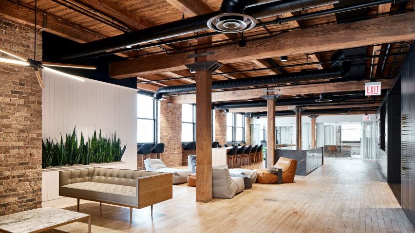
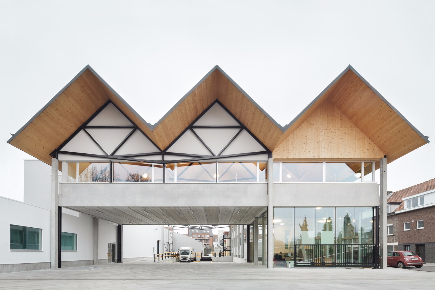
柠萌北京办公空间位于一栋20世纪50年代的苏联建筑中,三层的独栋建筑具有强烈的对称感。序列的基调在建筑外立面中表现的极为强烈。域式建筑在此基础上,为柠萌影视创造了一个与之呼应的办公空间,将建筑的秩序引入到空间的秩序中,让节奏与秩序感融于空间中,并运用自然元素打造一个舒适怡心的办公空间。
Linmon Pictures Beijing office space is located in a Soviet building in the 1950s. The three-story single-story building has a strong sense of symmetry. The tone of the sequence is extremely strong in the facade of the building. Based on the existing condition, Ustudies Architects creates a corresponding office space for Linmon Pictures, which integrates rhythm and order, and uses natural elements to create a comfortable and pleasant office scene.
▲ 柠萌北京办公楼外立面/ LINMON PICTURES
BEIJING OFFICE FACADE ©存在建筑
HUB AREA AXONOMETRIC ©域式建筑
三层楼每层楼平均面积约1200平米,楼层空间的规划上,在遵循秩序感的同时,将自然引入空间,并且根据隐私程度不同,由一楼至三楼依次布置开放、办公、私密的空间;一楼功能包括接待大堂、餐厅、影院、健身房、会议室等,二楼为主要办公与会议区,三楼则由办公室 、大会议室与接待空间组成。每一层的布局除了功能秩序严谨之外,还将不同的自然元素融入其中,让自然的活跃感与序列的秩序感成为一种和谐的组合。
The average area of each floor is about 1,200 square meters. In the planning of floor space, nature is introduced into the space while following the sense of order, and according to the degree of privacy; first floor includes reception lobby, restaurant, cinema, gym, meeting room, etc. Second floor is the main open office and meeting area, third floor includes private offices, large meetings room and VIP rooms. In addition to the strict functional order, the layout of each layer also integrates different natural elements into it, making a harmonious combination of the sense of natural activity and the sense of order of the sequence.
Disorder and surprise in open order
FIRST FLOOR- RECEPTION LOBBY ©存在建筑
走进室内,先进入到的是首层空间枢纽的接待区,7米2长的悬挑前台首先映入眼帘,石材与石材之间的相嵌关系,将大堂各自为阵的体块关系连接在了一起,并弱化了在大堂视觉中心的四根结构柱。300平米接待区为未来的公司形象展示保留空白的同时,利用了天花与墙面点缀的弧形造型与灯光搭配,丰富了接待区的层次感。在接待区横向天花中线上,利用了对称的圆角造型与灯带分割了空间的视觉关系与功能性,前区主要作为展示区,后区则为等候区与拍照区。天花灯带与石材墙面在造型上也做了联系,一方面增加了南北横向的通透感,另一方面墙面的切割也让光产生了实体感。
As you walk in, the first space you enter is the main hub of first floor- the reception lobby, soon the cantilevered front desk with a length of 7.2 meters comes into sight. The embedded relationship between stones connects the isolated volumes in the space as a whole, it also weakens the existence of four structural columns. While the 300-square-meter reception lobby is kept blank for future use of corporate image display, the filleted-corner ceiling and lighting of the walls are designed to enrich the sensual of the reception lobby. On the center line of the horizontal ceiling in reception lobby, the symmetrical filleted-corner and light strips are designed to divide the visual relationship and functionality of the space. The front area is mainly used as a display area, while the rear area is a waiting area plus a photo-taking area. The light stripes on the ceiling are visually connected to the stone wall which avoids the space from visual boundary on the north-south direction and creates a sense of transparency on one hand, and on the other hand, the cutting of the wall also brings the light to life.
▲ 南北向天花与墙面造型/ CEILING AND WALL DESIGN ON NORTH-SOUTH DIRECTION ©存在建筑
▲ 等候区与门套细节 / WAITING AREA AND DOOR POCKET DETAIL ©Erik Ho
▲ 前台与墙面相嵌细节/ THE EMBEDDED RELATIONSHIP BETWEEN FRONT DESK AND THE STONE WALL ©Erik Ho
▲ 一楼拍照区/ FIRST FLOOR- PHOTO-TAKING AREA©存在建筑
▲拍照区灯膜与灯带细节/ DETAIL OF THE ROUNDED LIGHT STRETCH CEILING AND LIGHT STRIPES©存在建筑
拍照区位于方正的大堂区的最底端,利用原有空间布局形成了一个半围合空间。灯光上利用圆形软膜天花提供了拍照所需要的柔和光与穿过前台产生了一个次视觉焦点,提供团队拍照区域的同时,也为未来空间增设卡座休憩区打好基础。
The photo-taking area is located at the end of the reception lobby which took advantage of the original layout to form a semi-enclosed space. The round light stretch ceiling is designed to provide the soft light needed for taking pictures while creating a secondary visual focus through the front desk when entering. It’s not merely a space for the team to take pictures, but also lays a solid foundation for adding a fixed sofa area in the future.
▲等候区与拍照区/ WAITING AREA - PHOTO-TAKING AREA ©存在建筑
接待区分割了一层南面的会议区与北面的休闲区,在走道设计上,也通过了照度与灯具材质的选择,将两边的性质区分开来。
The reception lobby divides first floor into two parts, the meeting area on the south and the leisure area on the north on the first floor. To illuminate the difference of function on north and south, the choice if lighting fixtures, materials and illuminance of the north and south corridor are differentiated.
▲ 一层餐厅/ FIRST FLOOR- RESTAURANT ©Erik Ho
▲ 餐厅拱型墙面细节/ RESTAURANT- ARC WALL DETAIL ©存在建筑
▲ 餐厅细节/ RESTAURANT DETAIL ©Erik Ho
餐厅区以亮黄色强化了品牌形象,与木色搭配的同时,利用拱形造型,将空间氛围区别于其他区域,营造出了较为轻松活泼的用餐场景,希望员工与访客能在用餐时充分休息与转换心情。
The restaurant area uses bright yellow to strengthen the brand image. While matching with the wood color, the arched shape is used to distinguish the space atmosphere from other areas, creating a more relaxed and lively dining scene hoping employees and visitors can fully rest and switch moods during meals.
▲ 项目筹备室/ PROJECT ROOM ©存在建筑
▲ 一层南走廊/ SOUTH CORRIDOR ©Erik Ho
南面办公区设置为临时办公与会议区,属于有对外性质的空间。走道空间作为会议区与办公区间的灰空间,同时兼具了临时等待区的功能,因此在天花设计上,将等待区天花高度适当下降,提供了较为静态的动静区分割。
The south office area is planned as temporary offices and meeting area which involves external communication nature. The corridor space is the gray space between the meeting area and the office area, it also contains the function of a temporary waiting area. The ceiling of temporary waiting area is designed to be lower than the rest to provide a relatively static division from the dynamic areas.
The natural environment introduced layer by layer
▲ 二层玻璃盒绿植区/ SECOND FLOOR- GLASS PLANT TERRARIUM ©Erik Ho
进入二层,首先是一个位于中心区域的前厅,以一个充满绿植的玻璃盒子为核心,将自然层层引入空间。这种看朦胧且半通透的绿意,让人们在在二层入口及各个主动线上均能将视线落在这里。除此之外,在布局上也模拟了四合院的空间关系,将前厅区围绕著玻璃盒绿植区布置了会议区、茶水区与电话间等人与人交流的空间,利用了二层洄游动线的属性,使之承担了整个办公层的交互纽带。
Entering the second floor, there is first a front hall located in the central area, with a glass box filled with green plants as the core, introducing nature layer by layer into the space. This hazy and semi-transparent greenery allows people to focus their attention here at the entrance to the second floor and on all active lines. In addition, the layout also simulates the spatial relationship of the traditional courtyard house which meeting rooms, pantry area, phone booth where people actively communicate are planned around the glass plant terrarium. It acts as the interactive link of the entire office floor due to the nature of migration circulation on second floor.
▲ 玻璃盒绿植区与会议室入口/ GLASS PLANT TERRARIUM - MEETING ROOM ENTRANCE ©存在建筑
▲ 玻璃盒绿植区近景/ GLASS PLANT TERRARIUM
玻璃盒绿植区在灯光设计上,同样利用了软膜天花的设计模拟了天光的效果,作为中心区的焦点照亮了整个空间的同时与射灯进行搭配,让整个空间在光感上张弛有度。
In the lighting design of the glass plant terrarium, the design of the light stretch ceiling is design to simulate the effect of skylight given the space sense of outdoor. As the focus of the hub area, it illuminates the entire space, collocate with the spotlights, to light the space with gentleness.
▲ 二层中会议室/ SECOND FLOOR- MEDIUM MEETING ROOM ©Erik Ho
▲ 二层开放办公区走道/ SECOND FLOOR- CORRIDOR
OF OPEN OFFICE AREA ©Erik Ho
二层作为主要办公区,南北两侧基本为对称布局,过道两侧结构柱以壁灯进行点缀,界定开放办公区空间界线的同时,增添了灰空间的柔和氛围。
The second floor is the main office area, with a symmetrical layout on the north and south sides. The structural columns on both sides of the corridor are embellished with wall lamps, which define the space boundary of open office area, at the same time adding a soft atmosphere to the gray space.
▲ 二层开放办公区/ SECOND FLOOR- OPEN OFFICE AREA ©Erik Ho
▲ 二层开放办公区/ SECOND FLOOR- OPEN OFFICE AREA ©存在建筑
开放办公区呼应了原有建筑结构的秩序与节奏,天花以圆弧造型与间接照明相互搭配,给予办公区更柔和适宜的灯光氛围。间接照明利用了工位线性灯上方的空间配置了灯带向上打光,使圆弧造型光线从边缘柔和的晕染开来。圆弧造型的设计也一定程度上增加了施工难度,在造型与功能的平衡上,在靠过道部分,主视线遮挡的天花区域,将圆弧一半调整为直线,方便安装侧出风口,施工方也对检修口进行了优化,将检修口设计为弧形检修口。
The open office area echoes the order and rhythm of the original building structure. The arc shape of the ceiling collocation with the indirect lighting, giving the office area a softer and more suitable working atmosphere. The indirect lighting makes use of the space above the linear lamps above the workstations which illuminate upwards, so that the arc-shaped light is softly blurred from the edge. The design of the arc shape also increases the difficulty of construction to a certain extent. In order to balance between shape and function, half of the arc is adjusted to a straight line in the ceiling area near the aisle where the main line of sight is blocked, so as to facilitate the installation of side air outlets. The construction party also optimized the access panel and designed the inspection port as an arc-shaped access panel.
▲ 二层洗手间/ SECOND FLOOR-RESTROOM ©Erik Ho
The continuation of order and nature
▲ 三层接待区/ THIRD FLOOR- RECEPTION AREA ©Erik Ho
▲ 三层前厅区悬浮水景台/ THIRD FLOOR- RECEPTION AREA &
CANTILEVERED WATER PLATFORM ©存在建筑
三层的空间以一个悬浮的水景台展开,除了造景的目的外,也同时提供了一个动线导向性,区别与一层与二层的洄游动线,将更多的动线导向南侧,为北侧的接待空间提供了进一步的隐私。三层由于私密性空间的增加,材料应用上更为多元与深沉,
The space on the third floor is expanded with a suspended waterscape platform. In addition to the purpose of landscaping, it also provides a flow guide, which is different from the migration circulation on first and second floor. The cantilevered water platform guides visitors more to the south side, providing a further privacy for the VIP area on the north side.
▲ 三层前厅区悬浮水景台细节/ THIRD FLOOR- CANTILEVERED
WATER PLATFORM DETAIL ©存在建筑
▲ 三层接待区/ THIRD FLOOR- RECEPTION AREA ©Erik Ho
▲ 三层大会议室/ THIRD FLOOR- LARGE MEETING ROOM ©Erik Ho
前厅区后方的大会议室,在保证大型会议基础上,在靠窗区域预留了空间保证了能增添座椅,以满足全员会议的功能。
The large meeting room is behind the reception area. To ensure the hold of large-scale conferences, space is reserved near the window area to ensure that seats can be added to meet the size of a full-crew meeting.
▲ 三层北过道/ THIRD FLOOR-NORTH CORRIDOR ©存在建筑
▲ 三层独立办公室/ THIRD FLOOR- PRIVATE OFFICE ©Erik Ho
三层南北过道延续了一层与二层的弧形元素,但在设计与材质上有所区别,使三层空间整体材质统一中,根据细微的差异体现出不同的氛围。
The north and south corridor on the third floor continues the curved elements of first and second floor, but there are differences in design and materials, so that the overall materials of third floor are unified, and different atmospheres are reflected according to subtle differences.
项目信息
项目名称 | 柠萌影视北京办公空间
设计公司 | 域式建筑
项目设计 & 完成年份 | 2022.04 – 2022.12
主创及设计团队 | 付强,刘思妤,申祚宁,孙小明,周子璇
施工单位 | 北京百尚达建筑装饰工程有限公司 BSD Group

项目地址 | 北京朝阳区酒仙桥路10号(26-27)
建筑面积 | 3727㎡
摄影版权 | 存在建筑|Arch-Exist  / Erik Ho
毕业于同济大学建筑系,曾就职于多家境外建筑设计事务所和房地产开发公司。2011年创立UStudies工作室,并于2015年成立域式建筑/UStudies Architects。作品在不断探索空间改造以及新型空间利用的创新与可能性,设计从建筑师的角度出发,着眼于空间全局,并且强调材料本质和设计的关系。作品获得2019年BEST 100中国设计100强、2019年美国AIA 国际建筑奖和可持续未来建筑奖等殊荣,并且被美国INTERIOR DESIGN杂志收录为封面。
域式设计于2015年创立于上海,前身为创始人付强在2011年设立的UStudies工作室。域式设计是从事建筑和室内设计的专业合伙人事务所 。自2015年开始,域式设计开始探索空间改造和室内设计在建筑设计行业转型期的可能性,并在以 “柠萌影业总部”、“补时影院”、“水会”为代表的一系列办公空间、定制豪宅和城市商业空间的设计中,尝试建筑学对空间更新改造的实践意义和基于材料本质的设计回归。域式设计专注于作品的完成度和实施效果,在施工过程中高频度参与施工和软装配饰的全过程服务。此外,域式设计作品被国内外媒体和网站多次报道和采访,如美国 Interior Design 杂志,Archdaily,《外滩画报》,OFFICESNAPSHOTS网及德国室内设计网等。
采集分享
 举报
举报
别默默的看了,快登录帮我评论一下吧!:)
注册
登录
更多评论
相关文章
-

描边风设计中,最容易犯的8种问题分析
2018年走过了四分之一,LOGO设计趋势也清晰了LOGO设计
-

描边风设计中,最容易犯的8种问题分析
2018年走过了四分之一,LOGO设计趋势也清晰了LOGO设计
-

描边风设计中,最容易犯的8种问题分析
2018年走过了四分之一,LOGO设计趋势也清晰了LOGO设计


 PintereAI


