新作|Anastasia Pridachina • 用色彩打造冲突美学 首
2023-12-18 09:19
空间的一半依赖于设计
另一半则源自于存在与精神
“Half of space depends on design the other half is derived from presence and spirit.”
——安藤忠雄(Tadao Ando)


Anastasia Pridachina 在公寓的内部反映了顾客对新体验持开放态度的性格。年轻人要求设计师将设计变为现实,电影《闪灵》的第一个场景意外地成为了参考。
Anastasia Pridachina reflects the open attitude of customers towards new experiences within the apartment. Young people demand designers to turn designs into reality, and the first scene in the movie Shining unexpectedly became a reference.


引人注目的勃艮第色调照亮了淋浴和浴室,而白色的穿孔则定义了储物布局。该项目中几乎所有的颜色都是基于斯坦利·库布里克的画作,他电影中的许多元素都通过塑料金属和石膏的棱镜重新诠释。
The eye-catching Burgundy color scheme illuminates the shower and bathroom, while the white perforations define the storage layout. Almost all the colors in this project are based on Stanley Kubricks paintings, and many of the elements in his films are reinterpreted through prisms of plastic, metal, and plaster.


宽敞的公寓位于螺旋形建筑内,因此每层楼都稍微顺时针偏移。最初,该物体是一个没有直角的细长房间,但在最意想不到的地方有承重柱。客户的要求是建造一个带有相邻浴室的私人和公共区域。
The spacious apartments are located within the spiral building, so each floor is slightly offset clockwise. At first, the object was a slender room without right angles, but there were load-bearing columns in the most unexpected places. The clients request is to construct a private and public area with adjacent bathrooms.


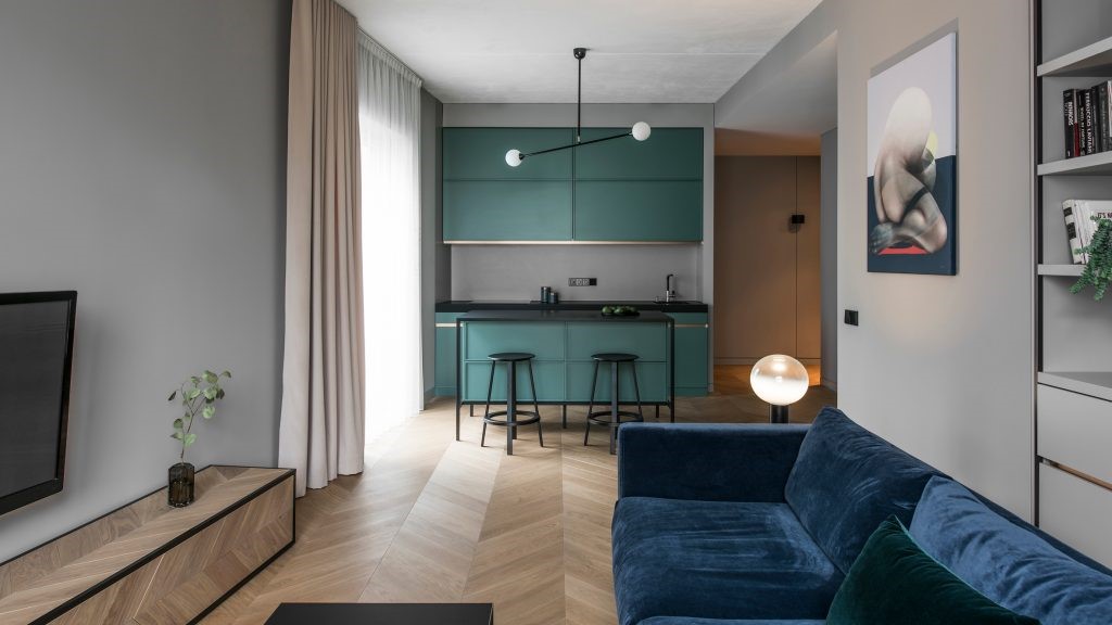
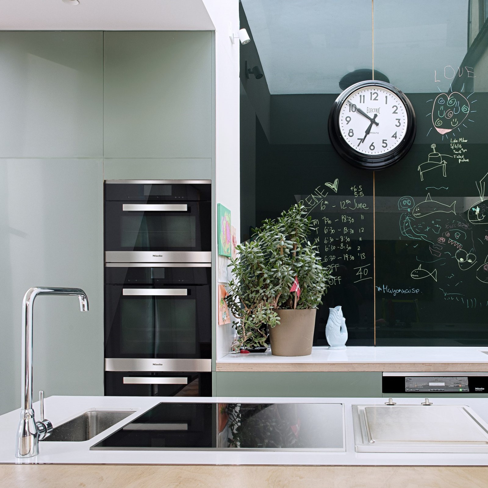
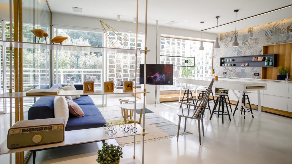
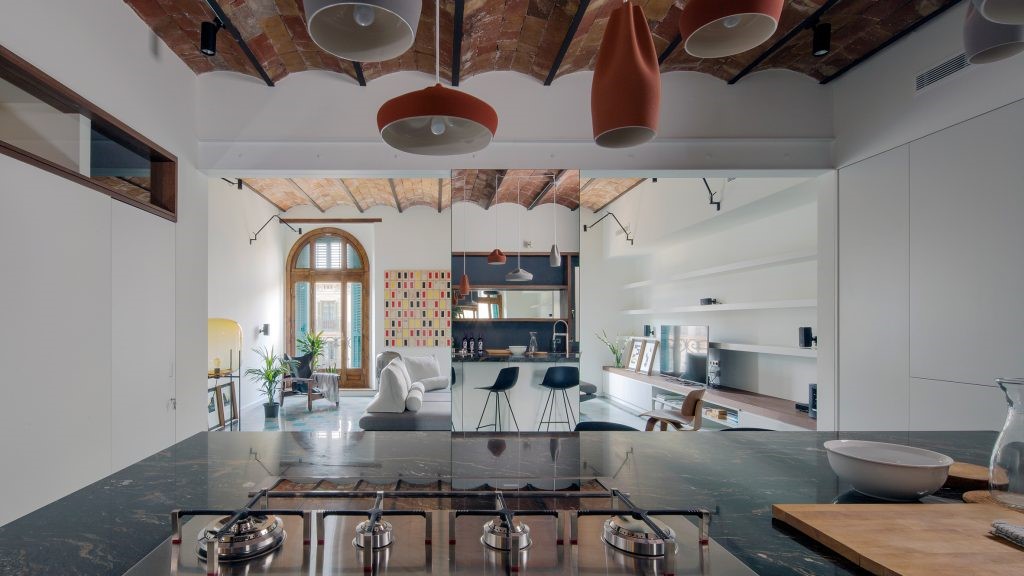
在入口处,迎接客人的是由模块化 MEXO 扶手椅和 Andrey Pichushkin 设计的帆布装饰组成的壮观组合。从这里您可以前往更衣室/洗衣房或客用卫生间。窗户附近有一套对比鲜明的厨房设备和一张巨大的桌子和紫色的椅子。他们的室内装饰的颜色也出现在公寓的天花板和白色瓷柜的内墙上。
At the entrance, guests are greeted by a spectacular combination of modular MEXO armchairs and canvas decorations designed by Andrey Pichushkin. From here, you can go to the changing room/laundry room or guest restroom. There is a set of contrasting kitchen equipment, a huge table, and purple chairs near the window. Their interior decoration colors also appear on the ceilings of apartments and the interior walls of white porcelain cabinets.


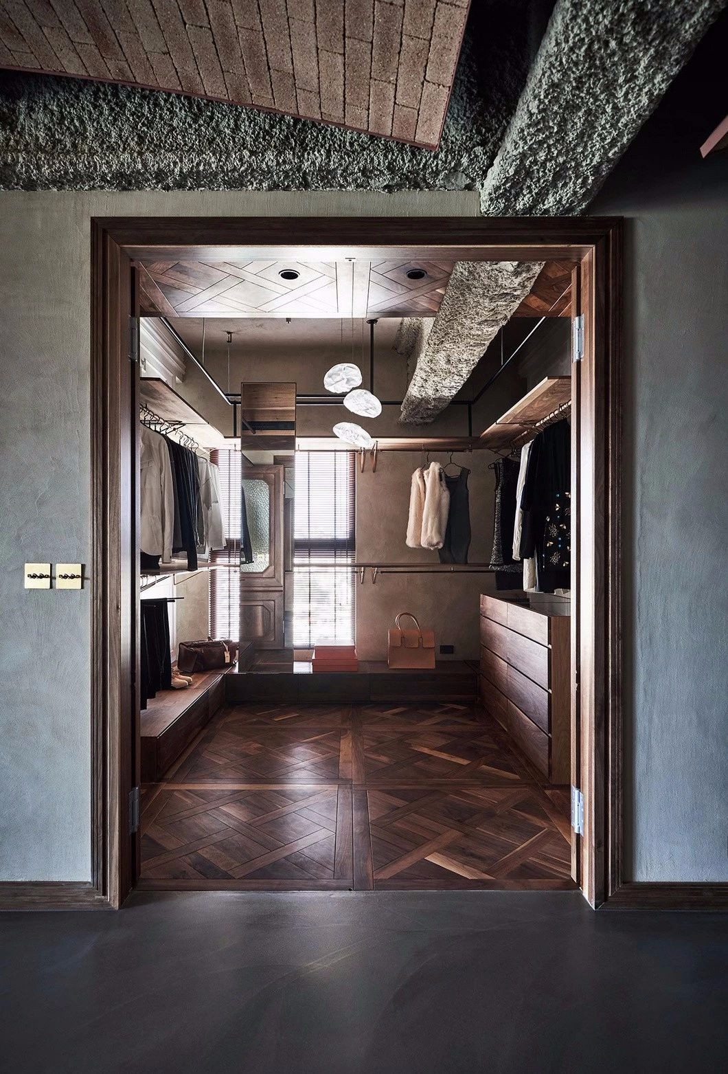
隐藏的门后面是主卧室,毗邻主人的更衣室。浴室与浴室之间由玻璃铰链隔断隔开 - 自然光透过隔断到达独立式浴缸。内部的特点是带有金属碎片的自流平环氧树脂地板以及浅色装饰石膏。
Behind the hidden door is the master bedroom, adjacent to the owners changing room. The bathroom is separated by a glass hinge partition - natural light passes through the partition to reach the independent bathtub. The internal features are self leveling epoxy resin flooring with metal fragments and light colored decorative gypsum.


Anastasia Pridachina 想要创造一个略显单调的背景,并通过方形 Kerama Marazzi 瓷砖制成的围裙形式的强调来活跃气氛。单色调色板被选择与整体空间颜色相匹配的水泥浆稀释。
Anastasia Pridachina wants to create a slightly monotonous background and liven up the atmosphere through the emphasis of an apron made of square Kerama Marazzi tiles. The monochromatic color palette is selected to match the overall space color with cement slurry dilution.


柔和的红色浴室是对《闪灵》第一个场景的致敬,而白色瓷器和紫色巨石的混合让人想起《发条橙》中著名的酒吧。当配色方案最终确定后,设计师和客户开始开发橱柜家具。装饰强调了设计的讽刺性——Qeeboo 兔子椅和卡门旋转顶灯。
The soft red bathroom pays tribute to the first scene of Shining, while the mixture of white porcelain and purple boulders reminds people of the famous bar in Clockwork Orange. After the final color scheme is determined, designers and clients start developing cabinet furniture. The decoration emphasizes the satire of the design - the Qeeboo rabbit chair and the carousel rotating ceiling light.
FLOOR PLAN


面方案 / DESIGN FLAT PLAN
INFO
项目名称:APARTMENTS INSIDE SPIRAL BUILDINGS
建筑面积
AGENCY FOUNDER


ANASTASIA PRIDACHINA
建筑设计师 ARCHITECTURAL DESIGNER
Anastasia Pridachina
Architect Anastasia Pridachina focuses on creating modern style private homes, and interpreting classics has been his goal for many years. His design always adheres to the characteristics of simplicity and comfort. He believes that design is not meant to be seen, but truly needs to provide residents with relaxation and rest.
图片版权 Copyright :Anastasia Pridachina

 PintereAI


