新作丨 叁十设计 • 琼琚 QIONGJU 首
2023-12-03 20:18
“Half of space depends on design the other half is derived from presence and spirit.”
该项目位于杭州,是一套建筑面积为125m²的精装爆改,设计团队:叁十设计,屋主是一对24岁年轻夫妻,女屋主(able)为设计师本人。
This project is located in Hangzhou and has a building area of 125m ² Renovation of the fine decoration, design team: Thirty design team, the homeowner is a 24-year-old young couple, and the female homeowner (able) is the designer herself.
“轻硬装,重软装”的概念,人们对于轻硬装,重软装的理解会有一些偏差,我的理解是房子就像一幅画,硬装部分就是它的底色,亮点不需要多,色系统一,给软装留出上色空间,我非常喜欢这个概念,觉得很适合我们家的状态。
The concept of light and hard decoration, heavy and soft decoration may have some deviations in peoples understanding of light and hard decoration, heavy and soft decoration. My understanding is that a house is like a painting, and the hard decoration part is its background color. There are not many highlights, and the color system is one, leaving space for soft decoration to be colored. I really like this concept and think it is very suitable for our homes state.
原户型为四房两卫一厨一阳台再加上一间储藏室,格局上存在的问题:
The original layout had four bedrooms, two bathrooms, one kitchen, one balcony, and a storage room, but there were some issues with the layout:
精装修统一存在的问题主要还是出现在材质不好看,以及每种材质所在的位置具有不合理性。
The main problems with unified fine decoration are that the materials are not aesthetically pleasing and the positions of each material are irrational.
Lets talk specifically about the topic of renovation of furnished houses through this case study
改造:格局上实现“小改动带来大舒适”的效果,材质上不适合的一律拆除更换
Transformation: Achieve the effect of small changes bring great comfort in the layout, and remove and replace all unsuitable materials
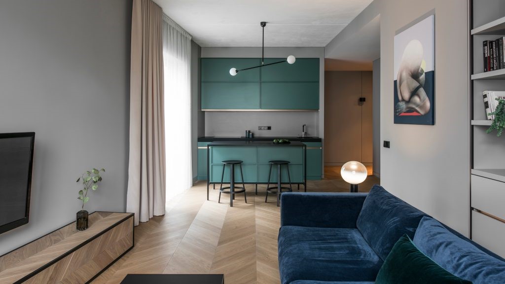
客厅空间我们取消了传统电视背景墙的概念,改为书架墙的形式提升整个空间的氛围感,通过改变沙发位置,使原本过道的部分转化为客厅的一部分,实现空间到空间的感受,取消了过道的存在感,并且比起家里随时有个电视机的存在,我们更喜欢晚上拉上窗帘看投影幕布的效果,所以在吊顶内安装隐藏式幕布,地毯换了好几次,最终来自摩洛哥的纯羊毛手工地毯一眼惊艳,成为客厅的魅力中心,也是因为这块地毯让我成为地毯重度爱好者。
In the living room space, we have eliminated the traditional concept of a TV background wall and replaced it with a bookshelf wall to enhance the atmosphere of the entire space. By changing the position of the sofa, the original hallway is transformed into a part of the living room, achieving a sense of space to space. We have eliminated the sense of existence in the hallway, and we prefer to close the curtains at night to see the projection screen effect, rather than having a TV at home at all times, So hidden curtains were installed inside the ceiling, and the carpet was changed several times. In the end, the pure wool handmade carpet from Morocco was stunning at a glance, becoming the charm center of the living room. It was also because of this carpet that I became a heavy carpet enthusiast.
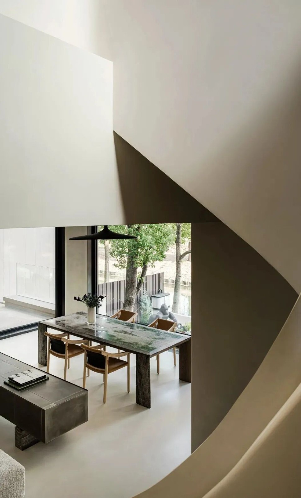
餐厅部分由一张长度为1米8的悬浮餐桌与岛台结合,岛台的一侧直接架在飘窗上,飘窗、岛台、餐桌三者形成一体的穿插结构,增加厨房空间的同时还增加储物,并且在岛台上增加一个小水槽,功能上与厨房水槽进行区分。材质上通过岛台的洞石岩板与客厅茶几的原洞石衔接模糊空间,增强客餐厅的连接感
The restaurant consists of a suspended dining table with a length of 1.8 meters combined with an island platform. One side of the island platform is directly placed on a bay window, forming an integrated structure of bay window, island platform, and dining table. This not only increases kitchen space but also increases storage, and adds a small sink on the island platform, which is functionally different from the kitchen sink. In terms of material, the connection between the cave stone rock slab on the island platform and the original cave stone on the living room coffee table blurs the space, enhancing the sense of connection between the dining room and the dining room
原本的储物间拆除改为半开放空间,解决玄关狭长的问题,同时保证面对客厅那部分墙体的完整性,墙体部分做了镂空的设计增加采光的同时设计了Prada绿大理石结合壁炉的造型,柜门改为黑色烟熏木色更能映衬壁炉的氛围感
The original storage room was demolished and converted into a semi open space, solving the problem of narrow entrance while ensuring the integrity of the wall facing the living room. The wall was designed with hollowing to increase lighting, while Prada green marble combined with a fireplace shape was designed. The cabinet door was changed to black smoky wood color to better reflect the atmosphere of the fireplace
针对主卧门对着外卫门的问题我们调整了门的位置,同时我们改变床头方向又解决了主卫门对着床头的问题, 在床尾增加了一排衣柜,与之前相比增加了不少储物空间,软装上我们在墙面设计了多种不同材质的装饰方式结合,印度手工挂毯的质感结合LC4躺椅的设计感增加整个空间的视觉享受
In response to the issue of the master bedroom door facing the external guard door, we have adjusted the position of the door and changed the direction of the bed head to solve the problem of the master bathroom door facing the bed head. We have added a row of wardrobes at the end of the bed, which has increased storage space compared to before. In terms of soft furnishings, we have designed various decoration methods with different materials on the wall, combining the texture of Indian handmade tapestries with the design of LC4 lounge chairs to enhance the visual enjoyment of the entire space
在保证书房空间足够大的情况下我们调整书房与次卧之间的墙体位置,使次卧能够正常使用的同时书房还能增加一组展示柜,书桌我们选择直接与墙体衔接做出悬浮书桌的效果弱化它在空间的存在感,原本的开门改为移门形式,形成半开放式书房,增强室内采光,来自jesscia hans的陶瓷花瓶与珊瑚色系水牡丹特别搭
While ensuring sufficient space in the study, we adjusted the wall position between the study and the second bedroom to ensure that the second bedroom can be used normally. At the same time, the study can also add a set of display cabinets. We chose to directly connect the desk to the wall to create a suspended desk effect, weakening its presence in the space. The original door opening was changed to a sliding door form, forming a semi open study, enhancing indoor lighting, Ceramic vase from Jesscia Hans paired with coral colored water peonies
参十设计是一个怀揣梦想并执着于挑战的90后年轻团队。基于近十年的从业经验演绎出当下主流的”人文思想”与”繁简共生”的时代愿望,从而致力为业主营造良好的空间情绪表现结构美学,丰富居住体验。
我们期待的生活应是一种个体审美、个性及风格的表达,将每位业主的追求、品位、志趣、价值序列延伸于活动与住场所。设计不仅满足功能与美学,更是对生活的态度及觉知。
SANSHI Design is founded by the post 90s entrepreneurs with an extensive background in designing, fuelledwith dreams and desired for challenges.With over 10 years of experience, our team was inspired by the idea of mainstream approaches emphasizingin humanistic approach and complexity of simplicity, striving to design that prioritized in shaping a goodresidential space, delivering the aesthetic values of structures,creating experience of comfortable, luxurioussetting.
To live an aesthetics life is a form of personality expression. We are committed to providing a level of servicethat extended to outdoor activities, commercial and residential areas to ensure the style meets our clientsneeds, preferences, and aspirations. This personalised approach ensures that each design reflects the clientpersonality and lifestyle, making the space not only visually appealing but also functional and meaningful.
A design is not only to meet the mutual inclusive and balance between the aspects of functionality andaesthetics, but more reflect on our attitude and perception towards life.
采集分享
 举报
举报
别默默的看了,快登录帮我评论一下吧!:)
注册
登录
更多评论
相关文章
-

描边风设计中,最容易犯的8种问题分析
2018年走过了四分之一,LOGO设计趋势也清晰了LOGO设计
-

描边风设计中,最容易犯的8种问题分析
2018年走过了四分之一,LOGO设计趋势也清晰了LOGO设计
-

描边风设计中,最容易犯的8种问题分析
2018年走过了四分之一,LOGO设计趋势也清晰了LOGO设计


 PintereAI


