PintereAI


新作丨简璞设计 Elene 忆念美 首
2023-09-20 22:14


缘起
Origin
Elene忆念美作为重庆本土高端皮肤管理品牌,已经度过了其光辉的24年。甚至有年轻的朋友调侃道,“这是服务了我妈妈半辈子的护肤品牌”。
As a local high-end beauty brand in Chongqing, elene Reached its glorious 24 years in business . There are even some young people say,This is the skincare brand that served my mum for half her life.
但也正因为有这样根深蒂固的观念,忆念美在大众市场的视角里,总被冠以“老品牌”、“服务妈妈们的护肤店”等标签。从而,对于年轻消费者的吸引力略显后劲不足。
Because of this deep-rooted perception, elene has always been labelled as an old brand and a skincare shop for mums in most peoples minds. As a result, the attraction for young consumers is not strong enough.


于是,在这样的背景之下,品牌第二代主理人开始思考关于品牌的重塑与传承问题。在此期间,24周年旗舰店项目也顺理成章的被提上了日程。
Because of this deep-rooted perception, elene has always been labelled as an old brand and a skincare shop for mums in most peoples minds. As a result, the attraction for young consumers is not strong enough. So, against this background, the second generation of the brands managers began to think about the brands reinvention and heritage. During this period, preparations began for the 24th anniversary flagship shop project.


创思
Creativity
关于品牌形象的升级,并非是纯视觉化的改头换面。而是在尊重原品牌基础和受众群体的前提下,所进行的优化与升级。所以,我们所构建的空间本质,便是基于其服务动线与用户习惯而产生的结果。
Upgrading a brands image is not just a visual facelift, but an optimised upgrade that respects the brands foundation and audience. Therefore, the essence of the space we create is the result of service offerings and user habits.


而视觉创意的方向则是来自于皮肤管理中最为重要的水元素,以及代表健康科技的蓝色为主调。并依托于极简、柔美、且当代的建筑构成形式,所构建出的一个专属于忆念美的柔美视觉符号。
The direction of visual creativity comes from the most important element in skin care, water, and the blue colour, which represents health and technology.The main use of minimalist, soft and modern architectural composition form, constructed a soft visual symbol that belongs to elene.


空间
Space
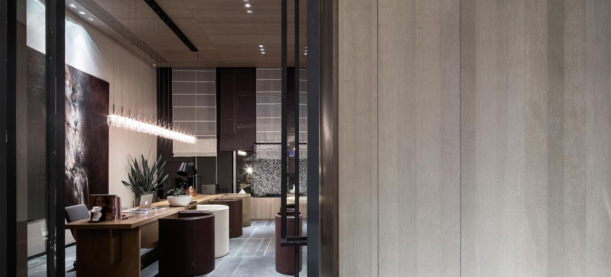
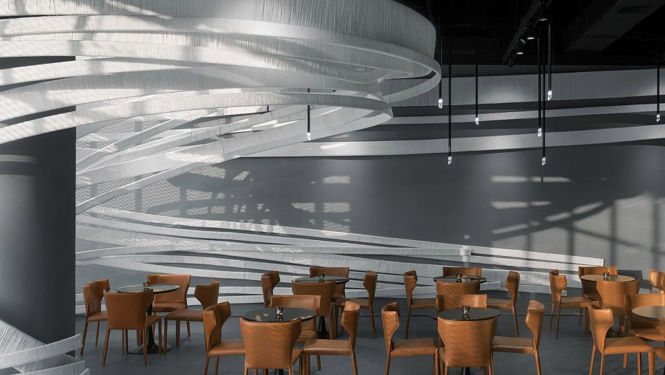
因其原始建筑中极为优秀的层高条件,我们通过合法改造的方式,将其变更为了独立的两层室内空间关系。并依托于居中于建筑空间里的旋转楼梯,将接待服务、咨询、配料、储藏、休憩、以及SPA包房等功能内容串联在了一起。同时,空间的美感,也与功能动线相互关联,从而满足了视觉与客户体验的双重保障。
Because of the great advantage of floor height in the original building, we transformed it into a separate two-storey space by means of a legal renovation. A rotating staircase, centred in the architectural space, connects the functions of reception services, consultation, ingredients, storage, lounging, and spa rooms.At the same time, the aesthetics of the space are interconnected with the functional areas, thus satisfying the visual and functional experience of the customer.


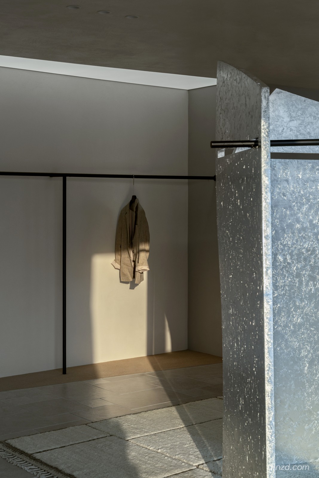
相对于丰富的公共空间形态,SPA包房则运用了更为简洁、温和、且宁静的处理手法。这样的手法,也与在该业态背景之下,客户的实际消费体验,紧密相关。当然,更为简约的设计,对于员工的日常维护、清洁、更换等工作,也更为友善与便捷。
Compared to to the richness of the public space, the SPA rooms are treated in a more simple, gentle and serene way.In this way,it is closely related to the actual consumer experience of customers in the context of the industry.Of course, the more minimalist design is also friendlier and more convenient for employees daily maintenance, cleaning and replacement.


质感
Textures
大面积的肉色肤感涂料,更像是建筑的肌肤。它干净、整洁、且连贯。细腻、光滑的触感,也更迎合消费者的到场(在地)心理状态。
The large areas of flesh-coloured skin paint are more like the skin of the building. It is clean, neat, and coherent. The delicate, smooth touch also appeals more to the consumers state of mind when they visit the shop.


蓝色元素作为空间里的情绪、氛围担当,也将以不同的形式,恰到好处的穿插在空间之中。于是,根据其职能使命的不同。它可以是渐变的蓝色涂料,也可以是半通透的蓝色玻璃,还可以是轻透的泛蓝色灯光。
The blue element, as the mood and atmosphere of the space, will also be interspersed in the space in different forms.According to different effect.It can be gradient blue paint, translucent blue glass, or light translucent blue light.


而阳光的引入则是点睛之笔,它被我们赋予了新的使命。空间的质感,在被自然光线的干预下,也将在不同的时间和天气中,呈现出不同的空间质感,从而营造出不同的空间氛围情绪。而这样的体验,无疑是最为惊喜和欢愉的。
The introduction of sunlight is the finishing touch, and it has been given a new effect by us.The texture of the space, when illuminated by natural light, takes on different spatial textures at different times of the day and in different weather, thus creating different atmospheric moods in the space.And such an experience is undoubtedly the most surprising and joyful.


自然、健康的理念,也将通过空间的氛围营造,潜移默化的根植于消费者心里。
The concept of nature and health, we through the atmosphere of the space to create, subconsciously rooted in the hearts of consumers.


项目信息
Information
项目名称:
新生|忆念美24周年纪念店
EleneThe 24th Anniversary Store
项目地点:
中国 · 重庆
Project Location:Chongqing, China
设计总监:
文超
Design Director:
Steven
设计团队:
jsd . 简璞
Design Team:
JSD
全案统筹:
jsd . 简璞
Overall Project Coordinator:JSD
建筑面积:
800平方米
Building Area: 800
空间摄影:
边界人-文超
Photography:
Borderman - Steven

文超
简璞设计创始人
文超,创意设计工作者。于2015年成立了自己的设计品牌JSD简璞设计,并逐步确定了其不受风格、业态限制的创意型设计机构的专业方向。亦在不断的发展过程中,积累并提炼出了具有简璞内核的“自由实用主义”的设计主张。
Wen Chao, Creative design workers. In 2015, the design brand Jade Simple Design(JSD)was established and gradually determined the professional direction is a creative design agency that is not restricted by style and format. In the process of continuous development, it has accumulated and refined the design proposition of Free-pragmatism with the core of JSD.
简璞设计是一家深根于重庆 - 上海,年轻、有趣、且不局限于某种业态内的开放型创意设计机构。简璞设计一直秉承着 “自由实用主义” 的创作设计理念,并将人与空间、器物间最真实的诉求关系作为设计思考的根基,以此创作出更加实用且有趣的空间与器物作品。团队设计板块涵盖:建筑、景观、室内、家具等多个领域。
JSD is rooted in Chongqing and Shanghai. It is a young, interesting, and open creative design agency that is not limited to a certain form. JSD has always been adhering to the creative design concept of Free-pragmatism and takes the most real appealing relationship between people and space and things as the foundation of design thinking to create more practical and interesting space and furniture works. The team design section covers architecture, landscape, interior, furniture, and other fields.
图片版权 Copyright :简璞设计


推荐作品

相关文章
-
2018年走过了四分之一,LOGO设计趋势也清晰了LOGO设计
-
2018年走过了四分之一,LOGO设计趋势也清晰了LOGO设计
-
2018年走过了四分之一,LOGO设计趋势也清晰了LOGO设计