新作丨S P 空间的诗学 蔚见家居体验馆 首
2023-05-24 22:18


蔚见,汉格家具旗下的高端设计品牌。蔚见的品牌主张是自然、自由、有趣与时间。我们认为,所有的家居品牌应该是因为品质生活原理而设计。你在一个什么样的生活方式里面,才需要一个什么样的家具。如果只关注家具本身,会囿于造型这类问题。
VEIJ
believe that all brands should be original because of principle. What kind of lifestyle do you live in? What kind of furniture do you need? If you only pay attention to the furniture itself, you will get stuck in problems like modeling.


为什么我们的品牌主张里有个关键词是时间?因为我们是活在生活里面的。我们要把建筑空间和产品链接起来。
Why is time a key word in our brand proposition? Because we live in life. We want to link the building space to the product.


2022年,蔚见在上海创造了有东方意境的“漂浮的圆”;23年在广州,穹顶之下继续描绘着生活的模样。今年的展厅,一半为庭院,一半为室内,希望让生活在城市里的人有一种新的体验。是生活,又不是真实的生活,是理想中的,一方精神庭院,也是都市里的乌托邦。
In 2022, VEIJ created Floating Circle in Shanghai; 23 years in Guangzhou, under the dome continues to depict the appearance of life. This years exhibition hall, half courtyard and half interior, hopes to give people living in the city a new experience. Is life, but not real life, is an ideal, a spiritual garden, but also the city of utopia.


一方庭院,希望能在忙碌的快节奏中有一个角度来探讨生活和实践,这是蔚见所坚持的。所以这次展会用了更大的空间来为产品留白,用了一半的面积来做庭院。院子,既是一个居住空间,也是一个安放心灵的空间。做庭院就是为了让人们在看展的过程中有一个安静停留的空间。
One courtyard hopes to have a perspective to discuss life and practice in the busy fast pace, which is what VEIJ insists on. So this exhibition used more space for
products and half of the area for courtyards. The yard is not only a living space, but also a space for the mind. The courtyard is designed to give people a quiet space to stay in the process of watching the exhibition.


这次的展会以黑色为主色调,没有主光源,也没有顶部照明,我们希望营造出一种傍晚的感觉,再用金色的弧形跳跃的曲面,加上地面打灯光的方式让空间的线条活跃起来。树草散布在各处,在灯光的映衬下,树影婆娑。让体验者从远处走过的时候就能看到一个非常有精神属性的,4.5米高的,神圣感的庭院。
The main color of this exhibition is black. There is no main light source and no top lighting. We hope to create a feeling of evening. Trees and grasses were scattered here and there, their shadows dancing against the light. Let the experiencer walk through from a distance to see a very spiritual property, 4.5 meters high, sacred courtyard.


设计是在有序的解决问题。我们的设计为品牌带来了比较大的流量,既能让体验者有一方净土,又能让品牌获得比较大的关注力。
Design is about solving problems in order. Our design has brought more traffic to the brand, which can not only let the experiencer have a pure land, but also let the brand get more attention.


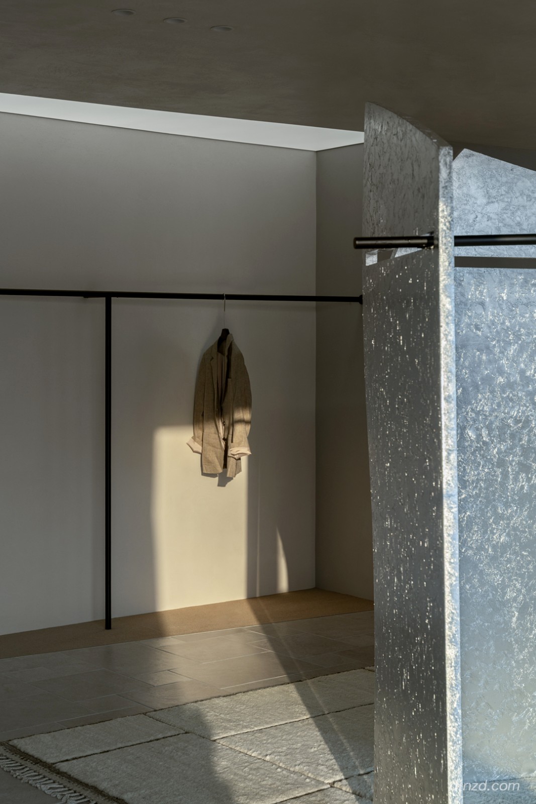
四天的展会我们尽量少耗费一些材料去搭建一个临时性的展厅,所以我们选择用宣纸来叠成几面墙。灯光一打,既能起到半通透的感受,让人有一种朦胧的,灯火阑珊的感觉,又能用很轻的、环保节约的方式去做一面墙,因为不用考虑耐久性,它是在当下即合理的一面墙。
During the four-day exhibition, we tried to use less materials to build a temporary exhibition hall, so we chose to fold rice paper into several walls. A dozen lights, can not only play a semi-transparent feeling, let a person have a kind of hazy, the feeling of lights, but also can be used to do a wall in a very light, environmental protection and saving way, because do not consider durability, it is a reasonable wall at the moment.


在展会期间,有许多年轻人在院落里拍照,你甚至可以感受到微风,整个展厅是流动的,有芒草,能够感受到光影的晃动,在3月第51届中国家博会(广州)相遇蔚见是一件很惬意的事。回廊对空间的链接,以及行走在其间,可以让节奏慢下来。也许有一些感悟,也许触动了心中的诗和远方。
During the exhibition, there were many young people taking photos in the courtyard, you could even feel the breeze, the whole exhibition hall was flowing, there were miscanthus, you could feel the shaking of light and shadow, it was a pleasant thing to meet VEIJ in the 51st China Home Expo (Guangzhou) in March. The link between the cloisters and the Spaces, and the walking in them, can slow down the pace. Perhaps there are some feelings, perhaps touched the heart of the poem and the distance.


项目信息
Information
项目名称:
蔚见家居体验馆
Project name: VEIJ Furniture Exhibition Museum
项目类型:
生活体验中心
Project type: Life Experience Center
项目地址:
广州市阅江中路380号
Project address: No. 380 Yuejiang Middle Road, Guangzhou City
设计方:
S P空间的诗学设计事务所
Design agency: Poetic Design Office of S P Space
完成年份:
2023年3月
Year completed: March 2023
建筑面积:
430㎡
Building area: 430 square meters
摄影版权:
王策
Photographer: Wang Ce
客户:
汉格家具
Client: HIK
品牌:
蔚见、汉格
Brand: VEIJ, HIK
「空间的诗学」
扎根在云南——风光和人文之美交汇密集之地,更贴近纯粹和生活的本质结合国际化视野、地缘性美学,创造了一系列与云南风土和谐共生的空间和产品。
The poetics of Space radicates in Yunnan where the beauty of scenery and humanity converge intensively. The life of Yunnan is closer to purity and the essence of life. Combining international vision and geographical aesthetics, it has created a series of Spaces and products that coexist harmoniously with the local culture of Yunnan.
图片版权 Copyright :蔚见家居

 PintereAI


