当海天交汇于设计前沿 - BMW宝马前海客户体验中心 首
2023-05-17 09:17
“设计师所创造的世界应该是一个和谐的、尝试用线把生活的过去和将来编织在一起的世界。而用来编织的最基本的经纬,就是人纷繁的情感之线和包括人在内的自然直线”,正如建筑师阿尔瓦·阿尔托所言,空间的生命感与发展性往往来自与城市记忆和发展愿景的交织共鸣。
The space created by architects should be harmonious and a world trying to weave the past and future of life together with lines, and the most basic longitude and latitude lines used for weaving is the line of complicated human emotions and nature including humans. As the architect Alvar Aalto said, the sense of life and development of space often come from resonance from Intertwined urban memory and development vision.
BMW宝马前海客户体验中心位于深圳前海,由特殊的地域位置及合作区未来前景发想,设计师在整体构思中引入“海岸线”的双关概念,既从意象上融入前海的自然肌理中,又在向度上顺应前海合作区创新探索的发展追求中,缔造出一域超越海天的前沿设计空间。
The customer experience center for BMW in Qianhai is located in Qianhai, Shenzhen. Based on the special geographical location and the future prospects of the Cooperation Zone, the designers introduced the pun concept of coastline into the overall design, integrated the coastline into the natural texture of Qianhai from the perspectives of imagery and conformed to the development and pursuit of innovation and exploration of Qianhai Cooperation Zone from the perspectives of dimension, so as to create a leading design space that transcends the sea and sky.
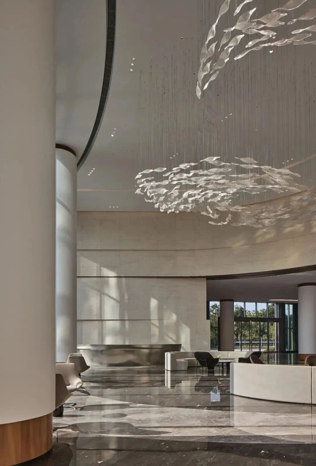
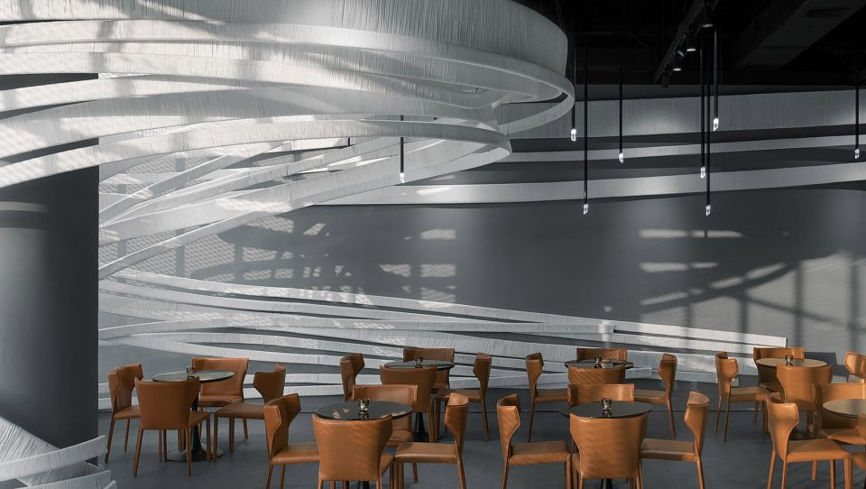
临海枕浪,万象入怀。为了回应前海地域特点,设计师将“扬帆起航”确立为本案室内设计概念,空间采用大量波涛浮动的海岸线概念造型及风帆鼓动的创意造型。空间天花模拟海浪的自然弧度,并以吊顶层次具现浪沫堆叠的视觉效果,立面部分则以风帆的弧线造型呼应天际的浪潮翻涌,此独具匠心的手法令顾客踏入此间便可饱览一派海天倒悬、飞帆竞渡的浩瀚图景。
Sleeping on the waves near the ocean, the universe is in your arms. In response to the geographical features of Qianhai, setting sail was determined by the designers as the interior design concept of the case in which a large number of conceptual shapes consisting of coastlines with rolling waves and creative shapes consisting of full sails would be used in space. The ceilings of the space simulate the natural radian of the sea waves, and create a visual effect of stacking waves by the layers of ceilings, while the arc shapes of sails on the facade echo the surging waves on the ceiling. The innovative technique allows customers to enjoy a vast landscape of the sea and sky upside down and sailboats racing.
项目从由钢结构及混凝土建筑结合的原有建筑结构中重塑筋骨。原有的两种建筑结构在衔接交界处存在大量立柱,为了消解立柱带来的遮挡与割裂,设计师将柱子化作弧形造型墙,将其融入风帆造型结构之中,巧妙的利用材料与空间之间的浮动特性,模糊“有”与“无”的虚实边界,从而弱化原有立柱凌乱交错的遗留问题。
The project reconstructs the muscles and bones from the original building structure made of steel and concrete. There were a large number of columns on the border of the original two building structures. In order to eliminate the shelter and separation caused by the columns, the designers transformed the columns into arc-shaped walls, incorporating them into the sail-shaped structure. By utilizing the floating characteristics between materials and space skillfully to blur the virtual and real boundaries of Existence and Nothingness, the question left over by disorder original upright columns is weakened.
“自然界中没有直线或尖角。因此建筑也必须没有直线或尖角”,展厅区域的原始布局功能凌乱,展示区、销售与客户洽谈区划分刻板、缺乏互动。设计师一改功能区“各自为政”的布局方式,将海岸线的蜿蜒起伏糅入空间造型,增强了互动性体验动线,给顾客更多“从流飘荡,任意东西”的自由与惬意。
There are no straight lines or sharp corners in nature. Therefore, buildings must have no straight lines or sharp corners. The original layout and functional of the exhibition hall area were messy, and the display area, sales and customer negotiation area were divided rigidly and lack of interaction. The designers changed the fragmented layout of the functional areas, incorporated the meandering wavy coastlines into the spatial shapes, strengthened traffic flow of interactive experience, providing customers with more freedom and comfort to float with the stream eastwards or westwards.
一层的销售动线与二层的售后动线也更加泾渭分明,动线的合理规划有效分流了客流人群,运营的提升服务也让客户体验感拉满。
The sale traffic flow on the first floor is more distinct from the after-sale traffic flow on the second floor. The rational planning of the traffic flow effectively diverts the passenger flow, and improving service of operation also promotes the customer experience to the utmost extent.
在浮浪堆叠处拾级而上,就更能触及海天交汇的原点。二层区域分成饮品吧台与客户休息区,从天顶盘旋垂落的波浪造型围成了艺术吧台,与天花绵延起伏的浪涛形象呵成一气,饮品吧台的功能属性亦暗合了“水”的实质意蕴。顾客闲坐于吧台侧畔,外部风物天光穿过格栅缝隙照进室内,虚与实的交融与暧昧在现实框架的基础上,赋予空间更广阔的精神境域。
When stepping up on the stacking floating waves, the original point of the intersecting line of the sea and sky becomes more accessible. The area on the second floor is divided into a beverage bar counter and a customer rest area. The artistic bar is surrounded by waves shapes hovering and falling from the ceiling, forming a harmonious relationship with the continuous wavy waves shapes of the ceiling. The functional attribute of the beverage bar counter also implies the essential meaning of water. When customers sit around by the side of the bar counter, the external scenery and daylight shine through the grille gaps into the room. The blending and vagueness of virtuality and reality based on the real framework, provides the space with a broader spiritual realm.
空间美学是设计师对材料、方法和想象力多方的掌控与胜利。设计师运用水波纹不锈钢材质与外缘玻璃护栏相呼应,在素雅静谧的纯白浪花中点染“水”独有的灵动与澄澈气息,呈现“浮光跃金、静影沉璧”般的璀璨水色。
Space aesthetics is the control and triumph of designers over materials, methods, and imagination. The water ripple stamped stainless steel is used to echo the outer glass guardrail, stippling the unique agility and clarity of water in the tasteful and tranquil pure white foamy waves, presenting a sparkling waterscape like the rolling waves glitter like gold and silent shadows in the water glimmer like jade.
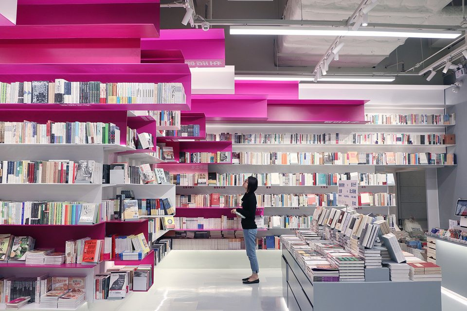
整个休闲区藉由书架进行巧妙划分,顾客或寻静处小憩、或把一卷漫读、或眺远景闲望,皆可不受打扰,随心尽兴。
The entire leisure area is skillfully divided by bookshelves, allowing customers to enjoy themselves without being disturbed, either finding a quiet place to take a nap, or reading at will or gazing freely at the distant view.
主要材料:GRG、再生纸筒、木饰面、水波纹不锈钢等
Project Name: Customer Experience Center for BMW in Qianhai
Project Location: Qianhai, Shenzhen City
Design Company: ARCHIHOPE Ltd.
Chief Designer: Hihope Zhu
Designer Team: Jane Fang, Xu Chang, He Mengjun, etc.
Total Floor Space: 4,390 square meters
Main Materials: GRG, Recycled Paper Tubes, Wood Veneers, Water Ripple Stamped Stainless Steel, etc.
Completion Date: December 28th,2022
Project Photographer: Vincent Wu
Video Shooting Team:Blackstation
采集分享
 举报
举报
别默默的看了,快登录帮我评论一下吧!:)
注册
登录
更多评论
相关文章
-

描边风设计中,最容易犯的8种问题分析
2018年走过了四分之一,LOGO设计趋势也清晰了LOGO设计
-

描边风设计中,最容易犯的8种问题分析
2018年走过了四分之一,LOGO设计趋势也清晰了LOGO设计
-

描边风设计中,最容易犯的8种问题分析
2018年走过了四分之一,LOGO设计趋势也清晰了LOGO设计


 PintereAI


