新作丨简璞设计 班晓雪 BAN XIAOXUE 首
2023-03-30 22:20


将自然视为信仰,保持最初的沉默和柔和。
Considering nature as faith, keeping the initial silence and softness.


溯源
RETROSPECTIVE
BXX最新门店的设计语言更像是一次对于品牌的溯源。我们把成长记忆中那些质朴的、天然的、美好的记忆通过空间碎片化的方式进行了重组。但这些碎片,也不再是某种单一、原生的材质表达。而是通过将那些熟悉的、天然的质地重新组合,通过再造的方式,让新的质地得以呈现。并有机会覆盖在建筑基础之上。之所以有这样的思考,亦是对BXX早期服装设计作品中的一些自我认知与理解。
The design language of BXXs newest store is more like a retrospective of the brand. We have reorganized the rustic, natural and beautiful memories of growing up through the fragmentation of space. But these fragments are no longer a single, native material expression. Rather, by recombining those familiar, natural textures, new textures are made present by way of recreation. And have the opportunity to cover the architectural foundation. The reason for such thinking is also some self-knowledge and understanding of BXXs early garment design works.


空间营造
SPACE CREATION
而空间布局的关系也犹如梦境一般。空间体块不再是常规的罗列,而是看似无序拼凑出来的积木。当然,这也是为了更好的利用原建筑外观弧形开口面所带来的不利因素。从而得到更为立体的外观视觉效果,与周边门店形成差异,提升消费者的吸引力。
And the relationship of spatial layout is also like a dream world. The spatial blocks are no longer conventional lists, but seemingly disorderly pieced together blocks. Of course, this is also to make better use of the disadvantage brought by the curved opening surface of the original building appearance. Thus, the visual effect of the appearance is more three-dimensional, which is different from the surrounding stores and enhances the attractiveness of consumers.


轻与重、内与外、精致与粗糙这些看似矛盾的关系都在这一空间中被打破。我们甚至没有了常规的门头,没有了与商场之间明显的界限。这样开放的设计,无疑是反商业的设计思维。但我们应该试想一下,当所有商业空间都以看似最“完美”的商业模型呈现在大众面前时,品牌基因何在?个性何在?吸引力何在?
The seemingly contradictory relationships between light and heavy, inside and outside, delicate and rough are all broken in this space. We dont even have the conventional doorway and the obvious boundary between it and the mall. Such an open design is undoubtedly an anti-commercial design thinking. But we should think about this: when all commercial spaces are presented to the public with the most perfect commercial model, where is the brand DNA? Where is the personality? Where is the appeal?


所以,在如此扁平化的世界里,可能反商业的思维输出方式,才是最能吸引个性化消费群体最好的方式。但反商业,并非是不遵循商业业态的底层逻辑。
So, in such a flat world, probably the anti-business way of thinking output is the best way to attract the best personalized consumer groups. But anti-business, is not not to follow the underlying logic of the commercial business.


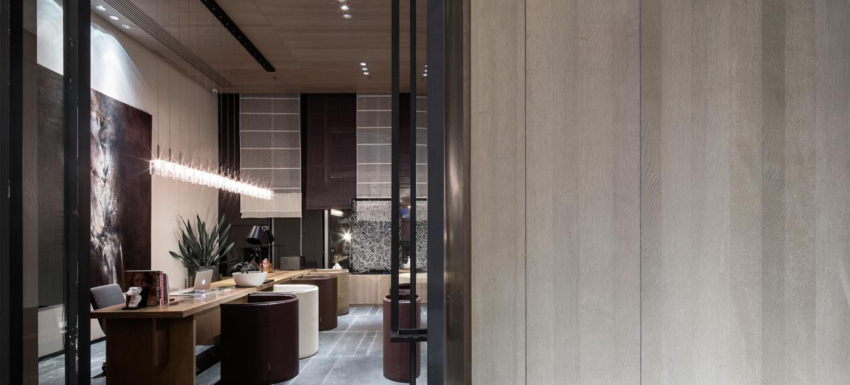
空间可以重构,材质可以丰富。但功能关系却一样也不能少,每一面墙体都有了它的使命,这关乎空间美感,也关乎功能、陈列等诉求。特别是结合开放的空间关系,墙体的利用率反而被放大,从而提升了在小空间中的实际使用面积。收银服务台也以更开放的姿态,成为空间中的核心元素。因为,通过服务台的设置,我们才得以把一个看似分散的空间重组起来。这样的设置,也能让我们的工作人员更为全面的照顾到不同区域的客户。满足更为便利、高效的营销目的。
Space can be reconstructed and materials can be enriched. But the functional relationship is no less, and each wall has its mission, which is about the aesthetics of the space, but also about the function, display and other claims. Especially combined with the open space relationship, the utilization rate of the wall is instead amplified, thus enhancing the actual use area in the small space. The cashiers service counter also becomes the core element in the space with a more open posture. It is through the setting of the service counter that we are able to reorganize a seemingly scattered space. This setup also allows our staff to take care of customers in different areas more comprehensively. It meets the purpose of more convenient and efficient marketing.


处理手法
PROCESSING TECHNIQUES
朴拙的质态,是贯穿整个空间设计的核心。这不仅表现在材料质感的处理上,也与空间的造型,构成有很大的关系。比如主入口处看似下压的吊顶、向外开放的橱窗、以及内部空间里漏斗式的门洞等等。这些看似比例夸张的造型,正是为了与质朴且粗粝的材质形成鲜明的戏剧化效果。同时,配搭着精心营造的灯光氛围,旨为把零售展厅秒变为一个随时准备就绪的小型秀场。因为,所有的空间设计,都将回到一个原点,为真正的主角而服务。而这里的主角,不是空间、不是灯光造型、更不是软装陈设,而是我们所要展示、销售的“每一件衣服”。
The rustic texture is the core of the design throughout the space. This is not only expressed in the treatment of material texture, but also has a lot to do with the shape, composition of the space. For example, the seemingly depressed ceiling at the main entrance, the windows that open to the outside, and the funnel-like doorways in the interior space, etc.. These seemingly exaggerated proportions are designed to create a dramatic effect with the rustic and coarse materials. At the same time, the lighting atmosphere is carefully created to turn the retail showroom into a mini-showroom ready to go. Because all the space design will return to a point of origin, to serve the real protagonist. And the main character here is not the space, not the lighting, not the soft furnishings, but the every piece of clothing we want to show and sell.


项目信息
Information
项目名称:
BAN XIAOXUE
Project:BAN XIAOXUE
项目地点:
中国合肥
Project Location:Hefei,China
设计总监:
文超
Design Director:Steven
设计团队:
JSD-简璞设计
Design Team:JSD
全案统筹:
JSD-简璞设计
Project Coordination:JSD
建筑面积:
137平方米
Cover Area:137㎡
空间摄影:
边界人-文超
Space Photography:Boundary Man - Wen Chao


文超
简璞设计创始人
文超,创意设计工作者。于2015年成立了自己的设计品牌JSD简璞设计,并逐步确定了其不受风格、业态限制的创意型设计机构的专业方向。亦在不断的发展过程中,积累并提炼出了具有简璞内核的“自由实用主义”的设计主张。
Wen Chao, Creative design workers. In 2015, the design brand Jade Simple Design(JSD)was established and gradually determined the professional direction is a creative design agency that is not restricted by style and format. In the process of continuous development, it has accumulated and refined the design proposition of Free-pragmatism with the core of JSD.
简璞设计是一家深根于重庆 - 上海,年轻、有趣、且不局限于某种业态内的开放型创意设计机构。简璞设计一直秉承着 “自由实用主义” 的创作设计理念,并将人与空间、器物间最真实的诉求关系作为设计思考的根基,以此创作出更加实用且有趣的空间与器物作品。团队设计板块涵盖:建筑、景观、室内、家具等多个领域。
JSD is rooted in Chongqing and Shanghai. It is a young, interesting, and open creative design agency that is not limited to a certain form. JSD has always been adhering to the creative design concept of Free-pragmatism and takes the most real appealing relationship between people and space and things as the foundation of design thinking to create more practical and interesting space and furniture works. The team design section covers architecture, landscape, interior, furniture, and other fields.
图片版权 Copyright :简璞设计

 PintereAI


