ZROBIM architects丨原木简约公寓,就是这么美! 首
2023-02-16 13:30


ZROBIM architects
我们的团队对架构有自己的看法。我们接近于简单的形状,它允许光线和空间成为物质,影响我们的感受。关于我们所处环境的重要位置。任何形式都不应损害环境,而只应补充环境。我们试图从过去的建筑中吸取最好的东西,并用现代思想补充它。
Our team has its own view of the architecture. We are close to simple shapes, which allows light and space to be something material, to influence our feelings. On the important places of the context in which we operate. Any form should not harm the environment, but only supplement it. We try to take the best from the architecture of the past and to supplement it with modern ideas.


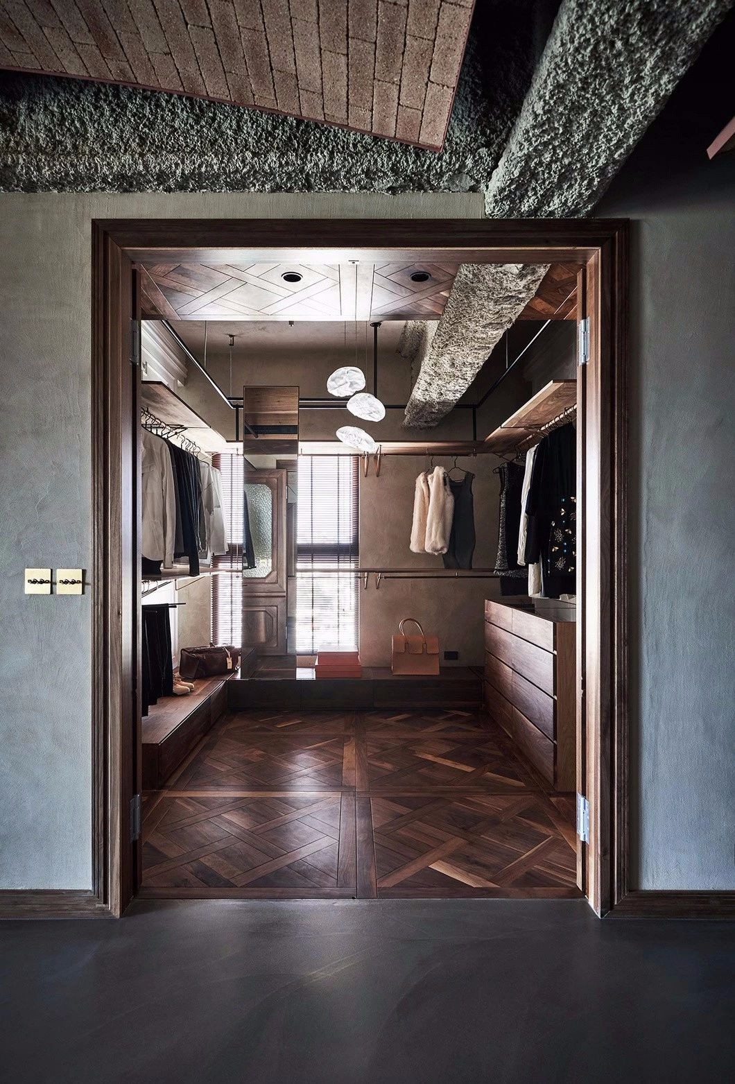
在这个项目中,ZROBIM建筑师为一个有孩子的年轻家庭设计了一套公寓。我们在这里的任务是创造一个现代极简主义室内,带有淡淡的苦行僧气息。由于该公寓位于60年代的老房子中,其主要优势是天花板高度超过3米。老房子的另一个特点是承重墙形成的拱门。我们将其保存下来,并将其融入到空间的总体概念中,赋予了该项目一种特殊的魅力。
In this project ZROBIM architects designed an apartment for a young family with a child. Our task here was to create a modern minimalist interior with light ascetic notes. Since the apartment is located in an old house from the 60s, its main advantage is the ceiling height of more than 3 meters. Another characteristic attribute of old houses is the arch formed by the load-bearing wall. We preserved it and integrated it into the general concept of space, giving the project a special charm.


该项目客户的主要要求之一是在平静的光线下使用自然、耐磨的材料。因此,作为地板覆盖物,我们选择了一种浅微水泥,公寓墙壁的颜色是一般的粉彩调色板:米色、浅橄榄色、浅赤陶色。
One of the main requests of the customers of the project was to use natural, hard-wearing materials in calm light shades. Therefore, as a floor covering we have chosen a light microcement, and the colors of the walls in the apartment are in the general palette of pastel colors: beige, light olive, pale terracotta.


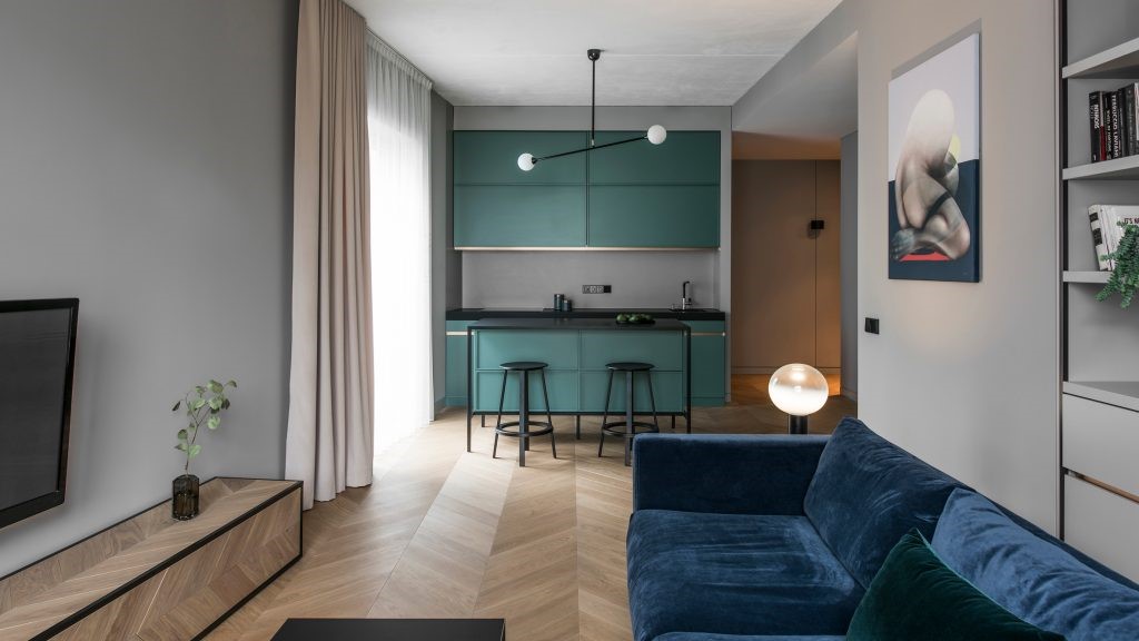
公寓最初的布局被划分为许多小房间,所以我们决定改变它,创建一个大的公共空间厨房客厅,一个带卧室、壁橱和书房的父母单元,一个儿童房和两个浴室。同时,孩子和父母的单位彼此隔离,这让所有家庭成员都可以舒适地在公寓里度过。
The original layout of the apartment was divided into a lot of small rooms, so we decided to change it and create a large common space kitchen-living room, a parental unit with a bedroom, a closet and a study, a childrens room and two bathrooms. At the same time, the childrens and parents units are isolated from each other, which allows all family members to comfortably and privately spend time in the apartment.


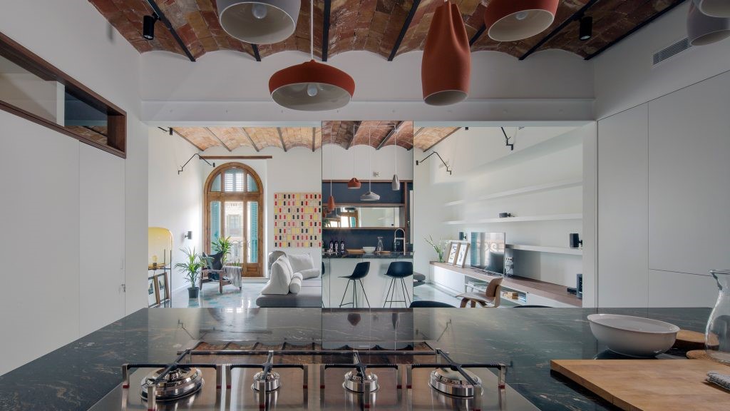
在整理和材料方面也有一些有趣的技巧。墙壁和天花板的上部用白色粗糙的灰泥装饰,让人想起公寓的历史。同时,大部分墙壁都被干墙占据,所有的结都整齐地隐藏在干墙后面。从石膏板过渡到石膏板,我们有意使其略低于天花板,以在视觉上增加其高度并使空间更轻。此外,隐藏的底板增强了这种效果。
There are also some interesting tricks in finishing and materials. The upper part of the walls and the ceiling are finished with white coarser plaster, reminiscent of the apartments history. At the same time, most of the walls are occupied by drywall, behind which all the knots are neatly hidden. The transition of the plasterboard into the plasterboard we intentionally made a little lower than the ceiling, to visually increase its height and make the space lighter. Additionally, this effect is enhanced by a hidden baseboard.


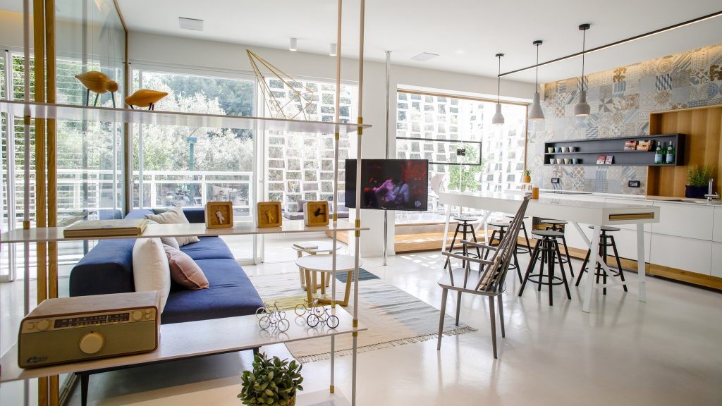
公共空间的一个主要特点是木质沙发,它整齐地框住了窗户开口,并重复了木质厨房正面和餐桌表面。顺便说一下,这张桌子是根据我们的设计师专门为这个项目绘制的草图定制的。与令人愉悦的焦糖色木材形成对比的是黑色餐椅和桌子上方的灯。这样的组合使室内充满活力。
One of the main features of the common space are the wooden soffits, which neatly frame the window openings and repeat the wooden kitchen fronts and the surface of the dining table. The table, by the way, was made to order based on sketches of our designer specifically for this project. In contrast to the pleasant caramel shade of wood are the black dining chairs and the lamp above the table. Such a combination makes the interior lively and dynamic.


图片版权 Copyright :ZROBIM architects

 PintereAI


