真正的意义 简单而精致 首
2023-02-11 22:51


真正的意义,
简单而精致。
设计师手记
让人感到谦逊
同时散发出积极的气息
采取极简主义的方法
这意味着使用对我们
真正重要的
我们实际需要的物品
最终形成了那些在我们生活
中真正有意义的家具和艺术品
少即是多
Less is more


位于艾哈迈达巴德的多学科设计公司Intrinsic Designs将其 少即是多 的理念转化为一个简单而精致的空间。
For their office, Ahmedabad-based multidisciplinary firm Intrinsic Designs translated its philosophy of ‘less is more’ into a simple but sophisticated space.


为了适应我们的工作风格,我们想创造一个有家的感觉,同时又有精致感的空间。我们不希望办公室里充满物品,所以我们只设计了对我们真正重要的东西。
To suit our working style, we wanted to create a space that feels homely while still having a sense of sophistication. We didn’t want an office filled with objects, so we designed the space only with the things that are really important to us.


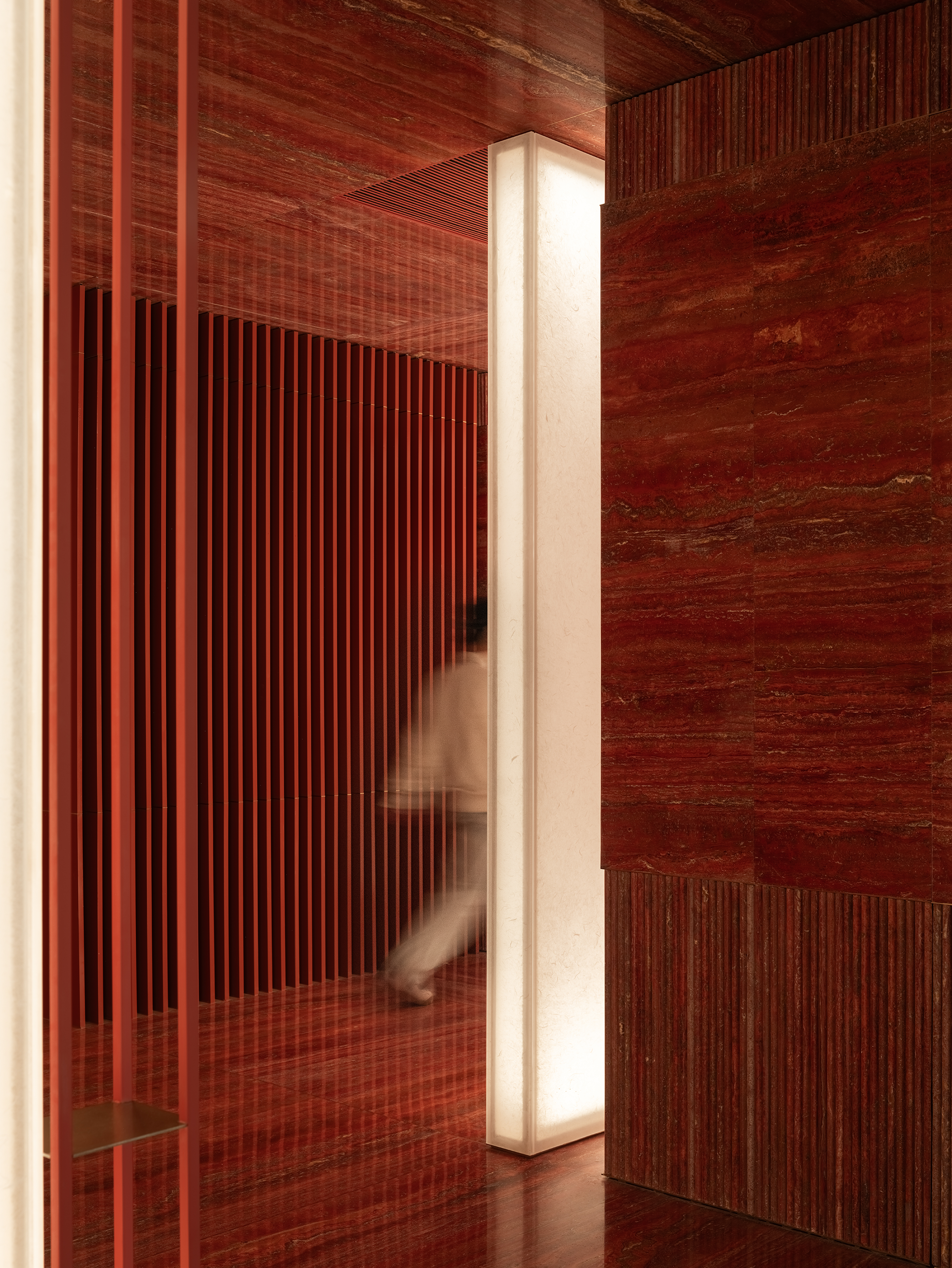
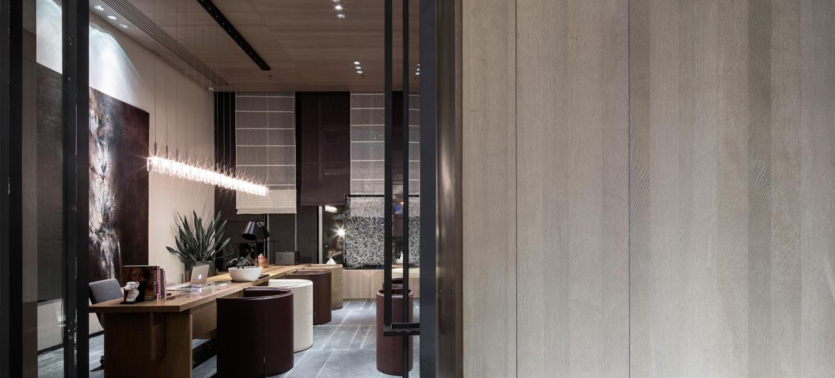
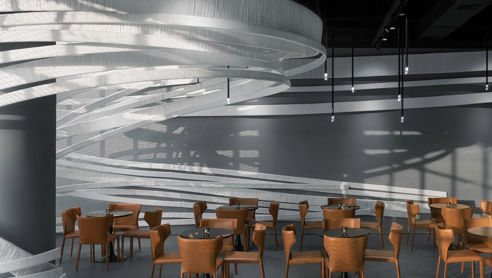
The visitors face the light, approach the rising light, and have a special experience in various ways in a space filled with light as the light guides the way according to the flow of the program.


我们希望有一个让人感到谦逊的办公室,同时散发出积极的气息。我们通常对自己的空间采取极简主义的方法,对我们来说,这意味着使用对我们真正重要的、我们实际需要的物品。因此,办公室最终形成了那些在我们生活中真正有意义的家具和艺术品。
We wanted to have an office that felt humble while giving off positive vibes. We usually take a minimalist approach towards our own space, and for us that means working with the objects that are really important to us and that we actually need. So eventually the office took shape with the pieces of furniture and art that really have meaning in our lives.


我们喜欢橡木和白色,我们使用透明或凹槽玻璃来带来一些透明度。我们有一张Campus Martius的ichnography地图,我们想把它纳入会议室,所以我们选择了一张黑色的桌子来补充它。
We like oak wood and whites, and we used clear or fluted glass to bring some transparency. We had a Campus Martius ichnography map that we wanted to incorporate in the conference room, so we chose a black table to complement it.


我们在整个工作室中使用了橡木和橡木单板,并在墙壁上涂了一层浅色的Marmorino灰泥,并进行了哑光处理。所有的木材和木皮都用水性PU覆盖,以达到亚光效果。
We used oak and oak veneer throughout the studio, and painted the walls with a light Marmorino stucco with a matt finish. All the woods and veneers were covered with water-based PU to achieve a matt finish.


对于隔断,我们在希望保持连接感的地方使用透明玻璃,在其他地方使用凹槽玻璃。在校长的工作室和会议室之间有一个可滑动的、可折叠的隔断,当会议室不使用时,可将其收进室内,使工作室变得更大。
For the partitions, we used clear glass where we wanted to maintain a sense of connection, and fluted glass everywhere else. Between the principal’s studio and the conference room is a sliding, foldable partition that can be tucked inside to make the studio larger when the conference room is not in use.


The idea was to use as many natural materials as possible to create a humble and grounded atmosphere, so we used plenty of wood and natural stone throughout.
YUN Pangyo
YUN Pangyo


恽代英 有两个侧面平行对称地运行在一起。场景由两个外墙组成,长度像一个长的矩形,设计简单。
‘Yun Pangyo’ has two sides running together symmetrically in parallel. The scene consists of the two facades running the length like a long rectangle in a simple design.


虽然有些人可能觉得大面积的曝光有很多好处,但我们认为,由于运动和注意力的分散,在品牌故事和运营方向的声音展示方面,缺点多于优点。
While some may feel that there are many advantages to be gained from exposure to the large area, we believe that there are more drawbacks than advantages in the sound demonstration of the brand story and operational directions due to the dispersal of movement and attention.


如何在空间建设上克服这个缺点,让顾客在购买我们的产品时感受到云的身份,是我们遇到的另一个使命。我们从韩国传统的墙体中找到了表达 云 的核心概念和克服这些弊端的线索。
It was one of the other missions that we encountered to overcome this drawback in terms of the construction of space and to have our customers feel the ‘Yun’ identity while making purchases of our products.We found the clue for the expression of the core concepts of ‘Yun,’ and for the overcoming of these drawbacks from traditional Korean walls.


The traditional Korean house uses the pillars and horizontal angle brace to wholly include the surrounding scenery in the effort to embrace nature, and this shows the Korean attitude towards nature in the past. The outer walls were meant to complement the drawbacks of the houses, and these were also meant to accommodate the surrounding terrain and landscape.


此外,围墙不仅是内部和外部的界限,也是修改围墙外景色的画框。这也是一个从外面到里面的微妙沟通的边界,或者说是反过来的。
Furthermore, the walls not only act as a boundary between the inside and the outside but also as a picture frame that modifies the view beyond the fences. It was also a boundary for subtle communication from the outside to the inside, or in reverse.


As if to accommodate the surrounding space, ‘Yun Pangyo’ includes 3 walls of different forms and sizes. Through these walls, the facades show different appearances from both sides.


Yun 讲述的是日常生活,因此与近年来具有华丽和挑衅性产品的品牌分开了道路。尽管如此,Yun 在其行动中成功地抓住了人们的思想和情感。
‘Yun’ speaks of everyday life, and therefore parts paths from brands with gaudy and provocative products of recent years. Despite this, ‘Yun’ in its moves manages to capture the minds and emotions of people.

 PintereAI


