自然律动 以有趣的方式 首
2023-02-09 22:19


自然律动,
以有趣的方式。
设计师手记
尝试将日常生活
中的各种灵感
提取转换之后
应用于空间设计之中
希望能够展示一种
独特的切入视角
精品店SVRN
Boutique SVRN


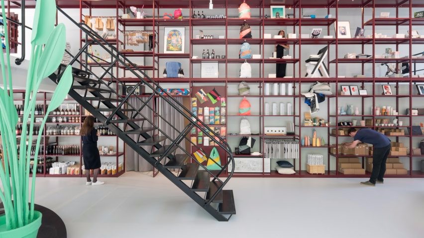
在首次开业仅三年后,创始人David Kim再次换档,在首尔建筑事务所WGNB的帮助下,改造和扩大了他的高档多品牌精品店SVRN--这是 主权 的简称。
founder David Kim is once again shifting gear, both revampingand expanding his upscale multi-brand boutique SVRN – that’s short for ‘sovereign’ – with the help of Seoul-based architecture practice WGNB.


该零售空间占据了芝加哥西环购物区新建的综合体Aberdeen East底层的390平方米(4198平方英尺)的单元。
The retail space occupies a 390 sqm. (4,198 sq.ft.) unit on the ground floor of Aberdeen East, a newly built mixed-use complex in the West Loop shopping district of Chicago.


有着韩国血统的Kim在设计规范上与自己合作,从而形成了以有趣的方式融合东方和西方的设置。因此,当自信的西方视角直接审视物体本身时,亚洲视角的包容性更强,而是关注物体的周围关系。
Kim, who is of Korean origin, has collaborated himself on the design codes, resulting in settings that blend East and West in interesting ways. So, while the assertive Western perspective looks directly at the object itself, the Asian perspective is way more inclusive and focuses on the surrounding relationship of the object instead.


SVRN的店面基本上分为两个部分--主销售楼层点缀着整体性的装置,创造了购物者在其中的流动,这在很大程度上决定了他们的空间体验,还有一个里屋是用拉丝不锈钢和对比强烈的微水泥石膏涂料设计的。
The SVRN store basically is divided into two sections—the main sales floor which is dotted with monolithic fixtures that create a flow of shoppers navigating within, and it’s one that pretty much determines their spatial experience, and there’s a backroom which is designed with brushed stainless steel and contrasting micro-cement plaster paints.


头顶上一排无尽的漆黑横梁有嵌入式照明,增加了视觉动态。SVRN精品店一直是风城的一个路人甲,提供独特的、经过严密策划的、横跨街头服饰和时尚的高端男女商品组合。
An endless row of pitch black beams overhead have embedded lighting and add to the visual dynamic. SVRN boutique has been a wayfarer of sorts in the Windy City, offering a unique and tightly curated mix of high-end men’s and women’s items that straddle both streetwear and fashion.
Lachoix概念店
Lachoix Concept Store


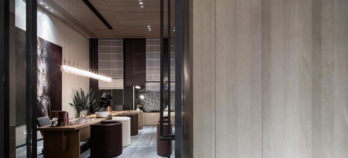
我们的愿景是创造一个干净而精致的现代空间。为了实现这一目标,我们剥去了假天花板和多层油漆,以达到结构的本质。随后,我们加入了白色、灰色和棕色,以创造所需的氛围。
Our vision was to create a clean yet sophisticated contemporary space. To achieve this, we stripped the false ceiling and layers of paint to get down to the essence of the structure. Subsequently, we added whites, grays, and browns to create the desired atmosphere.


客户要求他们的开放空间概念店既能作为展示区又能作为工作空间。 亚麻布帘是作为两个区域的分割和连接的元素。
The client required that their open-space concept store mutually functions as a display zone and working space. The linen curtain is the element that serves both as a division and connection between the two zones.
Holzweiler
Holzweiler


Holzweiler在哥本哈根建立了其第一个国际零售点,将其独特的挪威思维方式带到了新的地区。
Holzweiler established its first international retail location in Copenhagen, bringing its distinctively Norwegian mentality to new locales.


室内设计的品味体现了Holzweiler设计和休闲产品中弥漫的著名的创意能量。当从繁忙的哥本哈根街道进入时,一种平静的感觉扑面而来。
The tastefully designed interior captures the renowned creative energy that permeates the Holzweiler design and leisure offering. When entering from the hectic Copenhagen streets, a sense of calm prevails.


痕迹 的概念在品牌转移到一个新的地方时,传达了一种对品牌有价值的过去的情感,让人联想到一种持久的记忆或感觉。
The concept of “traces” conveys an emotional sense of the brand’s valued past as it moves to a new place, reminiscent of a memory or sensation that endures.


木墙引领人们穿过商店,围绕着手工包覆的粘土结构,阐明了围绕物品的环形运动,并提供了沿途的意外发现。
Timber walls lead one through the store, around the hand-clad clay structure, articulating a circular movement around the items and providing unexpected discoveries along the way.


一个弯曲的橡木单板隔断环绕着,作为整个区域的背景。功能和可持续性是选择材料时的两个关键考虑因素。
A curving oak veneer partition wraps around as a backdrop to the whole area. Function and sustainability are the two key considerations when choosing materials.

 PintereAI


