未定义与无形 空间故事 首
2022-11-22 23:15


“ 未定义与无形, 空间故事。 ”
设计师手记 选择材质 通过空间创 造出色彩的统一 同时运用不同的纹理 突出展示品的各种颜色 参与创造一个亲密的声音 表现出未定义与无形的空间故事


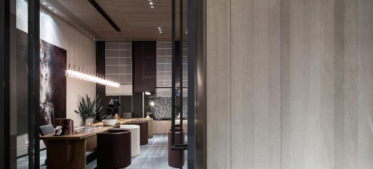
位于市中心的 charleroi,新的 poloé 珠宝是建立在一个前超市。从一个未定义的空间开始,深度通过覆盖整个表面的统一的悬挂天花板得到强调,建筑干预的目的是通过强调隐藏在几个装饰层之下的现存的奇异性来消除这种内涵。
Located in the city center of
, the new Polomé’s jewelry is established in a former supermarket. Starting from an undefined space in which deepness was emphasized by a uniform suspended ceiling covering the entire surface, the aim of the architectural intervention is to erase this connotation by highlighting existing singularities, hidden under several finishing layers.


该项目的设计已经开始作为一个循环,跟随客户的发展,通过空间。事实上,这次旅行是从大楼外面开始的。玻璃橱窗的形状是一个沉思空间的标志是一个圆形休息由玻璃砖。透过其透明的特性,砖保留了珠宝的亲密感,同时也照亮了街道。
The design of the project has been initiated as a circuit following the client’s progression through the space. In fact, this journey begins outside the building. The vitrine is shaped as a contemplation space marked by a round recess made of glass bricks. Through its diaphanous characteristics, the brick preserves the intimacy of the jewelry as well as illuminates the street.


商店的入口由一系列粗梁构成,这是建筑结构逻辑的证据,也是空间的序列。表面的组织成为透视图,当环路边界的长幕布体现了景区空间——展厅——和后台——工作室和办公空间的划分。
The entrance in the store is rhythmed by a series of thick beams, evidence of the structural logic of the building that sequences the space. The organization of the surface becomes scenography when the circuit borders the long curtain materializing the division between scenic space – the exhibition hall – and backstage – the atelier and office spaces.


这个旅程也偶尔被凉亭打断,其亲密性被装修空间周围的织物褶皱所强调。透过商店的灯光也可以看到透视效果,有时展台的摆放突出了展台的水平状态,有时是凹室的垂直状态。
This journey is also sporadically punctuated by alcoves, whose intimacy is accentuated by the textile drape surrounding the fitting space. The scenography is also perceived in the lighting of the store, where mountings underline sometimes the horizontality of exhibition desks, sometimes the verticality of alcoves.


最后,由于第二个玻璃砖凹处散发出更明亮的自然光,客户的回路被自然引导到珠宝的后面,与街道上的玻璃橱窗相呼应。砖块重组了光线,照亮了唱诗班。商店的另一边被高大的镜子打断,这些镜子通过反射减少了它的线性。这些垂直元素也模仿了更个性化的装修空间。
Finally, the client’s circuit is naturally guided toward the back of the jewelry thanks to a brighter source of natural light emanating from a second glass brick recess echoing the vitrine along the street. The brick restructures the light and illuminates the choir. The other side of the store is punctuated by tall mirrors that reduce its linearity by playing with reflections. These vertical elements also delimitate more individualized fitting spaces.


选择的材质通过空间创造出色彩的统一,同时运用不同的纹理,突出珍贵宝石的各种颜色。墙壁和地板上的纺织品的选择,以及天花板上的预计纤维素,参与创造一个亲密的声音。
The chosen materiality creates a chromatic unity through the space meanwhile playing with different textures with the aim of highlighting various colors of the precious gems. The choice of working with textiles on the walls and the floor, as well as projected cellulose on the ceiling, participate in the creation of an intimate acoustic.
Schulstrasse 17商店
Schulstrasse 17


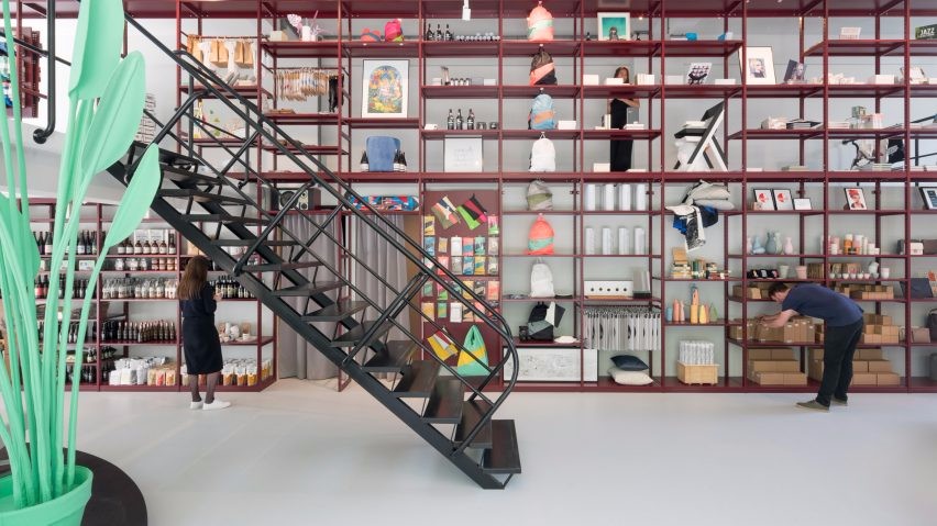
空间宽敞的概念商店,提供技术产品和创新的初创产品,这是出于最低限度的审美考虑。整体设计理念是保持建筑场地的一些自然外观,并使用折衷的材料,以避免任何形式的传统饰面。
The spacious concept store for technical goods and innovative start-up products is driven by a minimal aesthetic. The overall idea is to keep some of the building site’s natural look and to bring it together with an eclectic use of materials to avoid traditional finishes of any kind.


这个建筑被剥去了骨头,并且提供了一个美妙的画布来创作。原始的方格天花板以温暖的米黄色调占据了整个空间,与混凝土墙和有趣的楼层布局和商店橱窗相映成趣,商店橱窗的功能就像一个小画廊。
The given architecture was stripped to the bone and offered a wonderful canvas to work on. A raw coffered ceiling in a warm beige tone dominates the space and gets complimented with concrete walls and an interesting arrangement of levels and shop windows that function as little galleries.


两个巨大的支柱中心的空间,并给出了很好的理由,砂石池显示工作围绕他们。这些游泳池的定制底座是用石膏板建造的。
Two massive pillars center the space and gave good reason for gravel pool displays to work around them. The bespoke base of those pools is made out of drywall construction elements.


光滑但大胆的不锈钢侧面显示给空间最大限度的自由量的产品安排。最后,所有的物品都展示在柔和的反光材料上,以强调它们的重要性和价值。另一个亮点是由两部分组成的展示,遍布整个空间,并强调了商店的大小。
Sleek but bold stainless steel side displays give space for a maximum amount of freedom concerning the arrangement of products. In the end, all objects are displayed on softly reflective materials to underline their importance and value. Another highlight is a two-part display going through the whole space and underlining the size of the store.


不锈钢家具的概念打破了残酷的建筑,由巨大的定制人工卵石支撑,作为艺术品平静的氛围。其结果是一个存在与未来相遇的概念,通过融合高科技和低科技的感觉来创造氛围。
The concept of stainless steel furniture interrupting the brutal architecture is supported by massive bespoke artificial boulders, functioning as art objects calming the vibe. The result is a presence-meets-future concept where the atmosphere is created through merging the feel of high and low tech.

 PintereAI


