WGNB新作丨空间故事 首
2022-11-02 09:36


是韩国首尔的一家设计工作室,由三位年轻的创始人Jonghwan Baek、Jonghyeon Shin和Dohan Kim成立于2015年。WGNB尝试将日常生活中的各种灵感提取转换之后,应用于空间设计之中,希望能够展示一种独特的切入视角。
WGNB is a Seoul-based design studio founded in 2015 by three young founders, Jonghwan Baek, Jonghyeon Shin and Dohan Kim. WGNB attempts to translate various inspirations from everyday life into spatial design, with the hope of presenting a unique perspective.


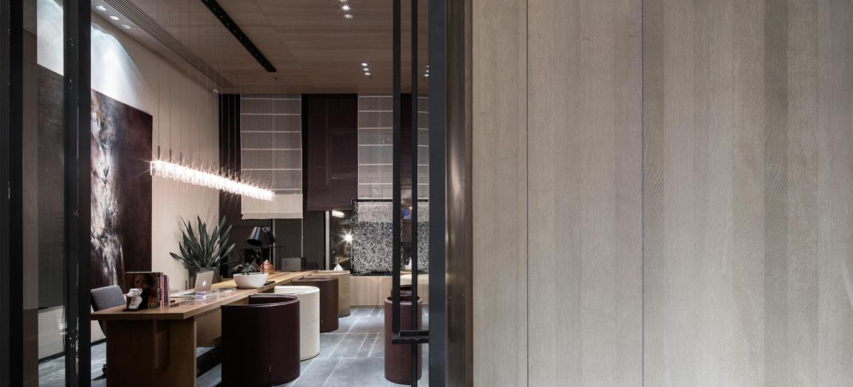
SVRN Store Chicago
SVRN Store Chicago
,灵感来源于WGNB以东方的视角对
品牌形象进行重新的诠释和具有故事性的情感叙述。西方的视角通常关注的是物质本身,而东方的视角则更关注物质与其周围的关系。旗舰店的空间布局主要考虑到顾客动线的开放性和商品陈列在空间中所产生的当代性与潮流感。
SVRN Store Chicago, inspired by WGNBs reinterpretation and emotional storytelling of the SVRN brand image from an Eastern perspective. Whereas the Western perspective usually focuses on the material itself, the Eastern perspective is more concerned with the relationship between the material and its surroundings. The spatial layout of the flagship shop takes into account the openness of the customer flow and the contemporary and trendy feel of the merchandise displayed in the space.


空间被划分为两个部分,其中主要的销售楼层由装置式的艺术构件或者形体所组成,环绕其间,创造了一种独特的顾客指引。而位于后方的空间,采用拉丝不锈钢和对比强烈的微水泥灰泥涂料等主要材料,可视的整体性体现了
的品牌身份和形象展现。
The space is divided into two sections, with the main sales floor consisting of an installation of artistic components or forms that surround it, creating a unique customer orientation. The space at the rear, on the other hand, uses key materials such as brushed stainless steel and contrasting micro-cement plaster paint, with a visible integrity that reflects the identity and presentation of the SVRN brand.


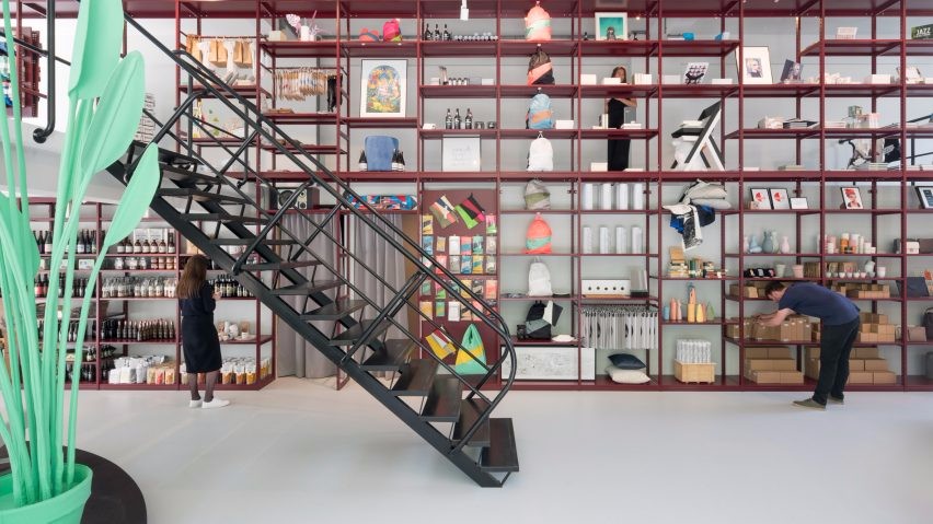
Musinsa E PTY
Musinsa E PTY
,韩国享有知名度的时尚购物商店,因其独特的审美和能够精准的把握时尚潮流而备受年轻人的喜爱与欢迎。所以,品牌的目标群体中,大致有45%的客户年龄段为18岁至24岁之间。
Musinsa E PTY, a Korean fashion shopping store, is popular among young people for its online aesthetic and ability to accurately grasp fashion trends. As a result, 45 percent of the stores shoppers are between the ages of 18 and 24.


该商店一共有四层,每一层的空间氛围和功能都有别于其他的楼层,但它们之间具有相同的特点。
一直遵循着前卫、时尚的设计风格,积极地、巧妙地为前来消费、参观的顾客们创造一种线条干净、简洁和流线顺畅的购物空间。
The shop has four floors, each with a different atmosphere and function from the others, but with the same characteristics between them, and WGNB has always followed an avant-garde, stylish design style, actively and subtly creating a space with clean, simple lines and a smooth flow for the customers who come to shop and visit.


商店以黑、白和灰色作为空间的主要色调,并在运用中形成鲜明的对比。当顾客身处深色调占比较大的空间时,使其产生一种安静和平稳的即视感。与此同时,
摒弃了复杂的装饰,以造型感强烈的商品展示架、墙体和储物柜来丰富空间的层次。
The shop uses black, white and grey as the dominant colours in the space and creates a stark contrast in its use. When customers are in a space where darker shades dominate, it creates an immediate sense of quietness and smoothness. At the same time, WGNB eschews complex decoration and enriches the space with strongly shaped displays, walls and lockers.


大面积的玻璃窗让自然光线可以自由的进入室内,也能让处于室外的人们可以清晰的看见室内的陈设和展示的商品,在吸引人们的眼球的同时,增加前来购物的人流量。镜子在空间中也被重复使用,既可以为客户带来便利,又能在视觉上扩大空间。
The large glass windows allow natural light to enter the interior freely and also allow people who are outside to see clearly the furnishings and products on display, attracting the eye while increasing the flow of people who come to shop. Mirrors are also used repeatedly in the space, both for the convenience of the customer and to visually expand the space.


 PintereAI


