理想之“家” 迷失在设计师艺术作品中 首
2022-08-18 09:30
设计师手记 对色彩的使用 对丹麦设计中 传统上被称为 克林特学派的反叛的 另一个维度——社会美学功能主义 将设计推向其最基本的必需品 并批评奢侈的装饰
Finn Juhl 陈列室是一个按照自己的节奏四处游荡、收集灵感并迷失在设计师的艺术作品世界中的地方。全世界的设计爱好者——当世界重新开放时,当计划去哥本哈根旅行时,一定要规划一下新开的 Finn Juhl 陈列室。House of Finn Juhl 距离国王新广场仅几米,于 2020 年秋季推出了展厅。
The Finn Juhl Showroom is a place to wander around in your own pace, gather inspiration, and get lost in the designer’s universe of art pieces.Design lovers of the world—when the world reopens again, when a trip to Copenhagen is planned, be sure to map out the newly opened Finn Juhl Showroom. Located a couple of meters from King’s New Square, House of Finn Juhl launched the showroom in the fall of 2020.
一年多来我们新的 COVID 现实的直接结果——因为一个又一个的设计博览会和活动被取消——House Finn Juhl 决定创建自己的设计圣地。向所有人开放,雄伟的环境拥有完整的 Finn Juhl 系列以及 Konsthantverk 精心挑选的闪电作品、艺术品和配饰,与丹麦中世纪现代现代主义的庞然大物相得益彰。
A direct consequence of more than a year of our new COVID-reality—as one after another design fair and event were cancelled—House of Finn Juhl decided to create their own design mecca. Open to everyone, the majestic surroundings hold the complete Finn Juhl collection as well as hand-picked lightning pieces by Konsthantverk, artworks, and accessories complimenting the behemoth of Danish Mid-Century Modern.
新 Finn Juhl 陈列室的位置在哥本哈根的文化生活中发挥着重要作用。说得很快;在 1989 年去世之前,Finn Juhl 和 Hanne Wilhelm Hansen 是一对夫妻。Hanne 和她的姐姐一起是丹麦音乐出版公司 Wilhelm Hansen Music Publishers 的继任者。
The location of the new Finn Juhl Showroom plays a significant role in Copenhagen’s cultural life. Put very shortly; until his passing in 1989, Finn Juhl and Hanne Wilhelm Hansen were a couple. Together with her sister, Hanne was the successor to the Wilhelm Hansen Music Publishers—a Danish music publishing company.
1988年,姐妹俩决定卖掉出版社,并以此为契机成立基金会,以回馈艺术家。1998 年,在 Finn Juhl 去世 9 年后,Hanne 联系了 Onecollection(今天也称为 House of Finn Juhl)的创始人,提出了重新推出 Juhl 设计的想法。随着时间的推移,这次合作为 Juhl 的家具带来了新的活力,Hanne 授予 Onecollection 的所有者生产所有 Finn Juhl 作品的专有权。
In 1988, the sisters decided to sell the publishing house and from the sale, they established a Foundation with the goal of giving back to the artists. In 1998, nine years after Finn Juhl’s passing, Hanne contacted the founders of Onecollection, also known as House of Finn Juhl today, with the idea of relaunching of Juhl’s designs. As time went on, this collaboration turned out to bring new life to Juhl’s furniture, and Hanne granted the owners of Onecollection exclusive rights of the production of all Finn Juhl pieces.
尽管他在丹麦的许多现代主义同行都热衷于实用的建筑和极简主义,但 Finn Juhl 的作品更像是雕塑家的作品。他的设计是有机的,他的革命性想法经常让橱柜制造商努力工作。他坚持不懈地努力使家具的一部分到另一部分的过渡尽可能无缝,创造出精致的形状和细节。他的椅子上的座位经常出现浮动,好像与扶手和靠背分开。
Whereas many of his Modernist peers in Denmark were occupied with practical constructions and minimalism, Finn Juhl’s work more resembled that of a sculptor. His designs are organic, and his revolutionary ideas often put the cabinetmakers to hard work.With such a strong focus on creating spaces that are rich in character and revel in the unexpected, YSG’s work is grounded in a passion for materiality. Each project’s priorities are set by the material palette, which informs the space as a whole. Summing up the studio’s approach to materiality, Yasmine describes how “possessing a precise but refreshingly off-beat eye for visual compositions is our key offering.
Finn Juhl 对色彩的使用是他对丹麦设计中传统上被称为克林特学派的反叛的另一个维度——社会美学功能主义,将设计推向其最基本的必需品,并批评奢侈的装饰。他的沙发、橱柜或咖啡桌的鲜艳色彩是一种全新的家具构思方式,人们质疑这些设计的寿命。时间证明他们是错误的,因为 Finn Juhl 的设计现在已成为丹麦设计史上的稳定产品,并享誉全球。
Finn Juhl’s use of colors are a whole other dimension in his rebellion against what is traditionally known as The Klint School in Danish design—the socially aesthetic functionalism, scraping down a design to its bare necessities and criticizing extravagant decorations. The bright colors of his sofas, his cabinets or coffee tables were a brand new way of conceiving furniture, and people questioned the longevity of these designs. Time has proved them wrong, as Finn Juhl designs are now a stable in Danish design history and celebrated worldwide.
Finn Juhl 陈列室不是一家商店,而是一个按照自己的节奏四处游荡、收集灵感并欣赏周围环境的地方。走上螺旋楼梯,全面了解空间,享受柔软面料、色彩缤纷的橱柜和有机形状的沙发桌的许多细节。无论您是否考虑购买图标,都非常欢迎您迷失在 Finn Juhl 的艺术作品世界中。
The Finn Juhl Showroom is not a store, but a place to wander around in your own pace, gather inspiration, and take in the surroundings. Walk up the spiral stairs for a full overview of the space, and enjoy the many details of the soft fabrics, colourful cabinets, and sofa tables in organic shapes. Whether or not you are considering purchasing an icon, you are more than welcome to get lost in Finn Juhl’s universe of art pieces.
作为一个名副其实的试验场,达令角看到了一种不同寻常的纹理和饰面的融合,这些纹理和饰面引用了一种全球精神。George Livissianis 过去与客户建立了舒适的关系,将 Darling Point 重新构想为反映实验性和开放性的公寓。在众多酒店项目中合作后,地中海的影响迫在眉睫,这是一种共同的愿望,即探索纹理、光线和空间安排,最终结果融合在一起。从典型的小酒馆风格餐厅中汲取灵感,出现了一种轻松、平静、柔和且不那么结构化的美感。
As a veritable playground of experimentation, Darling Point sees an unusual coming together of textures and finishes that reference a global spirit.
Coming from a comfortable past relationship with the client, George Livissianis reimagines Darling Point as an apartment that reflects an experimentation and an openness. Having worked together on numerous hospitality projects, the Mediterranean influence was imminently anticipated, and it was a shared want to explore texture, light and spatial arrangements that saw the final result come together. Taking cues from the typical taverna-style restaurant, a relaxed, calming, soft and less structured aesthetic emerged.
George Livissianis 过去与客户建立了舒适的关系,将 Darling Point 重新构想为反映实验性和开放性的公寓。由 Chichu Constructions 和 Inde Studio 的细木工建造,公寓的重点围绕着体验。与接待场所的吸引力非常相似,正是沉浸在异国情调、手工和质感中,从而提升和唤醒,复制这种激活是很重要的。乔治在谈到他参与该项目时说:“乔纳森和我从小就是朋友,在他所有的餐馆都工作过,这让我天生就帮助他打理他的公寓。
Coming from a comfortable past relationship with the client, George Livissianis reimagines Darling Point as an apartment that reflects an experimentation and an openness.Built by Chichu Constructions, together with joinery by Inde Studio, the focus of the apartment centres around experience. Much akin to the draw of a hospitality venue, it is the immersion in the exotic, the artisanal and the textural that heightens and rouses, and replicating that activation was important. Speaking to his engagement on the project, George says, “Jonathan and I have been friends since we were kids and having worked on all of his restaurants it innately led me to helping him with his apartment.
因为我非常了解他,我了解他的审美以及他被什么吸引,这是一个自然的过程。” 他当时沉浸在布里斯班 Greca 的设计中,他补充说,这家餐厅“确实影响了公寓的方向,除了我们使用了更复杂的材料,这是有道理的,因为他被它们作为住宅的诠释 我们一起工作。”
Because I know him so well and I know his aesthetic and what he is attracted to, it was a natural process.” Having been immersed in the design of Brisbane’s Greca at the time, he adds that the restaurant “really did influence the direction for the apartment, except that we used more sophisticated materials, which made sense as he was drawn to them as a residential interpretation of our work together.”
Darling Point 是一个精选的收藏和故事物品空间,这些物品唤起怀旧感并连接到回忆。公寓里点缀着来自朋友的艺术品、沿途收集的家具和照明设备,以及来自许多精心策划的餐厅。
Darling Point is a curated space of collected and storied items, items that evoke a sense of nostalgia and connect to memories. The apartment is dotted with artwork from friends, furniture and lighting collected along the way and from many restaurants curated.
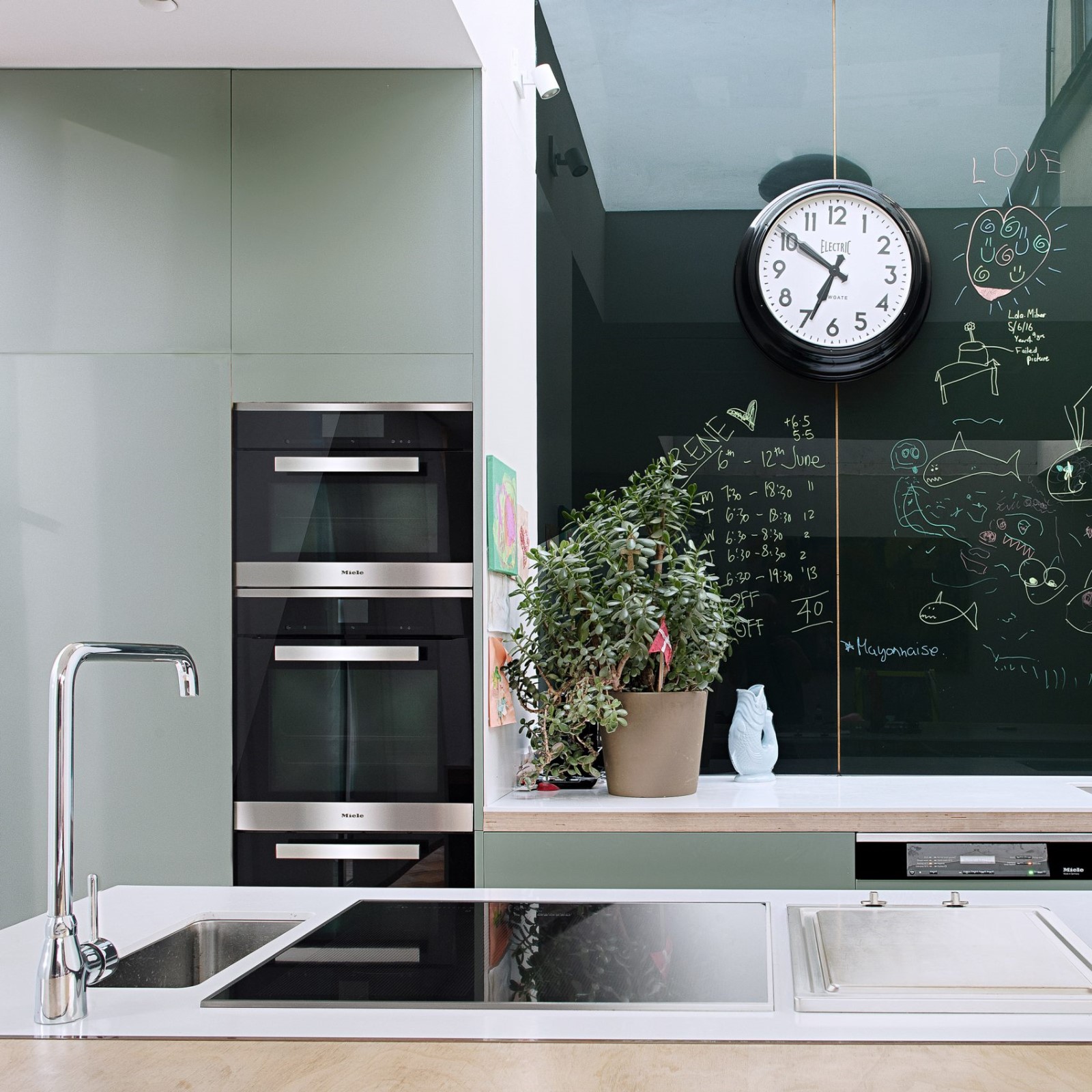
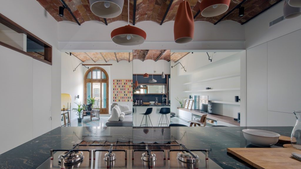
厨房设计为开放式,以便与家中的生活区域建立清晰的联系,并表达了业主作为餐馆老板和主人所珍视的东西。将这些元素中的每一个结合在一起就是物质性。George 解释说:“从调色板的角度来看,我一直非常简约和简单。我喜欢细木工,更精细的细节是我发现力量的地方。公寓真的需要一些纹理,这样它就不会感觉是合成的,这就是石灰渲染的原因。虽然 Greca 更详细(作为参考),但公寓故意更锐利、更精致。纹理、墙壁和最小的细木工方法之间存在平衡。”
The kitchen is designed open to allow for a clear connection with the living areas of the home, and as an expression of what the owner holds dear as a restaurateur and host. Bringing each of these elements together is the materiality. George explains, “from a palette perspective I’ve always been very minimal and simple. I love joinery and the finer details are where I find strength. The apartment really needed some texture so that it didn’t feel synthetic, and that is how the lime render came about. While Greca is more detailed(as a reference), the apartment is deliberately sharper and more refined. There’s a balance between textures, the walls and the minimal approach to joinery.”
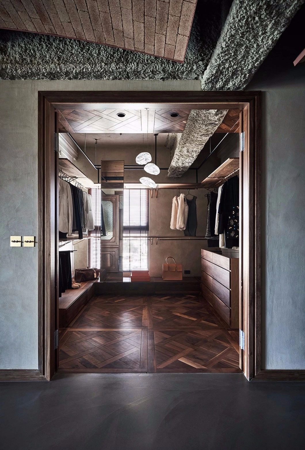
与石灰水洗的墙壁、烟灰细木工和相配的橡木地板相得益彰,而浴室中的红玛瑙色调和厨房中的威尔第维拉则增加了纹理的深度和丰富性。乔治描述说,使这些空间充满活力的关键是与光的相互作用。“对我来说,光总是一件大事。
Together with the lime washed walls, smoked ash joinery and matched oak flooring sit together in unison, while red onyx tone in the bathroom and verdi vera in the kitchen add textural depth and richness. Key to enlivening these spaces is the interplay with light, George describes. “Light is always a big thing for me.
公寓里有非常棒的西方光线,宴会区有美丽的晨光,我们想捕捉到这一点。这一切都是关于规划,以及作为一个开放和连接的空间。” 通过全球视角看待一切,他对过程、完成或方法中的新鲜事物持开放态度,这也一直使他处于有利地位。
You get really great western light in the apartment and beautiful morning light at the banquette area, and we wanted to capture that. It’s all about planning and about being open and connected as a space.” Viewing everything through a global lens, his openness to newness in process, finish or approach has also always held him in good stead.
他补充说,“这真的是一种本能反应,并根据调色板和完成的感觉来开发它。一路走来,一切都是精致的,我从不拘泥于任何事情,总是乐于以更开放的心态看待事物。在它建成之前,我非常灵活。”
He adds, “it’s really about an instinctive reaction and developing it based on what the palette and finish feel they should be. Everything is refined along the way, and I am never fixed on anything and always open to looking at something more open-mindedly. I’m very fluid until it’s built.”
其实践包括一半的酒店和零售工作以及一半的住宅项目,正是这些之间的相互联系使乔治的方法保持活力。他说,他的过程“总是一样的。我总是从计划和草图设计开始,我迫不及待地拿起铅笔开始画画。在涉及到我们的流程时,我一直非常透明,因为我们必须与如此多的品牌打交道,并且我们参与创造不断变化的各种体验。
With a practice that comprises half hospitality and retail work and half residential projects, it is the interconnection between these that keeps George’s approach dynamic. His process, he says, “is always the same. I always start with planning and sketch design, and I can’t wait to pick up a pencil and start drawing. I’ve always been very transparent when it comes to our process as we have to deal with so many brands, and we’re involved in creating varied experiences that are always changing.
所以,我们必须适应,你变得更像变色龙。” Darling Point 展示了这种善解人意和影响力的方法,一种对无数刺激开放的方法,而不是拘泥于一种严格或死板的风格,让主人的表达得以通过。
So, we have to be adaptable, and you become more of a chameleon.” Darling Point shows this empathetic and influenced approach, one open to a myriad of stimuli and not committed to one strict or rigid style, allowing an expression of the owner to come through.
Awkward and outdated makeover
顾名思义,Edge House 坐落在俯瞰太平洋的 80 米高的悬崖上。位于悉尼的室内设计工作室 Hare Klein 在经历了近九年的临时改建和扩建后,偶然发现了这座房子。该团队描述了他们认为“尴尬”和“过时”的东西,并制定了一项计划,将房屋恢复到原来的辉煌。最终结果体现了功能性,同时反映了客户对色彩和烹饪的热爱。
As the name suggests, Edge House rests on an 80-metre cliff overlooking the Pacific Ocean. Sydney-based interior design studio Hare Klein stumbled across the house after it had sustained nearly nine decades of makeshift alterations and additions. Describing what they saw as “awkward” and “outdated”, the team devised a plan to restore the home to its original glory. The final result epitomises functionality, all the while reflecting the clients’ love of colour and cooking.
Edge House 的简介要求人与地方之间有明确的联系;换句话说,家需要与住在那里的年轻家庭保持一致。色彩爱好者(特别是粉红色)、热心厨师和经验丰富的主人,通过坦率的材料调色板、现代厨房设施和慷慨的室内和室外娱乐产品来描绘业主的个性。厨房值得一提,还有一个大管家储藏室和酒窖(不出所料,业主也是葡萄酒爱好者)。
The brief for Edge House called for a clear connection between people and place; in other words, the home needed to align with the young family that lived there. Colour enthusiasts (one in particular: pink), keen cooks and experienced hosts, the owners’ personalities are portrayed through a candid material palette, modern kitchen amenities and generous indoor and outdoor entertainment offerings. The kitchen deserves a special mention, with the addition of a substantial butler’s pantry and wine cellar (unsurprisingly, the owners are wine lovers as well).
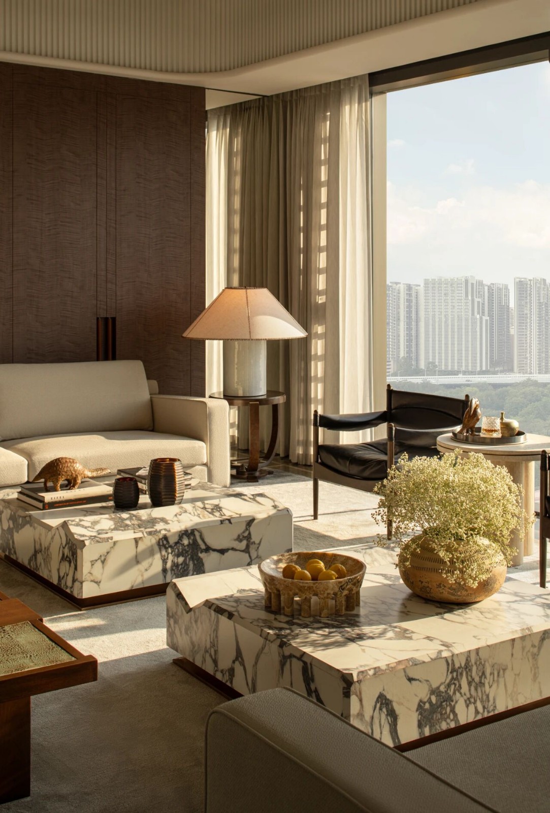
这些材料源于客户对粉红色的热爱,并通过家具、照明和饰面的策划整合在一起。Hare Klein 的创始人 Meryl Hare 表示,粉红色的图案为室内增添了“一种内敛的奢华气息”和“奇异的魅力”。事实上,这个主题构成了一些有趣的材料组合。红色天鹅绒、玫瑰纹大理石、浅色木纹;名单还在继续。
The materials are informed by the clients’ love of pink, which has been integrated through the curation of furniture, lighting and finishes. Hare Klein founder Meryl Hare says that the pink motif adds “an air of restrained luxury” to the interiors and “the odd flourish of glamour”. Indeed, the motif makes for some intriguing material compositions; red velvet, rose-streaked marble, light-wash wood; the list goes on.
房屋的实体建筑也需要进行一些重大改造,Stratti Building Group 进行了这些改造。主卧的屋顶被抬高,并附设了新的更衣室、浴室和红外线桑拿房。两个小房间被改造成一个大房间,供业主的两个小男孩使用,并配有一张定制的双层床作为分隔物。“与建筑商的合作对于这个项目的成功至关重要,”梅丽尔说。
The home’s physical build also needed some significant alterations, which Stratti Building Group carried out. The roof of the master bedroom was raised, and a new dressing room, bathroom and infrared sauna were attached. Two poky rooms were transformed into one large room for the owners’ two young boys, with a custom bunk bed as the divider. “The collaboration with the builders was pivotal in the success of this project,” Meryl says.
Hare Klein’s Edge House 是对业主对粉红色的热爱和娱乐欲望的认真回应——同时,它的水边位置也达到了水平。
Hare Klein’s Edge House is an earnest response to the owner’s love of pink and desire to entertain – and at the same time, levels up to its water’s edge location.
采集分享
 举报
举报
别默默的看了,快登录帮我评论一下吧!:)
注册
登录
更多评论
相关文章
-

描边风设计中,最容易犯的8种问题分析
2018年走过了四分之一,LOGO设计趋势也清晰了LOGO设计
-

描边风设计中,最容易犯的8种问题分析
2018年走过了四分之一,LOGO设计趋势也清晰了LOGO设计
-

描边风设计中,最容易犯的8种问题分析
2018年走过了四分之一,LOGO设计趋势也清晰了LOGO设计


 PintereAI


