新作丨正负下舍 • 梵品 首
2022-06-02 09:48


整个项目追求更加质朴纯粹的调性,在空间中以装置隐秘地划分功能、串联空间,以变幻的层次引导动线,将原木质感发挥到极致。依据场地的空间尺度合理分配展示、洽谈、办公3大功能的位置以及空间配比,表达了梵品对细节的深究态度以及“环保 生态”的品牌理念。
The whole project pursues a more simple and pure tonality. In the space, the function and series space are divided secretly by the device, and the moving line is guided by the changing levels, giving full play to the log texture. According to the space scale of the site, the location and space ratio of the three functions of display.


原始户型结构分为1层、阁楼以及2层,分割空间未受承重墙限制,可塑性强,予以来者开放舒适的空间体验。木材通过“站姿”与“躺姿”拨动起无声的音律,借用均等间距铺叙无限循环的意韵。
The original apartment structure is divided into 1 floor, attic and 2 floors. The divided space is not limited by the load-bearing wall, and the plasticity is strong, giving visitors an open and comfortable space experience.


在空间组织上兼顾公共空间的开放性与展示区域的体验性,设计通过调整地面高低、尺度大小、光线强弱来暗示功能变化。框景视角,引出空间的凝炼性与简化性;光带与木质交汇,顺延着线条营造出舒缓、惊喜、细腻、隽永的气质。
The space organization gives consideration to the openness of the public space and the experience of the display area. The design implies the functional change by adjusting the height of the ground, the size of the scale and the intensity of the light.


展示台放低的姿态,是蓄势待发的表达语言,以平稳的力道包容各式各样的材质,让可能性、互动性及精美感合为一体,形成驻足区域的焦点。点缀的小石块,仿若礼花的引火线,勾起观者的思绪,只待向内部发掘更多的纷呈妙处。
The low posture of the exhibition stand is the expression language ready to go, and it contains all kinds of materials with a smooth force, so that the possibility, interaction and exquisite sense of integration, forming the focus of the stopping area.


巧妙运用艺术漆、木饰面、柔光面瓷砖、亚克力、石材等材质,通过简单的几何形体,构设开放的大尺度展台,最终形成能调动所有感官的沉浸式体验。艺术,在质感、虚实中输出美学调性与意识共鸣。
The ingenious use of artistic paint, wood veneer, soft smooth tile, acrylic, stone and other materials, through simple geometric forms, the open large-scale booth, the final form of an immersive experience that can mobilize all senses.


富有规则感的空间基调,让予出空灵的视觉观感。几何元素欢跳进来,或成面,或成体,在薄厚对比、宽窄搭配、错落排布的设计手法的帮助下,激荡出多功能、美感强的展示细节,我们的情绪随形而起伏,乐在其中。
The regular space tone gives an ethereal visual impression. Geometric element joyfully jumps in, or become a face, or adult, fall in the help of the design gimmick of thin thick contrast, width and narrow collocation.


立面蔓延的浅色,阻隔了紧绷的神经,柔抚了每个贴近它的内心。深调木柜,依照舒适的比例安身,沿轮廓线点燃的暖光与温柔色调无缝衔接,产生了微妙的光效变化。盘腿而坐,饮清香茶,悠闲洽谈,体会品牌的精神愿景与产品的高级品质。
The spreading light color of the facade blocks the tight nerves and soothes everyone close to its heart. Deep attune wood ark, according to comfortable scale is settled, the warm light that kindling along contour line and gentle tonal are seamless join up, produced subtle light effect change.


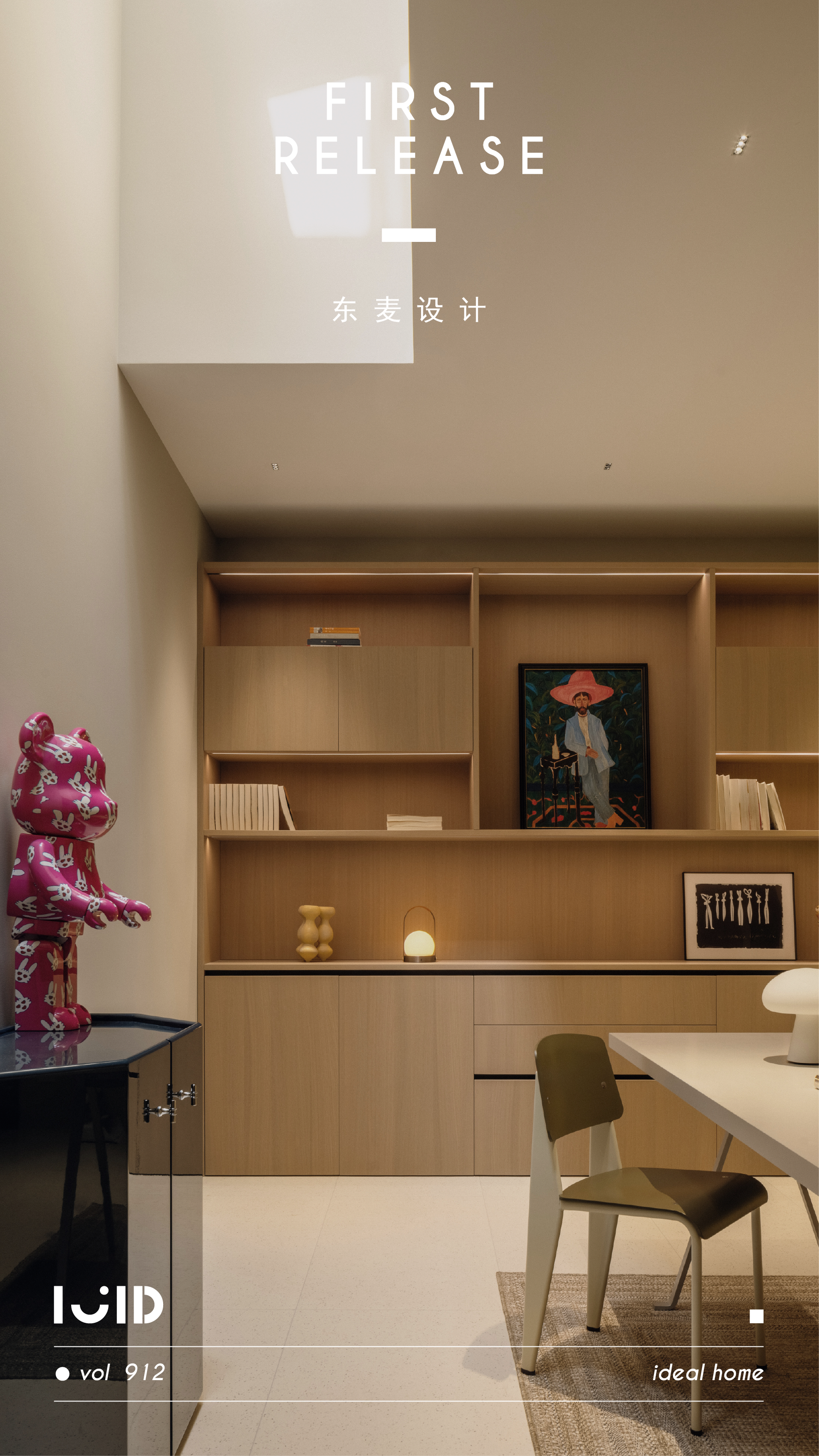
留白的背景,在天光的映照下,一收一放,运生静雅安然的诗意。黑与灰的色调向下沉淀,形成空间设计亮点与品牌主打展示的结合。在此查阅、办公、交流,可一边享受简约美学的格调,一边欣赏天然纹理的奇妙美。
The blank background, under the reflection of the skylight, a collection and a release, yun Sheng Jing Ya Enron poetry. The color of black and grey precipitates downward, forming a combination of space design highlights and brand flagship display.


木饰面板作为聆听者,听攀缘着它的石块讲述着独一无二的空间故事,一帧帧情节与画面,生动演绎出“回归自然”的空间逻辑和灵魂启示。人性化地台,提示我们拾阶抬步,感受不同空间的氛围,明确心之所向。
The wood panel serves as a listener, listening to the stones climbing around it telling unique spatial stories, so that the spatial logic and soul inspiration of returning to nature can be vividly interpreted. Humanized platform prompts us to pick up the steps.


项目坐标:广东 · 普宁
设计时间:2021.9
设计参与:锦程 展翼 建翰 洁微 洁泰


 PintereAI


