AIA Estúdio 巴西Haight 女装店设计 首
2022-01-11 22:40
在Shopping Leblon的Haight商店设计的前提是创造一个友好的环境和消费体验,在本质上带来一些不可能的东西。
The design for the Haight store at Shopping Leblon had the premise to create a welcoming environment and a consumption experience that brings something improbable in its essence.
该商场的氛围由人工元素和冰冷的材料定义,这与Haight的概念基础相反,后者与自然景观相联系。因此,第一次进入一个购物中心对项目提出了重大的挑战。
The malls ambiance, defined by its artificial elements and cold materiality is the opposite language of Haight’s conceptual basis - which is linked to natural landscapes. Consequently, being inside a mall for the first time posed a significant challenge for the project.
因此,设计采用了商店和购物中心之间的对比策略——尽管环境严格且受控,但提供了诸如没有门的可能性等机会。因此,该项目专注于一种有机的、程序化的和分层的语言来代表Haight的宇宙。
Accordingly, the design adopted a contrasting strategy between the store and mall - which, despite the rigid and controlled environment, offers opportunities such as the possibility of not having a door. Therefore, the project focused on an organic, procedural and layered language to represent Haight´s universe.
一个大的开口定义了商店的入口,让入口完全自由,这一方面强调了提出的对比,另一方面,建立了一种内部和外部的融合。位于商店中心的柱子——可以理解为一个障碍——成为主要的空间生成器。空间的流动性是由围绕柱子的占用来实现的。定义商店内路径的曲线增强了这种配置。
A large opening defines the entrance to the store, leaving access completely free, which on the one hand, emphasizes the proposed contrast and, on the other, establishes a kind of fusion between the interior and exterior. A pillar located in the center of the store – which could be interpreted as an obstacle – became the main spatiality generator. It is from the occupation around the pillar that the space fluidity is achieved. This disposition is enhanced by curved lines that define the path inside the store.
由柱子和天花板融合而成的体量以一种有机的方式成为一个元素,它参照了自然洞穴,并赋予整体统一。在它的周围,三个不同高度的石板作为一个展览空间和坐的地方。巴伊亚米色大理石和皂石被选择组成商店的中心。为了构造这些盘子,它使用了粗糙的巴伊亚米色。它们的排列方式是独立的,有不同的高度和材料,形成了组织流通的单元。
The volume created from the fusion between pillar and ceiling became an element in an organic way that refers to natural caves and gives unity to the whole. Around it, three stone plates of different heights act as an exhibition space and place to sit. Bahia beige marble and soapstone were the materials chosen to compose the center of the store. For structuring these plates, it was used rough Bahia beige. The way they are arranged - although independent with varying heights and materials - forms the unit that organizes circulation.
“terracor”材料覆盖了所有的墙壁和天花板,通过其粗糙的纹理与自然表面形成统一的氛围。无限多样的侵蚀过程形成了悬崖、洞穴、钟乳石、沙子、石头和水流的轨迹和形状,这使得我们的创意过程成为了商店空间概念的一部分。这个概念也从照明中探索,使用间接光作为基本元素来创造这种氛围。
The terracor” material, which covers all the walls and ceiling, gives unity to the ambiance through its rough texture that refers to natural surfaces. The infinite and diverse processes of erosion that form cliffs, caves, stalactites, sands, stones and the movements of water with its tracks and shapes led to our creative process being part of the concept developed for the stores spatiality. This conceptualization was also explored from lighting, using indirect light as a fundamental element to create this atmosphere.
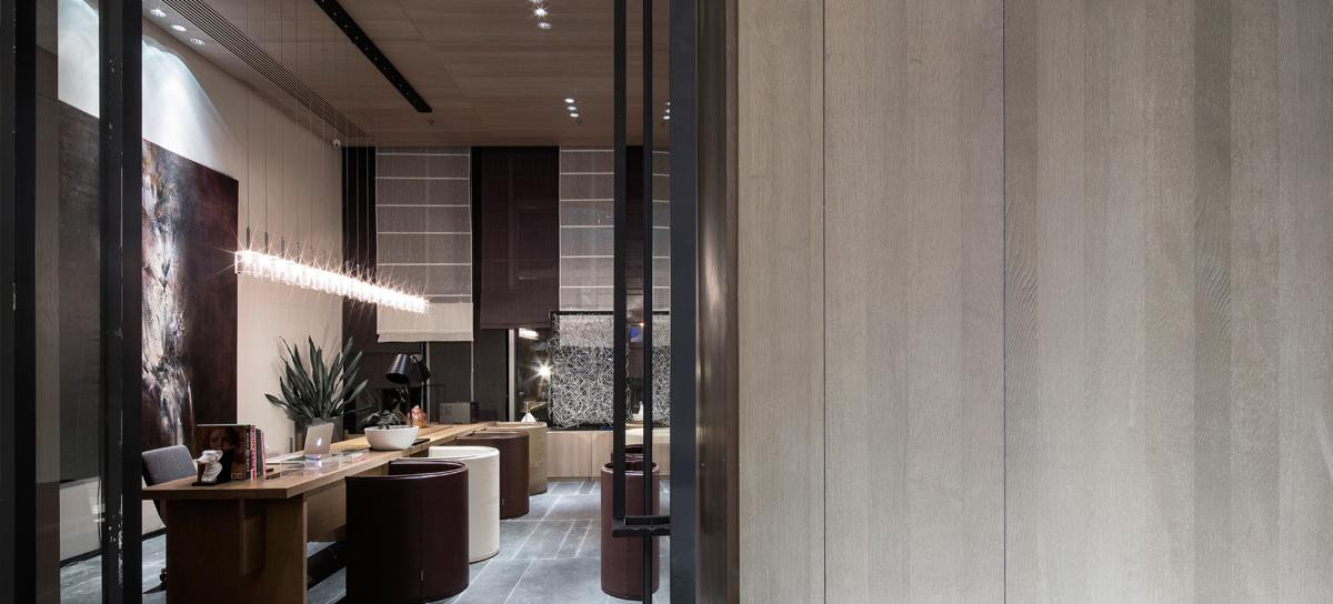
展览空间被认为是“墙壁”上的“切口”,通过材料的过渡强调了这种操作。这个切口揭示了壁龛底部的不锈钢板。在内部,有拉丝黄铜的展览架,它们具有更多的太阳方面,有助于微妙地温暖商店的氛围,以及皂石和它的灰色色调。
The exhibition interspace was thought of as a cut in the walls, an operation emphasized by the transition of materiality. This cut reveals a stainless steel plate in the base of the niche. Inside, there are exhibition racks in brushed brass, which, with their more solar aspect, contribute to subtly warming up the stores ambiance, together with the soapstone and its grayer tone.
采集分享
 举报
举报
别默默的看了,快登录帮我评论一下吧!:)
注册
登录
更多评论
相关文章
-

描边风设计中,最容易犯的8种问题分析
2018年走过了四分之一,LOGO设计趋势也清晰了LOGO设计
-

描边风设计中,最容易犯的8种问题分析
2018年走过了四分之一,LOGO设计趋势也清晰了LOGO设计
-

描边风设计中,最容易犯的8种问题分析
2018年走过了四分之一,LOGO设计趋势也清晰了LOGO设计


 PintereAI


